THE SCREENSHOT TOPIC RETURNS
Posts
It's small, but for odd reasons why the ruins wasn't sealed up or anything,
I don't explain it well. 5 areas, actually, final room is where something is
kept sealed.
The people you start off with got some treasure map, so
the place it properly somewhere in a desert.
I think it as a small prologue and who these guys are, they'll be set up for
the next part of the game later. The beginning is only for story purposes
of course, to set up the game.
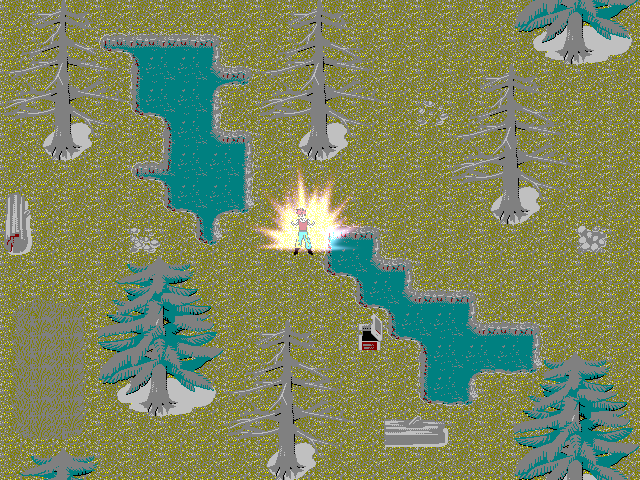
@obsorber: Don't take it the wrong way but Kyrsty is right, it's most unattractive map I've seen in years. Honestly man, there's nothing to argue here it's not even a question of taste, it's just a mess.
And yes, the character sprites have been created by me in a certain size. Then I have re-sized them for the game. I can't sprite so I create large sized templates from my own way of drawing and reside them.
Find another way then because it doesn't work.
Its based on classic style to fit with my skill level at graphic design which I already stated wasn't that good so you've pretty much pointed out the obvious. The graphics are the RTP that has been de-colourized to fit my game.
No, no, no. Enough of that, you're just coming at the defence of your shortcomings. If you're not good at it and you know it, practice and become better. I mean set higher standards for yourself. Polish your things a bit before showing them off because it's not even a case of providing criticism here, there's nothing to comment upon, everything has be ditched and start anew.
I was never aiming to make a colorful game but one that emphasized classic styles from the old consoles with my own original works within it. I enjoyed them and am not obsessed with graphics so much but game-play elements, story and presentation. Now days everyone thinks graphics are what makes a game good and forget the other important prospects which is why so many games which are great go unnoticed.
Again, that reasoning will get you nowhere, it encourages mediocrity and laziness. This isn't good like nes graphics were good in their simplicity. This is just not well done, there's no more explanation to be made.
You need loads and loads of practice. I'd spend my time practicing my pixels instead of making up excuses for yourself.
I mean the mapping isn't good, the DBZ light effect on the character is actually too high, the colors clash so bad...
Good luck for your future maps, sorry I know what I wrote is harsh but it wouldn't be in your best interest to encourage you down this path and it's kind of my pet peeve when people mess something and their defence mechanism kick in and they're rather not take responsability for it..
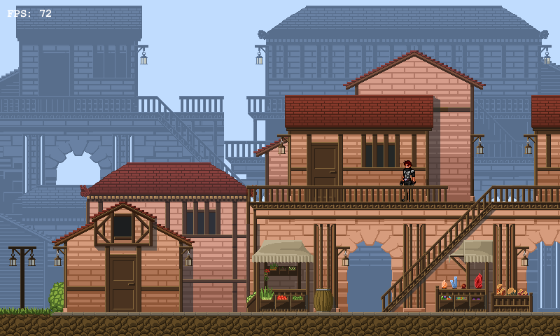
Here's an example of a pretty screenshot, by Harusame:
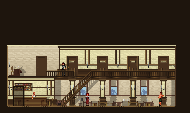
Another one by the same author:
Here's an example of simple pixel art which looks good, by Maelstrom:

Video! :D
I am allowed to do this right? haha
I am allowed to do this right? haha
^ The party looks a little clunky in motion, but maybe that's just the video's framerate. Otherwise, looks great :3 Do the footstep sounds change when you walk on other materials (wood, water, etc).
(videos are many screenshots one-after-another, so I think they still count)
(videos are many screenshots one-after-another, so I think they still count)
No thanks, I don't agree with your opinions and you can argue with me to the death. I personally just want to make a game for fun to express my old creative works. I don't have the skill or handwork to draw good graphics...
author=Archeia_Nessiah
Why post in screenshot topics if you don't want feedback on the screenshots?
For buttpats obviously.
It's been Real long ever since I told anybody about the progress I am making(Not like anybody fuckin' cares)but here it.

New title screen


And the ability to summon the "Office Whores" to deal damage to the enemies.

New title screen


And the ability to summon the "Office Whores" to deal damage to the enemies.
LockeZ

I'd really like to get rid of LockeZ. His play style is way too unpredictable. He's always like this too. If he ran a country, he'd just kill and imprison people at random until crime stopped.
5958
NOACCEPTANCE, the bad palette absolutely ruins that background. Also I think the purple and black and green window at the bottom clashes pretty badly, and the green text is almost unreadable.
There's a problem with the font you're using for those numbers, the HP and MP run into each-other.
Your new title screen has at least one of the same MAJOR problems as the old one did, which is that the images in it are squashed unevenly. The woman is stretched out vertically and the guy in the coat is stretched out horizontally. You need to find images that work in those spaces, or crop those instead of stretching them to get them into the shape you need.
No thanks, I don't agree with your opinions and you can argue with me to the death. I personally just want to make a game for fun to express my old creative works. I don't have the skill or handwork to draw good graphics...
Sorry. Your screen is sublime, keep going!
author=obsorberYou can still change the colours to not look like someone puked on the screen? It does NOT look "old school" or whatever you said you were going for. It looks like someone took some chipset from somewhere and changed the colors to the most boring and out of place possible colours.
No thanks, I don't agree with your opinions and you can argue with me to the death. I personally just want to make a game for fun to express my old creative works. I don't have the skill or handwork to draw good graphics...
Also you can say you won't care all you want, but we all know you DO care since you posted the image here. I guess you're going to ignore anything but "wow that looks awesome bro xD" so why am i even trying...?
author=LockeZ
NOACCEPTANCE, the bad palette absolutely ruins that background. Also I think the purple and black and green window at the bottom clashes pretty badly, and the green text is almost unreadable.
There's a problem with the font you're using for those numbers, the HP and MP run into each-other.
Your new title screen has at least one of the same MAJOR problems as the old one did, which is that the images in it are squashed unevenly. The woman is stretched out vertically and the guy in the coat is stretched out horizontally. You need to find images that work in those spaces, or crop those instead of stretching them to get them into the shape you need.
no please keep up the targness. it's cool.
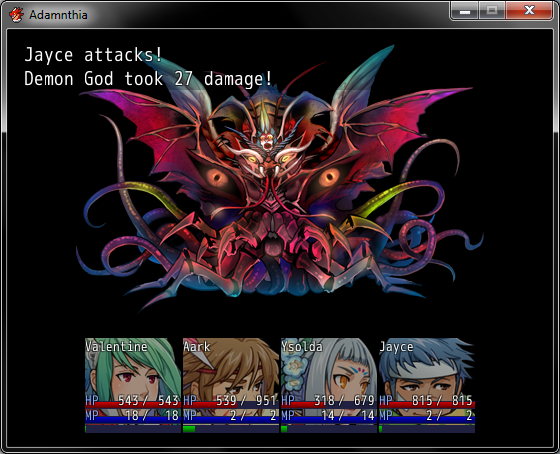
Redid the battle status, fits into the normal window now. Wish there was a way to change the padding on the left and right of the window, so that the characters weren't as bunched up as they are.

Custom made.
I'd like some criticism as to what I could change to make it better. It's a murder scene and some detective investigating on top of a building.
Do you think the detective looks effiminate with his outfit? I tried to go for the detective look but it seems a bit too pink to me.
Characters are faceless which was inspired by Newblack's game. I thought that removing features from the face made the characters more creepy looking.
@CokiCookie - Heh, the character's names are interesting! Also at ~27 HP per attack that boss fight will probably take forever D: Will the battle background always be black, or is it just not added yet?
@Ocean - I really like the palette you chose, using a shade of grey for your lightest color. Makes things a lot easier on the eyes :> Also you kept the paths simple and un-cluttered, A+ :D
@Shablo5 - I like it a lot, but there are a few issues. Immediately to the left of the house you have these logs under the pine trees, they sort of stick out because they're so desaturated compared to the map. Directly below the house there's a curve in the cliff but the water tile beneath it goes straight. Also, ground beneath the lamppost next to the bridge doesn't have a cliff edge. I really love the detail you put in the riverbed, though. Good job :D
@Creation - My immediate gripe is the text, everything else is so clean cut yet you used aliasing on the font D: It would look a lot better pixellated to match the rest of the scene. The chalk outlines are hilarious for some reason, I love them XD Maybe you could add some detail to the edges of the building like you did with the walls. The character's outfit doesn't really say 'detective' to me, but I guess it works. I dunno, P.I.s traditionally wear darker colors but I like pink too :D
Edit - @alterego
Haha whoa that's a really nice video. I noticed a few typos/grammatical errors but otherwise your dialogue is fluid and easy to understand. If you want I could do a short list of the errors I noticed :)
@Kyrsty: Ew, they walk very close to each other, that's gay. :( ...Seriously though, I don't remember FF8's 'caterpillar' system being so, caterpillar-y. Just something to keep in mind, that's all. The sprites seem to animate very well from all directions, so no objections there.
@Ocean: Why so blocky? D: I really think you should make the coastline look more 'natural', no matter how much you want to emulate that retro-game aesthetic. It would only be more visually appealing that way. Btw, I love how smoothly shaded those mountains and trees are.
@Creation: The tiles overall seem fine thus far, and I like the colors you're using this time. Have you been working on a palette? ...You're right about the detective's clothes though, they're too pink, and his hat looks rather tiny... All he needs now is a purse and a chihuahua. xD
_
I know I have this posted on my game profile, but I was wondering about something rather specific: How's the writing? ...Working on the script for my game is single-handedly the most difficult thing about its development. Not only do I lack formal education on the area, but I'm also no native English speaker, so I struggle a lot to make things make sense. -_-; But you know, as long as it's not physically painful to read the dialogue, I can leave that on the side for now and focus on other things.
Edit: @Miracle: I'd love if you did that. Thanks a lot in advance! ^^
@Nessiah: Haha, I like a lot your interpretation, actually. After all it is part of the idea to show Zohar as a rather melodramatic character at first; I just hope he doesn't come across as completely unlikable. ...And the whole scenario is already kind of a flashback, so a flashback inside a flashback would be a bit overkill. xD
AlterEgo...A lot might disagree with this but that opening dialogue would've fit in AFTER the whole conflict. For me it felt like, he decided to be a poetic badass then decides to do his work and then got kicked out by a dragon, making him look like a loser.
Or.. that dialogue could fit better as my friend says better than I, "He could have easily had the thoughts/recollections coming across the screen as remembered instead."
It just seems so melodramatic ;(
Or.. that dialogue could fit better as my friend says better than I, "He could have easily had the thoughts/recollections coming across the screen as remembered instead."
It just seems so melodramatic ;(


