THE SCREENSHOT TOPIC RETURNS
Posts
I think NOACCEPTANCE's postings here are questionable. But what I find even more weirder is the fact that if NOACCEPTANCE committed to every suggestion and criticism made in this topic, the game would be nothing like he wanted. And uh, if you were in a professional company where the whole point is to make money I can see where "objective reasoning" would come in to play.
guess no one accepts him
guess no one accepts him
LockeZ

I'd really like to get rid of LockeZ. His play style is way too unpredictable. He's always like this too. If he ran a country, he'd just kill and imprison people at random until crime stopped.
5958
author=Darken
And uh, if you were in a professional company where the whole point is to make money I can see where "objective reasoning" would come in to play.
Or if you were in an amateur community where the whole point is to make a good game.
no the point is to make a game you want to make. "good" is really subjective.
what NOACCEPTANCE wants to make isn't really clear, which makes it hard for people to provide suggestions. If someone is making a roguelike and wants it to be complex, then you have something to go off of.
do you get it
what NOACCEPTANCE wants to make isn't really clear, which makes it hard for people to provide suggestions. If someone is making a roguelike and wants it to be complex, then you have something to go off of.
do you get it
I dont buy "this is is style" as an excuse.
Its not WHAT hes doing (im not saying his weird dark techno anime stuff shuold go), but HOW its being done (low res graphics, lack of any design).
And it doesnt matter WHAT type of game he's going for, have you EVER seen a title screen look like that? In any genre?
The style he's going for (or at least what I think he's attempting) I can envision some of these screens, when done in a more successful way, looking pretty cool.
You cant just say "WELP THE SCREENS ARE SUFFERING AND CONFUSING BUT THAT WAS HIS STYLISTIC CHOICE", come on.
The things he's adding don't SERVE any purpose, they are just there.
Not everyone has to go for MINIMALISM, but as an amateur game maker who obviously has some graphical/design issues and seeking help, it might be a good place to start.
Start with the basics and learn to integrate your style as you develop it.
We are all constantly learning from each other, and sure GOOD is subjective, but that goes for the opinion of ANYTHING.
I guess a chef could make an expensive dish out of hair and sand if thats 'what he wanted to make', but dont expect anyone to eat it.
I definitely think his title screen can be improved with better use of composition and thought and all that. But uh, I am moving to the point where... is he even going for the ideal quality we're all thinking? At the same time there's something interesting about "visually assaulting" graphics and I do think it has its place in a weird cult like way. This review for example: http://rpgmaker.net/games/3315/reviews/1497/ provides some insight on why his game has its own appeal.
If that's the case, yes there's little point in posting your screenshots here if your goals greatly differ. Like, believe me I'm agreeing with 90% of the stuff you're saying. But if he's intent on making a crazy as fuck game with chaotic designless visuals, it seems pointless to persuade him otherwise. If he's actually making a push to make a more ACCEPTable game (heh) visually then forget what I said.
If that's the case, yes there's little point in posting your screenshots here if your goals greatly differ. Like, believe me I'm agreeing with 90% of the stuff you're saying. But if he's intent on making a crazy as fuck game with chaotic designless visuals, it seems pointless to persuade him otherwise. If he's actually making a push to make a more ACCEPTable game (heh) visually then forget what I said.
LockeZ

I'd really like to get rid of LockeZ. His play style is way too unpredictable. He's always like this too. If he ran a country, he'd just kill and imprison people at random until crime stopped.
5958
author=Darken
no the point is to make a game you want to make. "good" is really subjective.
Instead of arguing for thirty pages I'm going to delete what I wrote and just leave everyone with an extremely misleading, completely ridiculous and borderline incoherent statement that also totally explains my views on this matter:
art is a science
author=Demicrusaius
Them screens look great! I'ma gonna go download that there game.
This may seem counter-productive, but don't! Wait until the next demo release at the end of the summer, it will be way better.
author=Nightowl
@King of Games: Looks nice but that panda reminds me of how WombatRPGs failed horribly in some gamingw panda thing contest.
The only good thing that came out of that contest was some dude who dropped a crazy shump and was never heard from again. This is more like panda Morpheus, if that sounds any less ridiculous.
I really liked the looks of it, but it crashed after the intro because we have different RTPs... You should make it so that you don't need RTP to play it.
There is a tutorial for that somewhere on here...
There is a tutorial for that somewhere on here...
author=King of GamesDidn't Hima make that Hello Panda game for that contest, went on to make USG an Alice in Wonderland game? Pretty sure his stuff is on here.
The only good thing that came out of that contest was some dude who dropped a crazy shump and was never heard from again. This is more like panda Morpheus, if that sounds any less ridiculous.
Hima has always made interesting games, don't remember that particular one.
Oh yeah, and RTP can kick rocks!
Oh yeah, and RTP can kick rocks!
Here's a cutscene footage of the new storyline I'm implementing.

Sorry I used some stuff from Breach without killerwolf's permission but I'm gonna ask.>.>
UPDATE:I asked and he accepted ^_^

Sorry I used some stuff from Breach without killerwolf's permission but I'm gonna ask.>.>
UPDATE:I asked and he accepted ^_^
This here should be ready for a game profile in the next few days (but not with a download yet).
It'll feature a Legend of Dragoon-like Addition system, Game Boy palette, full custom graphics and fake FPP dungeons (thanks to Killer Wolf's shares).

It'll feature a Legend of Dragoon-like Addition system, Game Boy palette, full custom graphics and fake FPP dungeons (thanks to Killer Wolf's shares).

Avee, that looks awesome. Like, sooooo good. <3 It kinda brings Lufia to mind. :D
Also, NOACCEPTANCE: consider yourself accepted because that is a good screen.
Also, NOACCEPTANCE: consider yourself accepted because that is a good screen.
author=Liberty
Avee, that looks awesome. Like, sooooo good. <3 It kinda brings Lufia to mind. :D
Also, NOACCEPTANCE: consider yourself accepted because that is a good screen.
awwwwwwww thanks liberty!^_^
That looks terrific, Avee! But, how far are you into development? Any chance of reducing the space of the gameboy frame? I think it's a bit too overwhelming as it is... Yes, I know that the little screen there is roughly the size of an rm2k3 game (This isn't rm2k3, right?) which should be no different than playing one of those games, but the ratio of the screen vs wasted space is like 1 to 2. xP
_
_
author=DarkenI hate you. >:(
ahahahahaha wow dude. like just "make the default title screen with a black background" is all you can come up with?
author=DookieI love you. =)
...he should start with the basics of title placement and a strong logotype before piling on a bunch of random images.
Glad you guys like it :)
To answer your question alterego, I'm afraid it's a bit late to undertake such changes :S All graphics will be custom Pictures and I already drew about 175 (most are background and interface templates, such as the FPP dungeons and battle menus).
The screen is 160x144 pixels wide. Using a smaller screen and only 4 colors really cuts down the amount of work I have to do (a true blessing if you ask me).
I can only hope you'll get used to the style ^^
It is for 2k3 too.

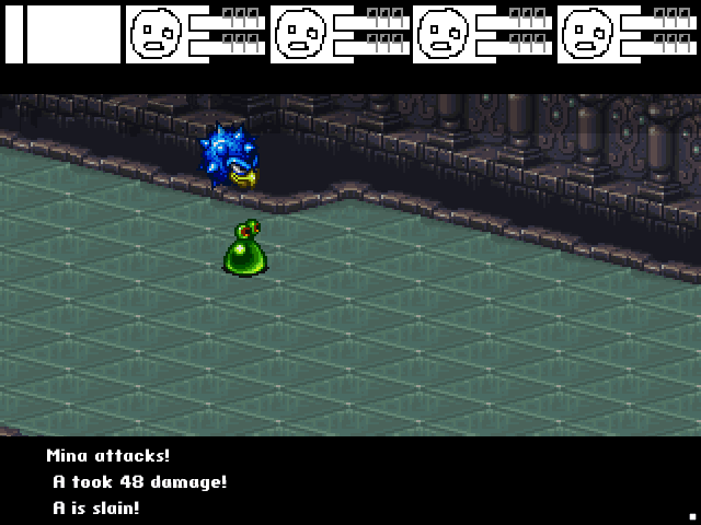
Firstly, keep in mind this is very much a WIP and there's a lot missing. What I would like thoughts on is the battle background. The thing is, the ripped backgrounds look terrible when made the 'right' size to fit the window fully, so I've come up with this solution. Now, the bottom black areas will, during turns, have windows covering them. The top part's the main issue for me.
Should I move it down a line or two and leave it black so that it acts as a sort of window for battle log messages?
Should I try to stretch the battle back to cover it somehow?
Maybe I should add a window there for the messages instead, though that would look odd when no messages appear.
Or perhaps I should make a frame around the edges of the battle back and leave the rest black.
LockeZ

I'd really like to get rid of LockeZ. His play style is way too unpredictable. He's always like this too. If he ran a country, he'd just kill and imprison people at random until crime stopped.
5958
Another option is to move the entire battle background up so it's adjacent to the top of the screen, and then increase the size of your battle status window at the bottom to fill the larger black area. This would require both making the window larger and choosing a bigger font size. Alternately, instead of increasing the font size, you could use the extra space to display more information, like status effects or turn order or a list of enemy names or something.
Another option is to edit the battle background to cover the extra area. It's a repeating pattern, so this seems like it would be super easy. However, some of your other battle backgrounds might be harder to edit, especially the outdoor ones.
Of the options you listed, my preference would be to make the black bar at the top thicker, so that it's the same as the black bar at the bottom, creating kind of a "widescreen letterbox" look.
@Liberty: I would do a layout kind of like this myself;
Where the thing on the top left would drop down and then expand rightwards for the menu.
Where the thing on the top left would drop down and then expand rightwards for the menu.
Khos: Thing is, I'm trying to keep to the style of the original game and personally prefer it on the bottom. ^.^;
LockeZ: You're right about the stretching thing - in most cases the grounds are not as easy to repeat, unfortunately. Hence why moving it up won't work either. I'm not sure I like the idea of stretching the box, either, as there's still plenty of room for stuff even without stretching. I might look into boosting the font size a bit and stretching it anyway, though, just to see.
I prefer the idea of the letterbox thing. The only issue I might have with that is the character sprites, but seeing as there shouldn't be more than four enemies in a battle at one time, everything should fit... hopefully.
(Keep in mind I'm not exactly a scripter and am doing the game myself at the moment, so what I can do is limited.)


