


THE SCREENSHOT TOPIC RETURNS
Posts


Decided to make original tiles for Centuria starting with the world map. They're still very much inspired by the NES Dragon Warrior tiles though.

Still need to replace bridge, castle, and town tiles.
Still need to replace bridge, castle, and town tiles.

@Liberty - Those are some really, really nice tiles but the fact that the bed in the lower right has the head in the middle of the room would really annoy me in real life, yet it looks fine in your screenshot. :S I guess it's because of the armour at the head of the bed - it's a nice touch, and makes it feel a bit more walled off. As always with VX though, the auto-shadows will be a constant source of annoyance, though I suppose that's not something you can change without parallaxing. Did you make those paintings yourself?
@Lotus - The background and dusty-bits in the first picture add awesome levels of atmosphere, and I really love that screenshot.. In the second I get that they're underwater, but there's not really much else to see going on. I expect that there's more to see in-game?
@UPRC - Damn, that looks great! M only concern is that some of the coast line is very thin and boxy because it's directly next to the grass. I can't decide whether it's off-putting or perfectly fine.. I'm leaning towards fine!


Pretty much self-explanatory: you can equip up to 8 skills at the same time - and you level them all by using. :)

@Caz: Yeah, those paintings were a combination of shrunk-down art I found over the years and minor edits here and there. I think they look pretty decent. ^.^
About the bed, I do see the issue and am currently trying to sprite some other-facing beds. It's taking a while, though. >.<; Auto-shadows are annoying but I'm thinking of either leaving them be or finding a kill-shadow script and adding my own lighting.
@Itaju: Neat! I like the idea. Is there any significance to the colour of the skills? And if so, perhaps you should change the blue spells to a different colour to differentiate them to the menu colours?
@Itaju - I like the concept, but the puzzle pieces seem "dirty". Like they have jpeg artifacts or something. It almost looks like you drew them larger and used a program to shrink them down to size.
Below the words Sword Strike, to the left of the word Effect, that puzzle piece looks like a dog was chewing on it u.u and the one under the word Level.
Below the words Sword Strike, to the left of the word Effect, that puzzle piece looks like a dog was chewing on it u.u and the one under the word Level.
finally got this... finalized. i might still do something different with the Ability/Pack box, not sure.

Itaju, I agree about the "dirty" puzzle pieces. Looks great, but those pull the eye away from the text. :<
Itaju, I agree about the "dirty" puzzle pieces. Looks great, but those pull the eye away from the text. :<

I really love those monsters, some of the best ones I've seen, the heros look a bit pale and the boxes they're in a bit square in comparison, but maybe that's a good idea.

@Lotus: I really liked the way you draw the first map. Those mountains are neat, pretty realistic, and that may be a problem because it contrasts with the animations that look draws in 2d. The HUD has a good shape too but if you put some texture on it instead of a gradient, it would look much much better. The second screen is very good, I've never seen such a good underwater effect.
@UPRC: I think you should continue drawing your own tiles. They are amazing and very charming. They deliever the nostalgic feeling of retro gaming. And I think that was your goal.
Only one thing about the map drawing. Some trees are too close together, it makes the map look too symmetrical, which is not very good. Try disperse them a bit.
@Itaju: I just loved the way you did those boxes, like pieces of a puzzle. Very fancy, and the system looks very awesome as well. Keep your good work.
@Craze: Man, that windowskins is just beautiful. I'm not a big fan of the first person battle style, but all the elements fit just fine. The battlers, the battleback, the faces and the window. I like it all, very much. :)
Good screenshots, good work everybody.
INYG

Tint checking and a map. I'm thinking the tints are about perfect. Any thoughts?
@Craze: While I like the windows, maybe you could decrease the size of the faces or something? They're rather large.
@UPRC: Can't believe I missed that map. I love the new tiles and the mapping is pretty sound, though maybe making the swamp areas a little less square might be nice. And the thin coastland strips are a bit squarer than they should be. Maybe you could add an B,C,D,E tile that you can run along the edges to make them less so?
I had a shot. It just makes it look a tiny bit less square.
The added coast stuff:

Revised coast:


@Liberty - Looks great, no complaints here.
@Craze - What liberty said, just while getting rid of the window behind the faces maybe? That's my suggestion anyway.

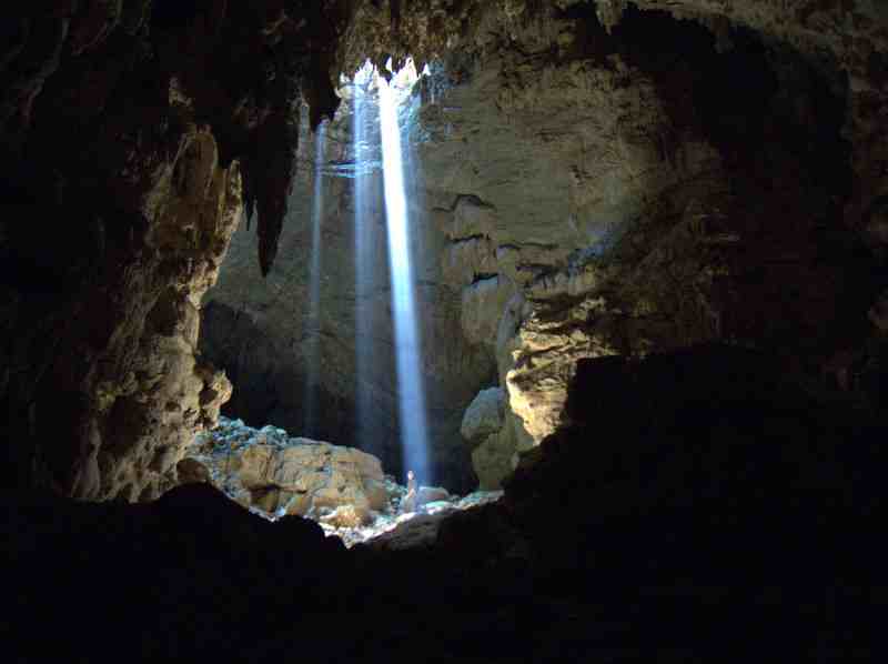
Does the lighting and tint look good or.. ? First time I've actually tried making lighting specifically for a map.
@Craze - What liberty said, just while getting rid of the window behind the faces maybe? That's my suggestion anyway.
Does the lighting and tint look good or.. ? First time I've actually tried making lighting specifically for a map.
I like it, though I'd add a bit of darker areas where the light would contrast brightly - say the middle of the pillars and behind the stones (they'd throw a shadow).
Liberty, nice effects, the tints are pretty good, and the map is very well drawn as well.
Tau, I think it looks fantastic, but you should put some light outside the cave, coming from the sky to create a contrast with the darkness of the cave. It remembers me the beaches of Portugal. Very good =)
Tau, I think it looks fantastic, but you should put some light outside the cave, coming from the sky to create a contrast with the darkness of the cave. It remembers me the beaches of Portugal. Very good =)
author=Tau
Tau, that looks good but I think it could be better, why don't you try some Sunshafts? I hope you don't mind, I edited the image.

Lib/Tau: I'll consider killing the window; half-transparent black boxes fit in with all the rest of the menus' aesthetics anyway. As for the face size, it's a little dorky but there are twenty characters - I honestly don't expect everybody to memorize all of their names, especially not upon the initial recruitment. Thus, big, chunky faces are easily noticed and remembered by the player ("Oh, that's the dancer chick that's good at boosting Morale. I could use her right now").
Tau: Godrays could look nice, like Cinderblock suggested. I like it as-is, though.
Tau: Godrays could look nice, like Cinderblock suggested. I like it as-is, though.
I like it better without the sunrays... or at least the ones Cinderblock provided. They're not subtle at all and look more like a chunk of colour (no offence, CB ^.^; ) but if some subtle rays were added, maybe.
Found these while looking for examples for sunrays. Maybe they'll give you some ideas on enhancing shadows/light.
@Craze: It's not the window that's the issue - I really like it - but the faces are a bit distracting, but I guess you're aiming for immediate recognisability, so, yeah...
Found these while looking for examples for sunrays. Maybe they'll give you some ideas on enhancing shadows/light.


@Craze: It's not the window that's the issue - I really like it - but the faces are a bit distracting, but I guess you're aiming for immediate recognisability, so, yeah...
I like sunrays. it looks flat without them

It's up to you. I think it looks nice both ways, although there are some noticeable tiles missing on the sides of the center and left columns! (I repaired them in this version)
It's up to you. I think it looks nice both ways, although there are some noticeable tiles missing on the sides of the center and left columns! (I repaired them in this version)

