


THE SCREENSHOT TOPIC RETURNS
Posts

@SorceressKyrsty: Yes, money is scarce, but that's mostly because most of the money goes into skills. It's a simple fix to restore HP really. Of note, there is only one other place in the entire game where the save point has 4 things surrounding it. Every other save point does not. Dunno if that matters or not.
The boss isn't until 3 screens later, and there's a save point and shop before said boss so...
@Liberty: Hmm..so should I lower the tiles of the land by one then? I was debating on how low to make the landmasses. Originally the entrance was going to have the back submerged in the lava, but I didn't know of any good way to make that work out so...

50x24. Just a couple siderooms in the second room. Simple little fix-up~ Thank you Trujin/Itaju for your mapping techs and for the tileset update! Those black tiles made this a lot faster to do without having to worry about 50 thousand details!
I'm thinking of having lava pools in a couple of these, but also having the screen tint slightly red in here (and maybe all other areas?) to signify how hot it is in the dungeon. I was thinking of making it so that it would gradually tint red and tint back to normal...not sure how I would do that though. Hmmm...but I know there's something missing in here. It has stalacmites, rocks, hills, and bats. There's not much else to throw in here in all honesty (the school pieces wouldn't be in here because this is in the second area, and the school stuff collapsed in the first area so...).
The boss isn't until 3 screens later, and there's a save point and shop before said boss so...
@Liberty: Hmm..so should I lower the tiles of the land by one then? I was debating on how low to make the landmasses. Originally the entrance was going to have the back submerged in the lava, but I didn't know of any good way to make that work out so...
50x24. Just a couple siderooms in the second room. Simple little fix-up~ Thank you Trujin/Itaju for your mapping techs and for the tileset update! Those black tiles made this a lot faster to do without having to worry about 50 thousand details!
I'm thinking of having lava pools in a couple of these, but also having the screen tint slightly red in here (and maybe all other areas?) to signify how hot it is in the dungeon. I was thinking of making it so that it would gradually tint red and tint back to normal...not sure how I would do that though. Hmmm...but I know there's something missing in here. It has stalacmites, rocks, hills, and bats. There's not much else to throw in here in all honesty (the school pieces wouldn't be in here because this is in the second area, and the school stuff collapsed in the first area so...).


Ok, I so recognise that logo. Wasn't that from a rm2k3 game?
Looks great though, love the rock texture =).
Edit: So it was, just found it at my harddrive =). Though it was rm2k not 2003 XD.
Looks great though, love the rock texture =).
Edit: So it was, just found it at my harddrive =). Though it was rm2k not 2003 XD.


author=Trujin
Ok, I so recognise that logo. Wasn't that from a rm2k3 game?
Looks great though, love the rock texture =).
Edit: So it was, just found it at my harddrive =). Though it was rm2k not 2003 XD.
Yes, it was an RM2K Project - Demo only.
This will be the remake.

@Itaju - maybe I don't have the eye for errors like other people, but your maps are always astounding. Your style is so detailed and like nothing I've seen before, and you always execute your imagery so well. The only thing I CAN see would be the bushes on the cliffs look like they stand out too much, as if they're on a horizontal plane and not sticking to the surface of the rock very well. That's not to say that specific foliage wouldn't work excellently on flat ground however.
@Choco - those screens are very cute and colourful, I like the vibe I'm getting. It's not an issue you can sort out without tinkering with the tileset or leaving it out completely, but the trees seem a bit close to the edge for my liking. I mean, I'm not saying trees SIMPLY CAN'T grow on edges like that, just that it looks a bit disconcerting. Otherwise splendid to look at!
@Choco - those screens are very cute and colourful, I like the vibe I'm getting. It's not an issue you can sort out without tinkering with the tileset or leaving it out completely, but the trees seem a bit close to the edge for my liking. I mean, I'm not saying trees SIMPLY CAN'T grow on edges like that, just that it looks a bit disconcerting. Otherwise splendid to look at!
author=Lotus_Games
@Koa: Looks great, I love the high-res textures but I'm curious what engine this is being made in!
Thanks.
The engine is Unity 3D
LockeZ

I'd really like to get rid of LockeZ. His play style is way too unpredictable. He's always like this too. If he ran a country, he'd just kill and imprison people at random until crime stopped.
5958
@Itaju: the shading on the cliff walls looks great, it really adds a sense of depth to the map and helps shape the mountain. The foliage looks off somehow, I don't know how to desribe what looks off about it but it kind looks you're using it for something different from what it was originally meant to be? But I understand the woes of making a custom tileset so I can't blame you, and while playing I wouldn't really care as long as it was consistently done like that across the area, I don't think.
@Caz
Thanks for the feedback :)
I started making my village map but I've got a major headache so I'm just gonna post my progress so far


Still need to finish the cliffs and the rest of the village...
Thanks for the feedback :)
I started making my village map but I've got a major headache so I'm just gonna post my progress so far
Still need to finish the cliffs and the rest of the village...
Oh man guys! Oh man! Are you ready for more CAVE action!?
This is the original map, 100x100. Yes, it...doesn't feel right the more I look at it. Only really one elevation, and it doesn't even really make much sense. And yes, this is 100x100 for ONE map, but this is also the entire dungeon (2nd dungeon of the game). There's no gimmick here at all and is just simply a "trudge forward to the exit". The Hard Path is 50x50 (the harder the difficulty of path, usually the shorter they are...usually), and that's an entirely different segment (still no gimmicks other than better treasures and harder enemies). The map itself isn't too terrible -I- think again, but it's lacking something...and no, I'm not going to cut down on the size of it either this time around unlike those caves I was cutting down!
Speaking of caves, I DID finish one of the caves off 100% so that's one down, and like 4 more to go...;__;

@Xenomic
I can't see much since from the screenshot since its downsized too much but from what I can tell it has the same problem all your maps do. Too much empty space with absolutely nothing going on.
I can't see much since from the screenshot since its downsized too much but from what I can tell it has the same problem all your maps do. Too much empty space with absolutely nothing going on.
Yeah, I had to reduce it to 12.5% because of its size. It's supposed to be a forest, but I can't do a good forest with the trees (as in, like having black tiles on top of trees or things like that) because this tileset doesn't have that really. I originally didn't want to just spam mushrooms and bushes and whatnot everywhere because I thought it'd look terrible myself. @_@;
@Xeno - your elevation ends too abruptly on the other side of the stream from what I can make out. I advise you just make all of the elevation the same height and have a waterfall coming down where the stream hits the cliff. It's probably not what you wanted but it's difficult to indicate slopes on a 2D plane like that. I like that you've added some variety to your flooring though, it really makes it feel a lot more textured. Try filling your empty gaps with more groups of trees.
@Choco - Loathe as I am to say it, that style really appeals to the Harvest Mooner in me for some reason. I realise they're WIPs so I won't point out obvious areas which need more stuff to fill it up, but you're doing a good job! The doors are the two tile high ones, right?
@Choco - Loathe as I am to say it, that style really appeals to the Harvest Mooner in me for some reason. I realise they're WIPs so I won't point out obvious areas which need more stuff to fill it up, but you're doing a good job! The doors are the two tile high ones, right?
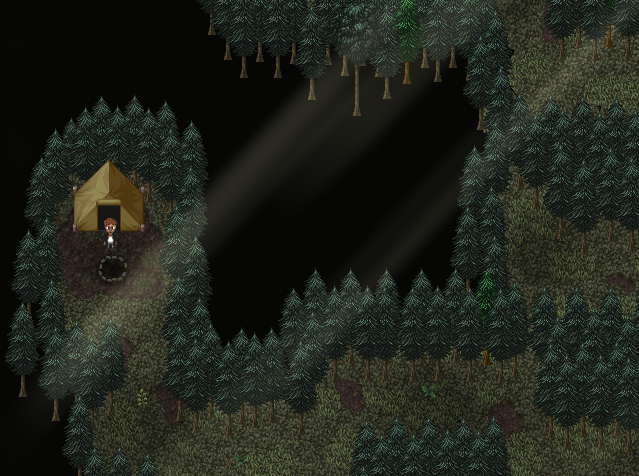
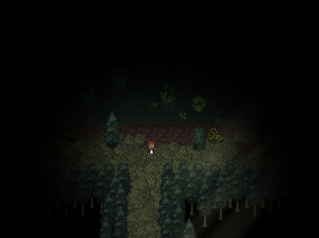
I like how there's a couple of greener trees in the mix of the other trees~ Path is pretty clear cut too from the trees and you use the black tiles well enough (though seeing trees standing on nothingness bothers me, but that's me~). I like how you have the rays of light shining in, making it seem like the forest is dark and dense, and even moreso with that darkness in the second link (I'd like to use that gimmick but I've no idea how to do so in 2k3...). Overall, not bad at all~
LockeZ
I'd really like to get rid of LockeZ. His play style is way too unpredictable. He's always like this too. If he ran a country, he'd just kill and imprison people at random until crime stopped.
5958
Are those two weirdly brighter trees somehow special? I assume that's some sort of indication that you can interact with them somehow, but I'm not sure how since they're behind other normal trees.
The way you do the black is unusual, reminds me of fog of war in Warcraft games. I like it, I think.
The way you do the black is unusual, reminds me of fog of war in Warcraft games. I like it, I think.


