


THE SCREENSHOT TOPIC RETURNS
Posts


LockeZ

I'd really like to get rid of LockeZ. His play style is way too unpredictable. He's always like this too. If he ran a country, he'd just kill and imprison people at random until crime stopped.
5958
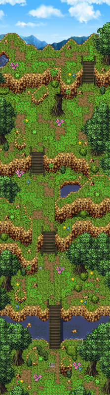
that is the entire map?
Not the entire thing, but almost. I might need to put one more building down somewhere in that map. :P
LockeZ
I'd really like to get rid of LockeZ. His play style is way too unpredictable. He's always like this too. If he ran a country, he'd just kill and imprison people at random until crime stopped.
5958
Put them side by side then. Problem solved.
Probably not directly side by side, because that's boring, and it's already a boring map. Maybe put the police building down a short flight of stairs leading down from that stone platform to the grass, and about four tiles further south than the hosipital.
Solid lines are the two buildings. Dotted lines are the ledge; the building to the left is on a raised platform. The two diagonal lines are a staircase leading down.
Probably not directly side by side, because that's boring, and it's already a boring map. Maybe put the police building down a short flight of stairs leading down from that stone platform to the grass, and about four tiles further south than the hosipital.
 _____
|     | .........
|     | :   ____
|_____| :  |    |
        :  |    |
......\\:  |____|
       \\
Solid lines are the two buildings. Dotted lines are the ledge; the building to the left is on a raised platform. The two diagonal lines are a staircase leading down.

Corfaisus

"It's frustrating because - as much as Corf is otherwise an irredeemable person - his 2k/3 mapping is on point." ~ psy_wombats
7874
Corfaisus
"It's frustrating because - as much as Corf is otherwise an irredeemable person - his 2k/3 mapping is on point." ~ psy_wombats
7874
EDIT: Well, that just happened.

author=Dreaded
I've considered adding the underwater tile throughout so long as I can get it to layer right (chipset works a little funny in that regard).
As far as more colors, ehh....I don't really plan for this to be a "bright" game and am trying to keep the color scheme sort of dulled. There will be more color when I add the animals and everything to the map. I'm trying to pay a lot of attention to small details like sound effects that will bring life to the game and give it that exploring kind of feel.
As for the worldmap, I don't know. I understand what you're saying but to be honest I kind of like the contrast. The compass spins as you move which I think was a cool little effect.
Hey Dreaded, for that game can you make a Production link to it, with mebbe a demo, so people can subscribe? It's tricky to keep track of new games, especially when they're promising ideas.
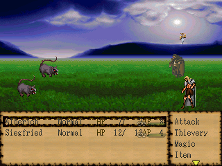
Wanted to see how people felt about the battlecharas; spent a lot of time recoloring the one for siegfried and editing it to match the charaset.
Before I went ahead and animated it I wanted to see how people thought it looks.
Bulma,
When I have enough of a game to post, Ill likely post a demo. I also intend to re-release my original game (which at one time may have been considered a classic, albeit unfinished) that I did some work on a few years ago, Diary of a Madman.
Creating a site hasn't really been on the priority list mainly because I do not have net at home (besides a smart phone) partially because its been unnecessary (although I've considered it up until recently, decided to buy a new car).
I can go ahead and shoot you an email once I put it. together if you'd like. Might be a while since its just a project out of fun for me but you never know.
author=Dreaded
Your edits could use a lot of work. They clash with pretty much everything else on the screen.
And also, Alucard generally isn't a good sprite to make an edit of and use as a RM2K3 battle character.

author=Dreaded
Bulma,
When I have enough of a game to post, Ill likely post a demo. I also intend to re-release my original game (which at one time may have been considered a classic, albeit unfinished) that I did some work on a few years ago, Diary of a Madman.
Creating a site hasn't really been on the priority list mainly because I do not have net at home (besides a smart phone) partially because its been unnecessary (although I've considered it up until recently, decided to buy a new car).
I can go ahead and shoot you an email once I put it. together if you'd like. Might be a while since its just a project out of fun for me but you never know.
Shit yeah, dawg. RMN has game pages and you can free host on-site. You just need to hover over the Submissions bar at the top and follow the steps. You don't need a download until you're ready to put it up, but you can furnish the page with images and information. (Check out the Games Portal to see examples.)
The edits aren't tooshabby, but you should probably change the background to something a little more simplistic that suits the battlers instead of the super-detailed version that you currently have.
(Also, don't forget that we have edit buttons so that you don't have to double-post, okay? ^.^ )

@Dreaded The top battle character looks faded compared to the bottom one.
I think I feel an edit coming in the future for Libby's post....
I think I feel an edit coming in the future for Libby's post....

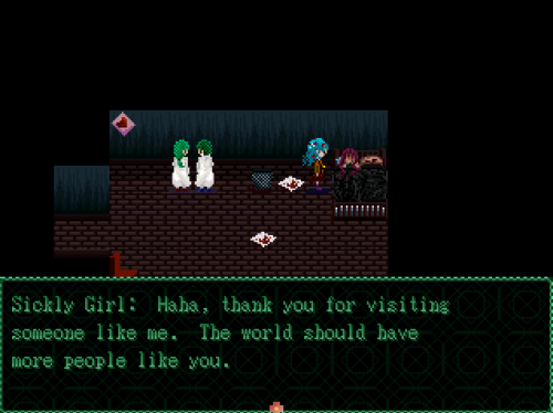
@Sion - It's nice and all but it doesn't really go anywhere except maybe a nice view? I hope this isn't what the money is going towards because it's very easily replicated work you've done here.
@Dreaded - Oh man Diary of a Madman is cancelled? I was shocked to hear you were still working on it but am quite saddened it's gone away now, it's a shame. Nice sprites, the system set is what bothers me more as the black bar around the information is way to thick.
@Dreaded - Oh man Diary of a Madman is cancelled? I was shocked to hear you were still working on it but am quite saddened it's gone away now, it's a shame. Nice sprites, the system set is what bothers me more as the black bar around the information is way to thick.
author=Tau
@Sion - It's nice and all but it doesn't really go anywhere except maybe a nice view? I hope this isn't what the money is going towards because it's very easily replicated work you've done here.
@Tau: I don't entirely know how to feel about that, but thank you. I'll have more to show in the coming weeks.
~Sion

author=Tau
@Sion - It's nice and all but it doesn't really go anywhere except maybe a nice view? I hope this isn't what the money is going towards because it's very easily replicated work you've done here.
I agree with this one. Like the bridge's palette don't fit at all. The trunks look like they were taken from rudra and smacked in with an SD3 Tree Top. the Cliffs are highly saturated. The grass looks like they were taken from SD3. In fact it looks like rips. I even asked someone to make sure I'm not seeing things.
Tau: Diary of a Madman was intended to be a 20 hour or so game. Between work and school (working on getting my CPA license) the time I'd have to dedicate to it would be too much.
As for the battlers. Well my intention was to use proportional style battlers to suit the game well. I could try running them through some filters to try and make them less sensitive to the resolution change. Anyone who would like to offer some help would be very much appreciated. :)
As for the battlers. Well my intention was to use proportional style battlers to suit the game well. I could try running them through some filters to try and make them less sensitive to the resolution change. Anyone who would like to offer some help would be very much appreciated. :)


