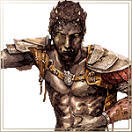
THE SCREENSHOT TOPIC RETURNS
Posts
author=Link_2112Just messing around with an idea. Thoughts? How about the shadows? I want to do something simple so it has some depth, but doesn't take long to fiddle with details.
I think that the outlines just need to be darker. It all looks to samey right now and sort of blurs together.

Hopelessly trying to get things done before I leave for my first work shift this week. I'm very, very pleased with the way this tileset came out, but I might change the cliff colour later. Not so sure about it.
The face graphic isn't finished, obviously. Still needs minor cleanup and shading.
EDIT: Wow, sorry about the pagesnipe.
Well, now that I'm looking at them in the day and not at 1 in the morning, they're fine. I don't exactly have the time to mess around with that stuff anyways.
Beginnings of a GUI
Buttons, tooltips, and other things added.
Menus can scroll now.
Please reply via the development portal, as linked, rather than in the screenshot thread.
Buttons, tooltips, and other things added.
Menus can scroll now.
Please reply via the development portal, as linked, rather than in the screenshot thread.

A potential title screen for the mini-project I've been working on. It's just a rough draft, so the lettering isn't as clean as at could be, but I wanna know what you all think of the design! Is it cool? Is mock-Final-Fantasy too overdone..?
author=Craze
why is it black text on a black background is my question
Ah, that's copped straight from one of the FF7 intro screens, where they use black text with white highlights on black. The more recent Final Fantasy titles have all been black text on white.
Just for kicks:

This is a little more like the color schemes they use for the more modern splashes. Actually, I think I do like the white background more... I'm still not sure about going the mock-FF route but it's tempting :)
EDIT: The more I think about it, the more the FF reference is kind of pointless - the game isn't an RPG and isn't about RPGs. I just like the simplicity of their logo style and with my minimal time available to try and hack together a title screen... but that in that case, if it's not parody or homage, it just means I'm being lazy, huh. Gah... but it looks cool!
@ Pizza
I really like that style, brings Earth Bound to mind.
Is the light in the game always coming straight from above?
@ SlashPhoenix
I think the white background is better as well, black was good but seemed a bit dull.
--
Not really a screenshot, but i'd like to know what you folks think of this grass i'm working on.

A second go at grass as the first is too busy.

I really like that style, brings Earth Bound to mind.
Is the light in the game always coming straight from above?
@ SlashPhoenix
I think the white background is better as well, black was good but seemed a bit dull.
--
Not really a screenshot, but i'd like to know what you folks think of this grass i'm working on.

A second go at grass as the first is too busy.

Corfaisus
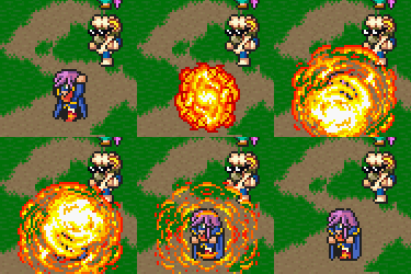

"It's frustrating because - as much as Corf is otherwise an irredeemable person - his 2k/3 mapping is on point." ~ psy_wombats
7874
author=Link_2112
How's this
The one thing that strikes me as odd is how his knees look more like knee pads, like they're a little too defined and appear to physically stick out too far, though I understand there's very little room available to correct this.
CAHRULL's version looks much better, I think. You really want to reduce the size of his kneecaps a bit more.

I hope to have enough time to draw similar images for the other 4 stages. This splash screen serves as a transition between the map and the actual stages.
The Sulky Suburbs
Enemies: Freckles (Pumpkin monster), Lumberjack (Mike Myers x Jason), TV Demon (see The Ring)

I hope to have enough time to draw similar images for the other 4 stages. This splash screen serves as a transition between the map and the actual stages.
The Sulky Suburbs
Enemies: Freckles (Pumpkin monster), Lumberjack (Mike Myers x Jason), TV Demon (see The Ring)
Ok, well, I don't see how that one is better and there's no real advice on what's wrong with mine. That light source looks like a 10 watt light bulb. Usually characters are outside and it's very bright. I want to keep it simple and not have every sprite covered in shadow. Sounds unrealistic and time consuming.
I'll try and adjust the knee caps but most of the time they will be covered anyways.
I'll try and adjust the knee caps but most of the time they will be covered anyways.
author=MusicalSwordsman
A second go at grass as the first is too busy.
A little graphical tip: the first grass is a lot better and more grassy looking, it is too busy, but it should work well once you lower the contrast.
You are correct, someone clued me in on this a while ago too ^^
Here is an updated image with a tree I was working on, tree already complete but not up yet.
http://imageshack.com/a/img266/8531/zeh0.png
Here is an updated image with a tree I was working on, tree already complete but not up yet.
http://imageshack.com/a/img266/8531/zeh0.png
Before I post my own stuff, quick comments on this page's stuff.
@Pizza I love everything about that screenshot, but it will definitely look better once the faceset has a little shading to match the rest.
@MusicalSwordsman It's really hard to tell whether the grass looks good or not without seeing against other objects and buildings on the screen. But I love the charsets. Seeing it with the tree, I like high definition better.
@Link_2112 Awesome characters. Is that for a profile menu or something? I like your shading version, and I don't think it needs to be more detailed than that.
Well, so here's my stuff:

For the record, when my brother saw me drawing this, he said it was horrible and looked like South Park. Behold the power of adding shadows and overlays!

--edit-- I just realized the screen is not symmetrical: the space on the right is bigger than the space on the left. I'll have to live with that.
The real challenge will be drawing sprites that look like they're laying on the bed.
@Pizza I love everything about that screenshot, but it will definitely look better once the faceset has a little shading to match the rest.
@MusicalSwordsman It's really hard to tell whether the grass looks good or not without seeing against other objects and buildings on the screen. But I love the charsets. Seeing it with the tree, I like high definition better.
@Link_2112 Awesome characters. Is that for a profile menu or something? I like your shading version, and I don't think it needs to be more detailed than that.
Well, so here's my stuff:

For the record, when my brother saw me drawing this, he said it was horrible and looked like South Park. Behold the power of adding shadows and overlays!

--edit-- I just realized the screen is not symmetrical: the space on the right is bigger than the space on the left. I'll have to live with that.
The real challenge will be drawing sprites that look like they're laying on the bed.
@Link_2112 Awesome characters. Is that for a profile menu or something? I like your shading version, and I don't think it needs to be more detailed than that.
Thanks. Yeah, it would be for the equip menu. The sprites won't change based on gear but each piece will have a unique graphic in the menu.
The real challenge will be drawing sprites that look like they're laying on the bed.
Then make them look like they are in the bed. Draw their head and maybe upper body and the rest is a white lump under the covers. Could you lengthen the bed easily? That might help.
author=Link_2112
Yeah, it would be for the equip menu. The sprites won't change based on gear but each piece will have a unique graphic in the menu.
I don't understand the difference.
Here's my take in laying sprites.

I think it looks ok. Not perfect, but considering it's a scene that will last like... a second... should be enough.


