


THE SCREENSHOT TOPIC RETURNS
Posts

Thanks for the feedback.
The plan is to do a short rmk2k3 game with some roguelike elements. You wake up in a dungeon filled with dangers and you have to find a way to escape. The dungeon will be generated from premade rooms, there will be permadeath and you get some stats how well you did in the end.
I love that face.
Love the atmosphere on the forest image. The sudden change of stones tiles in the first looks a bit strange. Would probably look better if you could get another version or two of the same stone tiles and use that to give some variation to ground instead.
author=0range00
momeka, that looks super interesting! That guy banging his head on the wall especially. What kind of game is this?
The plan is to do a short rmk2k3 game with some roguelike elements. You wake up in a dungeon filled with dangers and you have to find a way to escape. The dungeon will be generated from premade rooms, there will be permadeath and you get some stats how well you did in the end.
author=valkill101
Hello everyone, here a screenshot from my first completed game. It's called The Last Hour of Fairfield.
It was also my first time using the Zombie pack from the official store.

I love that face.
author=yuna21
Some Tristian screenies ( this game is seriously competing with Enelysion to see who makes it to the Full, Completed Gam mark first >< ).


Love the atmosphere on the forest image. The sudden change of stones tiles in the first looks a bit strange. Would probably look better if you could get another version or two of the same stone tiles and use that to give some variation to ground instead.


^Wow. Just wow. That's all I can say. I'm running out of superlatives to describe your amazing pixel work, Itaju.
Update 4. I've made significant progress again I think. I've created a new grass and dirt set as well as making some bushes, added shading, and created some cliffs, walls and stairs.


It's OK though I'd suggest adding flowers in a few places and randomizing the bushes a bit more. Also the tree shadows don't quite echo the shape of the tree, though I'll admit I'm not quite certain what angle the light is at.
author=BurningTyger
It's OK though I'd suggest adding flowers in a few places and randomizing the bushes a bit more. Also the tree shadows don't quite echo the shape of the tree, though I'll admit I'm not quite certain what angle the light is at.
Flowers and a walking path are next on my todo list. The shading is preliminary, I am going to make some better shading soon as well as shade that door.
I think these snapshots are significantly better than the ones I first took. I seem to be getting better which is a good sign lol XD
Cool. I hava f ew flower-like patters you might be ale to use if you'd like, since everything seems rather abstract.
I think "I've finally found inspiration for Tortura Island, the map I'm currently working on for Wyrm Warriors, in Siar Island off the coast of Papua New Guinea. I hope to be showing some screenshots soon
I think "I've finally found inspiration for Tortura Island, the map I'm currently working on for Wyrm Warriors, in Siar Island off the coast of Papua New Guinea. I hope to be showing some screenshots soon
I might be interested in seeing them, though I would have to do my own take on it as I want my first game to be all original art from myself. A lofty goal I know.
Also that sounds like a really cool idea for a game.
Also that sounds like a really cool idea for a game.

Slow progress on side project space game.
Some people say the "landing" sequences are too long, but I kind of want them to breathe a little, to add some scope...thoughts?

There is no animation for taking off from a planet, or leaving an atmosphere, just the landings.
Just noticed I used the wrong version of "Hangar".
Some people say the "landing" sequences are too long, but I kind of want them to breathe a little, to add some scope...thoughts?
There is no animation for taking off from a planet, or leaving an atmosphere, just the landings.
Just noticed I used the wrong version of "Hangar".

author=Itaju
This is incredible. ;D Nearly professional-quality, honestly. Everything from the shading on the objects, their structure, the color choices and artistic tone of the map is top-notch. You've come so far! The little details like the vines on the house, the plants, etc.. are really what are going to make your project memorable!
Ok, so I've made a walking path and alot more vegetation. Also tree iteration number 6 or 7 (I've lost count at this point lol).

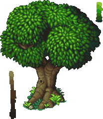
chaos vine- may want to go back to the drawing board for the trees, I think you can do better. The base specifically, is too flat looking. have that middle stump of trunk come towards the camera more.
The leaves look like a mspaint spraycan gone wrong. The brights are too neon bright, and the light and leaves don't appear very natural. Zoom in on some other games tree leaves and study up.
Nice start though.
The leaves look like a mspaint spraycan gone wrong. The brights are too neon bright, and the light and leaves don't appear very natural. Zoom in on some other games tree leaves and study up.
Nice start though.

author=chaosvine
Ok, so I've made a walking path and alot more vegetation. Also tree iteration number 6 or 7 (I've lost count at this point lol).
Yeah, these are almost a decline from the earlier version. I would go back to the drawing board with them and look through that tutorial again. Pixel art takes a lot of time and patience. If you just toss something together with the spray-can tool you're not really going to get the level of detail you're hoping for lol.
Also, look into finding ways to script out the shadow autotiling, because it looks a little garish!
Here's a few more examples:

The effect wasn't done using a spray can brush but it is similiar now that you mention it. I was experimenting with opacity and premade brushes. It does look a bit garish. I think my biggest problem is making the art style consistent across the board.

author=chaosvine
I think my biggest problem is making the art style consistent across the board.
Don't worry about this part. As you practice with different methods you'll settle into a style that you enjoy working with. It'll come in due time.
Well, these aren't exactly screenshots but...
Here are some title screens I made. I'll be turning these into games one at a time.
Each of these already have a story/plot attached to each, so it won't be hard for me to weave the game mechanics afterwards. Though I'd need some feedback first, so here goes...
'Anathema'

'Atonement'

'Nox Aeternum'

'All Fall Down'

Thanks :)
Here are some title screens I made. I'll be turning these into games one at a time.
Each of these already have a story/plot attached to each, so it won't be hard for me to weave the game mechanics afterwards. Though I'd need some feedback first, so here goes...
'Anathema'
'Atonement'
'Nox Aeternum'
'All Fall Down'
Thanks :)
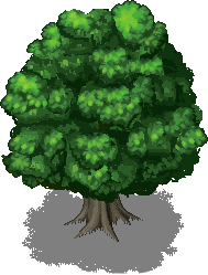
So I've remade the grass, path, and dirt set again (made them significantly lighter), and the tree yet again. This time I more closely followed some tutorials online. Can't tell if the end effect is good or not, but it looks better than the ones I had before.


Oh man, I read "All Fall Down" as "Ara Fell Down" and was just about to get excited about a possible Ara Fell sequel. Now I'm kinda disappoint. :<
I think you're gonna have to give some dark outlines to your sprites so that they'll pop out. He kinda blends in at the moment. Also, I really recommend taking your grass tile and messing with the top/bottom edge of the tile to make it less like a line. Same with the sand tile a little too. The best idea is to form a shape that overlaps the edge and 'spills' over to the other side so that when you lay it next to itself it doesn't look like a tile with lines running through (look at the grass and you can see the edge).
That said, I really like the bushes and flowers. I think the trees could do with more hard lines around them like the bushes. Definite shapes vs the odd outline that is currently what you have.
Sorry, Liberty :(
@chaosvine I think you need to add an outline around the sprite. He fails to stand out from your background. The grass tiles also show the 'grid-effect', maybe you could rework their edges and make them seem more natural? Also, your tree's bottom part is too flat. I mean, it's a straight line.
I guess that's all I could complain about. Nice job with the bushes and flowers, And good luck with your project!

