


THE SCREENSHOT TOPIC RETURNS
Posts
Working on those suggestions now. Yeah I was aware of the grass tile having the very obvious tiling effect before I posted. I'm attempting to fix them.
I'm also going to outline the tree and sprite like you said, I think you guys are right about the borders blending in. The tree is actually outlined with a dark green but I don't think it's dark enough or something. I'll play around with it.
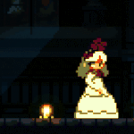
Btw, karins I like your splash screens. Good luck with your project as well and, may I ask will the splash screens be all one series or different games entirely?
I'm also going to outline the tree and sprite like you said, I think you guys are right about the borders blending in. The tree is actually outlined with a dark green but I don't think it's dark enough or something. I'll play around with it.
Btw, karins I like your splash screens. Good luck with your project as well and, may I ask will the splash screens be all one series or different games entirely?
So I did some preliminary outlining on the trees and played around with the lightness/saturation a bit this is what I came up with. Doing a comparison here, Tree on the right is the new one on the left is the old one.

Think I managed to fix the grass tile as well (looks a little less tiled now i think)

Think I managed to fix the grass tile as well (looks a little less tiled now i think)

You're getting there. Slowly, but surely, you're getting there.


What I've been working on. Autotiles are a pain. >< And all that using a mouse. With my right hand. And I'm a leftie, so it makes things a wee bit difficult.
What I've been working on. Autotiles are a pain. >< And all that using a mouse. With my right hand. And I'm a leftie, so it makes things a wee bit difficult.
Thanks. :)
I have to say I really like your art style yuna. May I ask what the name of this game will be? I will definitely try it out when you release it. :)
I have to say I really like your art style yuna. May I ask what the name of this game will be? I will definitely try it out when you release it. :)

Update and I need some advice. I have changed the bricks significantly giving them a base and border so that I can bring my building out multiple tiles for definition. I created some window tiles, and redid the shingles (they look much better now.
Ok I need some info on how to get the roofs of buildings to look better and more detailed. What kind of tiles would I need to make here?

@yuna21
I think your contrasts are too harsh. I would lower the contrast on everything, but especially the lighter colors (most jarring example would be the highlights on the trees leaves).
Also, why the different in color choice for the stone walls and the stone "decorations", and why the difference in contrast on them?
Yuna, the trees I especially like, but it's awful that you have to use a mouse with your non-dominant hand. Don't they make left-handed mice?
I'm just prototyping screenshots for now to see how the resources go together. I still have 2 other projects I need to finish. XD
Ah, the stone walls were made much earlier than the actual stones ( which I did yesterday ), but I'll start colour swapping and toning down contrasts.
As for the mouse-issue, I've been using it for the better part of seven years now, so I'm used to it. =) But it does make pixel work very tedious.
Ah, the stone walls were made much earlier than the actual stones ( which I did yesterday ), but I'll start colour swapping and toning down contrasts.
As for the mouse-issue, I've been using it for the better part of seven years now, so I'm used to it. =) But it does make pixel work very tedious.

author=SnowOwl
@yuna21
I think your contrasts are too harsh. I would lower the contrast on everything, but especially the lighter colors (most jarring example would be the highlights on the trees leaves).
Also, why the different in color choice for the stone walls and the stone "decorations", and why the difference in contrast on them?
I disagree, I think the color choices give it that extra pop. The first screenshot seems especially gorgeous. ;D I don't think there's anything that stands out too badly other than the rock.
And maybe vary the cliff tiles a tad, but that's all I can think of! I'm loving it.

Sorta changed the colour of the cliffs. I dunno if it blends too well now. Or should I keep the original colour?


So I've reworked the grass and dirt again, the cliffs are brand new, added new tall grass. Remade the building now more proportional to the character.
Just a few of the things I changed.
LockeZ

I'd really like to get rid of LockeZ. His play style is way too unpredictable. He's always like this too. If he ran a country, he'd just kill and imprison people at random until crime stopped.
5958
This is definitely coming along.
If you plan on having natural outdoor areas, I would definitely make the edges of those cliffs more curved instead of just perfect lines that end in perfect 90 degree corners. And also make some diagonal cliffs, ideally.
I really like your trees now, by the way.
If you plan on having natural outdoor areas, I would definitely make the edges of those cliffs more curved instead of just perfect lines that end in perfect 90 degree corners. And also make some diagonal cliffs, ideally.
I really like your trees now, by the way.
Thanks. :)
I feel like the proportion of the trees is a little small now though that I've made the building and cliffs bigger. May need to make them a bit taller. What do you guys think?
For the cliffs I think think they are my best work yet, but I realize the edges need refining. Question is how do I refine them. I'm not really sure. What do you mean by diagonal cliffs?

Here's some classic examples of diagonal cliffs from the 2k/3 RTP:


I had these floating around today for another reason but they'll work to demonstrate the general idea.
I had these floating around today for another reason but they'll work to demonstrate the general idea.

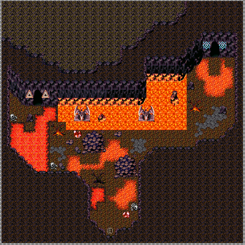
Current map of first room of Sealed Cave. I think I know what the gimmick of the dungeon may be...or one of them anyways. Damage floors here, much like earlier in the game. Thinking if damage floors should have random encounters or not, since random encounters is set to 0 for those types of floors...
Originally, Sealed Cave was going to have the "No Physicals" gimmick, as a counterpart to Hollowed Caverns "No Magic" gimmick, but I don't know if I'll do that or not, especially given the enemies that I want to have in here. Anyone have any good ideas for the dungeon gimmick? I was thinking of having to dispel barriers on doors in order to get through them but...not sure! Damage floors are going to be a big part I know that much (think of FFIV's Sylph Cave or Passage to the Eidolons. Similar concept, but they had random encounters, these damage floors don't...)
Also, if anyone is curious, these are the enemies I have in mind for the dungeon. I need to chop out some (most are going to appear solo in fights), but they're ALL big references to the FF series...
Sealed Cave:
Alexander
Atomos
Chocobo
Diablos
Fenrir
Asura
Ifrit
Odin
Ramuh
Shiva
Titan
Sylph
Shoat
Kirin
Midgardsomr
Phoenix
PuPu
Siren
Valefor
If you're wondering about Leviathan and Bahamut, Bahamut was already a pre-determined optional boss for Dragon Palace. Leviathan for now is going to be an optional boss at Misty Lake later.

Xenomic- Back wall is way too straight to be believably organic. (3 tile rule would be a good one to invoke here)
That lava pool is so painfully square, even if its supposed to be, it looks bad. I would highly recommend reshaping/editing/changing that entire lava pool with the gargoyles in it.
The area around the darker lava auto tile is the wrong color/aka doesnt match your current floor tile. (that can be fixed in a quick tileset edit)
also its in my personal taste to have a black/dark area for the "negative outer space" of the map, ESPECIALLY in interior/cave settings. And unless you have access to walk up there, theres really no need for it.
Right now, this looks like it could be outside, like at the base of a volcano.

really shitty edit to illustrate my points, sloppily with confusing lines all over it
That lava pool is so painfully square, even if its supposed to be, it looks bad. I would highly recommend reshaping/editing/changing that entire lava pool with the gargoyles in it.
The area around the darker lava auto tile is the wrong color/aka doesnt match your current floor tile. (that can be fixed in a quick tileset edit)
also its in my personal taste to have a black/dark area for the "negative outer space" of the map, ESPECIALLY in interior/cave settings. And unless you have access to walk up there, theres really no need for it.
Right now, this looks like it could be outside, like at the base of a volcano.
really shitty edit to illustrate my points, sloppily with confusing lines all over it
LockeZ
I'd really like to get rid of LockeZ. His play style is way too unpredictable. He's always like this too. If he ran a country, he'd just kill and imprison people at random until crime stopped.
5958
author=Xenomic
Anyone have any good ideas for the dungeon gimmick?
Optional battles against summoners, which cause the random battles in that area of a dungeon to cease after you kill the summoner?

