


THE SCREENSHOT TOPIC RETURNS
Posts

Wow, chaosvine. You're really dedicated, huh? ^^

Anyway, one of mine. It's for an Artsy Mapping contest over at RMW, where the map has to have a least one custom resource. But I don't stand a chance of winning VXAce, not after seeing Celianna's entry. 0_o
Anyway, one of mine. It's for an Artsy Mapping contest over at RMW, where the map has to have a least one custom resource. But I don't stand a chance of winning VXAce, not after seeing Celianna's entry. 0_o

Plz marry my game
Not far in development, had the concept for a while and some sketches but just started the pixel art last week.
So, the left hall was the alchemists, the right hall is the bankers: still tweaking some of their animations.
Not far in development, had the concept for a while and some sketches but just started the pixel art last week.
So, the left hall was the alchemists, the right hall is the bankers: still tweaking some of their animations.

@Dookie: I can't help but feel that it would look just a tad nicer if, instead of dropping shadows, the lightbulbs dropped circles of light on the floor. It would probably be harder to set that up though, and I don't know if you had a specific reason to NOT do that.
Gotta say that I love how much animation you put into each area. I would never have the patience for that.
EDIT:

Something I've been working on. Kind of stumped as to what else I could add to spice up the tileset. This is supposed to be a podunk, dirty little outpost style of town. Perhaps some rust stains or something on the metal, but outside of that I have no idea.
Gotta say that I love how much animation you put into each area. I would never have the patience for that.
EDIT:
Something I've been working on. Kind of stumped as to what else I could add to spice up the tileset. This is supposed to be a podunk, dirty little outpost style of town. Perhaps some rust stains or something on the metal, but outside of that I have no idea.
Corfaisus

"It's frustrating because - as much as Corf is otherwise an irredeemable person - his 2k/3 mapping is on point." ~ psy_wombats
7874
author=Dookie
What's the music you're using for this place? It seems so familiar, like how this struck me as something I should know but don't.
author=Pizza
@Dookie: I can't help but feel that it would look just a tad nicer if, instead of dropping shadows, the lightbulbs dropped circles of light on the floor. It would probably be harder to set that up though, and I don't know if you had a specific reason to NOT do that.
But, if you look closely, he did do that.


@Itaju: I doubt it would bother anyone. XD

I doubt my maps would look as good as Blindmind's, but he's still a big source of inspiration to me. ^^
I doubt my maps would look as good as Blindmind's, but he's still a big source of inspiration to me. ^^
@Itaju: I was so busy gawking at the house that it took me a while to actually find the cursor. Your work is an inspiration, as always.

author=Itaju
*snip*
Dang, forgot to remove the cursor. :D
Wow. That's a SUPER nice house. :o
author=yuna21
*snip*
I doubt my maps would look as good as Blindmind's, but he's still a big source of inspiration to me. ^^
Oh wooooow....:o
How did you get that lovely sun ray effect to work?!

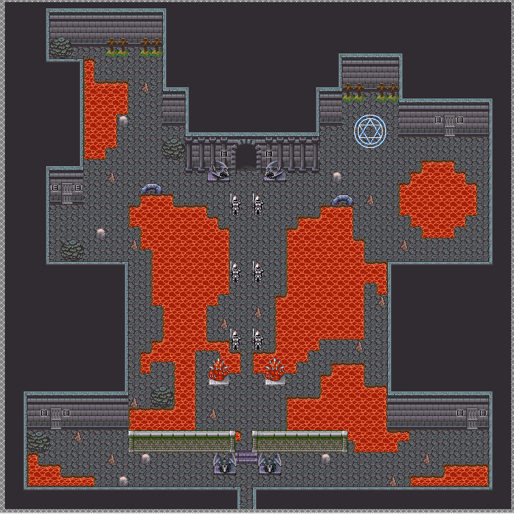
Nothing too spectacular. The main hub area of the current dungeon, which is also the main hub area for another character when the player plays that part of the story for a little bit (there's still random encounters even in that part of the story, which is explained by the villain (whom is the player's ally at that time of the story obviously) going "Oh, and some of the guys around here are hostile, so be careful" or something like that. This is after that switch puzzle of which I haven't finished yet. Decided to just skip it for now until I get help on it or figure it out myself. There is a teleporter in this room which the player can never use at any time, and the save point is in one of the rooms with a free bed. The other rooms? Not sure yet...in fact, I don't even think there will be a bed in the other room (don't have any beds in this tileset, and don't feel like changing the tileset for beds and stuff...). @_@;
Oh, and when you have to come here with the good guys, there's a boss here of course.

LockeZ

I'd really like to get rid of LockeZ. His play style is way too unpredictable. He's always like this too. If he ran a country, he'd just kill and imprison people at random until crime stopped.
5958
...be careful, he might not realize that's sarcasm.
I'm not being sarcastic, I really think his maps are too small. There's far too much personality within those walls to be contained by such modest dimensions.

Cashmere, I will thump you one if you mess with this kid's design aesthetic. He's been getting progressively better with each map and I'm very proud to see how far he's come. Granted, the maps are still quite large, but they're looking a lot better and more design-focussed than before. They have gimmicks! And are a lot more interesting to look at in general.
@Xenomic: If this is supposed to be a manor or castle, consider making it more symmetrical. If something is built by human hands it's more often than not, designed to a certain aesthetic and loses a lot of the size oddities that come with natural formations. In human creating everything has reason - there are reasons to pillars, reasons to how rooms are set up. In this case I think you should shrink the room proportions a tad, make the different sides symmetrical and add some dirt under those graves (digging up flooring just to bury people, then replacing the flooring is rather... tacky at best XD )

Example. As you can see, there's still a bunch of room to play with, but the layout is more planned and works for a place that was constructed, with logical though put into the design of the base building.
@Xenomic: If this is supposed to be a manor or castle, consider making it more symmetrical. If something is built by human hands it's more often than not, designed to a certain aesthetic and loses a lot of the size oddities that come with natural formations. In human creating everything has reason - there are reasons to pillars, reasons to how rooms are set up. In this case I think you should shrink the room proportions a tad, make the different sides symmetrical and add some dirt under those graves (digging up flooring just to bury people, then replacing the flooring is rather... tacky at best XD )
Example. As you can see, there's still a bunch of room to play with, but the layout is more planned and works for a place that was constructed, with logical though put into the design of the base building.
Hm...true. I wasn't sure on how to handle this.
Spoilered due to huuuuge wall of text about the dungeon in general:
Dungeon's name is Silent Shrine/Temple (because translators seem to go between Shrine or Temple for whatever reason. This being the main stronghold of one of the villains, which is situated in the middle of a miasma pool, so to get to it, the player has to go through an underground cave to get there. There's...not much else information on the place outside of the name and it being Konngara's stronghold (final level in Hell Route in Touhou 1) in canon so...rest is just up in the air heh. I went with this tileset since I felt it felt a bit more...hellish, so to speak, but without going TOO far into that aspect. But yeah, it could probably be made smaller a bit. Boss fight in this room is essentially in the middle there, up past the stairs/wall but before the red statues. In the villain's part of the story (where you control a different party but can't leave the dungeon), this area still has enemy encounters and such, but NPCs will be up and about here. Blue thing was meant to be the teleporter out to wherever it goes. May have to move those walls a bit in the tileset so that they're not the way they are in it (one side is a bit lopsided compared to the other), though I'm wondering if I should even have those walls...hmmm...
...But yeah, probably need some dirt under them graves heh. I need to see if I don't have those ledge types that are there in the screenshot (on the sides of the lava pools). The rocks I figured could go wherever because rocks and stalagmites. Though of course, lava in front of the doors won't help either so may move those heh.
So yeah, more than likely not built by humans, but by demons instead. Probably same aspect regardless, but yeah...probably wouldn't hurt to make it a bit more symmetrical as well as slightly smaller.
I apologize for the huuuuge wall of text, but thought I'd throw my thoughts on what I was doing with this out there and information about it in general.
LockeZ
I'd really like to get rid of LockeZ. His play style is way too unpredictable. He's always like this too. If he ran a country, he'd just kill and imprison people at random until crime stopped.
5958
The lava probably shouldn't be symmetrical, but the symmetrical walls do look a lot nicer, especially around the north exit.
I'm not sure the side walls actually matter that much when you're walking around, since you can't see them at the same time, and they're not overly illogical. It seems like something that only looks really bad in the big overview screenshot. In-game it would bother me as a designer, because my brain is tuned to actively look for that kind of thing, but it probably wouldn't bother a player as much.
I'm not sure the side walls actually matter that much when you're walking around, since you can't see them at the same time, and they're not overly illogical. It seems like something that only looks really bad in the big overview screenshot. In-game it would bother me as a designer, because my brain is tuned to actively look for that kind of thing, but it probably wouldn't bother a player as much.
The lava symmetry came from me just copy/paste/mirroring one side to match the other. It's just the basic building layout that I meant should by symmetrical. ;p

@Dookie: I love that art direction!
Holy hell there's a lot of talented people here. Gedday folks, figured I'd drop by the forums and show a little of what I've been up to.
The music you hear is an original piece by the game's lead Composer, MoneyMenace. (It's not all done yet, placeholder music is used in the two videos below.)
Here's the games intro, also.
So what's all this about?
Well lately I've been working on Menagerie: Remastered - Game of the Year Edition. Should be released sometime this year. Not making a specific date, but it'll be ready when it's reached the level of quality I deem 'ready'.
There's so much new stuff along with re-balancing and all that it's virtually a new game.

