THE SCREENSHOT TOPIC RETURNS
Posts
XP trees have a fucking digraceful purple shadow that is not used in VX+, just replace the magenta color channel on the shadow with black and possibly the red, and you'll have something that looks more right.
I like how cluttered it is, the obvious flaw is the difference in the shading and drop shadow of the XP tree.
Also the dead tree right before the water looks weird, consider revision or removal.
On my end, it's been a dry spell, in a bit of a mental block which I'm sure I'll get over. But here's an older video i probably haven't shown yet.
I'll probably trim the opacity of the clouds down something shocking, it's very hard to see and this fight is disorienting enough as it is.
Voices, music and some SE are placeholder, and may already have a piece in game to replace them already. This was uploaded in july sometime.
So, I'm very much a scripter / coder. I'm definitely not a great good artist or a mapper, but I'm working on a game and seeing as I have yet to find anyone to help me with the mapping and art I've been working on it on my own.
So I'm going to post a few screens from the game here and I would appreciate some feedback, and tips on how to improve them:


Thank you to whomever does respond in advance.
Edit: Feedback apart from the fact that apparently I cut the screenshots horribly and left some window edges on some of them, that much I see myself now. Doh.
Edit Two: Added another screenshot.
So I'm going to post a few screens from the game here and I would appreciate some feedback, and tips on how to improve them:


Thank you to whomever does respond in advance.
Edit: Feedback apart from the fact that apparently I cut the screenshots horribly and left some window edges on some of them, that much I see myself now. Doh.
Edit Two: Added another screenshot.
author=luiishu535
I personally think these trees fit in a lot more than the old ones.
I've heard of this 3 tile rule, but I can't quite remember ATM, so I guess I'll look that up a bit later.
I believe that the flower auto-tiles are making the maps pretty detail-heavy on their on and not just the objects placed above.
I must truly have a different visual "palette" than everyone else here, but your screenshot honestly draws my attention far more than most of super-generic VXAce RTP maps. There's LITERALLY such an overload of them on this site that I think the visual busyness is helpful in this instance.
However, I do agree with Liberty about the RMXP trees. You seem to have edited them to a point of relative consistency with the Ace color scheme, though.
LockeZ

I'd really like to get rid of LockeZ. His play style is way too unpredictable. He's always like this too. If he ran a country, he'd just kill and imprison people at random until crime stopped.
5958
Yeah, that looks better. I notice you toned down the doodads a little, and I don't think yout lost anything by doing so.
I mean, it looked good before. But now it looks really good.
I mean, it looked good before. But now it looks really good.
Thanks for the critique and feedback. I'll try to edit tree shadows myself in GIMP, as practice.
I'm also thinking about BIG trees(XP ones) vs SMALL(VX ones). I think some people might think it looks awkward and some think the XP trees simply looks like bigger trees. I know that mapping would sure be a lot easier if I only used big trees.
I'm also thinking about BIG trees(XP ones) vs SMALL(VX ones). I think some people might think it looks awkward and some think the XP trees simply looks like bigger trees. I know that mapping would sure be a lot easier if I only used big trees.
Honestly, there are short and tall trees in nature. That's not including saplings, either. Hell, in my front yard are two tall gumtrees and a smaller shrubby tree that's half their height, so I don't really see it as a huge deal, myself, as long as the graphical consistency is there in the colours.
Man, it must have been forever since I last visited this thread...
So, here's a little something I'm working on - first time ever trying to create a side-scrolling game. Still a huge WIP, but everything is self-made, so that's something, I guess.

So, here's a little something I'm working on - first time ever trying to create a side-scrolling game. Still a huge WIP, but everything is self-made, so that's something, I guess.

LockeZ

I'd really like to get rid of LockeZ. His play style is way too unpredictable. He's always like this too. If he ran a country, he'd just kill and imprison people at random until crime stopped.
5958
I like the 70% of it that doesn't have outlines better than the 30% of it that does.
LockeZ

I'd really like to get rid of LockeZ. His play style is way too unpredictable. He's always like this too. If he ran a country, he'd just kill and imprison people at random until crime stopped.
5958
Graphics really need to have the same style of outlines on pretty much everything, otherwise it looks really mismatched.
Though I say that, doing outlines only on character/enemy sprites or only on interactive objects/icons is also a popular method. And is done by so many professional games as to be considered normal by now. Makes the outlined things stand out as game-relevant while everything else fades into the background.
Either way, I just noticed that the shadows of the trees are going partially over the top of, uh, "horizon" I guess.
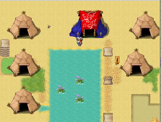
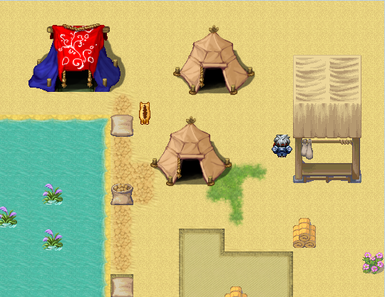
BurningTyger, your camp looks basically fine I guess, there's just not much there. I think if you surrounded those tents with rugs and doodads and stuff, and maybe added a palm tree or two, it would look fine. The water is oddly rectangular but, yeah, I get it, VX Ace, whatcha gonna do. Better than zigzagged edges.
Corfaisus

"It's frustrating because - as much as Corf is otherwise an irredeemable person - his 2k/3 mapping is on point." ~ psy_wombats
7874
Yay, chocobo! Just kidding. That thing's piercing my soul. Is it going to eat me?
@LockeZ and BurningTyger: I don't want to get rid of every single outline, since the objects would fade into the background too much, but I could easily use the 'just objects that you can interact with and characters have outlines' approach. I'll keep the shadows of the trees in mind, too! Thank you two for the idea~
The problem is not so much that there are outlines, the problem is that the outlines are perfectly horizontal, I think. It doesn't look natural.
@SnowOwl: That could be it! I think I will erase the outlines, just to see what it looks like, and then make a decision. =)
LockeZ

I'd really like to get rid of LockeZ. His play style is way too unpredictable. He's always like this too. If he ran a country, he'd just kill and imprison people at random until crime stopped.
5958
Also consider making the outlines be a darker version of whatever color the object is, instead of black. It may not look better but it's worth trying. This is how RPG Maker sprites actually do their outlines.
Sorry guys I've done basically nothing the last 5 days. :(
Not done much because I'm in a shitty not-productive mood, but here's a little of what I did do.

Not done much because I'm in a shitty not-productive mood, but here's a little of what I did do.

@Burning Tyger: Carpets are rectangular or square. Make that waterline a bit more natural (that is, not a square - randomise it a bit more). The stall really doesn't fit with the rest of the graphics. You can easily create a stall using the default tiles (shown below). The grass patch is very out of place - using the moss is a good idea, or the sandy grass tile that is provided with the RTP is a good idea too.
Not sure why you're using the bundles from XP as they don't fit the rest of the graphics at all, and doubly so when there are bundles included in the default RTP. A recolour isn't hard - if you need one just ask, I'll be happy to do it for the sake of consistency.


As you can see, you too can use RTP to create stalls!
Not sure why you're using the bundles from XP as they don't fit the rest of the graphics at all, and doubly so when there are bundles included in the default RTP. A recolour isn't hard - if you need one just ask, I'll be happy to do it for the sake of consistency.


As you can see, you too can use RTP to create stalls!
Very cute, Libby-swan.
Also, have you considered a thunderstorm or rain for effect/mood?
Image 2: Trees too uniform. Could use some scattering, and use different tree types as well. If you put two trees overlapping, you can use an Above Hero event to overlay the tree sprite, to give it a different look, too. As is, the trees here are a little too perfect. Imperfection is where it's at, unless this is a orchery.
Image 3: Same problem with the trees. Not bad map so far, though.
Image 4: If you reduce the right side of the shop one square, you'll achieve symmetry... Otherwise, good map.
author=FleetingInfinityImage 1: I'm not sure if you have the two different death poses segregated like that to represent two different armies, or not. If not, try to mix up the posed soldiers so it looks a little more diverse. Wouldn't hurt to add something else, like logs or something. I'm complaining just 'cause.
So, I'm very much a scripter / coder. I'm definitely not agreatgoodartist or a mapper, but I'm working on a game and seeing as I have yet to find anyone to help me with the mapping and art I've been working on it on my own.
So I'm going to post a few screens from the game here and I would appreciate some feedback, and tips on how to improve them:
Also, have you considered a thunderstorm or rain for effect/mood?
Image 2: Trees too uniform. Could use some scattering, and use different tree types as well. If you put two trees overlapping, you can use an Above Hero event to overlay the tree sprite, to give it a different look, too. As is, the trees here are a little too perfect. Imperfection is where it's at, unless this is a orchery.
Image 3: Same problem with the trees. Not bad map so far, though.
Image 4: If you reduce the right side of the shop one square, you'll achieve symmetry... Otherwise, good map.


