THE SCREENSHOT TOPIC RETURNS
Posts
Nice job rebezion and JosephSeraph! :)

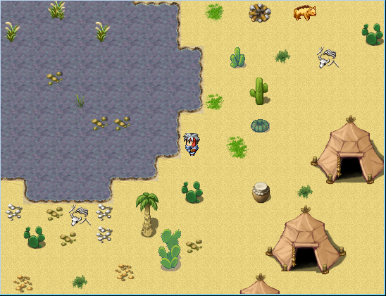
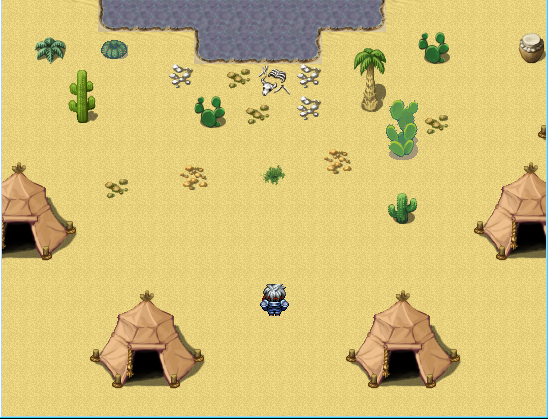
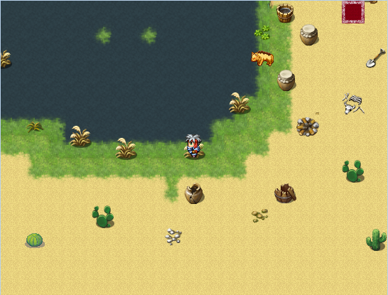
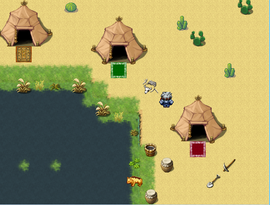
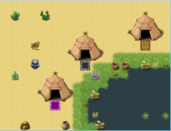
Not actually game footage. It's a tile set test. A tile set I might share some day, so stay tuned if you want to use it at one point.

Not actually game footage. It's a tile set test. A tile set I might share some day, so stay tuned if you want to use it at one point.
LockeZ

I'd really like to get rid of LockeZ. His play style is way too unpredictable. He's always like this too. If he ran a country, he'd just kill and imprison people at random until crime stopped.
5958
You packed a lot into that screenshot, huh? The second floors of the buildings help. Having different heights is a great way to help make a town look like it's bustling. Not sure why, but it always seems to work well.
Itaju, I have a problem with the screenshots you post. My problem is that they're so consistently utterly amazing that complimenting them feels redundant. Like, it should just be taken for granted at this point.
@JosephSeraph: I would like to subscribe to your newsletter.
Itaju, I have a problem with the screenshots you post. My problem is that they're so consistently utterly amazing that complimenting them feels redundant. Like, it should just be taken for granted at this point.
@JosephSeraph: I would like to subscribe to your newsletter.
I apologize for any pain this may cause.

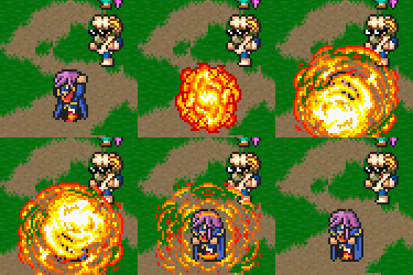
Just two optional tier 5 bosses.

Just two optional tier 5 bosses.
It looks like they're battling in a Skittles commercial. Taste the rainbow!
@Itaju: The amount of detail in that shot is exquisite.
@Itaju: The amount of detail in that shot is exquisite.
Itaju, that's is so amazing.
I seriously hope you are going to do something professional with these skills.
I seriously hope you are going to do something professional with these skills.
Corfaisus

"It's frustrating because - as much as Corf is otherwise an irredeemable person - his 2k/3 mapping is on point." ~ psy_wombats
7874

Yay! Bunnies! ♫♫♫
Itaju, it baffles my mind how you are able to cram so much detail into a single 2k3 chipset. That is a beautiful looking town, you need to make it part of the game rather than just a test shot!
@Itaju: That's really nice, however I am going to point out a few little flaws I found, for instance, in the top left corner on the verandah, the flowers on the railing have a really ugly pitch black outline (almost like you didn't make them transparent but meant to) and it horridly contradicts the rest of the image.
Also solid black outlines are used sparingly betwixt what is otherwise softly albeit well-contrasted color coded decor. Just some things to consider!
@Corfaises: Not sure if it is an error or on purpose, but the way the grass is blatantly overlaying the footpaths is trigger within me deep OCD no's.
Other than that, I advise (though this is personal preference) erasing the generated auto shadows with the tool provided.
Also, those bunnies are great. In fact the brown one mid-hop is one I edited for Tristy's sprite. Still looks nothing like a kangaroo, but meh!
We figured it out! (not rly tho!)
Anywho, apologies I had to expose all o' you to that. The main issue is the battleback, I've figured out a fairly decent workaround to fool most out of seeing the parity between the contradicting styles.
Borders. The clear distance between the great divide of a blue cyan border is enough it turns out! For facesets, the one in the screenshot above is use only in battles and on the menu, everywhere else is just the usual mspaint rigmarole.
This forum has been a really great source for feedback, and I promise you fellas my next games art will be coherent across the board! Not because, you twisted my arm. But because I want to do it, now! Menagerie is just too large to go whole hog with that sort of a renovation, but a new smaller project, oh yes, I can see that happening!
LockeZ, you're probably the closest person I consider to a friend on here, because your feedback has been valuable, and I love the way you are so blunt!
Being one who is pretty blunt himself, I appreciate it!
Anyway, here's a different thing entirely!
This cutscene gives me goosebumps, especially around 2:22 and beyond. Post-processing allows me to do a lot more to help with the epic pulse-pounding timeline feel.
The music is indeed, a Placeholder currently, my composer is leaving it till last, since it's gonna be one hell of a syncing track job.
Also solid black outlines are used sparingly betwixt what is otherwise softly albeit well-contrasted color coded decor. Just some things to consider!
@Corfaises: Not sure if it is an error or on purpose, but the way the grass is blatantly overlaying the footpaths is trigger within me deep OCD no's.
Other than that, I advise (though this is personal preference) erasing the generated auto shadows with the tool provided.
Also, those bunnies are great. In fact the brown one mid-hop is one I edited for Tristy's sprite. Still looks nothing like a kangaroo, but meh!
author=AlphaOmega247Maybe they are?
It looks like they're battling in a Skittles commercial. Taste the rainbow!
We figured it out! (not rly tho!)
Anywho, apologies I had to expose all o' you to that. The main issue is the battleback, I've figured out a fairly decent workaround to fool most out of seeing the parity between the contradicting styles.
Borders. The clear distance between the great divide of a blue cyan border is enough it turns out! For facesets, the one in the screenshot above is use only in battles and on the menu, everywhere else is just the usual mspaint rigmarole.
This forum has been a really great source for feedback, and I promise you fellas my next games art will be coherent across the board! Not because, you twisted my arm. But because I want to do it, now! Menagerie is just too large to go whole hog with that sort of a renovation, but a new smaller project, oh yes, I can see that happening!
LockeZ, you're probably the closest person I consider to a friend on here, because your feedback has been valuable, and I love the way you are so blunt!
Being one who is pretty blunt himself, I appreciate it!
Anyway, here's a different thing entirely!
This cutscene gives me goosebumps, especially around 2:22 and beyond. Post-processing allows me to do a lot more to help with the epic pulse-pounding timeline feel.
The music is indeed, a Placeholder currently, my composer is leaving it till last, since it's gonna be one hell of a syncing track job.
@Corfaisus: Not bad, not bad. A few little notes, though, that should help a bit. Don't use the large vines - they look quite odd. The smaller vines work well, though, as they're the right size for climbing walls/trees. Also, learning how to shift-map would be a good idea, especially for where you grass borders against the tree-tops. Try not use one-tile-wide roofing for tree tops - it looks a bit ridiculous as tree-tops are rarely, if ever, as wide at the top as their trunks. Personally I'd add a bit of normal green grass (not the long grass) around, especially around the dirt paths, as it's not likely that dirt would be edging up against long grass without the transition of shorter grass.
Otherwise, it's nice. Not too much detail or too little and the treeline itself is well done.
Here's my video on shift-mapping in case you want to learn more about it.
Otherwise, it's nice. Not too much detail or too little and the treeline itself is well done.
Here's my video on shift-mapping in case you want to learn more about it.
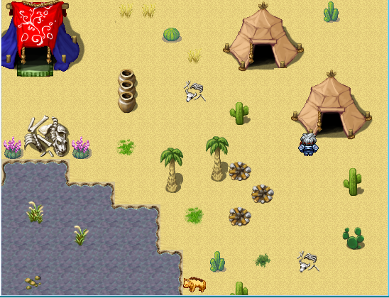
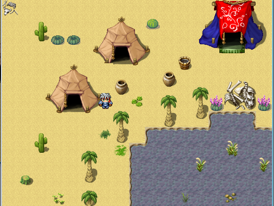
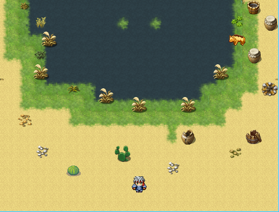
...why poisonous water? And why green stumps and moss/grass spots? There's more likely to be grass tile at the edge of the water, tapering to dirt then to sand instead of just straight sand. No-one would live around water that didn't support life around it. You should probably look up some images of oasis so that you get a better idea of what they actually look like.
Also, the blue tent... doesn't really fit. Aside from the shadows and structure of it, the carpet coming out of it makes it look like the tent is on a higher ground than the rest of the area so it looks kinda off.
Also, the blue tent... doesn't really fit. Aside from the shadows and structure of it, the carpet coming out of it makes it look like the tent is on a higher ground than the rest of the area so it looks kinda off.
author=LibertyI will; however, since the oasis is located in an area already noted as inimical to life and the Ulriki must filter the water to some degree, it's unlikely to be totally pristine. . . . and kill the tent. gotcha.
...why poisonous water? And why green stumps and moss/grass spots? There's more likely to be grass tile at the edge of the water, tapering to dirt then to sand instead of just straight sand. No-one would live around water that didn't support life around it. You should probably look up some images of oasis so that you get a better idea of what they actually look like.
.
you could to try lower the saturation of the tent if you want to see if it works like that.
i think the brightness of it is making it look like a bouncy house for kids
i think the brightness of it is making it look like a bouncy house for kids

e: caption
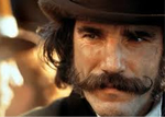
Playing around with more letterbox style to scenes, because I can't tame Ethan's hat any other way.
author=BizarreMonkey
@Itaju: That's really nice, however I am going to point out a few little flaws I found, for instance, in the top left corner on the verandah, the flowers on the railing have a really ugly pitch black outline (almost like you didn't make them transparent but meant to) and it horridly contradicts the rest of the image.
Also solid black outlines are used sparingly betwixt what is otherwise softly albeit well-contrasted color coded decor. Just some things to consider!
@Corfaises: Not sure if it is an error or on purpose, but the way the grass is blatantly overlaying the footpaths is trigger within me deep OCD no's.
Other than that, I advise (though this is personal preference) erasing the generated auto shadows with the tool provided.
Also, those bunnies are great. In fact the brown one mid-hop is one I edited for Tristy's sprite. Still looks nothing like a kangaroo, but meh!
author=AlphaOmega247Maybe they are?
It looks like they're battling in a Skittles commercial. Taste the rainbow!
We figured it out! (not rly tho!)
Anywho, apologies I had to expose all o' you to that. The main issue is the battleback, I've figured out a fairly decent workaround to fool most out of seeing the parity between the contradicting styles.
Borders. The clear distance between the great divide of a blue cyan border is enough it turns out! For facesets, the one in the screenshot above is use only in battles and on the menu, everywhere else is just the usual mspaint rigmarole.
This forum has been a really great source for feedback, and I promise you fellas my next games art will be coherent across the board! Not because, you twisted my arm. But because I want to do it, now! Menagerie is just too large to go whole hog with that sort of a renovation, but a new smaller project, oh yes, I can see that happening!
LockeZ, you're probably the closest person I consider to a friend on here, because your feedback has been valuable, and I love the way you are so blunt!
Being one who is pretty blunt himself, I appreciate it!
Anyway, here's a different thing entirely!
This cutscene gives me goosebumps, especially around 2:22 and beyond. Post-processing allows me to do a lot more to help with the epic pulse-pounding timeline feel.
The music is indeed, a Placeholder currently, my composer is leaving it till last, since it's gonna be one hell of a syncing track job.
Yay! A screenshot of a game that is actually downloadable!
author=BizarreMonkeyi love it!
I apologize for any pain this may cause.
Just two optional tier 5 bosses.
LockeZ

I'd really like to get rid of LockeZ. His play style is way too unpredictable. He's always like this too. If he ran a country, he'd just kill and imprison people at random until crime stopped.
5958
Lol, "Assail" instead of attack
Also, although it's physically painful to say so: really good use of Homestuck music. That cut scene is, uh, not exactly consistent graphical quality, but it's actually really well directed.
Also, although it's physically painful to say so: really good use of Homestuck music. That cut scene is, uh, not exactly consistent graphical quality, but it's actually really well directed.


