LARGE'S PROFILE
Large

332
Search
Filter
 The Screenshot Topic Returns
Yeah, I guess that was not the right word. I meant... let me try to describe it. Sometimes developers try to give it an edge, to make it humorous, or something. Most of the time, they can't pull it off. In other games, supposedly with a medieval setting, things in dialogues get technical or with a contemporary feel. I don't like that.
And obviously, I think I can manage to make it feel in the right setting.
And obviously, I think I can manage to make it feel in the right setting.
The Screenshot Topic Returns
Well, the engine is really not to blame here. I've seen the idea working in other games (Lun Calsari's "The Way" did this, but not with hand painted graphics. 3D pre-rendered landscaping was his thing), but what you need is a more polished drawing. Your lamps, for example, have pink artifacts around them.
Oh... I just remembered that XP and VX are not limited by 256 colors, like 2k3 is. Maybe it is the engine after all.
Oh... I just remembered that XP and VX are not limited by 256 colors, like 2k3 is. Maybe it is the engine after all.
The Screenshot Topic Returns
No, Felipe! (My middle name is also Felipe xDD) It's just that I'm not really familiar with SSBX, which I'm guessing is some sort of mugen-like project for Super Smash Brothers (And that rocks!)
I liked the playability shown in your video, but the character's jumps seem "short". Usually the sprites jump higher... that's the only "but" I can think of right now.
I liked the playability shown in your video, but the character's jumps seem "short". Usually the sprites jump higher... that's the only "but" I can think of right now.
The Screenshot Topic Returns
@Versalia: I understand what you're saying. However, I feel it NEEDS to be like that, because the aim of the game is serious. I hate the campy tone of most RPGs being made by the community; I'm striving for darkness in the characters, and maybe, a way to redemption... but you have to get there. You see, this scene is in the future of the game; you start much more lighthearted.
The only thing I find discouraging from your comment is the fact that you jumped 2 minutes into the video, and the video is 2:52. So, you judged it as "pretty terrible" only by watching 52 seconds? Huh.
@Chana: Thanks, that's what I was aiming for. This is a guy who's coming into town to do something pretty bad, and he brought henchies; they're just securing the place for him. I wanted to show action, that's why you see the guards and captains being attacked (In the background). The focus is HIS monologue, but things are happening around him.
However, and this is something I can draw from your comment and Versalia's, the characters are not having a conversation. This is a guy that is having a monologue; he is talking to his minions (which are actually undead creatures), because that's the audience he has. I feel like it might not be clear (Although their faces are grayed out, while his is not), so... any advice on how to make it clearer?
Thanks for feedback. I haven't created a project page, but when I'm further into development I will.
The Screenshot Topic Returns
Thanks! Keep practicing your mapping. Fo example, the first vuilding as a total frontal perspective, but the next one has a small view of the roof, as in "top view" perspective. Try to keep consistency.
The Screenshot Topic Returns
I like the style, reminds me of TMNT II for NES, one of the best games in that console...
I made a short video of the intro of my game. Feedback?
I made a short video of the intro of my game. Feedback?
The Screenshot Topic Returns
The map looks OK if you're trying to achieve that oldschool NES-type of feeling (which I'm assuming you are). The sprites clash heavily though. Too many different styles and shading.
The Screenshot Topic Returns
Rips are not really a problem, but originality might be. I think the first SS is very similar to... Legend of Mana. And the second is clearly Chrono Trigger, a VERY similar setting called "Ocean Palace", which is super close to "Imperial Palace" (as shown in the SS).
In any case, the screens look very good.
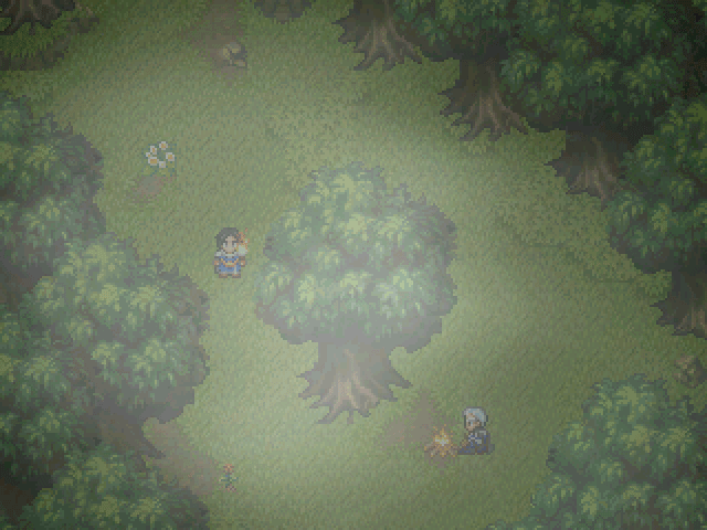
How about mine?
In any case, the screens look very good.
How about mine?