


VERSALIA'S PROFILE

"I married him because his kid is strong and he doesn't wear a shirt" - craze
Search
Filter
 TR_Screenshot__Forest.png
author=narcodisauthor=VersaliaI don't understand how you conclude that "many different kinds/colors of plants" equates to "magical". It's like you're saying a wide diversity in vegetation is somehow unreal?
You have like 6 different kinds/colors of trees and like 12 different kinds of bushes and flowers.
That forest better be effing magical as hell
I think it looks great.
Except for the evergreen trees scattered around. Pine forests look like this
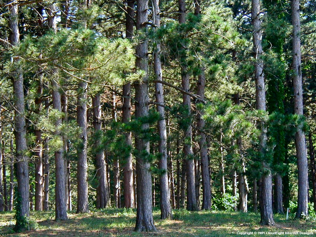
and indeed most forests that have varying types of trees do not have the different types of trees growing in neat clumps more or less segregated from each other.
The flowers don't quite match up but are by no means egregious. The little patches of wildflowers on the ground - perfect! They grow in concentric clusters of like-species, just like flowers would do. Then the type of flower with white and pink varieties are used among the other flowers but still close together - excellent, very natural! However, for the rest of the flowers and even the trees: the graphical styles are way too different. It's great to have different shades of trees, but that's like 6 different shades of warm green and cool green mixed together. Those mushrooms stand out more than the rocks stand out more than the wildflowers, so my eye gets yanked to those things staring at me on the map. (Botany lesson: Most mushrooms don't grow in direct sunlight.)
You'll also have a lot of trouble giving any kind of memorable identity to any other forests/segments of forest. It's a lot easier to remember and to add themes with "that bright green forest with the colorful flowers" and "the dark pine forest with a lot of rocks and mushrooms." I see a trend of lot of just trying to use EVERY forest tile and it just doesn't work for me. If it's a large forest you can travel through different parts of, it'd be natural to see different kinds of plants preferring different locales (like the mushrooms in the shade); if it's not, it's literally every possible forest in one.
PeReMessageStyle2.png
I like that message box style! I just have no idea how to pull it off whatsoever; I don't think I can do that with the ATS unless I set up some very special menu skins that will draw that by default. (The namebox has a separate windowskin, obviously) I'm not willing to change it if it requires using Show Picture or something for all the dialog windows to pull it off though. I like the cleaner Riviera version but it feels like a minor change overall.
If it's not possible to cleanly pull the former off, I could make the name window fully opaque? Honestly, I'm unconvinced that the black namebox sticks out in principal. It must be something about my execution? All the other UIs are black round-edged rectangles laid on top of other things. Check out the datestamp UI, the battle UI, and the Status screens. XD I'll try to make it even rounder~
Also, the text would be squared, but I prefer to indent the first line in dialog boxes. Stylistic choice!
PeReMessageStyle2.png
author=Miracle
making a transparency gradient to fade it out on the side
Also, are you planning on changing that Name-Box? D:
Transparency gradient might work. I used "fit text to window" for this shot, so the window box is squeezed inward and downward - so you can see the desktop glowing to the right ^^ Otherwise the message box covers it. So, NORMALLY, it won't looked cramped.
As far as the name box - I really like it as a black rounded-edged window. The edging needs to be rounded off a little bit more, I think, but otherwise it'll resemble the black boxes in the Status window. Did you think it was glaringly mismatched or something...?
 Creation Custom Crafts: Craving Criticism
author=Creation
I don't think it should matter that much anyway as the trees will be in a whole different ''world''. Thanks for pointing that out though, dudesoft.
That being said, the graphical style of the second tree would actually look beautiful if grayscaled and tinted blue and used as a cloud design. Well, don't ACTUALLY directly rip it like that, but that would give an approximation of a fluffy, puffy cloud~
PeReMessageStyle2.png
Oh, he knows what he's talking about for sure, so I edited my comment~ I know not to take it too personally! It just blindsided me with a sudden list of flaws in a face that hadn't extremely bothered me outside of "some cleanup." Sorry if I seemed defensive or not willing to take the feedback - trust me, I'm all over it. I don't intend to let anybody look terrible in-game, I love them too much :)
PeReMessageStyle2.png
author=alterego
Is the portrait a placeholder? or a wip? or what? I'm curious because it's very poorly edited, it has jpg artifacts all over it, jagged edges, and the colors could use a touch as well. Also, you should place it a little lower, I don't think I should be able to see the bottom of the text-box under it.
...Oh, and just to be a nag, that red spot of light on that computer is way too bright. ;D
I was going to clean up the edges and some remaining colorsplotching (like on her hair and the yellow bust detailing, the yellow collar), but otherwise, that's the completed face set. Technically a WIP I guess but I didn't think it was -that- WIP. D:
...Oh, and just to be a nag, that red spot of light on that computer is way too bright. ;D
I was thinking that but going back and forth - I've been 50/50 on that one. Computer monitors are really really bright in a room that has the lights turned off... (since it is technically not in the same room as the lighted kitchen). Should I lower the light intensity and disperse the glow to a slightly larger area?
Mixing RPG aspects into your RPG
author=LockeZ
Menu-based combat, especially if it's also turn-based, is inherently less thrilling than real-time combat - it intentionally sacrifices this thrill for the sake of allowing a greater depth. But when RPG designers decide to remove the depth, or make the game easily beatable without the player understanding the depth, they're essentially getting the worst of both worlds. They've sacrificed the excitement and gained nothing.
Maybe I just don't play shitty games but ... you make it sound like there aren't any good ones at all. I've heard of a few high-profile examples of trying to include strategy but failing, and big companies pushing shitty games, but these long blocks of ranting are making it sound like you're just making bitter rants about the game industry and fluff games. Let's not encompass generic churned-out-for-profits devoid-of-quality games into our collective psyche, okay? It's just not productive to rant about the "sell lots of copies! mindset" on a community designed around exactly the opposite of that. We barely need to discuss the pitfalls of designing around selling a million copies because none of us will; personally, game design & theory should be discussion relevant to the design and theory of OUR games.
Unless it's a discussion about how you're going to storm the ranks of the gaming world and right these wrongs. Right? ... RIGHT?!


