@Sated
Wow, a lil bit of cynical ideas in there. The contrast is really huge. I think the pink will really burn on full-screen, tho. Ouchie.
PEOPLE I DID IT!!! WHOOOO!
For your pleasure libby, putting together things.
@SgtMettool
God they're so cute! Even with the grey n light colors. Only the villain-looking guy is a lil muddled due to it being all dark, so less contrast.
Cool!
@Piano:
Cool, can definitely agree, and they are all planned to be used. And yes, I know what you mean.
I also listened to your tracks meanwhile. Very interesting atmosphere. It has a little bit of foreboding, otherworldly but also .. calm and relaxing to it. Seems like Silent Space is kind of a main theme?
The druid factory has a nice build-up, I really like the enhancement ~30-40. The starting addition at first seemed almost a lil too different, loud and "simple" from the rest? Listening to it at first, given how subtle the main beat is. But with the end-build-up it comes out really cool.
What Remains at the End makes for a really intriguing atmosphere ..
Really, great job! I love these! I want to listen to the druid factory again right away.
@Zero3D
So it seems like you enter nightmares to rescue the person involved? Seems like a cool concept to play around with. There are a few nice movies out there like Paprika, always makes for some cool settings. I hope you can bring in the changing dreamworld somewhere.
Anyyyhow. Aesthetically, the health bar would look better above the level, since it is the exact space needed and otherwise it reaches quite far into the screen.
Or if the level-display moved up (altho the level may also be cut-out if you get any lvl-up signs and messages)
What is the right candy-gem-like bar for? If it is a temporary environment-thing (like a timer), it is fine, but if belongs to the character (like mana), it would be concise and likely prettier if it were under your health bar, imho.
The opening screen looks pretty decent, I like the simplicity in it and the color choices a lot! Sadly the spray effects of the "N" interrupt this simplicity and thus its beauty. The N in normal font would likely improve the overall aesthetic, even without having a big letter to fill up the screen. (is the hunter in the title more important than the nightmare part btw? Or did it just look better that way?)
I'm just nitpicking here *chuckle* Looks pretty good! Keep it up~
@Dreamie
Well, I've seen it beforehand, so it's kind of moot, but the icons are indeed absolutely lovely, vibrant and cute! The char, too, altho I really would've liked to see the variations up there, too :)
@Piano
More songs! They're really kool. The battle-track is again simple, but the build-up later makes it really fun. The chorus-esque effect makes it seem epic.
The other song is quite drawn out with some interesting variations, very decent. Really feels more like a journey, which seems to be like the end of a journey? So that is very appropriate.
I like that you reuse themes, it is a great way to build up suspense during your game. Nier for example has a magnificent soundtrack, and there are so many variations of one.
@Cyberlouis
I like the Secrets theme. It has a very comfortably homey feeling to it mixed with seeking and searching? Seems like a great theme for dialogue, but also cut-scenes. Or the beginning of sth.
The Infiltration is a weird mix and kiinda reminded me a bit in its oddity of Mushroom Men which is a great thing. It is a little bit out there, but makes for an sense of switching between uncertainty urgency, tension and the comfort of routine. I can imagine it really well for the purpose. I don't really like the opening portion, but I really like shift at 0:33 and buildup.
A future feeling I find hard to like with its dissonant main beats and random effects .. I can't really find anything for it. A dream sequence, maybe?
So .. character art and some spriting + animation for the protagonist? Is she wearing a shirt or a short dress? Seems like the being imprisoned and escaping type at first glance. The sillhoute is very light on the white background, but all looks decent and simple.
The usual skimpy looking females and a slim guy, alright! Looking solid.
@Liberty
The walltiles do look a little off, mainly due to there being a lot of light-effect on it (since it's all one solid paper, isn't it?) - seems like it'd look better if there were just effects on the top portion and not on the bottom, since that should be fairly well-lit given the doors n floortiles.
Now the floor-tiles are kept very simple. I think they tiles would be fine by themselves but coming together it seems off.
The sprite kicks ass tho! Strong beautiful and two different-colored eyes making for a little maniacal suspicion! I'm just hoping.
@Deltree
Uhhhhh...! So pretty! The background as well! And animal and critters and wheee!
The rain of numbers reminds me of Disgaea a little bit. It is a little bit much, but it makes for a fun addition and something you can just roll with. What does the status messages of the bottom two mean? They are out of battle naturally, seems like one is simple gone and one dead? Or is that just a random play on words or are they supportive ..? Really hard to tell with the messages alone. Kool! Keep it up!
@Luchino
I love the battlers! The axe-dude is just awesome. What is the left guy holding tho? A shovel? Then the handles too thick.. It looks like it has a blade when it really should not. It could be a club if not for the metal part. Of made into a mace..really weird-looking tho.
And pretty pretty maps. I especially like the port-town, has a nice balance of highly details and just soft space. You've got a highly detailed style, it can be a little too much buzz for my eyes, like the boat windows. Nevertheless, very very pretty!
@Dyhalto
I love journal-pages-styles. I think the green-ish highlight disrupts the overall clean look of it tho. If there were any rips or old hints of being used, they would likely be darker. The fact that it is the same for any page make it seem odd, too. Unless it was light? Which then would be odd for the right portion. I'm nitpicking here, tho. Looks very good and the introduction seems nice n concise if it is that :)
@MakioKuta
More Erwin! So .. there will be a larger portion on his town? Kool. That part looks a lot more varied and less super-luxurious bare that marmor looking building.
I see salami in that inn scene... or is that ham?! And the right stack could be crackers altho they can't be. And then bread.
MEAT AND BREAD! I AM PLEASED.
@luuishu
So that is the upcoming dungeoncrawler. Light and simple as opposed to the usual dark and foreboding images most people use. Kool. I hope you can pull of the twists well!
@Infectionfiles
So a house, simple n neat. The cliff one tho looks so .. so amazingly gorgeously beautiful. Brutal and slightly unnerving too, but the armors are really well-done, and the soft rocks came out really well.
@unity
Very kool stuff! Not sure if I like the more detailed dirty-looking animations more or the really simple but pretty ones. I really like the ring ones on the second sheet. And cute-creepy critters! They suit the tone so well, great job on that mixture! Not to mention that the UFO is just funny and stylish.
@DinkleDaBerry
A cutesy looking detective game? Looks awesome so far, only the battle screen is a little bit out there for I have no idea how it is works, and there are a lot of different styles coming together (drawn portrait, background, then sprites and pixel-door) viewed .. from afar? Looks a little bit messy as it is.
The rest is pretty cool and solid tho. Not to mention that the christmas game Frogge did for me had your main character as me, and that just makes it so much more awesome looking at it! Really like the areas you have so far. All seem natural.
@mjishi:
Ohh. Boats. Simple n pretty. But why is the framed map on the ground?
Lots of windows.. make for an interesting look tho. Boat tiles seem so difficult to identify looking at the RTP.
@Irog
Hoh, strategy stuff. With how detailed all those fighters are, the one-color block shield stands out a lot. I was first thinking it might be an icon or a status. I think if it was a lil toned down or just a cross or something on it to break it up it would stand a lot less out.
Looks like a solid concept gameplay-wise!
@kory toombs
so a gritty-looking game. The mapping is solid and more functional than pretty. The green light color of the arrows really disrupt this atmosphere, tho. Especially since the doors and stairs shown here are in plain view and a natural focus. Is that for a tutorial? I would go in there whatever it was. Is that a story-progress-related pointer? If so it would prolly awesome if there was the option to turn it off.
The battle-screen blends in really nicely. Works well to integrate the battles well into the environments. Ohh.. you can move around. Very nice. So it is more of a tactical rpg/hybrid. Neato.
@Addit
is this the .. rumored .. MONOPOLY? The icons look very very nice! So clean and simple. The blue might be a shade darker to have a similar contrast as have the other two. Kool that you can adjust taxes and other things to your leisure. Will allow to change the pace. Keep it up! You shall finish this!
@Pizza
Is it me or does the tileset look a lil more detailed than the last oens you used? It's gorgeous! It strikes a really good balanced between detailed and simplistic look. Plus animal character and a portrait! Whee! You're getting better and better, keep it up!
@KatanaHiroshi
The holographic something looks really really nice! Great clean sci-fi look. The map is really really large tho. Plus very uniform. Is hard to tell with just the big size, but I guess if you stood at the northern portion you couldn't tell which of these same-looking doors you are facing unless you walked left and right. Unless it's meant to be intentionally disorientating and confusing, do add some doodads and other markers so you can know where you are just by standing where you are (once you got to know the environment). Keep in mind you only ever see a tiny portion of it at once, that can be really really frustrating. All that said, it's nowhere near as confusion as it could be, so it may pan out alright.
Is there some sort of garden area in the middle or why are there only two doors at the top leading to it? Seems like a huge area cut-off.
@Red Nova
So there is a shop. I like having values displayed. The icon for the sheathe is strange tho *g*
@Lucy Fox
This is so spoiler-territoriy : D for me who knows anyway. The bridge is a lil out there but it's all sooo pretty! And the funeral. Yeah, I think this will turn out really great. I suppose there are a few more snippets of dialogue coming for that one, aren't there?
And ohh! Thank you! :) You wound me if the winged pair of legs is the only creepy thing haha, but really, glad you like 'em!
@Housekeeping
Ohh, so neat. Is that a slime-transporation secret pathway kind of system? Or a fancy spawn animation? It has a healthy green like my avatar, so it has to be a friendly slime.
The castle theme is really laid-back but still got that majestic vibe with the trumpets going. Very nice!
@Zephire98
Is this an edit or made from scratch? Looks very decent and will surely make a nice addition.
@zDs
Other people already said it .. but yeah, the black patches look odd. Some very dark tiles instead would make it look really nice! Otherwise good solid job. Kinda old-school in all the good ways.
@Frogge
Gonna be interesting to see how the variations actually work. Always find it hard to see it work on paper. And then I hope these extra abilities and power-ups also work really smoothly. The "fun" aspect of XOX is its sheer simplicity. I don't really like it as a game, but it's a simple way to spend some time.. sometimes. I rather like the 4-row variation where you drop it down ... god it has a name too, lol. It's the same core idea, but makes for longer build-ups and more strategy involved.. so just more fun.
ANYHOW. Gonna be interesting to see how you make this work
@Zero3D
Some foresty screens. Kool. The forest looks natural!
But the dialogue, this barely hits the mark, but.. I urge you to NEVER let your character say what is happening is their biggest fear - when that very same fear is triggered. Careful. It kills the impact. Any impact.
There are a couple of aspects to this - it requires a sort of introspection and reflection to even identify and acknowledge that we have fears, nevermind strong ones. Admitting you have them is already the first step to possibly alleviate them.
This sort of calm and level of introspection you may have during a calm dialogue (like, a really intimate moment of sharing and caring) you cannot have when you under extreme stress. Fear triggers a sense of urgency and danger - fight or flight. Calm, relaxed with a good introspective is the polar opposites of that, making these notions completely crash.
It is also due to this that when it is phrased like that, the sense of fear is very very diminished.
How to fix this is really just by minor tweaks. The realization it's her fear should be shown in action and expression indirectly, or it can be added as a realization or just dialogue later. "Thank you for saving me. I .. I really .. I really am scared of policemen. ...it ..it's like I will be rotting in a dark cold cell without fail." -- stuff like that
During the scene, however, don't spill it out. Just scrapping the "it's my biggest fear part" and replacing it with something displaying her FEAR and STRESS in that situation is what you want to do. No calm introspection. STRESS. Experiencing something you fear is a huge huge strain on body and mind.
You get something like this:
"I'm going to get ARRESTED?! But, but .. Noo I DIDN'T DO ANYTHING PLEASE DON'T TOUCH ME GET AWAY!"
I hope that makes sense! I see something like this happening a LOT, hence my focus on it. It is a very easy twist to do! The idea works! Just be wary of this pitfall and you'll be good to go.
@KatanaHiroshi
Sure we go with more feedubacku!
Cute sprite, what is this bright green band tho? Is it like a name plate? I would try setting the saturation a little bit lower, it clashes with rest of the coloring, imo.
I really really like the lab! And the second classroom :) All concise. Simple but pretty.
I am not sure what the chair-collection classroom is for. Seems like there is a cut-scene there looking for clues around, but here is a lot of empty space. You may either artificially remove space by placing bigger objects or some kind of cloth-fence there (too tired to look up the appropriate word, lol). If it's an exception it should be fine tho. Still looking around THERE will be more annoying due to the number of chairs to check.
I like the look of the statue, guess that too will chase you around.
The monster has a nice black lining reminiscent of that black guy. Gotta be an enemey you can fight, otherwise the lining would be too thick (gotta keep it consistent with the others tho)
But yeah, just rambling. I'm tired out after working the whole day without lunch, lol.
@Sooz
Ohhh, I love sketches! That's a nice city-layout you have there.
Plus a nice vintage-styled drawn photograph? Looks very very good and authentic. Plus it's nice to see different skin-tones, 'tis such a rarity. They come out beautifully.
@BerryRMN
Weird alien critters, check. Food, check. I really like the ambience of the second screenshot - it also has a lot denser beautiful mapping. The first seems more like a make-do in a dungeon, and the kitchen-counter is soo long. The only odd thing is that the pans are way in the back, far away from where they are actually used. That seems quite unnatural.
The updated version looks much more natural! Very nice!
@AceofAces
The starting screen looks very nice! Altho I think that the slight pattern in the background distracts a bit from the characters, but then you have the blue to red change going on.
the dungeon seems more practical, and so does the town. But they look like they will work splendidly.
@Pooperflooper
WHEE MORE BUTTHEART LOVE! ;) Thanks
I really really love the watercolor-like, or watercolor-digital mix you have going with the house. Makes it so atmospheric, but also has a great focus on the house due to it being stylistically different. I think I would've skipped outlining the trees and the hill, tho.
The screens are looking just as good. Simple and beautiful. I really love all these little objects - the record player, the radio. And that toaster! But on the walls as well with the air-thingies.
There are a lot of different patterns coming together (striped walls, checkerboard kitchen, tiles floor), but it still comes out looking very nice. I'm impressed!
@Punkitt
Talk about simplistic! This looks very interesting and visually pleasing with its simplicity. The contrast is very nice, too, between the blocks and the ground. Slightly surreal, but enjoyably so.
The waterfields do not come close just yet in their colordesign. The blue looks less like water and the darker brownish patch looks too similar to the strong yellow. The grass on the topleft has a lot of texture but doesn't work well posted in a cluster.
That said, I really adore your style as a whole, great job!
@Thunder176
Very nice! I quite like the simple variation on the crystal, makes for a simple neutral starting screen. Then the interior design is very nice, lots of tiles coming well together giving it a kind of rich majestic overall feeling. Feels like statues and (gods too?) seem important, or are just abundant. I'd like them to be important. The dungeon design seems more practical, the water portion especially (I would assume the floating pieces serve a gameplay function?)
but overall - very very solid. Good job!
@kr0x
ohh, lots of different stuff. I really really love the simple fluid linework. The sprites look gorgeous! The big guy seems to be walking rather strangely, but given the weird composition of claws and standing on their toes, this seems to work.
The mapped gif seems solid, but the saturation is very high. I think it would be very hard on my eyes if I were to play it full screen. That bright grass green in particular. I think a softer color would work a lot better.
The pixel-gif is really really pretty! The logo sadly is not as pretty, for the lack of outlines in th background clashes with the ones of the logo popping up.
Keep it up!
@Nessy
Ohhhhh.. riches. So pretty and detailed! For a second I thought the girl was sitting on a miniature city, lol. Guess I have to contend with crystals
Craze
Yes, Karsuman's artwork is indeed gorgeous! Sounds like a solid set-up, too. Where are they going to be in?
@LucyFox
Ohhhh.. the trailer is really amazing! Most RPG Maker games trailer suck. Honestly, this is the first I have seen that really pulls of the right amount of wonder, tease and just beauty while showing the general gameplay/game focus. The music choice is just spot-on.
@Nessy
Beautiful crisp animation :) It's always a pleasure to look at your stuff. I really like the fairy spirit. I love the idea of weird shapes all across the body. The colors come together really well and all give a magical-energy vibe off. Altho due to the shades getting fairly dark, it might also be an evil spirit. Gotta be interesting what you do with it.
And while the sword has a lot of elaborate spiky things, I really like how the blade is kept thin. Makes it look far more natural.
@Donut
Wow, this is really pretty! Especially the shop.
The outside has a little too much of soft tones without any lineart, clashing with the objects, flowers etc. It happens in the shop too with the ladders, but far less noticeable since it is much more balanced.
The anime portraits/characters sadly have a very thin lineart which makes harder for them to pop up from the ground. Compared to the menus, too, they are really really weak and just don't have the focus they could have. They are pretty, but I would suggest to line them out with a solid black to have them fit right in and be the focus they should be. Makes it more look like random assets put together, and that'd be a shame.
You are using pretty assets. Now you just need to make them come together, adjust and edit so they come to a balanced, coherent style.
Edit: and ohh.. first person dungeon crawler too? Seems like that is still being built up tho, so little to say about it.
@karins_soulkeeper
Yay, you did a script! So it displays equipment discriptions based on .. stuff. I honestly can't put two and two together to what such a description would look like. Can you give an example?
@Bad_Luck
The map is super cute, the names sadly don't really pop up half the time, but they are all readable. The screens all looks gorgeous! Some childhood-friend banter of NO MORE DAMSAL IN DISTRESS, good, cool monsters and that lovely purple heart for HP, check. Great-lucking lvl-up point-distribution, check. Shit going down with other people standing around doing .. something. check. Honestly it doesn't look like they are even watching, that seems a little odd but without any context there is nothing to be done. Skull-filled elven-shrine, check.
All very clean, elaborate and gorgeous to look at. It is that one famous game everyone mentiones every now and then. Gonna be fun!
@Ljink
Could it be I missed talking about your stuff?
Starlight, seems like solid but a lil dull, there is little building up. Seems like more the background-music type of ost, which is fine, too. The one string coming in later is more disrupting and hurtful than anything else for me.
Enveloped by tenderness gives off that comfy farm feeling. I like it! Lon-Lon ~ oh.. wait. yeah. I really like that one!
Kids return is more a serious tension-buildup? Like pre- or in-bossfight. The chords (the second of the two repeated) 2:35+ sounds a lil disharmonic, so after 3:06 it ends up normal again, phew, thank god. It's okay overall, but that change really disrupts it for me.
Scattering blossoms could be an intro song for sure. I like the changes here, around 1 it seems to shift more to town-life? More like a calm piece. Cutscenes? Caves?
Almond Town also is a neat calm accompanying piece. It will work splendidly.
Anyhow, makes for decent accompanying music :) Good job!
@Aubrey the Bard
Modifying stuff! Very nice! But where are cat ears? I see tails but no ears, awwww.(
@Novalux
SLIME APOCALYPSE. Interesting. The start is a little weak due to you GUESSING you are packing for .. SOMETHING, but there is no sense of urgency or danger. Just a few sound-effects of shit going down outside would do to help it.
After enter/leaving any other houses you will again get the tutorial message.
Wow, a treasure chest with 0g.. talk about disappointing^^ At least make it 1 : D
In the inn you need to enter the stairs from below or you won't proceed. You should be able to from the side as well. Missile barrage so strong.
The phantasms are REALLY easy to avoid, and easy to kill, too.
Some spells are completely useless. The standard slash attack deals 2 damage, but the hilt smash does it too but + stun chance. I like the spells altho they are strong, but I would cut down on the number of them.
The orthography is lacking, there are a lot of missing fullstops and questionmarks, some "i" instead of "I", ";" instead of ":" for the voices, and in the inn scene the protagonist says "caught" instead of "taught". The survivor in the menu would look better with capital S due to this being a title.
The fighting scene, too, is again indicated when leaving the house. The events need to be only displayed once and then turned off.. not sure how to do that, sadly, as I am no gam maker.
Punk waiting in a cave full of monster to steal stuff ..? Odd. Entrances and other choke points would make much much more sense to catch passerbys!
After the thief fight .. you guessed it, the event repeats without even moving anywhere. Thankfully you can just quietly leave. And after supposedly getting an enchanted weapon to dmg phantoms with .. you don't get anything. Careful. Well, you get a teammate.
And I reached the end - overall. This game lacks a clear directive - you run and run and run without any point. Where are you going? If you don't know what happened, where might you find out? Could there be a safe place you are heading to?
The combat has a nice base imo, and even if it is easy, it is more a means of progressing. So in that sense you need to then flesh out the backstory a little bit more to give this fundament some more fun. It's okayish, just make sure you do the events properly. It will really really show throughout the whole thing and possibly leave you in a loop (like if you HAD to fight the thief)
Mapping is alright and more practical. The dungeon was a lil long but I guess walking back n forth was the whole idea. I commend you to use the people always go right trick to not find the stairs, but the random dude hinting at greater things without any reason why he could. (but you can work that out, I'm sure)
I know it sounds bad, but an okayish base is a GOOD THING. Cut some abilities/spells out when you would never use them, give the enemies stronger attacks since you have a lot of stun chances, and even if the battles stay on the easy side, it's okay if you keep the pace and flesh out the backstory and atmosphere of the situation. Using different tracks would help that, too. It seems more like an escape by the music - just that it never ends. And without any urgency for it to continue either, as there are fairly safe spots. Some time to regroup, rethink and plan is in order - and a change of pace in the dungeon etc.
The voices also seemed to come from the outside when they were in fact in the dungeon - that event may be better placed after you entered the cave, for one.
You can do this. The maps are solid for starting out, so keep at it. If you don't have any ideas as to where or how flesh out things in your world, ask. There are tons of ways. Scraps to finds, inscriptions, books, dialogue mentioning things in passing (not explaining) .. etc.
Okay - it seems the game.exe is not a second demo. You may want to delete it under management when it is just a scrap.
@Gourd
Wow, I'm impressed! The dialogue is really really good. A lot of joking around and a lil quick to read while watching, but her facing her fear of blaming others really came across well, natural .. and true. Lots of mixed stuff. The shift back to total goofing is a lil too strong, since, y'know, you're wounded, but so be it.
Some of the animations are really odd, like the .. "crying" flailing animations of the protagonist? The bright red also looks more like blood rather than anything else.
I really really really want to play this game! It sounds like such a solid story-driven game. And I like that!
@Ratty
Okay! I just played a few levels, this is a very solid smbx kinda game. There are a few added jumping parts that seem forced (like the one ramp early on where you need to jump at maximum length), but overall great job!
.. now if only it was my cup of tea, haha
@WolfCoder
Crafting Survival type of game, very kool! You get tones of material once you get the axe, wow. Sadly the shoveling system is .. really really odd to work with. How do you get to the surface? Using the dirt just blocks things. I can't dig through to the monsters, either.
It is quite bare as it is, but still, this is a really really nice starting the point! I really love the character customization. It is really elegantly designed with a lot of fun choices (plus animal ears n tails for the win!)
@LorSquirrel
I think the first thought of "what should I do" is better left out, there was a missing word somewhere too, but having it repeated to her father right afterwards seemed really bad. Him walking over seemed fairly long, and there being just quiet would have made it seem more realistic (rather than waiting for her to voice her thoughts). The following dialogue was a nice change to that initial impression.
I like the chapter scrolling, btw. simple and neat.
We actually get a REASON for a chest being there? WOW
How old is the character by the way? She looks really mature due to the elaborate portrait, but not so much in the way she's treated, and acting.
The quest log being there empty is a little jarring. People hitting you out of nowhere .. okay, that's .. a lil .. forced? and rude.
The second forest tracks seems to be far more suitable due to its soft tone than the first happy-go-round one while you are frustrated, being yelled at and hit.
The sound for flower-picking is really jarring, and herbs seem quite abundant. The coin-sound is already a lil edgy, but okay. I would keep it to one sound for all picking. there are a few tall sprites clashing both in size and style
Another missing/wrong word in the dialogue with Lucas "I shouldn't have mentioned"
The teleportation afterwards is really jarring. There was a pathway to the east to some woods as well, you would naturally head there.
The trees have a really thick edge shadow making it look more like they are separate from the rest of the tiles/grass.
So .. items are half a turn or something? I skipped for I selected easy, *innocent whistle* The battlers look nothing like the characters. Chainmail is good and looks stylish, but it is just not the clothing of our walking sprite or elaborate portrait.
Teleporting back makes much more sense than into the woods, btw :) Made it difficult to orientate myself there for a second.
Upon returning it is HER that is hating the bees, when the dialogue before was how HE hates them? She hates the wood and you can guess them, too, but still.
Her behaviour around him is still a lil laid back and suiting her general mood, great job there!
After the quest leaving the area, if you go to the right square of the path a dialogue of "the flowers grow in the woods" pops up when Lucas already left the field and party. You can still procceed afterwards going left.
Some of the house maps are really .. unnecesarily spacious.
So with the general overview - I really like the dialogue. The characters all seem very natural (bare a few forced aggressive lines), but a joy to read. So far nothing like a plot really came into play during my test-play, but keeping the dialogue style it should be quite fun. The portraits work really well with the character's style and personality so far.
The maps are less shiny and more practical for the most part. I would be mindful of house-interiors tho, smaller is usually better, especially there.
Combat I haven't seen enough of (and not in difficult either), soo.. hard to gauge.
@BadLuck
The trailer is really nice. The crediting seems really drawn out giving the general length, tho. A lot of overview, nice cuts (especially early on), I loved her waking up animation, by the way, it gives a nice build-up from simple life to more epic adventures. Showing snippets of gameplay (like the crouching mechanic) and also battle mechanics. Very nice!
@Unity
Now if that isn't stylish, hehehe!
@Thunder176
The confirm-sound is really .. jarring. Something softer on the ears would be neat! A skeleton is not the same as a corpse.
The instruction before battle in capslock seems unprofessional.
I like how you don't have a menu popping up in the save circles unless you interact with them.
More instructions in capslock. It's to head in, or face sth head-on before going through the door.
More caps .. for titles and menus please skip doing that. So forsaken is the chapter name? I like the music selection and the pacing seems quite nice.
First the trials are bit and then they "simply are X" - just nitpicking here, I think a you have to do x to .. works better. And here is the floating-bridge part!
I really like the idea of having different trials to escape (maybe) - makes for great pacing, anticipation, and also measuring your progress. Plus, it is neat and easy to oversee in development, too.
This is kept simple enough. Looks very promising, just like the screens. Keep it up!
@BadLuck
And hitting up the game, it's even more gorgeous! Really really polished and beautiful. I love the lil rat! So, more exploration mechanics, all goood fun ~
@Irog
I can't run your game, sadly. It says the "zlib1.dll" is missing on my computer. I extracted all I could, any possible solutions?
@Zero3D
Oh nice, the title screen is already adjusted? I didn't see you responding, so I am glad you are up reading and working. Looks much better without the effect N. The Demo-title looks really off because it is out of format (very much left when any other writing and title is on the right side) and sprite shadow still look off, but .. no matter. That won't be there for the full version.
Seeing it ingame, the dialogue-background-thingie is a little bit hard on the eyes. Makes it more difficult to read. I suggest a solid color.
The girl is cute. She says "aw men" instead of man I think.
Haha, I like the sandman dialogue, so nice to not take itself too seriously. Looks much more like a ma'am than a sir, tho.
Okay so no tutorial whatsoever. Took me a sec, but quick enough. I usually use enter and the right shift, so I needed to adjust, I tried the a right after.
The puzzle is simple. Sadly the combat has no tactical aspect to it other than get the first hit without them noticing you and then keeping at it. Seems that is the most effective way of fighting to me. You can't run while fighting/the animation/cooldown is in effect. Still, it works for procceeding and hitting stuff is good.
Hah, destroying a costume. I like this style of serious and non-serious. Decent pacing and .. practical maps. A few too weird and random - libby had this in a thread recently. Degrading proper maps to deteriorate them works a lot better than scattering random stuff. Nevertheless, seems like this will be quite decent!
Sadly that "this is my worst fear is still there - the girl IS straight-forward, but if it is scary for her, that can't go.
The base looks kool, by the way.
@AcesofAces
Well, starting the Ages of Knights.. it's not quite .. there. The world map is literally a large mess with little direction, a lot is obviously missing or seems ill-planned, as you are being sold ships when they are readily available, and your companion waits in a town you need a ship to reach in the first place. So.. odd. First rule of mapping - keep it practical and concise. Smaller is always always better than bigger! Because you can get a good overview and orientation that way. So, there's a lot to do, and a lot unfinished (in that one town you simple can't walk into most houses. and yeah, that's a sample map, they're okay, but use them well) No music, either.
Good luck working on it!
Immortal Sins - looking much much better! Gunfire in a mediavel church setting ..odd. But starting out, I really like the premise. The song used in town is really interesting and atmospheric, too. Love it! Beautiful portraits too. A standard out of nowhere buddying up + molester showing up, okay. Inviting stranger over? Okay. Interesting
Enough for now, good job there! Keep it up!
@Sir Bacon Knight
Soo! You shoot stuff, boss dead, you win the stage and procceed to the next one. The title font would be so much better in white the blue doesn't pop very well.
I didn't know what to do with the fridges at first, too bad they don't give any points. You get far too many healing items, they serve more as a roadmap rather than anything else (altho you do get an arrow pointing towards the boss of the stage in your compass-thing). The raptors are making cute noises and I love the sound picking up medi-packs. It is a little ironic, sarcastic given you shoot apples and are going with a happy tunes while fighting monstrosity after monstrosity. The worlds range from trippy - I loved the purple icy mountains and mushroom stage, to twisted realism or semi-realism. They all seem odd, and the pathways mostly forced.
I am tempted to try to analyze what the stages may mean but that may either be personal or completely in vain. It's called forum hell. There are all kinds of people, all kinds of shit, and it's basically the same thing all over again while you try to enjoy it somehow. I think for that it suits the idea very well.
Interesting game!
@J-Man
That guy-joining the group scene is soooooooo jrpg like hahaha. It has me chuckling, but in a good way! I like the battle animations a lot, the character poses look very natural. The custom low saturated sprites clash with the colors of the RTP since they seem quite pale in comparison. The green-haired girl also lacks an outline for her hair making her blend into the ground more and also makes her seem different from the other sprites. Her portrait is also completely different in style, whereas Zack's is still different from RTP but far closer.
.. then Silva joined. So that is actually a dagger, ohhhhh.. it really looks like a completely awkardly held sword.
I like the lil different twist of "we already know", far better than the IT ALL IS A SURPRISE. As well as the kind of stereotypical but still amusing rogue stereotype.
Seems like a solid jrpg in its tones!
@UPRC
MAPPING! + orchestra. That one kind of supernatural plane .. so does the pathway extend from one side to the other? Warpings seem out of the question.
Different races, diverse mapping (I like the vines on the stone), diverse areas, different races. Looks all solid.
It's really just a new area preview, for a trailer some dialogue and gameplay snippets would make it much more interesting to watch for the duration. But that's not the point, now is it.
Very solid work! There are a few things that seem less pretty (like the line of trees early on working up to a building seemed strangely linear), but overall great to look at!
@eplipswich
I really feel more like wanting to discuss this concept.. hahaha. Well I love the after-school music. And ... are you seriously having lessons during kindergarten? That's wild. That's the thing with borrowed terminology, hah!
The window layout is simple but in the introduction you may need to try formating a lil different, a lot looks strange.
The style is simple, and the dream cuddly and bright. So that all fits and is quite practical.
So this is about rediscovering a purpose in life? Of being stuck? You know that theme quite resonates with me, with a lot of people certainly, we all have moments where we feel we are not going anywhere. But then I don't see that as a permanent thing, nor do I see "working for nothing" as the reality of life, and .. a lot of other stuff.
I really wonder how this will pan out. It can be a make-do dream world fulfilling what you won't tackle truthfully.. or you can mature from that and see that part of what you dreamed of is still there or possible within the responsibilities of making a living, and/or that dreaming has been part of reality all along, or can be, that there's no formula to live life. Or that maybe there is. Stuff. Lots of possibilities.
And depending on what it is it can send quite some mixed messages.
I gotta be honest and say I don't enjoy this vibe, personally, but here's hoping. It can be quite powerful if done right.
There are a lot of cute details to it, haha, like the flea waltz! I could play that one as a little child, too!
The calling you out to be the best is really intentional, hah.
.. I must be crazy lol


 AraFellGreenlight_0000_TitleAraFellcopy2.png
 AraFellGreenlight_0001_TitleAraFellcopy.png
 AraFellGreenlight_0002_TitleAraFellcopy5.png
 AraFellGreenlight_0003_TitleAraFellcopy4.png
 AraFellGreenlight_0004_TitleAraFell.png
 AraFellGreenlight_0006_TitleAraFellcopy6.png
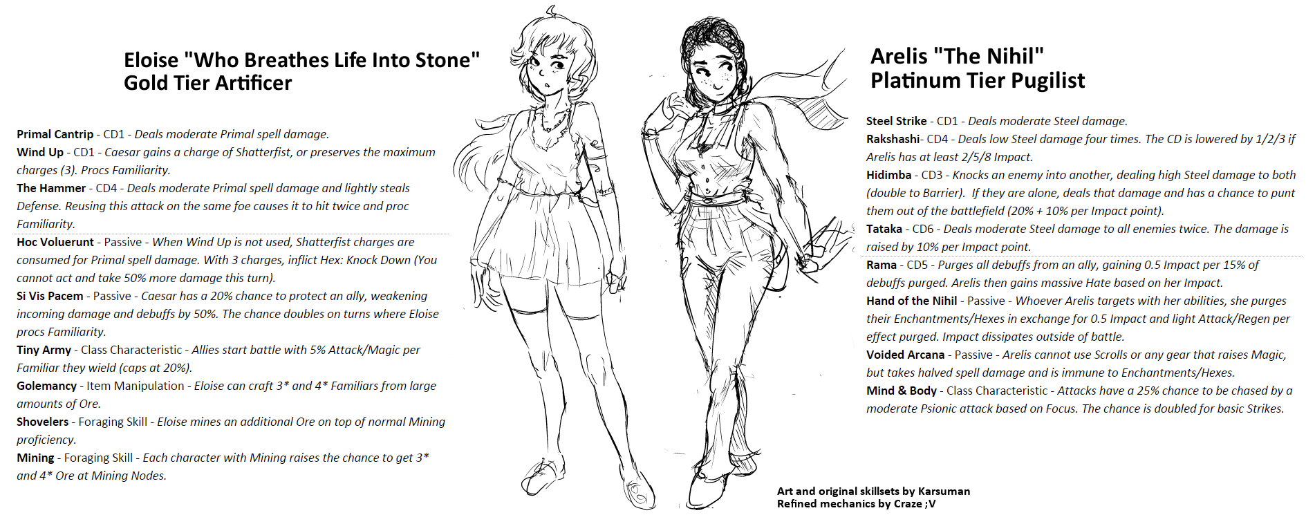 utVZj4G.png
 OverworldIconsRawr.png
 20160118_05050.png
 Eliciaattack3.gif
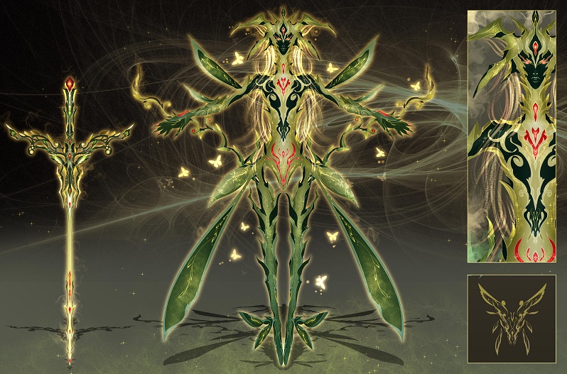 01_Fairy_Spirit.jpg
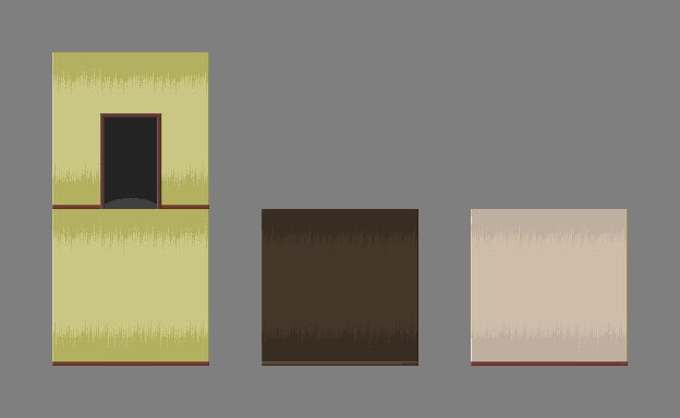 walls_and_door.png
 milla3.png
 milla_test.png
 milla_test_2.png
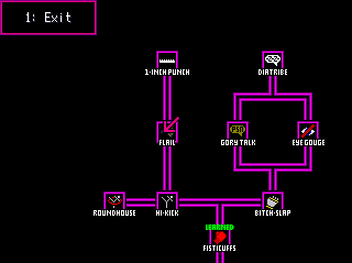
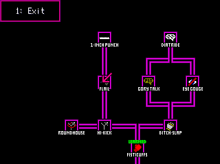 Skill_System.PNG
 High_Kick_Skill_Card.PNG
 One_Inch_Punch_Skill_Card.PNG
 minty.gif
 Battlers_1.png
 Ship_Bridge_WIP.png
 Ship_1.png
 Port_Town.png
 INTRO_03.PNG
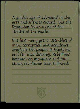 INTRO_04.PNG
 INTRO_05.PNG
 Screenshot_20160113_130013.png
 Screenshot_20160113_125854.png
 releasesomething1.png
 WeDroveThemOverTheCliffs.png
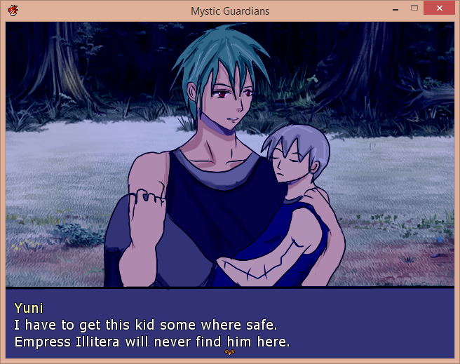 FirstScene.png
 Menu.png
 Untitled.png
 KILL_THE_CLOWN_Title_Screen_Concept_Art.png
 FaceSets.png
 Screenshot_1.png
 Screenshot_2.png
 map01a.png
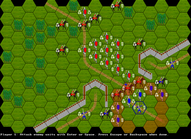 map06e.png
 map08a.png
 t2.png
 t4.png
 t5.png
 tactics1.png
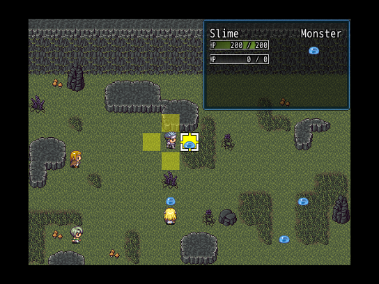 tactics2.png
 tactics3.png
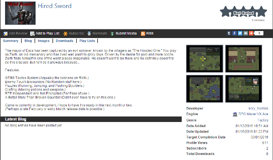 GamePage.png
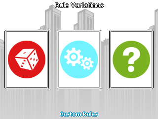 Rule_Variations.png
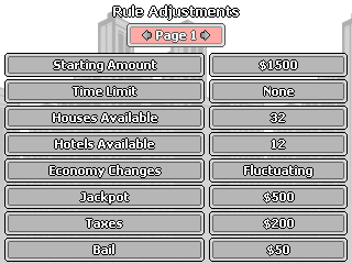 Rule_Adjustments.png
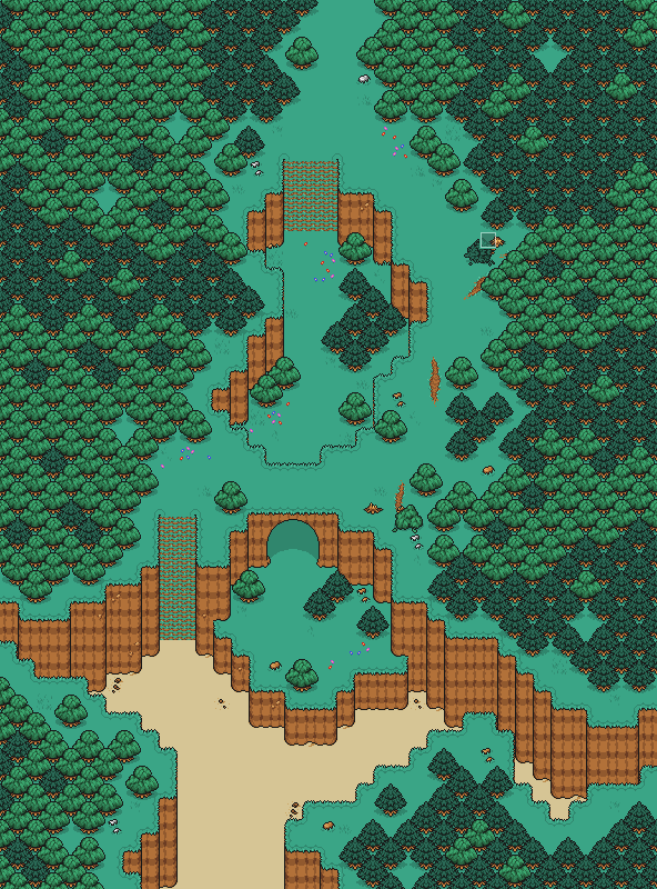 BeachWoods_2_Map.png
 CW_DevShot_8.png
 OWF_Sketch.png
 HolographicStnad.png
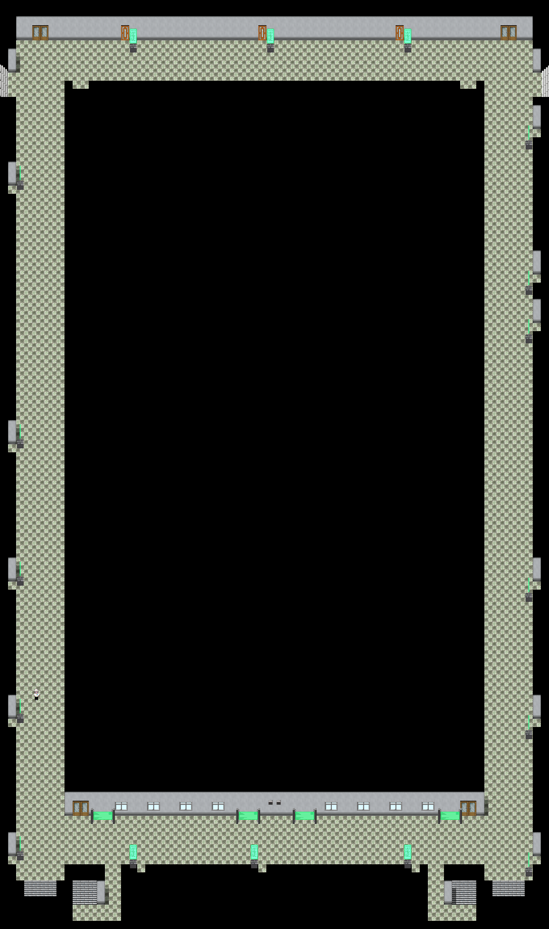 Map010.png
 Chaos.png
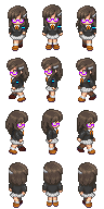 Kezia.png
 TheSerpent.png
 TheWeepingAngelEffectIsReal.png
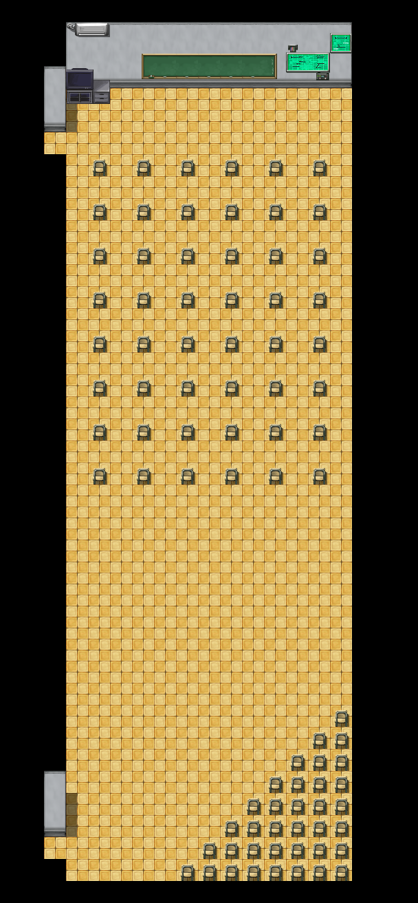 MMC_MultiMedia_Center.png
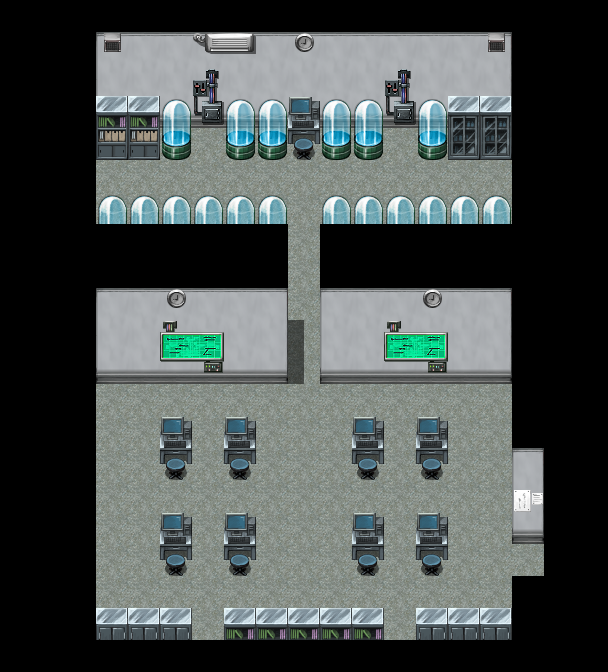 Tech_Room.png
 TRACE_System_1.png
 WhenTutorialsGoCanon.png
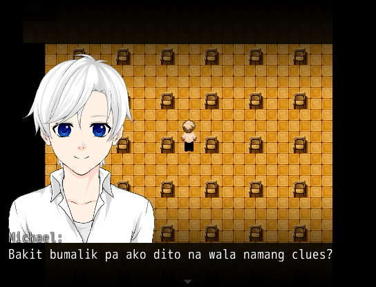 WhyDidIComeBackHereAgain.png
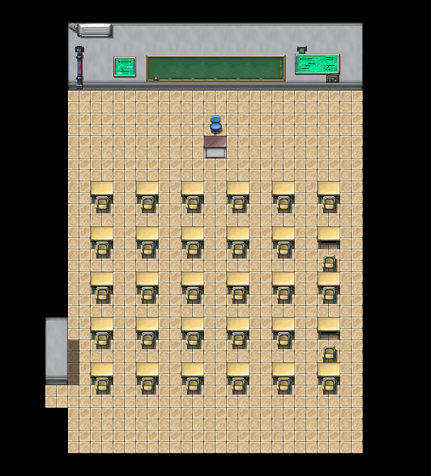 X__Xenarthra.png
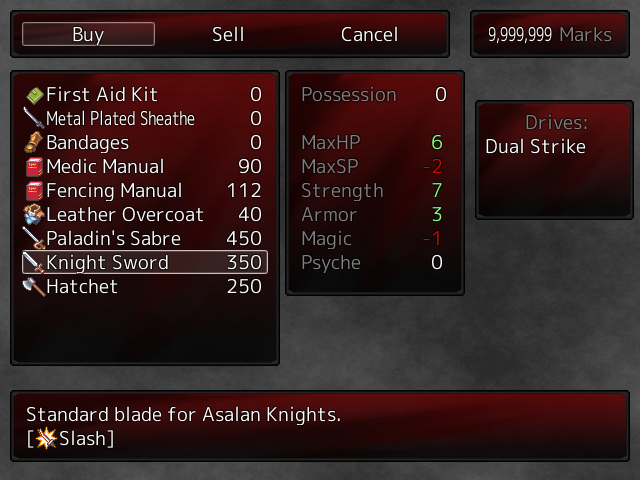 New_Shop_Menu_1.png
 Shop_Menu_tweaked.png
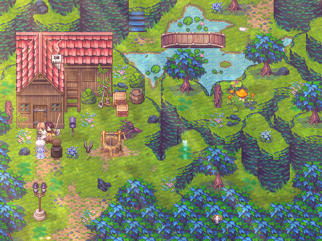 endhouse.PNG
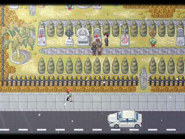 grave.PNG
 Blob2.gif
 Weird_And_Unfortunate_Battle_Animation1.png
 Weird_And_Unfortunate_Battle_Animation2.png
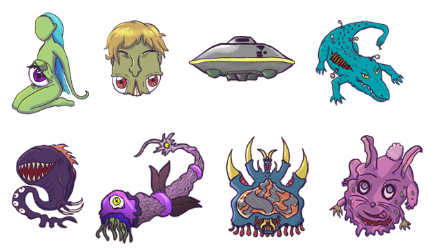 Weird_And_Unfortunate_Monsters.png
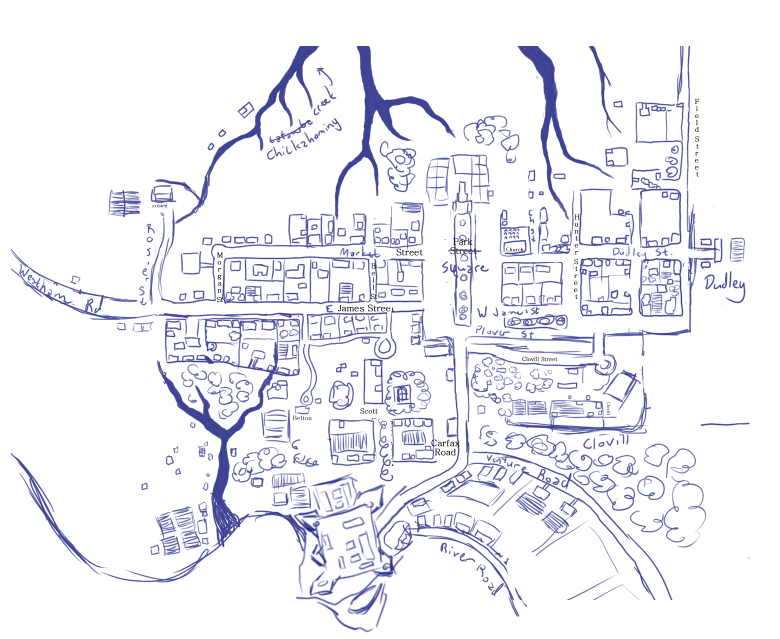 1760.jpg
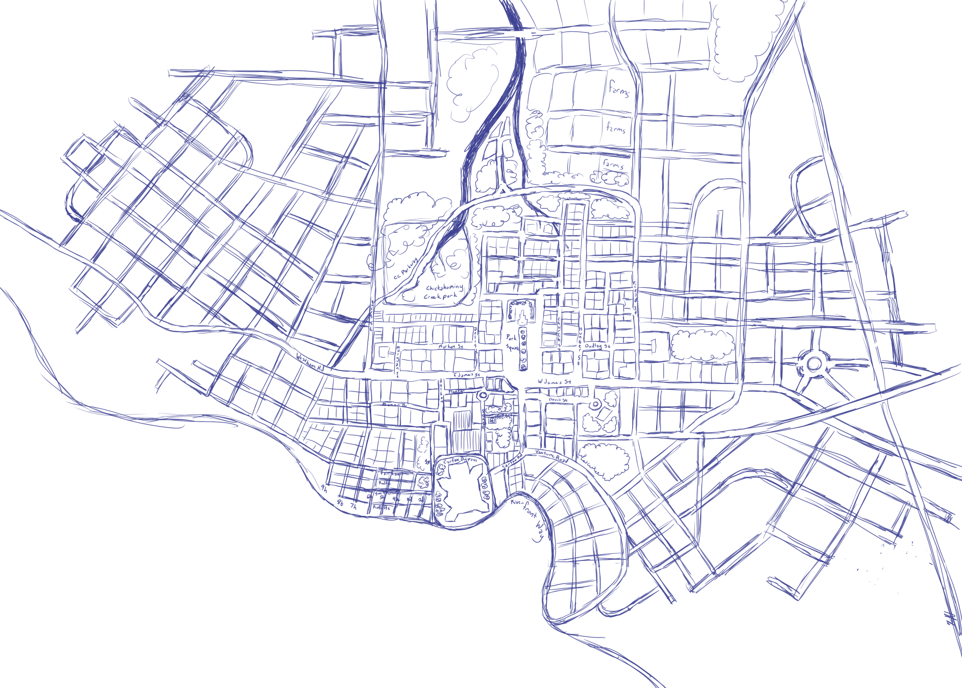 1947.jpg
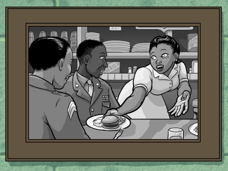 backgrounds.jpg
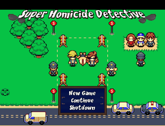 SuperHomicideDetectiveTitle.png
 SHDApartment.png
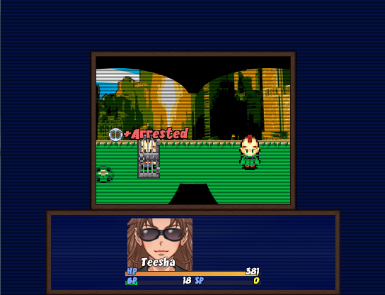 SHDBattleTest.png
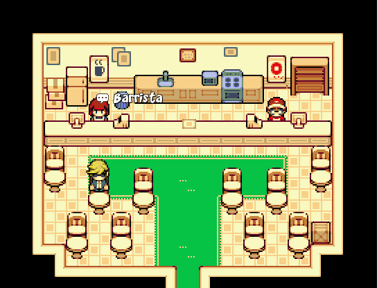 SHDCafery.png
 SHDCrimeScene.png
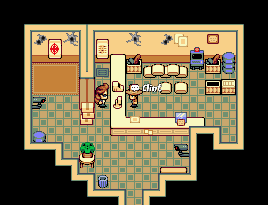 SHDGunnery.png
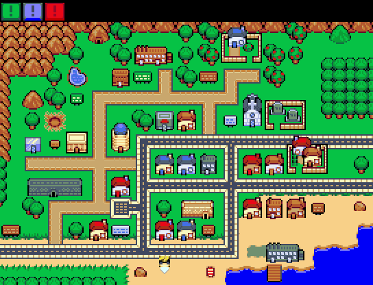 SHDMap.png
 SHDMorgue.png
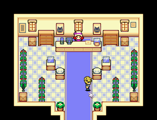 SHDOutfittery.png
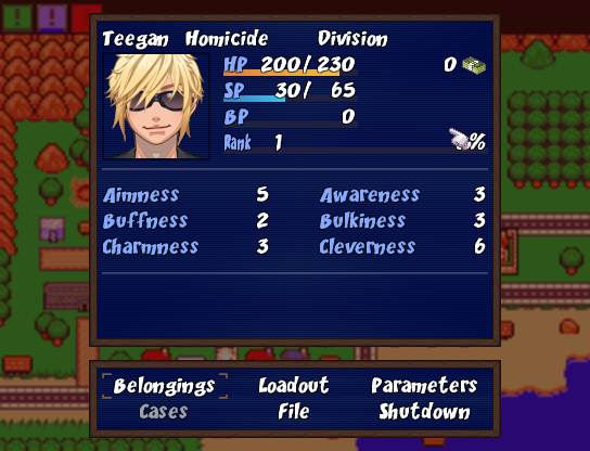 SHDStatusScreen.png
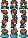 Issac_Swordsman.png
 SKETCHES_DREAMSCAPE_PHANTASM_COLLECTION.png
 Sketch_Collection_2.png
 Sketch_Collection_4b.png
 Buttheart2.png
 Critter_Sketch_Collection.png
 sketch_collection_3b_1.png
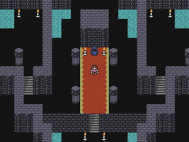 The_Keep.png
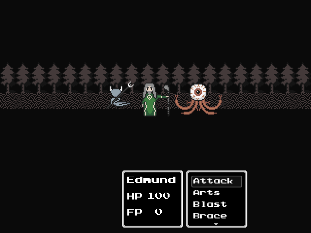 Battle_Layout_WIP.png
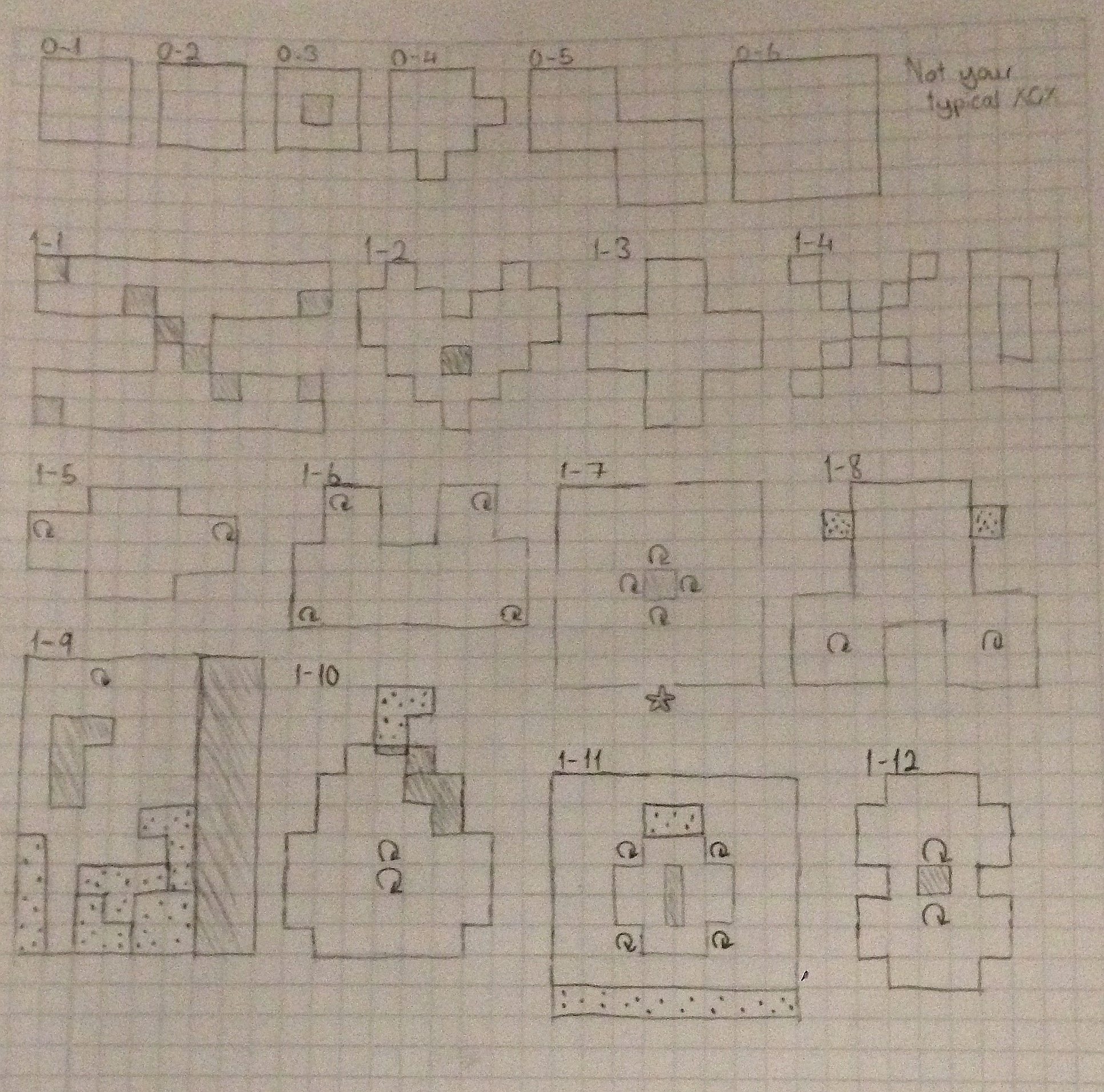 IMG_48771.JPG
 PowerUps.gif
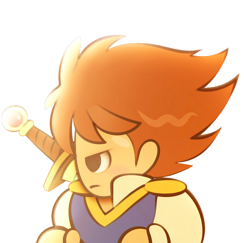
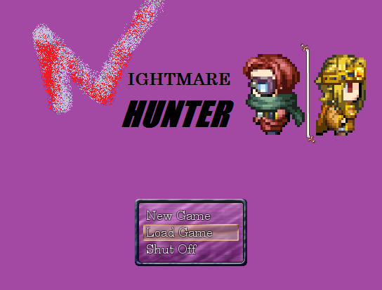 NightmareHunter_3.png
 NightmareHunter_4.png
 NightmareHunter_1.png
 NightmareHunter_2.png
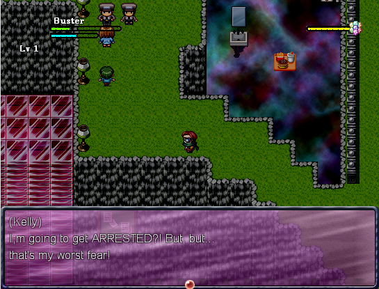 NightmareHunter_5.png
 Test2.gif
 DrAxton_Normal.png
 Sona_Normal.png
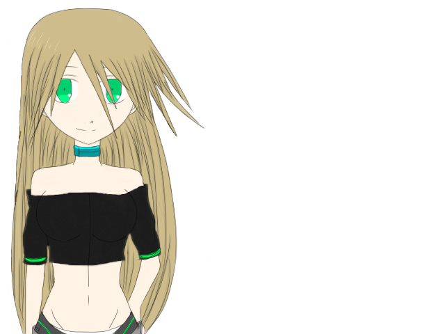 Echo_Normal.png
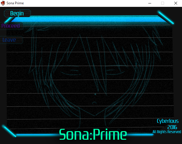 Title_Art.png
 Sona_Battler_1.png
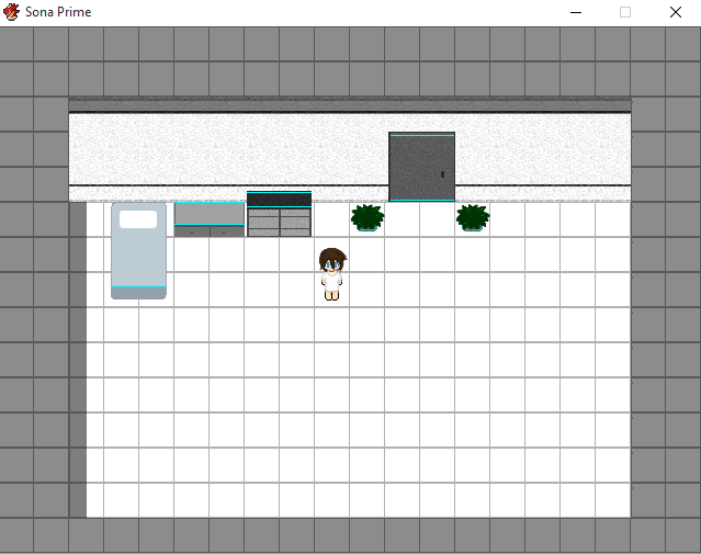 Screenshot01.png
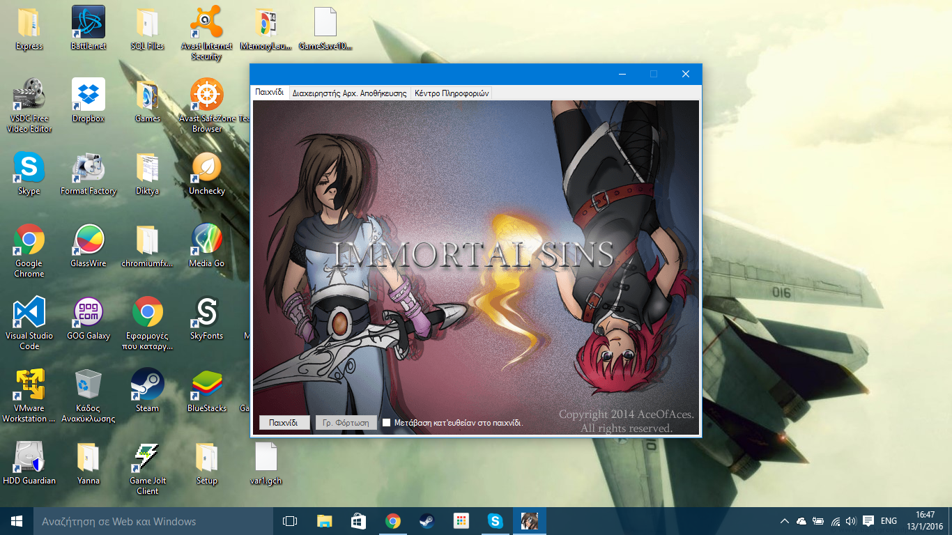 __38.png
 __39.png
 __40.png
 StealthSystem.png
 Rival.png
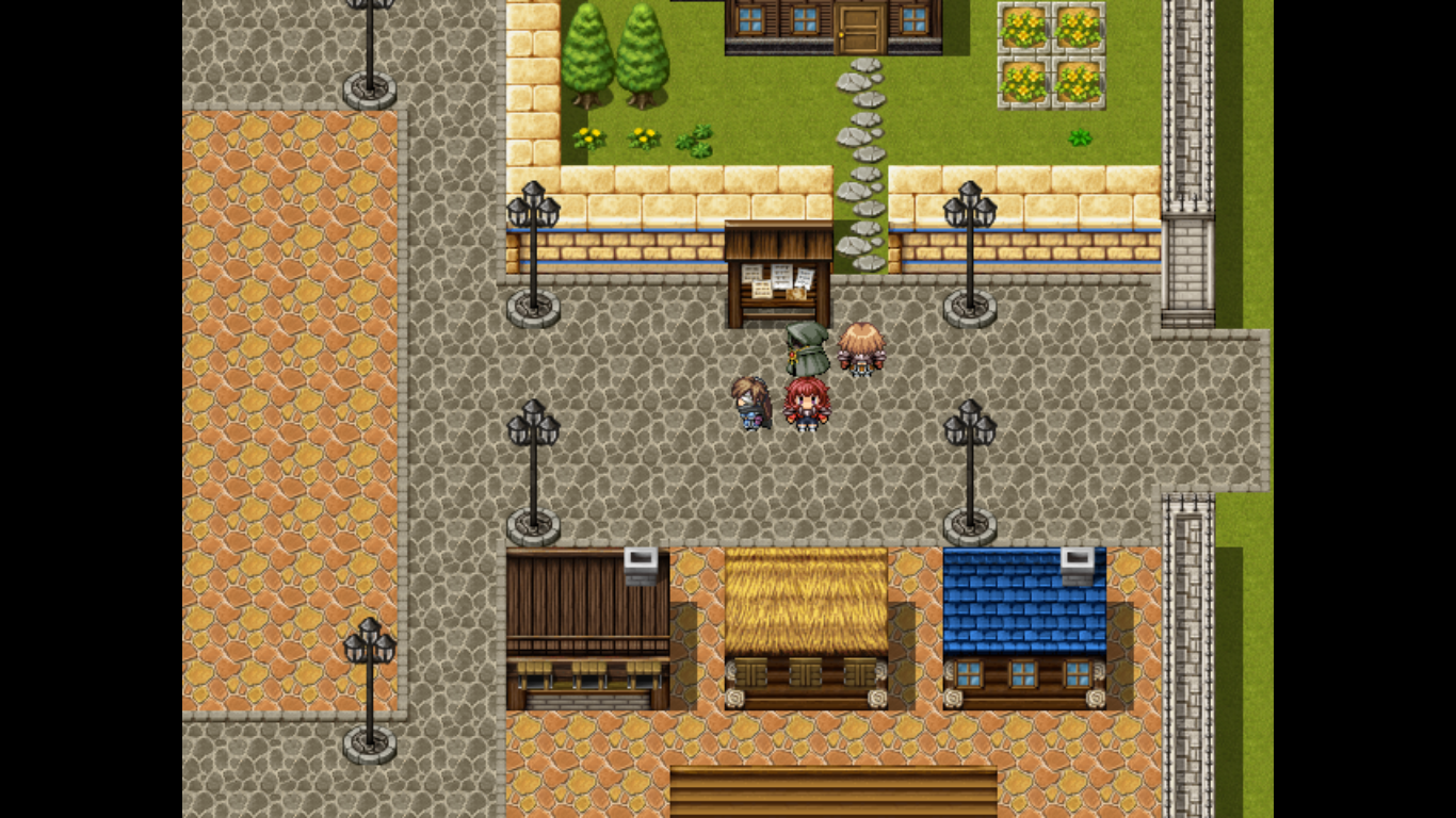 CeltiaInGame.png
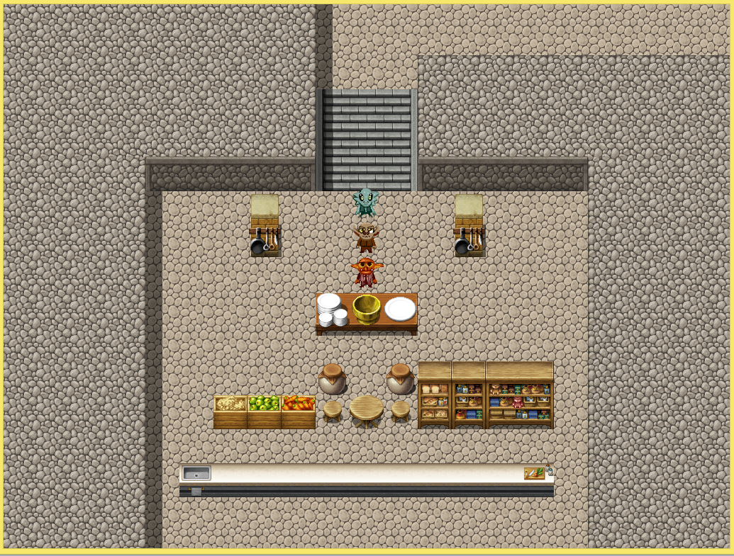 Cooking.PNG
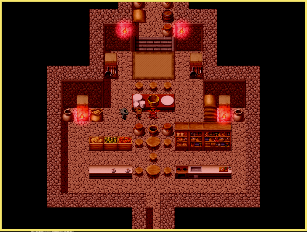 Cookingv14.PNG
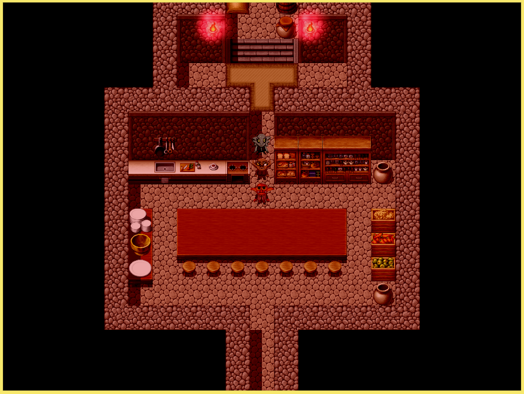 Cooking_v20.PNG
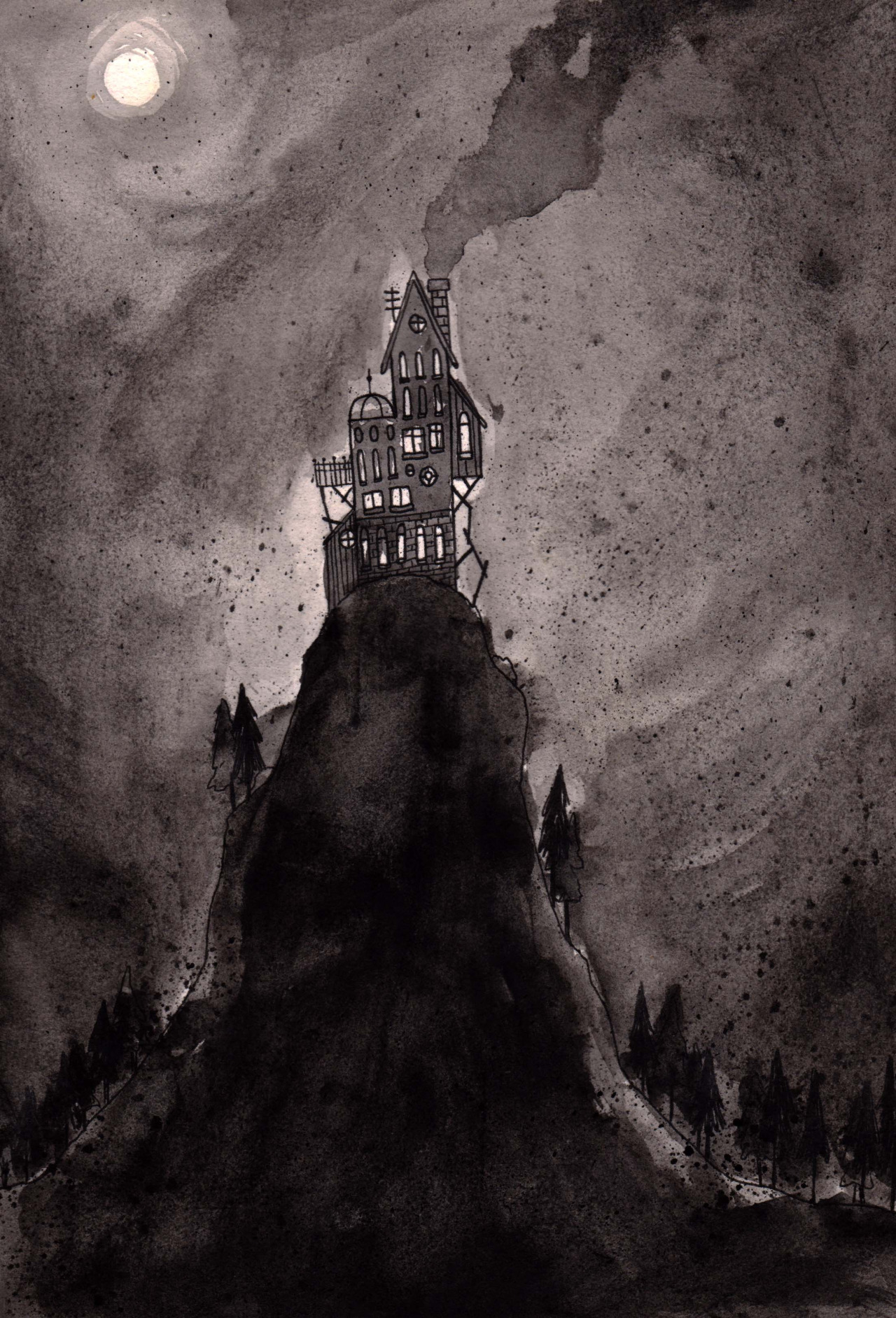 maison_dvasion.jpg
 attic.png
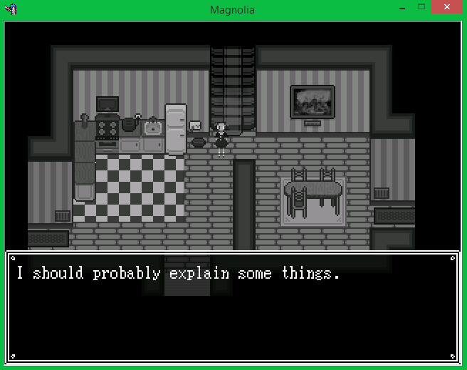 la_cuisine.png
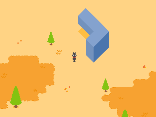 weird_geometry.png
 better_gemetry.png
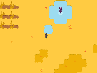 waterfields.png
 better_weird_geometry.png
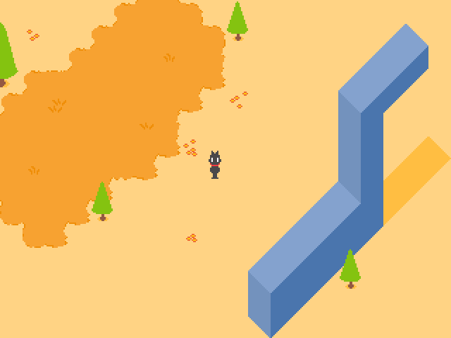 monument.png
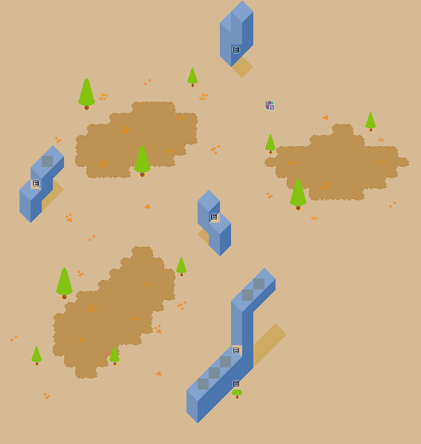 unfinished_map_layout.png
 title.png
 wordbubbl.gif
 starworld.gif
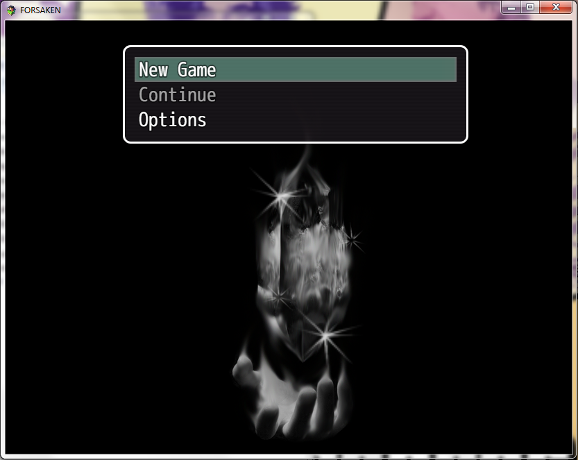 1.png
1.png 2.png
2.png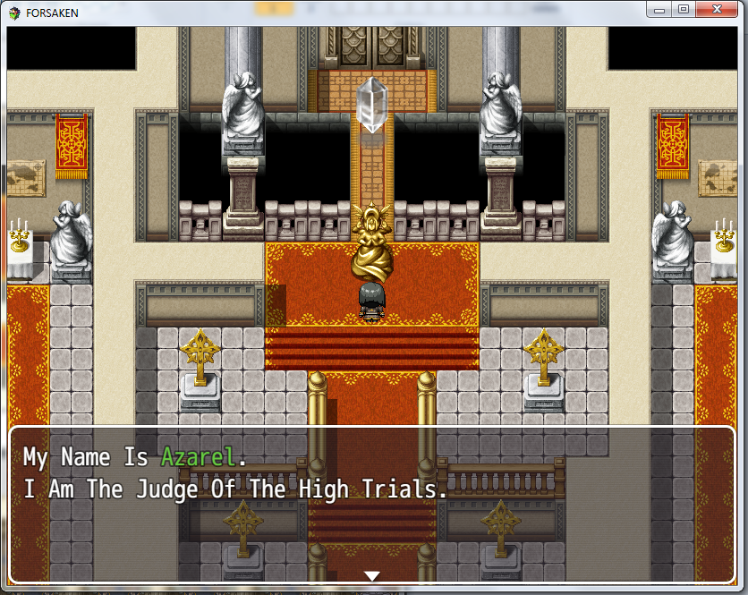 3.png
3.png 4.png
4.png 5.png
5.png J0e.png
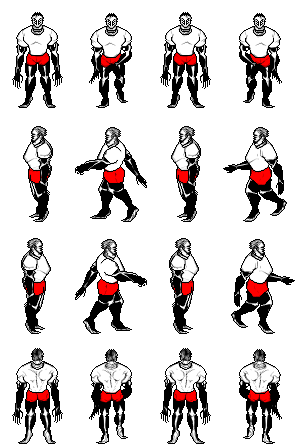 Coach_Imani.png
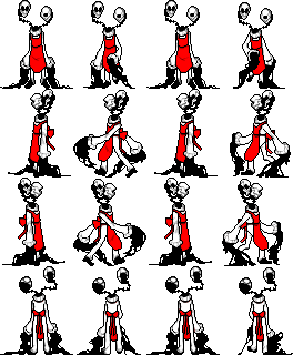 Art_Teachers_Kama_Ananta.png
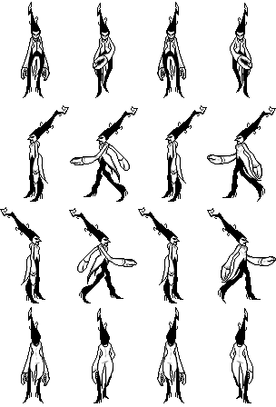 Music_Teacher_Amna.png
 clip0010.gif
 clip0003.gif


