SCREENSHOT SHOGUNATE
Posts

Rpgmaker VX, fun fun
Crap top of the page >_>
author=the_illusionist link=topic=1503.msg29668#msg29668 date=1220673038
I demand demo now XD
I submitted a game here with some details. That's the best I can do until I finish the battle system up which I think will take another couple of more weeks. If the battle is complete I think I have enough stuff for a demo but I kind of want to add more. I don't think there's a rush ;).
*sigh, you know you can just ask if you want it. Or you know, wait for my game to be released and you can take whatever you want.
*removes link
*removes link
Lol, sorry it's just that I just assumed that people usually want things when they ask that, it's a pretty redundant question to be honest.
Sorry if I may sound a little edgy, it's probably because my whole game is a mix of original and editted resources and being asked which one is and isn't is kind of tiresome.
Edit:
Yes.
Sorry if I may sound a little edgy, it's probably because my whole game is a mix of original and editted resources and being asked which one is and isn't is kind of tiresome.
Edit:
Yes.
author=jcavonpark link=topic=1503.msg28880#msg28880 date=1220227553I really like this.
author=Archeia_Nessiah link=topic=1503.msg29730#msg29730 date=1220697731
Rpgmaker VX, fun fun
Why "Start"? That sounds like a poorly localized SNES RPG. "Start New Game" or something to that effect is less ambiguous, doesn't make it sound like the game was badly translated, and (I'd assume) changing the text would require minimal effort.
What goes under "TIME"? It looks like the Lufia 2 menu where the party would be listed, but if they're the same height as the first character the time will appear on top of them. It isn't a huge issue but if you cut the labels (NAME and TIME) and put the name and time on the same line there won't be any overlap and I think it'll look better overal.
The cursor looks like it was given a simple x2 scale effect and it stands out in the higher res screen. An image editing program with teeth (not Paint, but Paint.NET can do it) can do some nice upscaling work so it doesn't look like a blown up graphic.
It's supposed to be a Lufia 2 knock off.
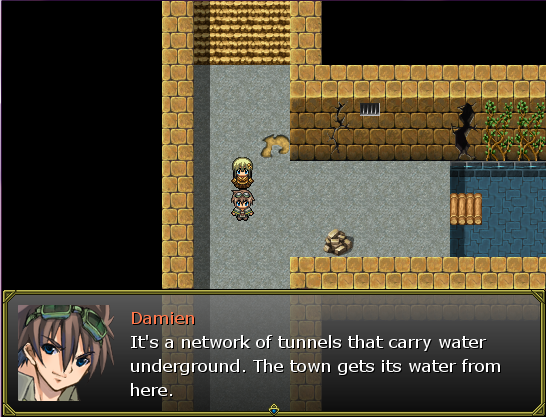
Immortal, I like your dungeon concept and esp. the graphics for your bespectacled protagonist. (They're not VX RTP, right?)
I feel that the dungeon itself could use some more garnish/clutter.
I feel that the dungeon itself could use some more garnish/clutter.
Uhh it's JPG, saved in paint for the hell of faster upload but it seems it disturbs the hell out of people. AND it's just start, I didn't know that's such a big problem :|
I'm modifying the script so the sprites would only show their heads since the sprites are huge.
I'll change that cursor as well.
I'm modifying the script so the sprites would only show their heads since the sprites are huge.
I'll change that cursor as well.
Nessiah, sorry for ignoring your post. I like the framework on that screen. The sprite looks lovely as well whether it's original or editted. I'm behind so I'm not entirely sure what your working on other then Sacred Moon. Are you working on Seraphim as all?
Anyways, Your blog looks pretty hot. It's a shame that there isn't much feedback there, which is pretty common with blogs :D.
Neok:
You've come back with something. I like the setup of the menu as well as the sprites. I would have to agree with Karsuman, it's a little rough on the eyes. I wouldn't mind either way though.
Hey my 10th post, awesome!


