


SCREENSHOT SHOGUNATE
Posts

author=Craze link=topic=1503.msg30931#msg30931 date=1221166653
Max.
Your game looks incredible.
Please make your battles somewhat balanced and not poopy.
I thought of you when I was making this game, Craze (cause of the RTP/humor and everything), so I'm glad you like it. : )
(The rest of this post is also about my game, not screenshots, so I decided the polite thing to do would be hide tag it. It is not very long though.)
My battles freaking own (I hope). The entire game is based on them so if any part is good they are. There's no dungeons, no quests, just a succession of battles.
They're really hard and require finesse. Unless you're an Evoker, in which case finesse is optional and BOLTS is mandatory, but being an Evoker is almost like playing on easy.
They're really hard and require finesse. Unless you're an Evoker, in which case finesse is optional and BOLTS is mandatory, but being an Evoker is almost like playing on easy.


I like that map Euphorian but I thought it was awfully grainy. I was fooling around with it in an editor and some how I got this.
I call it a VX/RM2k3 cross over then drive down the lane to finish off with a sweet lay up winning the game edit.
Swoooooooosh

I call it a VX/RM2k3 cross over then drive down the lane to finish off with a sweet lay up winning the game edit.
Swoooooooosh

author=Euphorian link=topic=1503.msg31018#msg31018 date=1221190562
Oh, wow, that's a pretty big improvement on the quality. What did you do to it, exactly?
I think he just added a VX sprite to it. Looks good though.


If that's a VX-converted chipset (like, you took the REFMAP one and converted it into RMVX), you are now my god, illusionist. :o

Honestly, I think it looks a lot worse. Part of the charm in Refmap is its simple textures, and you've made them nearly unrecognizable and senselessly blurred in your version, illusionist. Once you resize that to a playable resolution it's kind of hard to tolerate, as well. =/


RM2K3 runs at a 320x240 resolution, of course it would look bad.
You can't remove the "graininess" when you blow up a resolution like that. It isn't possible. Good try, though.
You can't remove the "graininess" when you blow up a resolution like that. It isn't possible. Good try, though.

Haha... all you have to do in order to "SWOOOOOSH" an rm2k3 screenshot like that is go into photoshop or psp, "smart size" it down to 50%, then smart size it again to 200%. Ta-da, instant blur effect.

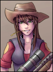
It is a VX charset. Its from the same site I got BotW's from. I'm actually using an color edit of that set in BotW.
It's *she by the way.
I've taken grainy tilesets and made them "non grainy" or similiar to what I've done here without leaving all the blur signatures. I was actually working at that size and didn't bother resizing. It's completely possible and that Blur filter isn't primarily the way to do it.
Immortal what are you talking about? It's just a simple VX charset edit and I'm pretty sure it's included in the rtp.
Edit:
Oh I see now Immortal, yeah.
I know, I was being somewhat sarcastic. Just sayin' to really accomplish getting rid of unwanted grains, apply blur or "smudge" effect in localized areas instead of the blur filter (which destroys the nice contrasting outlines of the 2k3 screen)

I know Feld, I acknowledge that it is blurry and what not. I also stated that isn't even the proper way to do it, it's just faster. Also to Myserguy you didn't even resize it properly. I'm not trying to make an argument out of this as I know that it was a shabby job to begin with (since I worked at the 320x240 size).
It still isn't great but here's how it really looks, I did no editing I just saved the background as a panorama and used it in rpg maker.

It still isn't great but here's how it really looks, I did no editing I just saved the background as a panorama and used it in rpg maker.

Looks kind of cluttered to me, it's pretty hard to see where I am and where I'm going. There is no question that the map is pretty well done, but if I was to play this game I would be lost and confused.

Huh? I agree that alot of pretty maps tend to get cluttered like you say, but this one's fine. The cliffs outline on where to go easily.


