


SCREENSHOT SURVIVAL 20XX
Posts


Corfaisus

"It's frustrating because - as much as Corf is otherwise an irredeemable person - his 2k/3 mapping is on point." ~ psy_wombats
7874
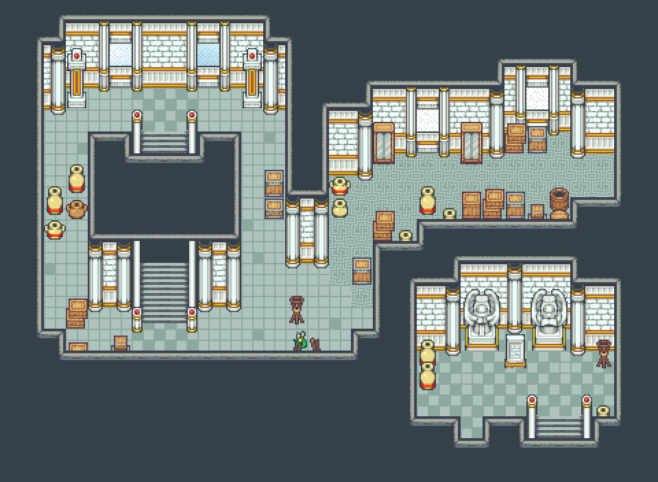
At first I was like "I really like the reflections in the tiling", but then I realized that they aren't proper reflections because you can see the tops of the reflected objects (such as the box and chair). Also the stand of the medical bag thing (I have no experience with such a thing so I don't know what they're called) should have its reflection moved up so that all four "feet" line up instead of just the front two lining up with the back two.

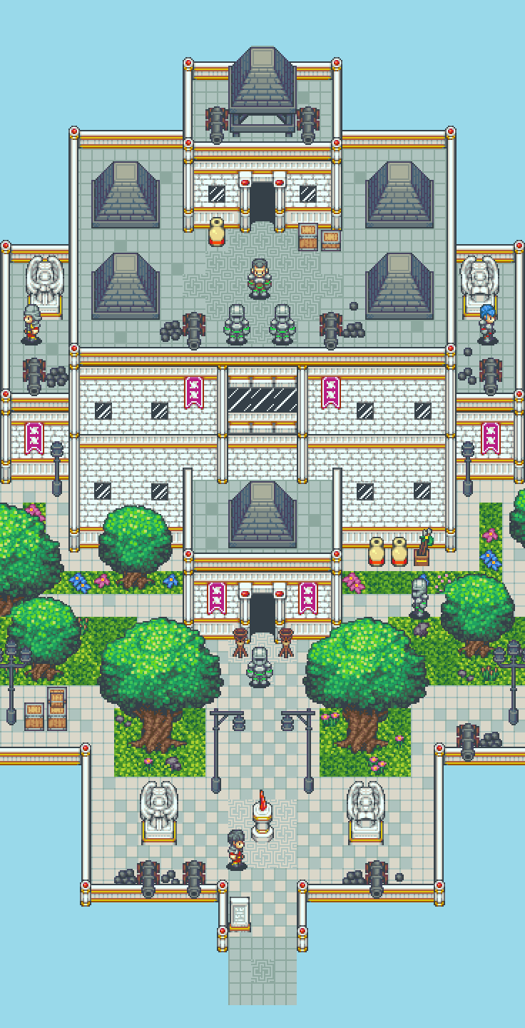
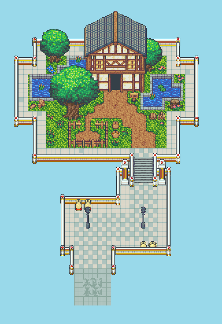
Understanding the cutscene nature of this place, I decided to scrap a labor-intensive idea and just made a representation of a courtyard with a grave in the middle. I got lazy, but at the same time, because I know what this place will ultimately be, I feel like I'm saving my effort for something important instead of polishing something that doesn't need to be polished.
Obviously I had to make a compromise with where the roof on the bottom of the screen would be in order for the player to see where they're going. Also, I may go back and add some small details, but this is largely complete.

@Corfaisus: That's a great use of the rtp. Looks lovely!
Built a map generator like last week or something, don't think I ever posted it here.
Here's an early progress gif:

Here's an almost finished version (I've added some more variation to the maps since this, but I'm too lazy to make a new gif):

Built a map generator like last week or something, don't think I ever posted it here.
Here's an early progress gif:
Here's an almost finished version (I've added some more variation to the maps since this, but I'm too lazy to make a new gif):


Momeka: Looking dope!
Corfaisus: Nice work, but I think reusing those cobblestone floor tiles as walls (at least, I think they're walls?) is more visually confusing than it needs to be.
Corfaisus: Nice work, but I think reusing those cobblestone floor tiles as walls (at least, I think they're walls?) is more visually confusing than it needs to be.

Those are not being used as walls... but it is visually confusing or else you wouldn't confuse them for walls. I had to look closely at it before I realized... the events helped.
Corfaisus
"It's frustrating because - as much as Corf is otherwise an irredeemable person - his 2k/3 mapping is on point." ~ psy_wombats
7874
Nah, the walls are mostly covered by the awning on the second floor. I was debating on retracting the awning one tile so that I could make the second floor look like the first, but I sort of started to like the perspective (how it becomes more visible the further the view is from the awning).


Corf is a fellow member of the RPG Maker 2k3 Brother/Sisterhood. Excellent work as always. You are a master of those tiles mah boi.
Some recent, decent works in progress....


Some recent, decent works in progress....

these are all so good decky
my favorite has to be the one with the single floating house. It makes me think of vaporwave in a way
my favorite has to be the one with the single floating house. It makes me think of vaporwave in a way
author=Frogge
these are all so good decky
my favorite has to be the one with the single floating house. It makes me think of vaporwave in a way
I would have replied with two words arranged in a very particular format but it would be considered a meme. Sad(ly). I'm not one of the boss Boys no more
thank yee

i'm having a lot of fun on this Swap In The Middle With You
lots of lovely lovely maps on this thread but especiallY MOMEKA !!!!!!!
WHAT.
IS.
THAT.
I LOVE YOU
lots of lovely lovely maps on this thread but especiallY MOMEKA !!!!!!!
WHAT.
IS.
THAT.
I LOVE YOU


author=StormCrow
Deckiller that's some gorgeous stuff, truly, especially that first volley.
Thanks m8 :)
love it very mucho and the color range is so comforting, though it's weird that the blacks of the sprite are lighter and colder than the blacks on the tileset
but yeah time fantasy is color-wise rather hard to work with ovurall i luv it
but yeah time fantasy is color-wise rather hard to work with ovurall i luv it

@Corfu:
I like the composition, but it seems like you used every visually noisy tile you had at your disposal. I know it's not RTP-kosher, but some darker versions of the same tiles or shadow charsets would help show depth and remove some of the aforecomplained height confusion.
@Momeka:
So awesome. Every time I see screenshots it looks better and better!
@da killer:
I'm usually not a fan of Time Fantasy, but those are some really nice looking areas! I'm a sucker for mysterious stacks of crates in caves, I can't not like them.
author=Kaempfer
@Corfu:
I like the composition, but it seems like you used every visually noisy tile you had at your disposal. I know it's not RTP-kosher, but some darker versions of the same tiles or shadow charsets would help show depth and remove some of the aforecomplained height confusion.
@Momeka:
So awesome. Every time I see screenshots it looks better and better!
@da killer:
I'm usually not a fan of Time Fantasy, but those are some really nice looking areas! I'm a sucker for mysterious stacks of crates in caves, I can't not like them.
there's a mineshaft further in and you have to do some stuff related to blowing up an unfinished mineshaft
also thanks :D

