


SCREENSHOT SURVIVAL 20XX
Posts

@infinite
Yeah I was thinking about a POOF or something. A pose would be fun, but seeing how toggling characters is going to be a big part of gameplay and navigating the maps and dungeons I need the switch to be fluid fast.
@Pizza - finally made the jump out of rm2k. Got a guy who is using something called Godot (i think it's comparable to Unity). It's nice because I can finally focus fully on art and assets while he makes everything work.

Dookie
@Pizza - finally made the jump out of rm2k. Got a guy who is using something called Godot (i think it's comparable to Unity). It's nice because I can finally focus fully on art and assets while he makes everything work.
Fuck man, nice. I hope to achieve a similar position once me and my friend get everything settled out and set up for "studio" work in the future. Nice to know things are working out for you and Trash Game.

author=Punkitt
Yep! And thank you! Manta ray sounds fun, I'll see where that goes!
You're welcome, and yay!
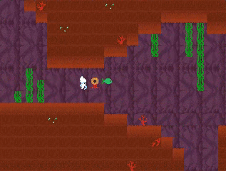
Working on my newest project and it's something I've wanted to do since working with 2k3, even have an old project that this is getting loosely based off of. Things are going great! Number 1 is usually visuals for me and since I have those High Fantasy resources packs and haven't really done any real development with them it finally dawned on me to mix those with the Mythos resource packs to make a post apocalyptic fallout inspired game!
Here is some rough beginnings for the game:


Pretty happy with how everything is turning out so far and excited to work on something again. I'm sure things will change but I am aiming to keep things basic and within my range. So for the most part basic battle system and not many feature scripts but it will have heavy emphasis on survival!
@Infection Files
Shoot, the photo graphics make some really interesting visuals. I'll keep my eye on this one!
@Dookie
Goodness, I love the way everything looks. Simply fantastic.
If you want to imply its confetti, then I'd suggest making it 'floatier.' Like, say, have it kind of explode upwards from the top of the character and then descend. Still a cool effect you've got already, though.
Working on fishy village stuff. I'm gonna move some spots closer together. Currently going for a Cave Story-sorta feel.
(oh god that red fish. that's the .gif compression, not what he actually looks like in game!!)
punkitt & dookie, you're making really cool stuff. Personality blinds me! Punkitt that game of yours reminds me of an old rm2k game where you flew around in side-view perspective as a demon with a gun Kid Icarus style. (sorry can't remember the name)
InfectionFiles, your game looks exactly the kind of game I always wanted to make. graphics give nostalgia vibes. Make sure you make survival absolutely ruthless!
InfectionFiles, your game looks exactly the kind of game I always wanted to make. graphics give nostalgia vibes. Make sure you make survival absolutely ruthless!


@InfectionFiles: Those are some huge-ass rats, dawg! xD Looking good and a bit nostalgic for some reason.
@Punkitt- Thank you! Hopefully I'll have a gamepage up some time soon :)
edit: again, super cute! I like underwater levels and an entire game of it? yes please! Even though sometimes I feel claustrophobic in game lol
@orange~ It's something I've always wanted to do to! I think that's why progress is going smoothly because it's a project I've been dwelling on for years
And don't you worry, the survival is going to be absolutely ruthless!
@lord luiishu- They are in fact, giant rats! :P and to comment on both you and orange~ about the nostalgic vibes, that's awesome it's coming off that way!
I'm aiming for the oldschool Fallout 1 & 2/Neverwinter Nights/Icewind dale era of games with dark gritty environments. I have dreams of adding some cool stuff but I am going to keep it simple for now. :)

Finally have my storage system and inventory working together as one! Whoo!
Still a million placeholders, but functionality!
As far as placement of the inventory boxes and the dialogue and the clock and all of this stuff, does it look like a good UI setup? There's still a lot of tweaking, but as far as major placement of general windows...?
Still a million placeholders, but functionality!
As far as placement of the inventory boxes and the dialogue and the clock and all of this stuff, does it look like a good UI setup? There's still a lot of tweaking, but as far as major placement of general windows...?


Maybe you could move the Fridge over a bit and put the categories down the left-hand side of it so that they're attached to the actual system they're sorting?
You mean push it to the right? I was wondering about the gap between storages, and whether the gap is too big or too small.
The "Category" stuff (and everything attached to the item description) is actually a Details section connected to each individual item. Those little stamp images change depending on the item you're selecting. Right now the images aren't perfectly aligned to the item. That's why this juice is a weapon type. XD
The "Category" stuff (and everything attached to the item description) is actually a Details section connected to each individual item. Those little stamp images change depending on the item you're selecting. Right now the images aren't perfectly aligned to the item. That's why this juice is a weapon type. XD
Ah, that makes some sense. It does feel a little removed from the description, though - probably because the description box has the header line and then it suddenly cuts off. The window with NUS... could you put the same design in the header line behind instead of the orange? It might help it seem a bit more connected to each other. As it stands they feel a bit like they're supposed to be about separate things than the same item.
How about something like this, but with a longer message box?

EDIT:
Or this?

How about something like this, but with a longer message box?
EDIT:
Or this?
I really like that format, Lib! Thanks a lot! I may have to use it once I finalize how many stamp details there will be (could be less). I like how it makes them seem more connected. Thanks!

@Punkitt please continue to do my life work for me I appreciate it.
Puppy archaeologist stuff!!!!


The fossil is NOT a POOP! Looking back at it after posting it on twitter though I see where people were coming from.
Puppy archaeologist stuff!!!!
The fossil is NOT a POOP! Looking back at it after posting it on twitter though I see where people were coming from.
I think I like the first one best, but the second goes better with the style of the fossil (black lines inside the lines).
author=Liberty
I think I like the first one best, but the second goes better with the style of the fossil (black lines inside the lines).
thank you libby! may just remove the outline on the neck and keep the tail black line on the second one

the fossil no longer looks like poop!
Still kinda looks like poop, but definitely better!
I think it's unavoidable with the shape and swirl you're using xD
I think it's unavoidable with the shape and swirl you're using xD
If you want it to not look like a pile of feces, then make the stone it's sitting on more square. Also, try removing the black outline where the Ammonite touches the rock, since fossils blend into the rock they're encased in.
The shadow colours you're using are too dark, by the way. They blend too well with the outlines.
The shadow colours you're using are too dark, by the way. They blend too well with the outlines.
Corfaisus

"It's frustrating because - as much as Corf is otherwise an irredeemable person - his 2k/3 mapping is on point." ~ psy_wombats
7874

Just a little experiment here. If rooms could talk (going off of what's displayed here), what do you think this one would say?

