


SCREENSHOT SURVIVAL 20XX
Posts

author=Liberty
You need to move the bookshelf down one, it's currently floating on the wall.
Was just about to point that out.
Also, the stairs look a little too narrow to me?

Well, I know there's enough for 5 events (Akyuu's is coming from the north room from the entrance, the other 4 are from the entrance itself), I was just wondering about additional others. I also don't know what I might do in the cutscene itself so there's that. I can always make adjustments to the scene if need be hue.
Whoops! So it is. Got any suggestions/ideas for tiles for the chipset to make the area/dungeon pop out real good? Any ideas on the gimmick to open the door on the 2nd floor? I ORIGINALLY thought of having a 3rd floor as well but don't know if I will or not...
As for the stairs, that's how they are on that tileset. Can't really widen them. I MAY have used different stairs in the Poltergeist Mansion though, so I could look into those stairs if need be.
author=Xenomic
As for the stairs, that's how they are on that tileset. Can't really widen them. I MAY have used different stairs in the Poltergeist Mansion though, so I could look into those stairs if need be.
Sure you can, I see the center sprite right next to it.
OH! Hurrr...I didn't even realize that was there lol.
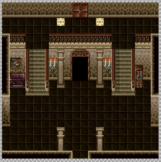
Thank you for pointing that out, I would've had a stairway that wouldn't work right otherwise. ^^;; Although I think MAYBE the door north of the entrance is one tile too big??
Thank you for pointing that out, I would've had a stairway that wouldn't work right otherwise. ^^;; Although I think MAYBE the door north of the entrance is one tile too big??

remember to connect the stair rail to the rail at the top ledge
you could try something like a floor mosaic that looks like a magician's circle
statues or gargoyles(that maybe come to life and attack)
skeletons on display, find the missing parts as a gimmick
weird looking plants, like different colors, glowing, or growing some sort of fruit
moat full of dangerous things
magician's robes hanging up
shelf or table full of colorful potions, maybe double the width of the cabinet


Not sure that steam pipes would be so pristine or shiny. Seeing that they have a hole in the side, there'd be rust build-up. Also, that green thing has a very weird perspective considering it's width and the way it's floating on the wall (and how the inner shadow isn't the same as the top of it, size- or shape-wise). Really, try grunging it up more. Add dirt stains, grit, cracks in the walls and floor, moss in big clumps on the walls, algae... maybe tip that tv on the side so it's corner down, and add a crack to the screen so you can see it's broken. Just... it's way too clean. How about gunk in the open-mouthed pipes (and shadows under then since they jut out), rust on the bars and ladder... all kinds of stuff like that.
Maybe take a look at some sewer levels from other games - TMNT games or Chrono Trigger have some good ones, but just checking out reference pics should help too.
Maybe take a look at some sewer levels from other games - TMNT games or Chrono Trigger have some good ones, but just checking out reference pics should help too.

Details aren't the real problem. You should break it both horizontally and vertically. Vertical is acceptable as it is, sure it would do with some extra overlapping. The strangest is the floor. It's a mile long pavement from Holland. You should add some bridge, a stream of acid can cross it, or some stairs, so distance from water differs.
All right peoples, I need your opinion. I'm really torn between two different styles of graphics I've been working on in my game.
The game is the same, and most of the assets have been designed using the game boy palette. However I got in the mood to experiment with more color, and so I made a mock up of one of the levels in color. Let me know which one you all prefer.
These first two are in four colors: black, white, and two shades of gray. I took the gameboy palette and made all of the assets with those 4 colors. Right now the characters, objects and environment are all crafted in these colors, including the protagonist you can see in one screen (one standing, one mid-fall). The style itself uses a bit of dithering for shades.


This last one is the same level, but in color. There's no protagonist in this final picture, because I haven't created him in color yet. This modern style does not use dithering, but uses different clusters of color instead.

Let me know which one you all prefer.
The game is the same, and most of the assets have been designed using the game boy palette. However I got in the mood to experiment with more color, and so I made a mock up of one of the levels in color. Let me know which one you all prefer.
These first two are in four colors: black, white, and two shades of gray. I took the gameboy palette and made all of the assets with those 4 colors. Right now the characters, objects and environment are all crafted in these colors, including the protagonist you can see in one screen (one standing, one mid-fall). The style itself uses a bit of dithering for shades.
This last one is the same level, but in color. There's no protagonist in this final picture, because I haven't created him in color yet. This modern style does not use dithering, but uses different clusters of color instead.
Let me know which one you all prefer.
Thanks for the feedback all, some very good ideas. I was about to implement some of them only to realize I had saved my graphic file as a .png without saving the original digital one, therefore losing all my layers.
I'll add them in my next screen however!
EDIT: Nevermind! I managed to work something out. New screen on its way folks!
Who could this refer to I wonder???

I'll add them in my next screen however!
EDIT: Nevermind! I managed to work something out. New screen on its way folks!
Who could this refer to I wonder???


@Gredge:
I have a soft spot for Game Boy graphics, but I think the NES palette might suit the idea a bit better. The different colours are much more readily identifiable, and so if the tiles have any sort of inherent characteristics then you want that obvious colour.
@Dookie:
I give both Dustin Binsley's house and his name 10/10.

@Caladium and Kaempfer: Thank you for your inputs! I've been working with a lot more colors and palette styles now. I do enjoy dithering quite a bit, but the colors have given me a lot more variety to work with.
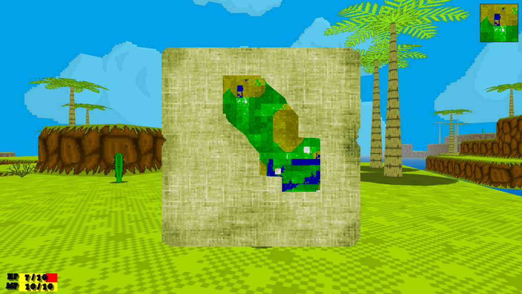
@grindalf: This is looking good. I'm excited to see where this project goes. Do the darker shades of green depict elevation changes?
@grindalf: This is looking good. I'm excited to see where this project goes. Do the darker shades of green depict elevation changes?
@Dokie, Binslayin masterpiece!
@Grindalf looks interesting. I would prefer a drawn map (without hic sunt leones) with this hold-in-hand style.
@Grindalf looks interesting. I would prefer a drawn map (without hic sunt leones) with this hold-in-hand style.
@Gredge109 thanks and yes the darker the color the lower the terrain.
@Cap_H me to, but its a randomly generated world so nothing can be premade. each pixel represents a single in world tile so I don't have much to play around with there. And I'm sorry but I don't know what hic sunt leones refers to
@Cap_H me to, but its a randomly generated world so nothing can be premade. each pixel represents a single in world tile so I don't have much to play around with there. And I'm sorry but I don't know what hic sunt leones refers to


This is my first (serious) VX ACE project after using 2k/3 for so long. I finally managed to get the pixel fonts working after a pretty tedious process... Now I just gotta figure out how to remove the opacity in the message box. Can anyone help me with that?


