


SCREENSHOT SURVIVAL 20XX
Posts


Well, that's looking amazing Sgt
The shadows were actually on the table for debate as I was making this so I'm glad I'm getting feedback on that.

Hey all! New to these forums =p Lotta great stuff in here, I really like the screenshots I've seen so far. Lot of custom graphics too! Seems like that's popular around here. I'm not a pixel artist myself so I use RTP and edits but I like to make the most out of it to give it my own style. I recently made this map as an introductory scene for my game but I liked it so much I decided to make it the actual titlescreen.
(Click the thumbnail to see full image)

Hope you like it! Let me know what you guys think =) I'm open to all kind of feedback.
Cheers
(Click the thumbnail to see full image)
Hope you like it! Let me know what you guys think =) I'm open to all kind of feedback.
Cheers

Good atmosphere.
What you did with the letters is a nice touch, perhaps with both that and the clock graphic it is becoming redundant
You might take some more screenshots and use one without the rainfall line up against the words since it looks like a / next to (un blues
What you did with the letters is a nice touch, perhaps with both that and the clock graphic it is becoming redundant
You might take some more screenshots and use one without the rainfall line up against the words since it looks like a / next to (un blues

I think there's a good looking map there, but it's covered in so many layers it's hard to see. The scene would keep the mood even if the effects were like 2-3x more subtle.
Also, the height of the bridge seems off. It looks like it's raised 1 tile above the height of the water, but the water and ground are on the height.
Also, the height of the bridge seems off. It looks like it's raised 1 tile above the height of the water, but the water and ground are on the height.

Just working on the next area for my game. I am really bad at mapping deserty-canyony types. So any and all feedback is greatly appreciated.
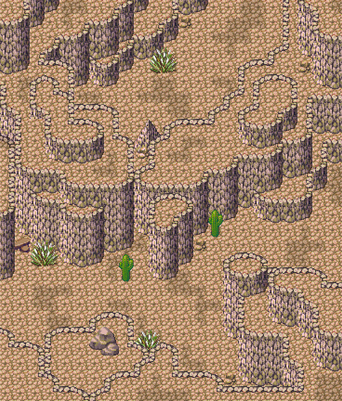
It's worth noting that I am trying to adhere to a map already used in SaGa Frontier 2 in lieu of the limitations of RM2K3.
It's worth noting that I am trying to adhere to a map already used in SaGa Frontier 2 in lieu of the limitations of RM2K3.


@Pyramid_Head:
That's looking pretty canyony, I'd say! My one suggestion would be to only use the darker dirt in the bottoms of the canyons and to use more of it. It'll give the map a more obvious contrast between bits you can traverse and bits that are there as walls. Right now, because both the depths and the heights use the same ground tile and the ground tile is very similar to the wall tile in colouration, it ends up being a little difficult to tell at a glance which is which. I'm sure it'd be clearer in game, but you want to guide the eye a bit more (sort of how you have the plants only in the valleys: smart).
That's looking pretty canyony, I'd say! My one suggestion would be to only use the darker dirt in the bottoms of the canyons and to use more of it. It'll give the map a more obvious contrast between bits you can traverse and bits that are there as walls. Right now, because both the depths and the heights use the same ground tile and the ground tile is very similar to the wall tile in colouration, it ends up being a little difficult to tell at a glance which is which. I'm sure it'd be clearer in game, but you want to guide the eye a bit more (sort of how you have the plants only in the valleys: smart).
I'll give that a try, thanks for the advice.
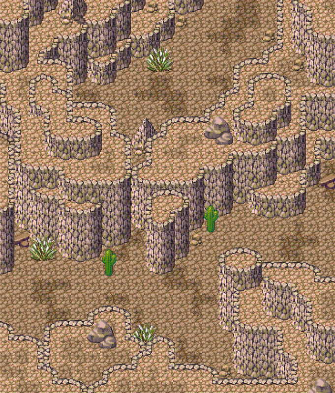
Was this more what I should be going for? With darker tiles on the floor and lighter tiles for the more elevated parts?
Was this more what I should be going for? With darker tiles on the floor and lighter tiles for the more elevated parts?

More of a feedback question then a showcase of new content - but!
Have any of you had the experience of taking an old game, and substantially revamping its visuals/remaking maps etc?
I'm in the odd situation now, of having to take maps I designed more than 5 years ago, and make them feel consistent/harmonious with the newer content in my project. There's a bit of a gap in quality, though. XD
I used to appreciate the vibrant palette back in 2009, but now I worry it looks too...garish? Not necessarily the mapping itself, but the color palette and the choice of tiles.

Is it worth taking older maps like these, and swapping/editing most of the textures or colors to achieve an effect closer to the screenshots below? Even if it added another 1-3 months of development time?


Have any of you had the experience of taking an old game, and substantially revamping its visuals/remaking maps etc?
I'm in the odd situation now, of having to take maps I designed more than 5 years ago, and make them feel consistent/harmonious with the newer content in my project. There's a bit of a gap in quality, though. XD
I used to appreciate the vibrant palette back in 2009, but now I worry it looks too...garish? Not necessarily the mapping itself, but the color palette and the choice of tiles.
Is it worth taking older maps like these, and swapping/editing most of the textures or colors to achieve an effect closer to the screenshots below? Even if it added another 1-3 months of development time?

The graphics do look a bit dissimilar in style when they're compared like this. You seem very dedicated about BR, so if the game means a lot to you, I say go for it! You've been working on the game for a few years IIRC. Two months are nothing in the long run. ;)
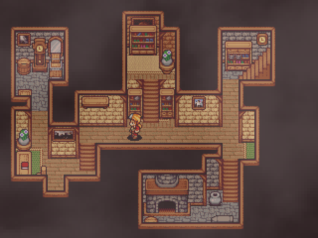
I've been playing around with the Time Fantasy graphics lately.
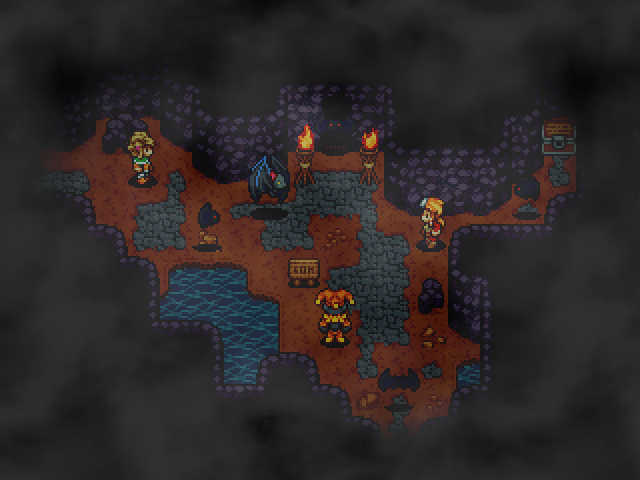
I really love these retro graphics.
I've been playing around with the Time Fantasy graphics lately.
I really love these retro graphics.
@Pyramid_Head:
Yeah, I like that a lot better! You could also maybe fool around with the colours of the cliff face a bit, but if you don't find anything you like they already make sense. It might be a good exercise, though, just to see if anything jumps out at you.
@Blimmins:
No. The earlier palettes are obviously different when you hold them up against one another, but that doesn't really ever happen in game. Also, the areas near the beginning are meant to feel more upbeat, so the more vibrant colours make more sense. The most I'd suggest is to just do quick palette swaps with some of the hues from the newer graphics (although I really think they look great already and this is unnecessary!), but even that seems like too much. Again, the effect is only noticeable when you hold them up next to eachother. In game, the palette slowly gets darker as the storyline progresses, which is perfectly fitting.
@Luiishu:
Those are some pretty pixels! But why hide them under such powerful overlays? They'd be so beautiful on their own <3
@charblar:
I watched too many cycles of blinks. Very relaxing.

@Blindmind. I would absolutely edit that color palette. Looks like two complete different games as such. Also worth noting those pine trees in the last screen are attractive, but don't really match the trees in the other shot. You might consider tweaking the pines "leaves" to emulate the other tree a bit more. Just my two cents. :)

