


SCREENSHOT SURVIVAL 20XX
Posts

author=Kaempfer
@Blimmins:
No. The earlier palettes are obviously different when you hold them up against one another, but that doesn't really ever happen in game. Also, the areas near the beginning are meant to feel more upbeat, so the more vibrant colours make more sense. The most I'd suggest is to just do quick palette swaps with some of the hues from the newer graphics (although I really think they look great already and this is unnecessary!), but even that seems like too much. Again, the effect is only noticeable when you hold them up next to eachother. In game, the palette slowly gets darker as the storyline progresses, which is perfectly fitting.
Yeah - about the progression of the palette, I agree. Since you're the only one who's actually played BR recently, I'll give your comments a bit more weight. XD Even though it might seem trivial, changing the beginning could have unexpected consequences; it could change the tone of the Prologue, or even take away the novelty of the later areas, etc. I'll have to think a lot about the decision.

Currently I'm making a short game to prepare for my big Halloween Event game. It's going pretty well. I've already completed the first town, and I'm making good progress on the first dungeon. Here's the first screen, and a shot of the first town.


(Sorry for how terrible these things look. At least the town's supposed to look crappy, since a bunch of monsters just rolled in.)
(Sorry for how terrible these things look. At least the town's supposed to look crappy, since a bunch of monsters just rolled in.)

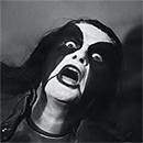
I know SOMEONE will have an opinion on my title screen.

I wanted something in the background, but I have had folks here a long time ago telling me a title screen should not be too "busy"
Because of that, I decided to just go with a black backdrop.
But if anyone can think of anything I could add for the background or to spruce this title screen up.. I'm all ears!.. or.. er.. I'm all eyes!
Cause.. ya know.. reading is not the same as hearing..

You took the far extreme. This is not busy enough. XD
If you want to keep a solid color, add a gradient, like this:
Also, the logo looks great, but that default NEW GAME options box doesn't work well with it.
If you want to keep a solid color, add a gradient, like this:
Also, the logo looks great, but that default NEW GAME options box doesn't work well with it.
AH okay.
I honestly would love to make the selections more fancy, and I think moghunter has a plugin for making nicer more fancy titles..
I will be looking into it.
I honestly would love to make the selections more fancy, and I think moghunter has a plugin for making nicer more fancy titles..
I will be looking into it.


Another progress shot,
before MV:

now on MV:

Graphics are still very much WIP, altho I have been concentrating more on the actual game making lately. I'm happy that the system of hacking body parts off is now fully working. yay : )
(might be a little hard to see from the screenshot, but the playable character is missing both of his arms at this point)
before MV:
now on MV:
Graphics are still very much WIP, altho I have been concentrating more on the actual game making lately. I'm happy that the system of hacking body parts off is now fully working. yay : )
(might be a little hard to see from the screenshot, but the playable character is missing both of his arms at this point)

I've been trying to make my MV game feel like an RM2k3 game...
Not all the way but at least close to that ~feel~

Not all the way but at least close to that ~feel~
#SuperBombJump is now available on Google Play store. I just updated it to include graphics that change with the season.


Jacket and his understudy Lute standing atop the fortress of Book's End. Working with some updated graphics from our map artist.


hiiii
@healy: try using less corners and make the room a bit smaller (although there could be things like chimneys or whatever, but this a bit too cornery for my taste). also try making the door not this big and maybe one tile away from the edge of the map.
@everyone else: i'm not too fond of the higher-resolution rpgmakers, sorry. but this bookshelf-thing looks neat.
here's mine:
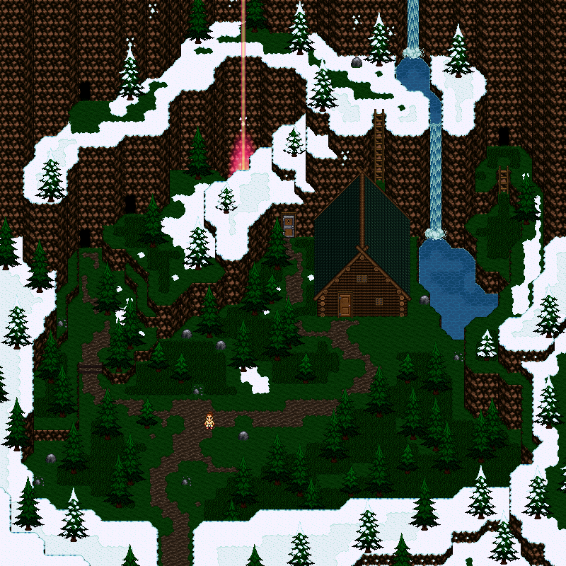
@Marian, I like that your mapping actually makes sense. The lava stuff is apparently warming up this area, so it's all green while rest of the map is snowy. Simple map, but I like it :)
@Dookie, needless to say it look awesome. For some reason I'm getting huge Robocod: James Pond-vibes from that :'D I really have no idea where this is coming from.
@Dookie, needless to say it look awesome. For some reason I'm getting huge Robocod: James Pond-vibes from that :'D I really have no idea where this is coming from.

