


SCREENSHOT SURVIVAL 20XX
Posts

Edit: While I'm fixing my page snipe:
author=marian
hiiii
@healy: try using less corners and make the room a bit smaller (although there could be things like chimneys or whatever, but this a bit too cornery for my taste). also try making the door not this big and maybe one tile away from the edge of the map.
@everyone else: i'm not too fond of the higher-resolution rpgmakers, sorry. but this bookshelf-thing looks neat.
here's mine:
author=SatedI like how it goes in and out - that's a good effect!author=SatedI was blaming my .gif program but I'm actually just a dunce. Here we go:
I tried making a .gif of how this looks animated, but I couldn't get it to look right. The .gif program I use kept screwing up the colours.


It warms my heart to see more people doing lighting effects this way, the more discrete levels and animation look way better and appropriate for lower res games.
e: no need for quote now
e: no need for quote now

@marian- that's beautiful, makes me feel cozy
@Sated- perfect, man. that's a nice lighting effect
@Sated- perfect, man. that's a nice lighting effect

not technically a screenshot, but I just got some sweet Iron Gaia fanart:

ps nice christmas map gourd
ps nice christmas map gourd

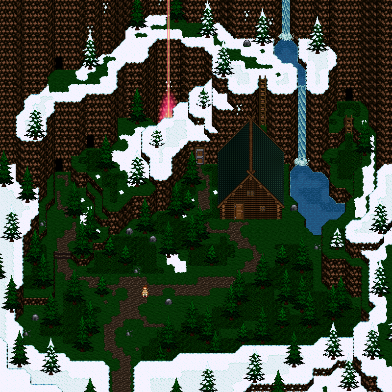
marian, i hope that looks as nice in-game as it does as a whole map. can you actually see all of the cliffs and details and such/are there reasons to just look around the map? it's very pleasing to the eye; i don't want that to go to waste once th eplayer beelines to the cabin and back or w/e XD

author=Craze
marian, i hope that looks as nice in-game as it does as a whole map. can you actually see all of the cliffs and details and such/are there reasons to just look around the map? it's very pleasing to the eye; i don't want that to go to waste once th eplayer beelines to the cabin and back or w/e XD
I was thinking exactly this too. ;_;'''''

yeesss thats the reasons why there are all those entrances. dungeons and caves everywhere! :)
my try on lighting effects with hard edges (as greatredspirit said, smooth gradients with shadows n stuff can look weird in low res things)
my try on lighting effects with hard edges (as greatredspirit said, smooth gradients with shadows n stuff can look weird in low res things)

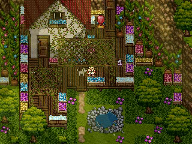
It's beautiful but I agree with Sated. I think less of the boxes of colorful things or at least a darker tone on them. Some variety in the purple plants/flowers on the ground would be nice.
Also all those plants on the edges are potted which is cool by I think it's too much pots.
The lighting is nice, but I'm not picky with lighting. It does have a nice warm feel to it which brings that map together as somewhere peaceful (hopefully) :)
Also all those plants on the edges are potted which is cool by I think it's too much pots.
The lighting is nice, but I'm not picky with lighting. It does have a nice warm feel to it which brings that map together as somewhere peaceful (hopefully) :)
LockeZ

I'd really like to get rid of LockeZ. His play style is way too unpredictable. He's always like this too. If he ran a country, he'd just kill and imprison people at random until crime stopped.
5958
Has the 3 tile rule gone too far?
thanks for all the advice :) ive changed a few things, like adding different plants, exchanged some pots for barrels and boxes, and lowered the opacity of that lighting picture. i didnt remove too much, i kinda like it that oversaturated.
updated version:
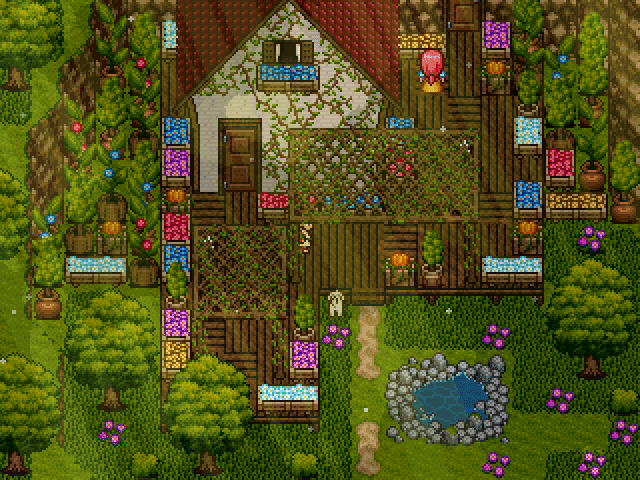
(i really appreciate all the criticism. thanks everyone!)
lockez: what 3 tile rule? dont know that one
updated version:
(i really appreciate all the criticism. thanks everyone!)
lockez: what 3 tile rule? dont know that one

The three tile rule is a general mapping guideline from the old days suggesting that you typically don't want three of the same tiles touching in a row.
People sticking to this rule too religiously results in maps that look scattershot, too busy, and geberally like your chipset threw up on the map.
I do think your map is a bit too busy even still. My eyes dont know where to go exactly.
People sticking to this rule too religiously results in maps that look scattershot, too busy, and geberally like your chipset threw up on the map.
I do think your map is a bit too busy even still. My eyes dont know where to go exactly.

It doesn't help that it was for water/cliff/treeline tiles and not actual decorative tiles. People just got a bit carried away with it, and the infamy grew from that.
That said, it might help to cut down on some of the pink flowers. Make some room in the left and right sides where the saplings are so that someone can actually walk there in order to water them (no one could reach the back ones), and maybe remove the trellis in front of the doorway. It's just blocking the way up to the door, which makes things awkward.
Think about the flow and use your area will be put to - this seems to be a quaint cottage home where someone has saplings for sale (I guess?) so you need to imagine what it would be like to be the person/s living there - where would they put things? Why? And remember, people are lazy when it comes to walking places - they go in straight lines and even cut away mountains to get through the shortest area. That trellis would be goneski. XD
Oh. I didn't notice that. Probably because there's just so much going on. A shadow might help to make that more apparently but I'm a bit iffy about suggesting it since it will make the whole thing a lot more busy.
Okay, to help with that I recommend making the wooden walkway all one direction instead of having some off-kilter spots. Also, might be a good idea to add the shadow I'm recommending. Get rid of the snow effects, since all they do is add a filter to the screen, make the lighting effects a little softer opacity-wise (and rely on tint screen a little more for the warmer hue you're after).
Someone recommended you recolour some of the purple flowers on the ground - either do that (and make them a more subtle colour) or remove some. Or do both.
I think part of the issue might be the colours used for the flower boxes, too. Try making the flowers in them a little paler? All this in addition to what I said before might help reduce the unnecessary details.
Currently, as Dookie and others have said, your eyes don't know where you're supposed to go due to all the details creating havoc. Use them and white space to draw your eyes into the path the player needs to/can go.
LockeZ
I'd really like to get rid of LockeZ. His play style is way too unpredictable. He's always like this too. If he ran a country, he'd just kill and imprison people at random until crime stopped.
5958
I was only joking, I really like it. I don't think it's too busy.
actually i dont think all these "you should map your stuff logically" things are that important. since you are restricted to not tooo many pixels, i think you should make most of them in terms of atmosphere and eye candy. and due to the fact that youre with the 16x16 tilegrid, its pretty hard to make somethink "realistic" and not too messy, especially with places that are ment to look like an actual mess. but im glad you said all the things about this map earlier :) i overworked it again (to a point where it really hurt to remove stuff haha) and i myself really like it way better than before, so thaaank you everyone! :)
and i really dont like this watering can i made, for some reason im not able to make a proper one... does anybody have a watering can sprite somewhere?
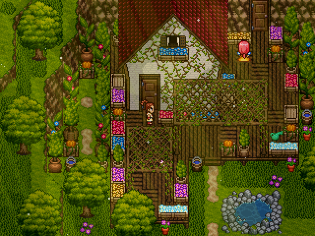
and i really dont like this watering can i made, for some reason im not able to make a proper one... does anybody have a watering can sprite somewhere?

