SCREENSHOT SCHMEENSHOT
Posts
Also the perspective on the top of the pillars is wrong, Badluck. It matches the Panorama, but not the game view. 2D RPGs use a weird type of eagle-eye view, that is essentially Top Down, if the surface is flat, and straight-on if the surface is tall.
I've tried to get our artist to change those, and she just can't seem to get them right. Probably because, yeah, the typical 2D RPG view is so strange. I'll make a few more attempts to have them (and other things) altered as we go, since she's progressively getting better, but unfortunately this might be what it's stuck like.
@Badluck: The dithering on the stone parts are really noticeable and looks kinda odd to me. Looks great thought.
@Mog: The reflected letters look weird since the tower isn't reflected. You could move the letters down and you might wanna make the reflection a little less strong.
@Mog: The reflected letters look weird since the tower isn't reflected. You could move the letters down and you might wanna make the reflection a little less strong.
@Badluck> Tell your graphical artists they are doing a fantastic job! Also, the cracked stone/bridges, as mentioned previously, look a little odd. I can't really explain it that well, but it is visible in the top of your first screenshot. The cracks just suddenly end, and the next one starts. It looks a little strange. Hopefully that sounds right?
@DE> What is your game about? I also think those graphics are gorgeous.
@Feld> I have no problems with this, other than that in my opinion, it is too bland, with a lot of black space. Maybe showing a bit more of the tower down there? Though, it is still nice how it is.
@DE> What is your game about? I also think those graphics are gorgeous.
@Feld> I have no problems with this, other than that in my opinion, it is too bland, with a lot of black space. Maybe showing a bit more of the tower down there? Though, it is still nice how it is.
It has been mentioned earlier that badluck hired artists to do pixel work, about how much has this project cost you so far, Badluck?
Well under what pretty artwork like that is worth, but enough that it isn't a trifle.
And actually, Prexus, if you know of any good examples of pillars like that in this perspective I can use as a reference for my artist, she doesn't grasp how it's wrong naturally and I don't know how to explain it to her properly. We've tried to fix them a few times, but eventually we decided our time would be better spent elsewhere.
And actually, Prexus, if you know of any good examples of pillars like that in this perspective I can use as a reference for my artist, she doesn't grasp how it's wrong naturally and I don't know how to explain it to her properly. We've tried to fix them a few times, but eventually we decided our time would be better spent elsewhere.
That is incredible, Badluck. I can see what the others are saying, but I wouldn't worry about it. There are more important things to work on than the minor issues of a screenshot.
I would love to see something other than outdoor environments. Perhaps a tower or palace, or a place that has a gloomy vibe to it. Something different than what we've normally seen, but still has a place in the atmosphere of your game. I hope your artists get around to something like that. Take your time though, there is no rush.
I would love to see something other than outdoor environments. Perhaps a tower or palace, or a place that has a gloomy vibe to it. Something different than what we've normally seen, but still has a place in the atmosphere of your game. I hope your artists get around to something like that. Take your time though, there is no rush.
author=Neophyte link=topic=2555.msg54917#msg54917 date=1231583559
I hope your artists get around to something like that. Take your time though, there is no rush.
It would help if there wasn't a time:profit ratio involved, most likely!
Also, BL, is your sister doing any of the work? It's just that you kept saying SHE and that she couldn't do some stuff PERFECTLY (like I would expect a paid professional to be). If so, that's pretty nifty, and she's improved a lot since SL6.
Production of 0.6 is still in the works. I hope to have the new content update out by March.
What the hell is in those containers!? - Ripped by me from BGII
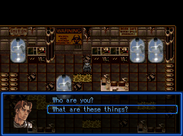
What the hell is in those containers!? - Ripped by me from BGII

author=demondestiny link=topic=2555.msg54679#msg54679 date=1231474724
Here is a screen from Demon Destiny 2.
Looks good bud. I don't think the picture does it justice to be honest. It's kinda choppy but i'm sure the in game shot does not look like that. The sword is a little out of place but like you said you're going to replace it. Looks good dude, keep up the good work.
author=BadLuck link=topic=2555.msg54909#msg54909 date=1231570536
Well under what pretty artwork like that is worth, but enough that it isn't a trifle.
And actually, Prexus, if you know of any good examples of pillars like that in this perspective I can use as a reference for my artist, she doesn't grasp how it's wrong naturally and I don't know how to explain it to her properly. We've tried to fix them a few times, but eventually we decided our time would be better spent elsewhere.
I tried looking for an example but wouldn't you know it, most RPGs have those pillars extend to the top of the screen (eliminating the need for the tops).
I imagine the top part would simply be a perfect circle. Following the logic towards the perspective I outlined in the first part, that makes the most sense. But, if it looks weird (and it might).. a compromise of sorts is likely in order.
Look at the RTP barrels for RMXP, they should technically be a full circle on top, or close to the perspective that your artist used for the pillar, but they are somewhere in between. That's probably the best example I can give.
I love that chipset, drakiyth. I should get around to trying Aftermath; maybe once I get my monitor trouble sorted out and the new demo is out. If it's got one thing going for it, it's definitely the atmosphere.
DD, that sword on the ground is ridiculously long.
DD, that sword on the ground is ridiculously long.
demondestiny, you probably should not resize your screenshots to such odd resolutions.


