


THE SCREENSHOT TOPIC RETURNS
Posts
LockeZ

I'd really like to get rid of LockeZ. His play style is way too unpredictable. He's always like this too. If he ran a country, he'd just kill and imprison people at random until crime stopped.
5958
It's like, someone took an influenza virus, and stuck it in a very tiny knife sharpener. And then started selling it to adventurers as a dagger.
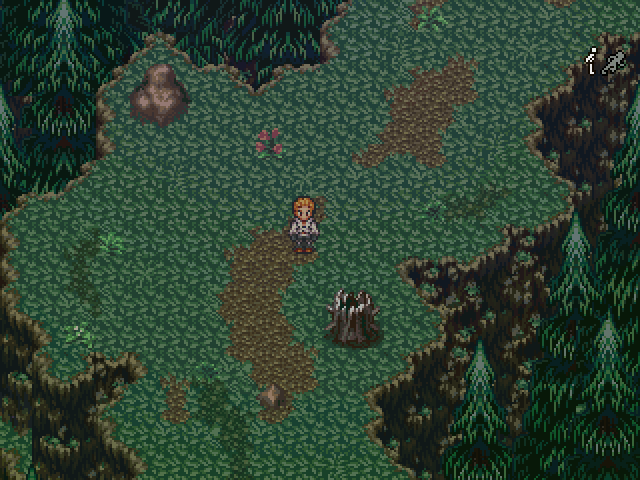
Or maybe, somewhat more sensibly, it's a store that sells status-inflicting magic spells, owned by Theodore Sharp.
Or maybe, somewhat more sensibly, it's a store that sells status-inflicting magic spells, owned by Theodore Sharp.

Just a name to go with the towns name Thorne. I do that for every town, Forte has it's item/goods store called Fortified Goods. I thought it was a nice touch.

@Tau
Nice maps, just the right amount of clutter and stuff.
2nd screenshot: Why is there light coming from the left window but none of the other?
Nice maps, just the right amount of clutter and stuff.
2nd screenshot: Why is there light coming from the left window but none of the other?
LockeZ
I'd really like to get rid of LockeZ. His play style is way too unpredictable. He's always like this too. If he ran a country, he'd just kill and imprison people at random until crime stopped.
5958
author=TauIn that case, you probably meant Sharp Armaments.
Just a name to go with the towns name Thorne. I do that for every town, Forte has it's item/goods store called Fortified Goods. I thought it was a nice touch.
@Lockez - B..bu.. but that's the item store :|
@SnowOwl - I.. have no idea haha. I'll fix that whenever I can get access to a PC. Browsing the internet sucks with a phone, well this site is really the only place I have to do this as my other sites all have very nice apps to use.
Another old shot, this one's from Nocturne, a very early fixture in the game.
LockeZ
I'd really like to get rid of LockeZ. His play style is way too unpredictable. He's always like this too. If he ran a country, he'd just kill and imprison people at random until crime stopped.
5958
Well, it may not be the weapon store, but it's not the disease store either, is it?
Sharp Elements? Sharp Medicants?
...Sharp Condiments?
Sharp Elements? Sharp Medicants?
...Sharp Condiments?

@Tau What type of setting are you going for with this map? A haunted forest look? The pathway is clear with a good variety and range of detail, not too little or much. Overall it looks good in my opinion.
***
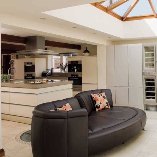
A simple RTP interior home, but something is off...? Any constructive criticism/advice would be appreciated, thanks!

***
A simple RTP interior home, but something is off...? Any constructive criticism/advice would be appreciated, thanks!

Kitchens are often (but not always) walled off and separate. People don't want to reveal their cooking secrets, and so it's usually not visible.
Also, the dining room is seldom the central or main room. For example...

or

Houses spill out into the foyer, or waiting hall, then typically have the study and bedrooms on the sides, the kitchen near the outside (that one's right), and the dining room is to the side of that. The living/common room is usually the core or center room. What you have looks like a merged kitchen/dining in center, which is fine except it needs to be higher, and all one room.
Also, make side walls even if there aren't doors, so it doesn't just look like generalized space merging together.
Pointy Implements.
Also, the dining room is seldom the central or main room. For example...
or
Houses spill out into the foyer, or waiting hall, then typically have the study and bedrooms on the sides, the kitchen near the outside (that one's right), and the dining room is to the side of that. The living/common room is usually the core or center room. What you have looks like a merged kitchen/dining in center, which is fine except it needs to be higher, and all one room.
Also, make side walls even if there aren't doors, so it doesn't just look like generalized space merging together.
author=LockeZ
Well, it may not be the weapon store, but it's not the disease store either, is it?
Sharp Elements? Sharp Medicants?
...Sharp Condiments?
Pointy Implements.

You've never seen an open-plan kitchen? Plus that second picture goes against everything you just said. There's a dining table right there by the front door in the main, central room, and there's an open-plan kitchen right next to it..
I personally think it's a nice layout you got there, Atoms. Seems like you have a thing for house design. You might want to make some of the tiled areas a little more squared though, for example the section in the bottom right. Those grey tiles should ideally be one big square instead of having them trail out like that.
It's also quite empty for such a big house, it could do either with having some clutter or perhaps being made a little smaller to cut down on the emptiness.
Thanks everyone for the feedback! bulmabriefs, I appreciate you taking the time to show me this, and I'll definitely consider it when mapping in the future, however I don't believe there is anything wrong choosing to merge the kitchen with the dinning room, though I may still try what you're suggesting and compare/contrast later.
Does below still seem to have too many colors? I'm hoping with tidying them up a little, that having multiply tiles may now look appealing?

Edit: Took what PepsiOtaku advice.
Does below still seem to have too many colors? I'm hoping with tidying them up a little, that having multiply tiles may now look appealing?
Edit: Took what PepsiOtaku advice.

LockeZ
I'd really like to get rid of LockeZ. His play style is way too unpredictable. He's always like this too. If he ran a country, he'd just kill and imprison people at random until crime stopped.
5958
I like this, it looks nice now.
Thanks everyone for the advice on helping make this look nicer!
@Caz I guess if that map has been put together right, really by practicing all the different possible settings you could make with the RTP beforehand is the best way to learn which tiles copy/paste over well and which don't. Then all that's left is order. Start with Plan > Structure > Tiles > Details but keep the end imagination in the mind.
What I love about RPG Maker is how it's like a copy/paste paint program when it comes down to mapping, thanks!

How's this for an interior map?
It's the upstairs of the house of a blind farmer, so I tried to keep clutter to a minimum. The thing in the middle of the bedroom is supposed to be a broken crystal ball, which functions as a TV in my world, on a table (it comes from an event that happened in my 1st game).

Also, I made a video of the gramophone in action for anyone who's interested. I guess these are a nice way to get some songs in that don't really fit the game normally, but are fun to listen to.
http://www.youtube.com/watch?v=amyG99WbDHE&hd=1
It's the upstairs of the house of a blind farmer, so I tried to keep clutter to a minimum. The thing in the middle of the bedroom is supposed to be a broken crystal ball, which functions as a TV in my world, on a table (it comes from an event that happened in my 1st game).
Also, I made a video of the gramophone in action for anyone who's interested. I guess these are a nice way to get some songs in that don't really fit the game normally, but are fun to listen to.
http://www.youtube.com/watch?v=amyG99WbDHE&hd=1

Finally finished trying to make the CMS for this game. It's still in beta so it has no decorations or borders.


Thoughts on my map of a modern-day office?

It's supposed to be dreary, with a really grey pallette and sucked out of life. I'll probably place a monochrome filter over the top.
It's supposed to be dreary, with a really grey pallette and sucked out of life. I'll probably place a monochrome filter over the top.
It's fine if it's just a short walk thorugh area, but if you plan on having the player staying there for long I would try to add some kind of variation to it, like different stuff on the desks, broken roof tiles, some kind of decoration, that kind of stuff.

@thatbennyguy
The "Lame" graffiti is on what looks like the wall of the SECOND floor, which is... kinda weird. Why would anybody write graffiti so high up? Also, those ceiling fans look kind of weird suspended in midair like that. I know they're supposed to be hooked uo to the ceiling but still. But I'm just being nitpicky so you can ignore me.
The "Lame" graffiti is on what looks like the wall of the SECOND floor, which is... kinda weird. Why would anybody write graffiti so high up? Also, those ceiling fans look kind of weird suspended in midair like that. I know they're supposed to be hooked uo to the ceiling but still. But I'm just being nitpicky so you can ignore me.

