


THE SCREENSHOT TOPIC RETURNS
Posts

Avee - I'm glad my tutorial is seeing some use. Let me know if you run into any snags.
Libery - I think the battle map looks fine as is, but if you don't like the empty space, maybe you could throw in some kind of border?
EDIT - Top of the page and no screens... ugh
From the archives, some of my stalled MMF projects-
Castlevania Game with Female Protagonist

Deep Space Salvage Game with Retractable Cargo Claw and Welding Laser Action

Bullet Hell Mech Game

You can tell they're early, since two of them are using the default object graphic for onscreen elements. I always try to focus on mechanics first. That way once the games work the way I want, I can lose interest and forget to develop enemy and background art.
Libery - I think the battle map looks fine as is, but if you don't like the empty space, maybe you could throw in some kind of border?
EDIT - Top of the page and no screens... ugh
From the archives, some of my stalled MMF projects-
Castlevania Game with Female Protagonist
Deep Space Salvage Game with Retractable Cargo Claw and Welding Laser Action
Bullet Hell Mech Game
You can tell they're early, since two of them are using the default object graphic for onscreen elements. I always try to focus on mechanics first. That way once the games work the way I want, I can lose interest and forget to develop enemy and background art.
Been playing around with my menus. This is right I came up with.

I removed the landmark text, but if want to see it, here...

I removed the landmark text, but if want to see it, here...

author=UPRC
Looks pretty decent, but the background is REALLY distracting!

You can still see the map in game/zoomed in.
I was thinking about crafting a little logo or something in that empty space next to Ziro's face, but I don't know.
LockeZ

I'd really like to get rid of LockeZ. His play style is way too unpredictable. He's always like this too. If he ran a country, he'd just kill and imprison people at random until crime stopped.
5958
Ah, the background looks much better now.
I still think the randomly half-erased faces are unattractive, and the background behind the selection box is pretty weird.
The small font, half-erased portraits and lack of information about the characters add up to a ton of black space scattered all over the screen. While blank space is often unavoidable, it's almost always best to have it be around the edges. You want the white space to fall off the side of the screen when you can, so it feels like a border instead of a gap. To solve this, you will probably need to rearrange a couple things, condense a couple other things, and you'll definitely need bigger text.
author=LockeZI think they'd look much better if the 'erasing' didn't seem so haphazard, i.e. horizontal slicing.
I still think the randomly half-erased faces are unattractive

Some new battle screens.


There is a little perspective issue with your monsters. Even the human ones, which should be "normal" sized, seem larger than the party. They might BE the same size, but being further from the "camera", it makes them look larger than the party in comparison.
I like the middle one the best, but I think the girl's pose is really unnatural/uncomfortable/anatomically troubling...etc.
EDIT - Also, if you ran your party graphics through Photoshop and use the Despeckle filter a couple of times, followed up with some Sharpen you would match the smoother look of your monsters a little more (which may or may not appeal to you!).
Oh,I know what do you mean,the human monsters.I'll try to improve them.+I'll change her pose cuz I made it like that using a side sprite.lol.:P
@ NOACCEPTANCE772
So far, so interesting haha :3
Thanks guys.
I'll be more competent with the fade out. I'm trying to make it fit the battle screen (with all its buffs going through the char's eyes,) and the save screen (where no fade-out looks crappy.)
So far so good. And that fonts been plaguing me in ways more than one >.>
So far, so interesting haha :3
author=LockeZ
Ah, the background looks much better now.
I still think the randomly half-erased faces are unattractive, and the background behind the selection box is pretty weird.
The small font, half-erased portraits and lack of information about the characters add up to a ton of black space scattered all over the screen. While blank space is often unavoidable, it's almost always best to have it be around the edges. You want the white space to fall off the side of the screen when you can, so it feels like a border instead of a gap. To solve this, you will probably need to rearrange a couple things, condense a couple other things, and you'll definitely need bigger text.
author=Yellow Magicauthor=LockeZI think they'd look much better if the 'erasing' didn't seem so haphazard, i.e. horizontal slicing.
I still think the randomly half-erased faces are unattractive
Thanks guys.
I'll be more competent with the fade out. I'm trying to make it fit the battle screen (with all its buffs going through the char's eyes,) and the save screen (where no fade-out looks crappy.)
So far so good. And that fonts been plaguing me in ways more than one >.>
author=Sanalol thanks, Sana.
If you need a new font, I know a few good sites that have some pretty interesting/good ones. :)

My new game's page is pending :)

I'll have at least 5 other portraits like this one to make, as well as emotions poses. The different skin color can't be helped though.
I'll have at least 5 other portraits like this one to make, as well as emotions poses. The different skin color can't be helped though.

Avee, I get that you're going for GB res, but man, the border is so obnoxiously intrusive, like you're playing a game through a window even though it's fullscreen! Def distracting, I would say make the actual game itself be at least 2x, which means you'd have more res/less space for the border, which I think would improve readability a great deal, even if it is just a gameboy esque device with flat netural shades.
Also the power light and the two lights on top are very distracting because they are in the immediate vicinity of the the game's 'screen'/playspace, and are the only objects which use bright colors, to the point where it battles with that off white for attention, whereas ideally, it should be muted by contrast so the eye doesn't focus on it.
As for the screen itself, I think you are hitting a resemblance to GB, but don't rely on that, or sub it for quality. I like the micro FE styled portrait, but you might have trouble at this res to convey multiple emotions with those faces. The char itself has readability issues again. GB is tricky to pull off, because you only get 4 colors, so you have to be careful about what you place where and how that affects/interacts with your main character sprite. You're using the light green shade for the skin of the chara, and the lightest value, white, for the sky, which is BG information, so not visually important enough to deserve the attention that that shade of white demands.
Furthermore, I think that you should play around with the pallet a bit more. There is a lot you can do with 4 colors, but idk if this non-canon puke green imitation of GB will get you there, there's a ton of GB pallets out there though so def experiment. Good start, regardless.
Avee: I think the border is a bit much! It draws my eye to the border instead of the screen (and that's a bad thing). I think you could probably make it smaller and it would look better. In addition, I think if you can't give the sprite light skin like her portrait, maybe you should try to darken her portrait's skin? It's pretty distracting to me, but if that's not doable, I think I could get used to it.
I'm also working on a game with a GB palette! And I've found it's a lot of fun:
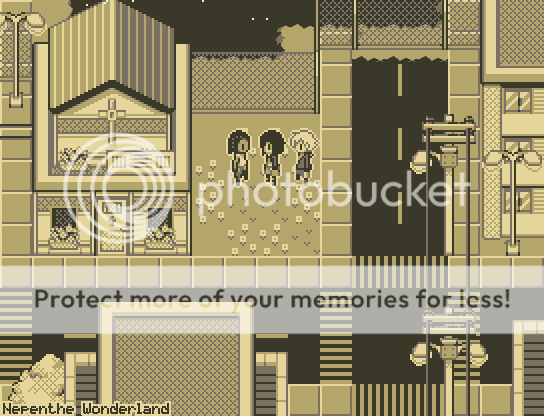
I'm still fiddling with a few things (like the streetlamps--there are a few pixels that bug me) but I'm really happy with my results. It's really fun to make these graphics and it doesn't even take that long!
I'm also working on a game with a GB palette! And I've found it's a lot of fun:
I'm still fiddling with a few things (like the streetlamps--there are a few pixels that bug me) but I'm really happy with my results. It's really fun to make these graphics and it doesn't even take that long!
LockeZ
I'd really like to get rid of LockeZ. His play style is way too unpredictable. He's always like this too. If he ran a country, he'd just kill and imprison people at random until crime stopped.
5958
For the record that puke green in Avee's screen is definitely the color of the original game boy. Game boy color and super game boy added different palettes, but this was the original.
Personally I think the game boy border is hilarious. There's some gray in the middle of the power light, where I assume it should be red or white. The large character portrait is relatively amazing considering the technical limitations.
Personally I think the game boy border is hilarious. There's some gray in the middle of the power light, where I assume it should be red or white. The large character portrait is relatively amazing considering the technical limitations.

author=Avee
My new game's page is pending :)
I'll have at least 5 other portraits like this one to make, as well as emotions poses. The different skin color can't be helped though.
I like it.
How about an option to allow the player to change that border image? That would be fun, and anyone complaining about it being distracting can turn it off. Also, it wouldn't get stale looking at the same border the whole game. I'm sure there are interesting things you can do with that space, like showing your current stats, equips or other useful information.

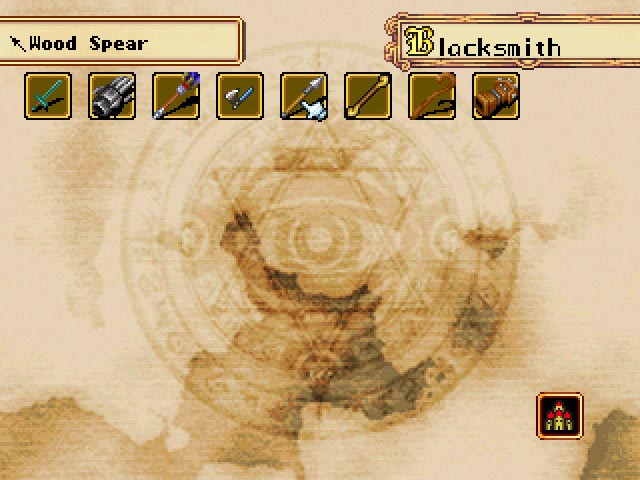
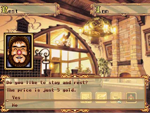
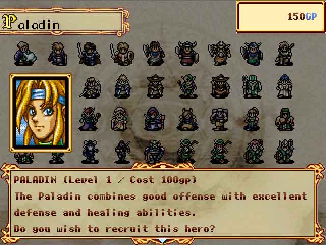
Here we have three more (simple) screenshots from my side-project that finally has a name "BattleQuest" (simple stupid name).
The game profile is still on private, except for the two lucky individuals who managed to subscribe while i was doing some maintenance work
:-)
you can see the custom shop menu, the custom inn menu as well as the custom hiring menu.
yep, thats all custom in this game - graphics and scripts are taken from my previous projects and the obsolete project of a friend. all graphics are from the shining force series.
recruiment and shops are randomly pre-generated, re-generated after x battles fought, also scale with party level and include epic-sales/epic-bargain at low %-chance.
tech:
* rpgmaker 2k3
* BetterAEP
* DynRPG by Cherry
* DynTextPlugin by Kaze
* Animated Monsters Plugin by dragonheartman
PS: the icons underneath the inns text box have already been moved to a better place in a newer version, not obstructing the text box anymore.
Those screens all look fantastic!
I've always wanted to do a custom shop because I want a fluctuating economy. I haven't yet because I'm worried that I would want to change values later and it would be a pain to do it in events versus through database, but maybe after my game is done I'll attempt it.
I wish your game was public, even from just a tech standpoint it's still very interesting and inspirational and I would love to subscribe.
That second screenshot should probably say "Would you like to stay and rest?" or "Do you care to rest here?" or something along those lines though. As it is now it more reads "Did you enjoy staying and resting here previously?" Maybe I'm just being nitpicky... In any case, fantastic stuff!

