


THE SCREENSHOT TOPIC RETURNS
Posts
The screenshots look fine in my opinion.
I must laugh at the way you take feedback btw, everything is awnsered with "I like it so I keep it that way". Not really a way to take part in a discussion XD.
Anyways, about the drab chipset comment of Dyhalto: he was just comparing the chip with the signs, he didn't say anything about drab being bad or something =p.
Ok this is weird, I just looked at your screens again and because of the square shadows it looks like every house is floating now XD.
I'm very curious about all the nitpicks you got from that other forum though =).
LockeZ

I'd really like to get rid of LockeZ. His play style is way too unpredictable. He's always like this too. If he ran a country, he'd just kill and imprison people at random until crime stopped.
5958
The colors on the signs really do look so bright and saturated compared to the buildings that they look like they were pasted on the outside of the computer monitor. However they do match the bridge and the well. It looks like maybe you took the tiles from two different games and combined them? I think if you highlighted those tiles in photoshop and desaturated them by like 10% it'd be fine.
You should never be happy with your work. Never ever ever. It's a detriment to progress and results in a worse game. Never stop improving.
As far as the town being missing something, it is. It's missing any noteworthy features. Why does the player visit this town? Figure out what the most important part of the town is, and make it like 5x as prominent.
(ROFL the buildings totally do look like they're hovering over the ground, with those shadows. I wonder if it's noticable in-game, when you can't see the whole building and surrounding grass at once.)

I have nothing else to say....
I should stop showing what i make and just make it and be happy with it...
I have seen PLENTY on here by other people that looked "drab" and misplaced and like it did not go together.. and others were like "oh it's great!" so yeah.. no....
I should stop showing what i make and just make it and be happy with it...
I have seen PLENTY on here by other people that looked "drab" and misplaced and like it did not go together.. and others were like "oh it's great!" so yeah.. no....
LockeZ
I'd really like to get rid of LockeZ. His play style is way too unpredictable. He's always like this too. If he ran a country, he'd just kill and imprison people at random until crime stopped.
5958
There's no such thing as "I can make it how I like it." This is a website where people who make games get together to make better games than they could alone. So we're working on a game: right now, yours. Everyone here wants to give the world better games.
If you think the way you did it is better than what's being suggested, then convince us! The people suggesting things aren't necessarily right: this is a forum, not a lecture. You should help them learn if they're the ones who are wrong.
Anyway, explain what happens in this town and maybe I can help you figure out what to add to it.
You absolutely should NOT stop showing us your work. That's what we're here for. You show us your work and we point out ways it can be improved.
Also I think you misunderstood the word "drab" as being an insult of some kind? I'm not sure why. There's nothing insulting about saying that a town feels a certain way. Were you trying to make it feel lively and vibrant? Is that why the word bothered you, because you weren't trying to make it feel drab?
author=MarkusT
I have nothing else to say....
I should stop showing what i make and just make it and be happy with it...
I have seen PLENTY on here by other people that looked "drab" and misplaced and like it did not go together.. and others were like "oh it's great!" so yeah.. no....
If you wanted to post screenshots to get compliments you should probably have made a game profile. People who like it tend to post comments, people who don't just move away.
This screenshot topic is ment to help people improve their games. Nothing we said was harsh or in any possible way ment to discourage you to either post screens or make games. It's a topic in the game discussion forum after all and is ment to give users feedback on their work.
And really, if we have nothing else to say than "ohw that shadow is to square/makes your houses look like they are hovering" or "the signs don't match up with the rest of the tileset" than you probably made a very decent game, since we would else most likely point out more basic stuff.
It might be a good idea to go through this topic again and try to act more like Xenomic for example, he posted really bad work here at first and improved his mapping because of our hints and feedback.
But if you are to leave I would like to wish you good luck on the game, because it does look promising and on the other hand: you might want to develop your skills in taking and interpreting feedback. You are kind of acting immature at the whole feedback thing. We are here to help improving games not stopping people from making games.

You people should be ashamed of yourselves! Ganging up like that on some poor soul and driving him/her away from the community?
Didn't your Mommas tell you that words hurt as much as stick and stones!? ...PfffffHAHAHA! Gosh, I love this place sometimes! x)
Didn't your Mommas tell you that words hurt as much as stick and stones!? ...PfffffHAHAHA! Gosh, I love this place sometimes! x)

@MarkusT
Well, I saw the screenshot before it was pulled, and from what I remember it looked okay. It was a little bare, but that was typical of the kind of old-school RPGs the tileset looks like it was emulating.
But yeah, you don't actually need to get feedback here to make a good looking map, it's just useful to have, since constructive criticism greatly speeds up the learning process. When I first posted in this thread, I knew next to nothing about pixel art, and my map composition skills needed some work. However, I got some excellent feedback from people and it really pushed me to improve. Now I'm reading up on tutorials, studying perspective, organizing things well in advance, etc., and every success opens up another avenue for further improvement.
...Of course, that above statement kind of makes me a hypocrite, because it's been so long since I've posted anything. The real reason for that has to do with interface setups and whatnot, which I am still figuring out. Once I'm happy with how it looks, I'll post all of the stuff I've been working on. But I digress.
Basically, sometimes criticism can be painful, especially when you thought your work was pretty good, but even when criticism is less than kind, it's usually still useful. Remember, it's not about you, it's about the work in question, and even the greatest artists of all time felt that they had room for improvement. If you can push aside the gut reaction to criticism and get at the useful bits of truth, you'll be in a strong position to succeed at anything you attempt.
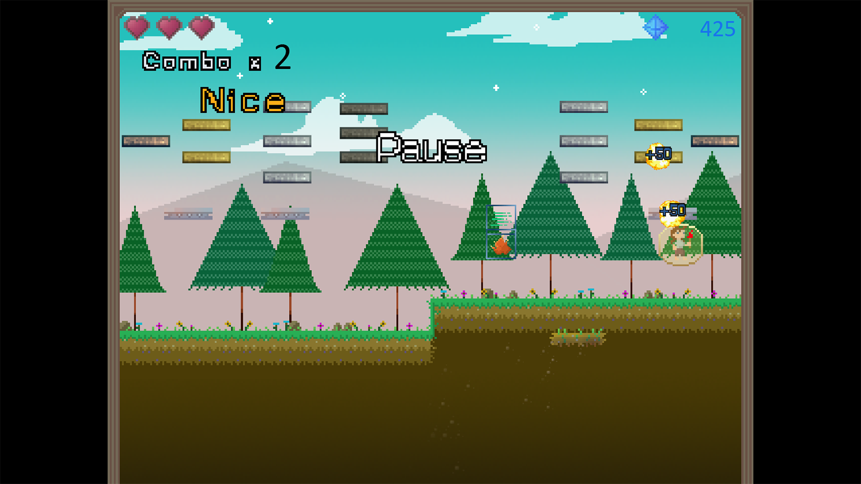
Breakout Hero is turning into something really fun, I can't stop playing it =]
Just an image this time around, Devlogs are on hold for now.
Warning...image size is gigantic!
I recommend right clicking and opening it in a new tab.
Just an image this time around, Devlogs are on hold for now.
Warning...image size is gigantic!
I recommend right clicking and opening it in a new tab.


The game was cancelled but I'd be happy to send you the "demo" aka everything in the video if you're interested. Thanks Benos.

Wow, a great tech demo. I'm sad it got cancelled, it totally looks like something I would enjoy <3.
I'm in strong need to give you some feedback but I don't know if it would be usefull since it's cancelled.
(Like the NPCs. with the choice "talk/cancel" - wtf? If you go up to them and press the action button - of course you want to talk to them. the choice is a waste of time. :D)
I'm in strong need to give you some feedback but I don't know if it would be usefull since it's cancelled.
(Like the NPCs. with the choice "talk/cancel" - wtf? If you go up to them and press the action button - of course you want to talk to them. the choice is a waste of time. :D)


@Itaju
It looks great! The cave walls and floor look very natural. You may want to diversify the moss a bit, but everything about the spritework looks okay to me (honestly, better than many professional games I've seen from that era of sprite design).
One thing that's a bit strange is how the tops of the wall change from top to bottom. I believe you are going for a lighting effect, and while it doesn't look bad it may be disorienting under certain circumstances.
One note on the character sprites, since I'm doing pretty much the same thing at the moment; like most action/RPG games with an overhead view, the characters are viewed more from the side than they really should be from this angle. Again, this doesn't look bad, but it's not technically correct, despite being the common and easier method of sprite design. One example of characters in a more technically correct perspective are the sprites from the SNES game 7th Saga:
http://www.youtube.com/watch?v=icX0iqgShoc
Again though, this is a pretty minor thing. In my opinion it's really not worth re-doing the already excellent spritework, as it looks fine the way it is.
Thanks, Lucidstillness!
Here I made an updated version.

I'm not sure what you wanted to say with the lightning from top to botton. do you mean it's unrealistic that the top is the part that has the most light on it? I think I need to keep it like it is so there is a frame on top of the room that gives the player some kind of orientation.
I don't think I can do the task of changing the sprites. I think sprites (and the maps!) will never be realistic in terms of perspective, there are always compromises to be made from this weird point of observation. :)
Thanks again!
Here I made an updated version.
I'm not sure what you wanted to say with the lightning from top to botton. do you mean it's unrealistic that the top is the part that has the most light on it? I think I need to keep it like it is so there is a frame on top of the room that gives the player some kind of orientation.
I don't think I can do the task of changing the sprites. I think sprites (and the maps!) will never be realistic in terms of perspective, there are always compromises to be made from this weird point of observation. :)
Thanks again!

