THE SCREENSHOT TOPIC RETURNS
Posts
author=Dudesoft
Image 1: I'm not sure if you have the two different death poses segregated like that to represent two different armies, or not. If not, try to mix up the posed soldiers so it looks a little more diverse. Wouldn't hurt to add something else, like logs or something. I'm complaining just 'cause.
Also, have you considered a thunderstorm or rain for effect/mood?
Image 2: Trees too uniform. Could use some scattering, and use different tree types as well. If you put two trees overlapping, you can use an Above Hero event to overlay the tree sprite, to give it a different look, too. As is, the trees here are a little too perfect. Imperfection is where it's at, unless this is a orchery.
Image 3: Same problem with the trees. Not bad map so far, though.
Image 4: If you reduce the right side of the shop one square, you'll achieve symmetry... Otherwise, good map.
Thank you for the feedback, I'll definitely try out some of your suggestions to improve the maps. The soldiers mostly were like that because they were two different armies though, yeah.
author=FleetingInfinity
The soldiers mostly were like that because they were two different armies though, yeah.
Question 2: did they kill each other from that far apart, or would they have been locked in melee combat? What if you had them near each other with blood on the ground?
author=Dudesoftauthor=FleetingInfinityQuestion 2: did they kill each other from that far apart, or would they have been locked in melee combat? What if you had them near each other with blood on the ground?
The soldiers mostly were like that because they were two different armies though, yeah.
Makes sense, I'll put them closer and look for something that shows a little better. The grass is darkened beneath them, to give the illusion of blood having soaked into the grass beneath them, but only a little.
Edit: Though they wouldn't have quite killed "each other" in combat the way I see it. One of the others would have killed one, then they would have moved on and lost to another, and so on. I should probably still put them closer though.
Thank you again.
Edit Two, Revised Screenshots:


That last one I'm not liking.
Here's why:
Super flat horizon line. No elevation changes, or even a defining separation between land and sky.
The merchant is way bigger than the horse. I realize thats a resource issue, but it looks dumb.
The way two of those trees are overlapping is weird.
Here's why:
Super flat horizon line. No elevation changes, or even a defining separation between land and sky.
The merchant is way bigger than the horse. I realize thats a resource issue, but it looks dumb.
The way two of those trees are overlapping is weird.
You could make use of the long grass tile for the areas where it's just flat green. For the cliff edge, try using the actual cliff edge tiles - they're found on A5 (bottom of the first page of tiles - remember you can mix and match tile sets to make new ones if need be). It'd look more like there's an actual cliff at least.
You've gotten better though. Keep pushing the envelope! ^.^)b
You've gotten better though. Keep pushing the envelope! ^.^)b
Don't take the overlapping tree thing the wrong way. He means the two side-by-side.
And IMO, the horse is fine. It's RTP. Beggars can't be choosers. I'm playing Dragon Quest 3 ATM, and animals are weirdly proportioned there, too.
And IMO, the horse is fine. It's RTP. Beggars can't be choosers. I'm playing Dragon Quest 3 ATM, and animals are weirdly proportioned there, too.
author=LockeZThanks; I'll work on that. Also the water's a non-rtp tile, which might explain the weird shape. Specifically, Gmork's orient A1.
Graphics really need to have the same style of outlines on pretty much everything, otherwise it looks really mismatched.
Though I say that, doing outlines only on character/enemy sprites or only on interactive objects/icons is also a popular method. And is done by so many professional games as to be considered normal by now. Makes the outlined things stand out as game-relevant while everything else fades into the background.
Either way, I just noticed that the shadows of the trees are going partially over the top of, uh, "horizon" I guess.
BurningTyger, your camp looks basically fine I guess, there's just not much there. I think if you surrounded those tents with rugs and doodads and stuff, and maybe added a palm tree or two, it would look fine. The water is oddly rectangular but, yeah, I get it, VX Ace, whatcha gonna do. Better than zigzagged edges.

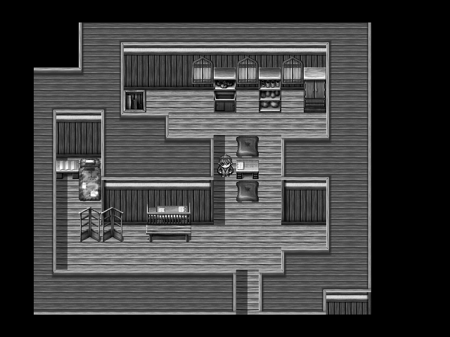
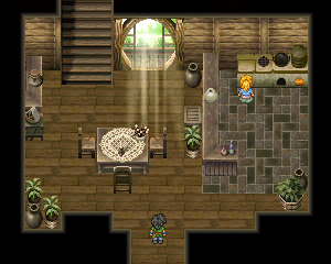
Recently stumbled across an old hard drive containing all my old RPG Maker stuff. Don't think I've touched any of it since around the time the RMXP came out - the screenshot above is from one of my old projects, actually. Kinda feeling like restarting it, probably gonna port it over to the VX Ace though since scripting seems nice and the hassle of upscaling everything strikes me as much less annoying than that of having to index all your graphics.
The light cast by the TV is animated by the way, can't really be bothered to make a webm though. Kinda dissatisfied with the lack of overlap between the computer desk and the window sill, too, probably gonna fix that if I do go ahead and port stuff. What do you guys think?
LockeZ

I'd really like to get rid of LockeZ. His play style is way too unpredictable. He's always like this too. If he ran a country, he'd just kill and imprison people at random until crime stopped.
5958
What do you mean by "index all your graphics"?
I like this screenshot. The left monitor seems to be a little too far back on the desk but the graphics look great and are used well.
Upscaling things is pretty easy except for the font. Uh, good luck with the font.
I like this screenshot. The left monitor seems to be a little too far back on the desk but the graphics look great and are used well.
Upscaling things is pretty easy except for the font. Uh, good luck with the font.
author=LockeZ
What do you mean by "index all your graphics"?
The old RPG Makers (well, the 2k and 2k3 versions) didn't accept any graphics you threw at them unless they'd been reduced down to 256 colors beforehand. There was an upper limit on how many colors the game could display simultaneously that was a little higher, but it was rather irritating as well if you're the sort who enjoys using lightmaps and the like.
author=LockeZ
I like this screenshot. The left monitor seems to be a little too far back on the desk but the graphics look great and are used well.
Thanks for the feedback. I'll make sure to look into that monitor's placement - now that you mention it, I agree that it looks a little off compared to the other stuff on that table.
This is less "hey critique my screenshot" and more "hey guys don't forge there is a MOG graphics event going on and if even a doofus like me can try his had at a custom graphics pack you should too"
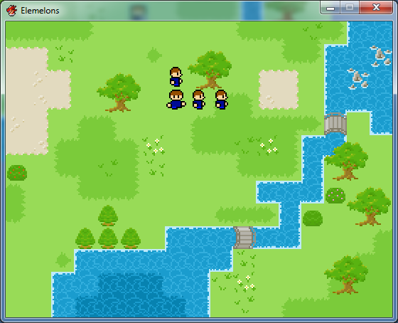
This is all I got done so far, after about ...5 hours (?) worth of work. Animated autotiles are hard. So are charsets.

This is all I got done so far, after about ...5 hours (?) worth of work. Animated autotiles are hard. So are charsets.
author=EliRIOT'sgood for reducing colors quickly.author=LockeZThe old RPG Makers (well, the 2k and 2k3 versions) didn't accept any graphics you threw at them unless they'd been reduced down to 256 colors beforehand. There was an upper limit on how many colors the game could display simultaneously that was a little higher, but it was rather irritating as well if you're the sort who enjoys using lightmaps and the like.
What do you mean by "index all your graphics"?
And I've gone back to look at my layout for the encampment, which included several things not in the current picture, including a stable;do the Ulriki use pack animals? (I considered using Cel's oasis tileset at one point, but seriously doubted the encampment had such nice buildings! The RTP tents don't cut it here; I want to give a sense of a unique culture. )
LockeZ

I'd really like to get rid of LockeZ. His play style is way too unpredictable. He's always like this too. If he ran a country, he'd just kill and imprison people at random until crime stopped.
5958
I like your trees, Kentona.
author=Eliauthor=LockeZThe old RPG Makers (well, the 2k and 2k3 versions) didn't accept any graphics you threw at them unless they'd been reduced down to 256 colors beforehand. There was an upper limit on how many colors the game could display simultaneously that was a little higher, but it was rather irritating as well if you're the sort who enjoys using lightmaps and the like.
What do you mean by "index all your graphics"?
There are a lot of "tricks" to get around this, such as using multiple photo layers, mapping objects via events, panoramas, etc. It's usually not necessary unless you're pulling from truly complex graphic assets, though. For most people it becomes too tedious.


This is the battle system I've been working on. what do you guys think? Does it look good?
I still have a lot of work ofc, but the main idea is clear: there are two options, normal attacks and Skills, inside skills you will find magic(Use SP) and physical(Use EP aka TP) attacks. It's pretty simple but effective.
Only Boss level enemies will have the life bar on top, the other ones will have a normal life bar.
Btw, it's really annoying when people are lazy and use the default battle system, c'mon, it's so ugly!
Honestly, it looks like a different windowed version of the default. I mean it's pretty basic all told. The layout, especially. The only real difference is the enemy HP display and to be frank it's not that great. Simple is best for display elements like that so that they're easily seen and understood. The weird shape doesn't help - it's very futuristic in design for what seems to be a normal RPG.
That said, the enemies and backgrounds look okay (if pretty normal for an RPG).
That said, the enemies and backgrounds look okay (if pretty normal for an RPG).
Right right, I thought the same, I'm still looking for a different window style, but the main problem is to find one compatible with this battle system. I also forgot to mention you can change the window color.
author=Liberty
As you can see, you too can use RTP to create stalls!
......Oh WOW. That's nice. I will use this technique in the future for desert related-shops. XD
author=Blindmind
;_; That's so pretty. The back door looks so amazing...
Great work ya'll got here... I'm out of my slump. So here's the most recent video presentation.
One of the multiple (8) Nostalgia bosses whom drop a Rose Tinted Petal... from these petals the Nostalgic Weapons can be made, and then employed against Corporation XVI.
These bosses are much MUCH tougher than regular optional bosses, and watching you'll see one example of why!
With Spooky, there's no Time Warp, no shadow spells and a lot less fuckin spells.
On a fight with a boss whom evades all physical attacks...
Yeah! Have fun. There is actually no way to bring him back, Lyza's damage is fucking absurd, she also does 500 unmitigated damage each turn. Keep in mind this is a Work in Progress and Numbers and indeed, in the middle of tuning.
The two music tracks you heard are done by Money menace, the first is "21 A Tragic Conflict" and the boss music was finished JUST today! It is "45 For Nostalgia's Sake!" and it's really fuckin' good.
Stay tuned for a much more updated Zardari finale, other Optional bosses and other great things as we tick down to inevitable release! (No there is not a release date, yet!)
Thumbnail art by Xiie.


