ASHLEY_LACURE'S PROFILE
Not much to know, was an older designer known as Alucardxdemon, but I left the RM community a few year ago. I'm back now to simply complete one of my favorite projects and share it with this community.
Search
Filter
 Whatchu Workin' On? Tell us!
Darken and LockeZ-sama you are both so knowledgeable I'll make sure to express my false professionalism with Box Art instead.
 World Ease of Use: Interactivity and You
My Argument:
Good topic. First I dont believe RM2k3 users all find a desire to use pictures. If they do its their game so I cant really say yes or no to their implementation of pictures unless they are not using pictures properly or the pictures clutter the screen, thus I believe my interactive system works well. When you walk towards something or if you are in the interactive objects general area (2-3 tile radius depending on the importance of the object) you will get the "press to interact". It doesn't take away from the game play, it doesn't slow the game down in anyway, and if anything it makes it clear what you can interact with.
Note: As said early FFIX does a great job of this. In my game some items you see on the map are interactive as opposed to some games where they are simply for show.
In terms of the exploration factor I don't believe a system telling you that you can interact with something limits exploration. Look at Skyrim, the game tells you what you can interact with but exploration is not based on the system telling you "here is a Smithing Iron" its based on the player actually going out and exploring the world. In my game for example, this system will pop up when you are close to an item that can be configured or provides a means of interaction other than just dialogue describing what it is.
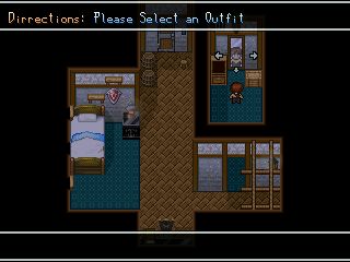
Example: In this screen I am facing a mirror, while I can press enter the game will only give my some internal dialogue about something on the players mind. But if I turn to my left and press enter on the dresser I can change my character's outfit if I desired to.
I do understand why some people dislike HUDs, however in terms of interaction and my game this system works best.
 The Screenshot Topic Returns
Wow my English has gotten worse since Ive left college, I meant interface. My bad man. Also read your game page, Finish this or I will break your bones. Or as Bane would say "When this game is done, then you have my permission to die."
Edit: Also the 2nd one looks the best. Try to keep your menus as simply and "tight" as possible it will make your menus look better.
Edit: Also the 2nd one looks the best. Try to keep your menus as simply and "tight" as possible it will make your menus look better.
 The Screenshot Topic Returns
@Craze: The interact image will stay, its used to tell you what items on the map can actually be configured and used. Also in terms of the sprinting icon I have yet to finish the stamina system but a little green gradient will fill the white similar to DHM's system.
@Max: I made that in 2006 before I finished my hooked on phonics work book haha. But thats an old screen.
@LockeZ: I agree with you 100%.
@Lotus: Love the interphase, noded at it in your Game Page, so keep posting some screens.
@Max: I made that in 2006 before I finished my hooked on phonics work book haha. But thats an old screen.
@LockeZ: I agree with you 100%.
@Lotus: Love the interphase, noded at it in your Game Page, so keep posting some screens.
 What are you jamming to?
 Ye Olde Ancient Screenshots Topique
@Geodude who hasnt evolved in 6 years: I remember this. The title screen looks nice, my real attention is drawn to the bike though :). I'll check out the link too.
@Mr.Nemo: Like the dark fantasy tileset, good work. And AB isnt ancient enough keep searching for older :P.
@Mr.Nemo: Like the dark fantasy tileset, good work. And AB isnt ancient enough keep searching for older :P.
 What are you thinking about? (game development edition)
@Mel: Im using a retry feature as well as such I took the save anywhere feature away. I think its fare.
Ive been thinking about my active event system. Similar to Persona events are based on time of day and current date. I guess I think this system will offer for exploration and freedom as opposed to linearity. However the biggest problem is filling the time that events do not take place. I guess I'll have to plan out each mission and "side-quest" to ensure that players dont get bored.
Ive been thinking about my active event system. Similar to Persona events are based on time of day and current date. I guess I think this system will offer for exploration and freedom as opposed to linearity. However the biggest problem is filling the time that events do not take place. I guess I'll have to plan out each mission and "side-quest" to ensure that players dont get bored.
 Whatchu Workin' On? Tell us!
The dimensions of the image as a whole are ridiculous but with that said it looks nice, whats wrong with the left side? Or are you still working on it.
Edit: I can barely see the guy on the passenger side whys that.
Edit: I can barely see the guy on the passenger side whys that.
 Whatchu Workin' On? Tell us!
- Finished the Title Screen Menu
- 50% on the Battle System
- Remaping and Spriting 30%:I've literally have spent hours spriting objects and tilesets to fit the RTP style, this is the most boring process ever.
Hide button doesnt work for me lemme know if you can see this or not.


The title screen twinkles and fades and their is a little introduction that is pretty cute before it. I need help working with lighting and shadows, if anyone would like to help me out I'd be willing to do something for them in return. Back to the cave.
 The Screenshot Topic Returns
@Nightowl: I agree with Chana, looks great but the roof doesnt look nice. Try something more solid, maybe a repeated brick pattern.
Anyways been working on my game a bit. Spriting to fit the RTP style sucks and takes forever. Heres the final result.
Before:

After: Alot of items to interact with, the alarm clock allows you to set and alarm to wake up earlier, the chest has a mini game to dig for treasure, and the dresser still allows you to change your clothes.

All thats missing are the lighting effects and shadows I need some help with em.
Anyways been working on my game a bit. Spriting to fit the RTP style sucks and takes forever. Heres the final result.
Before:

After: Alot of items to interact with, the alarm clock allows you to set and alarm to wake up earlier, the chest has a mini game to dig for treasure, and the dresser still allows you to change your clothes.

All thats missing are the lighting effects and shadows I need some help with em.


