CAZIC'S PROFILE
Search
Filter
 Looming Spire Notes - Runes
 Whatchu Workin' On? Tell us!
 Screenshot Survival 20XX
author=Blindmind
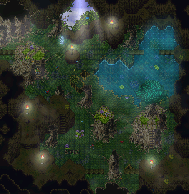
More progress on the cave/forest hybrid dungeon.
Awesome concept and execution, but you might wanna tone down the light effects a little bit. Also the light source at the top of the image (daylight from outside?) clashes pretty hard with the torches. Maybe remove the two torches on top? Or remove the light they give off.
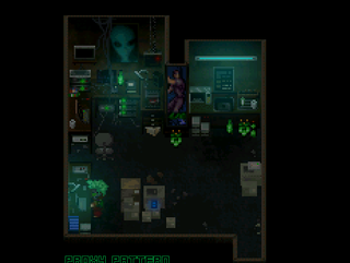
 Proxy Pattern
Updates are far and few in between, I have a terrible work ethic with this game. Coincidentally, I recently picked it up again. Currently working on getting the battle system to work correctly and doing some mapping and sound design on the side. And I still want to make a couple of GIFs to show how some of the maps look like "in action".
Glad you like it!
Glad you like it!
 Screenshot Survival 20XX
author=Luiishu535
Some quick tile-set improvisation. I'm not too happy with this one, but I feel like showing it anyway, just in case there's something I didn't think of. I do enjoy playing around with odd-ish color combinations, though.
Looks very cool, like an old-school DOS game. The tileset kinda reminds me of a non-isometric Ultima.
 Screenshot Survival 20XX
author=dethmetal
Here's the screenshot of a map I've been working on! It's an abandoned cathedral, the making of which involved very creative use of a town tileset. I'm quite proud of this one. It's not quite finished yet, but it was finished enough that I figured I'd post it here and possibly get some feedback.
This looks really good, like an actual real world building. Very cool (hah) color palette as well.
 Screenshot Survival 20XX
author=Xenomic
*Yeah, I'm not sure how to set up the walls. You can actually see most of the map because you can go up on any of those parts where there's stairs, so there's quite a bit of this map you can see.
I meant you can't see it all at once, like we do on the screenshot here. But I think I looked at it wrong, I can't find anything right now that doesn't make sense height-wise (since you fixed the bridge).
 6.png
6.png
 Screenshot Survival 20XX
author=Xenomic
Any suggestions on the castle? I know it needs some windows and stuff, though not sure what else I can do with it. I haven't planned anything for the interior outside of the main 3 rooms and the library so...
Just some minor nitpicks:
- Not sure what's going on at the entrance there with the windows, the tiles are not matching up with the wall.
- Those off-center swords & shield at the entrance are killing me (I'm sure you know this already and just haven't figured out a way how to center them).
- I think it would visually help a lot if you moved the bottom-most towers to the front of the corners (meaning one tile down and one tile right/left respectively). Right now the towers look like they are glued onto the wall by their sides. Look at Castle Doma to see what I mean, all the towers there are directly built into the wall, as it realistically should be.
And, as you mentioned, some more windows will go a long way to make it look nicer overall.
Perspective-wise some parts look off (specifically the height of some of the walls), but since the player will never see the entire map at once, I think you can ignore that. Just one thing: move that bridge on the right side a few tiles lower. Count the tiles on the bottom wall if you want to be precise.
Will there be any NPCs running around?
 Screenshot Survival 20XX
author=Xenomic
EDIT #3 - Updated Ruins Zone 1 map~
I'd recommend some variety in the floor texture, some cracked tile etc. (you did a good job with this on Lake Zone 2). Also I think those archways would look a lot better if they directly connected to the walls instead of standing there like a single entity. They don't make a lot of sense in an underground building the way they look like right now, especially the pointed tops.


