


OLDPAT'S PROFILE
Hi, I'm OldPat, an italian indie game developer. I'm trying to improve as much as I can, hoping to reach a professional level one day.
I also like to draw a lot and that's another of the fields I'm trying to improve. My English is still a bit bad, so I hope you'll forgive me if I make any mistakes.^^'
I also like to draw a lot and that's another of the fields I'm trying to improve. My English is still a bit bad, so I hope you'll forgive me if I make any mistakes.^^'
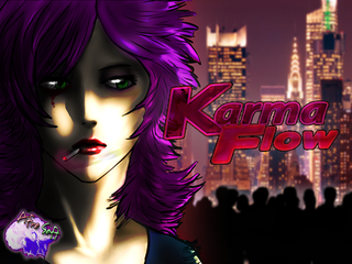
Karma Flow - The Prototy...
A Short 2D Noir Open-Stealth game. "Florien Kealborn is ready to do anything for her own family, even challenge Karma itself."
A Short 2D Noir Open-Stealth game. "Florien Kealborn is ready to do anything for her own family, even challenge Karma itself."
Search
Filter
 OIdPat's "Art" topic
She looks great and you nailed the expressions too. Good work.
Thank you, Dragn!^^
Gotta update a bit in here... I don't know why I never do that.
Ultra mega ultra fast sketch I did for PSYCHE Locke, sometime ago:

Direct Link: http://i66.tinypic.com/2s9x09k.jpg
And artwork showing Florien Kealborn and Steel Skin:
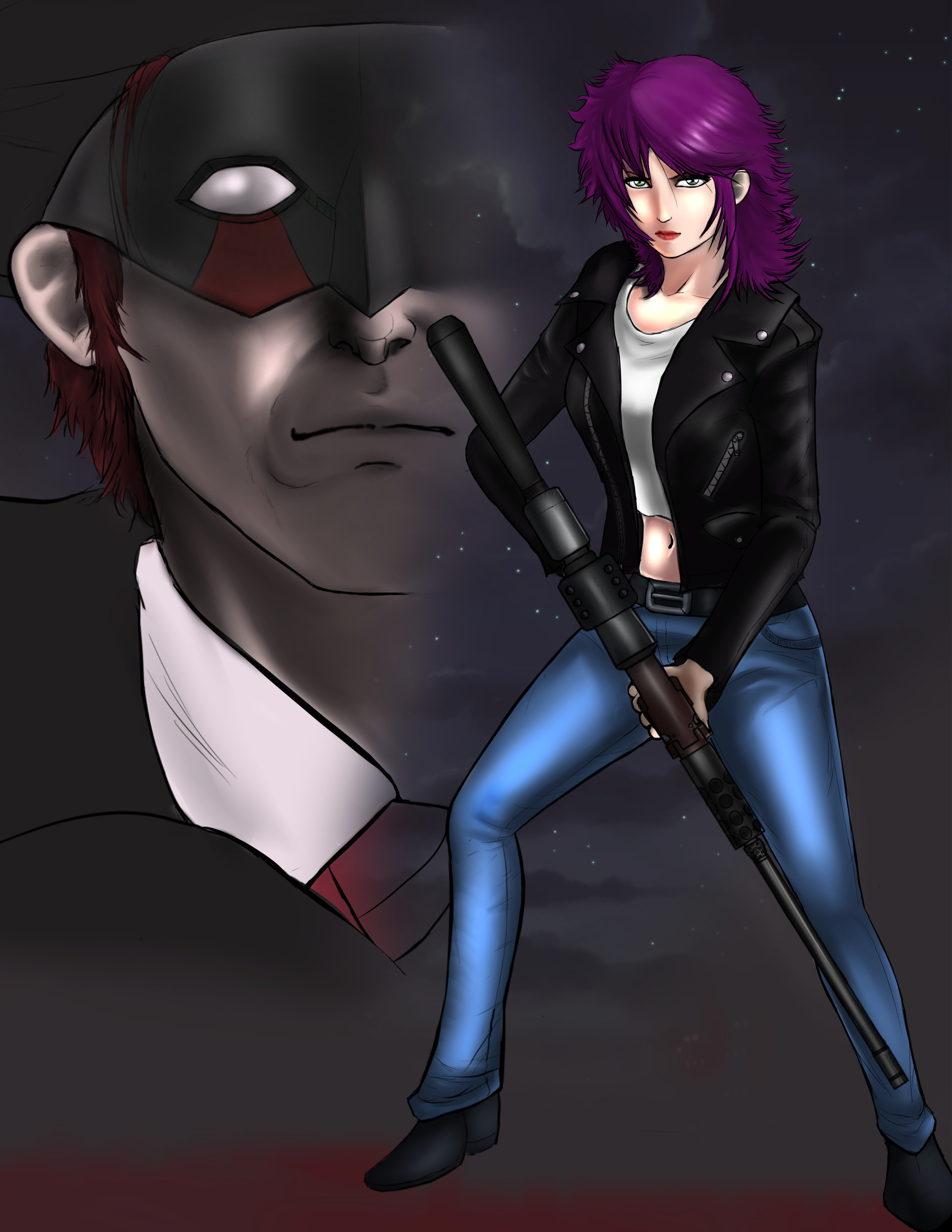
https://orudopatto.artstation.com/projects/xzzgnY
 PSYCHE Locke vs The World! | Misao Awards 2018
author=OzzyTheOne
Maybe you have my vote, maybe you don't, either way , good luck OrudoPato!
Thanks, Ozzy!
 Happy Birthday to Kloe-boo >:3
 Update - January 2019
That is a really, really, really good news, Lollo!
Theia is a game that deserves to be shared all around the world. I wish all the best to you and your project! :)
Gogogogo! Test the game like there's no tomorrow!
Also, finish Nec[]roma!
Theia is a game that deserves to be shared all around the world. I wish all the best to you and your project! :)
Gogogogo! Test the game like there's no tomorrow!
Also, finish Nec[]roma!
Merry Christmas RMN!
owner of a lonely heart
 S6.png
As you can see the game features different kinds of hot. Succubi and Flamethrower-ish skulls.
Best game ever!
The creator is a genius.
*Realizes he forgot to switch to his fake account*
DOH
Best game ever!
The creator is a genius.
*Realizes he forgot to switch to his fake account*
DOH
S3.png
(The Morte-like character I'm talking about was/is present in another game of mine and is going to be featured in this game as well.
Here he is, in a fanart for ToE made by the amazing Testament!
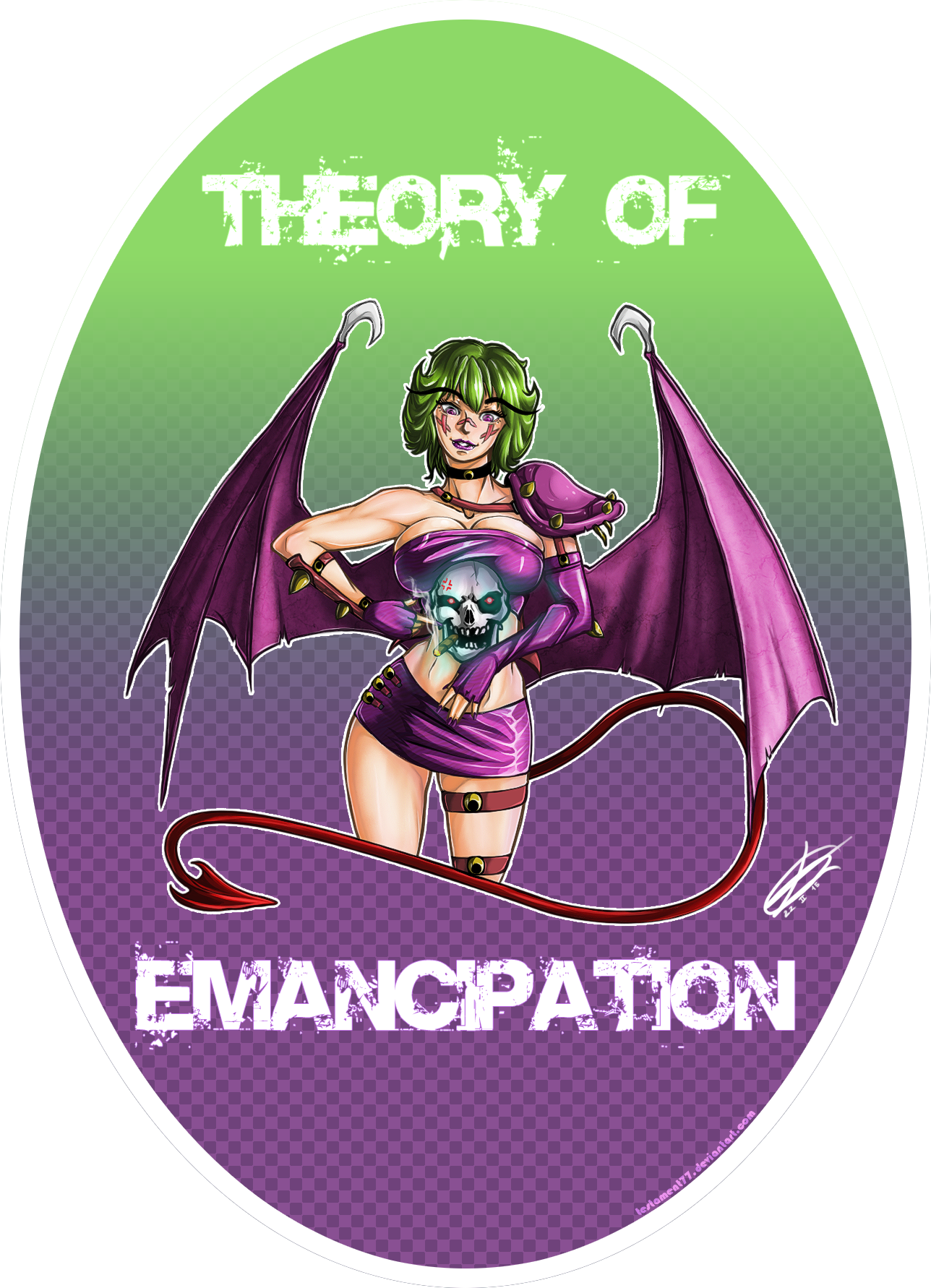
https://www.deviantart.com/testament77/art/Theory-of-Emancipation-Subbubus-and-Barbadan-515628511
(Succubi are going to be present as well)
Here he is, in a fanart for ToE made by the amazing Testament!
https://www.deviantart.com/testament77/art/Theory-of-Emancipation-Subbubus-and-Barbadan-515628511
(Succubi are going to be present as well)
S2.png
author=OzzyTheOne
While I agree that the fonts are indeed mismatched, I also agree with OldPat's statement that this is not an immediate concern as that can be fixed once the game is done and OldPat starts polishing the final product.
There's only one font, actually, and it's the same one everywhere.
Problem is, the text on the upper left corner of the screen has a 1x1 black stroke and that is probably what Frogge was complaining about especially, knowing him.
Also, the font of the icons is a bit blurred due to the fact that, somehow, it's under the map effects, that white-ish semi-trasparent picture. And, VX Ace tends to anti-alias texts. The one on the upper left corner of the screen isn't anti-aliased because it was photoshopped and I could just turn that off, thus it looks a bit "sharper".
AAAANYWAY, I think it looks just fine for now.
I will think more about it later on and I'll try to fix the Z coordinate of the HUD because that is indeed something that stands out a lot.
Don't worry, though, the game will look good when it'll come out.
You have my word!
S2.png
author=Froggeauthor=pianotmIt's not sized consistently with the tiles
I don't see anything wrong with the font.
Like those icons and UI btw
These inconsistencies you're talking about, though, while they could certainly be fixed a bit, do not make the whole thing look ugly.
They still blend pretty well together and it all fits the general "feeling" of the game (although I still have to find a way to fix the Z coordinate of the life bars so that they don't stay below the map effects).
For me at least.
These are the sort of things I will probably focus on later on, if I feel like they will make the game look really ugly.
First of all, I would like to have the game ready and make the things that stand out the most look good.

