


RAMSHACKIN'S PROFILE


Search
Filter
 Screenshot Survival 20XX
author=Sated
Skills that inflict a status effect (in this case Blind) always have the same animation after them as a visual indicator, so that's what the darkness thing is.
That's a pretty good idea! Tempted to rethink my skill animations.
author=Pizza
Some work I did today on an area called "Coral Castle" from Songs from Aelsea. Obviously it's still incredibly WIP. Not totally sure about the coral + fish paintings on the castle walls at the moment or of the colours, but I think it's shaping up nicely.
Lookin' good so far, Pizza. I'm a fan of the coral paintings. I like the way the shadow by the door curves in, but shouldn't all the shadows do the same?
My screenshot addition for today:

Exploring a forgotten temple built into a cavern.
Screenshot Survival 20XX
Screenshot Survival 20XX
Screenshot Survival 20XX
Screenshot Survival 20XX
Been getting back into RPG Maker, and game making in general, after a few years. So far I've been having too much fun putting this new project together.

The heroes enter a magic forest to help a magician find the key ingredient to his greatest trick yet.
The heroes enter a magic forest to help a magician find the key ingredient to his greatest trick yet.
Screenshot Survival 20XX
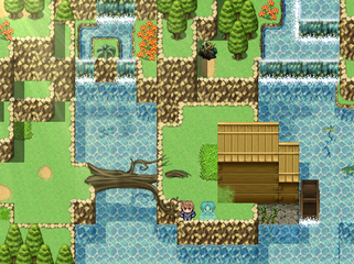
Looks beautiful Luchino. Did you make the tree glow a bit? Something about that looks nice.
Did you try shift mapping the waterfalls to get rid of the rock border?
Did you try shift mapping the waterfalls to get rid of the rock border?
Screenshot Survival 20XX
author=Red_Nova
So things are slightly different now. I wrote the script to display the weapon's skills in the Description window (which took way longer than it should have. But hey, baby steps!), made the top nameplate smaller, changed the text colors, softened the edges of the windowskin, etc. I'm really bad at determining which text colors should go where, so hopefully this isn't too bad.
Better?
Much better! The info flows more naturally and the window order matches the order a player would read them.
Screenshot Survival 20XX
author=Red_NovaRamshackinActually, it will change the most. This project puts a lot more emphasis on swapping out equipment rather than leveling up, so this will be one of the most visited screen in the game.
2. This info changes the least, and in turn, will have the least user attention. The equip box doesn't need center stage.
I meant the equipment box changes the least in terms of the context of the menu, rather than the game. For example: user selects armor, scrolls through Helmet, Plated Vest, Leather Vest, before finally deciding on Leather Overcoat. The other info boxes have changed 4 times before the equip box has something new in it. Sorry for the confusion!
Screenshot Survival 20XX

1. It's clear the user is viewing the equip menu from the context. In fact, chances are, the user selected a menu item named 'Equip' to reach this screen. You can drop this top bar entirely without losing anything.
2. This info changes the least, and in turn, will have the least user attention. The equip box doesn't need center stage.
3. In order to learn about a selection, the user must look in nearly every direction. Plated Vest. Look up, look right, look down. Leather Vest. Look up, look right, look down. You get the picture. Consecutive pieces of information read great when laid out like a book.

