


SAYA'S PROFILE
Saya
30
Saya likes to draw and play video games. =w=
Search
Filter
 Video thread
How to fully edit the title screen? *RMXP*
Easy answer: Change your window.
In the window skin, you have categories that determine what goes where. For example:
The box on the left is for the window's inside, the top-right box is for the frame, and the section circled below is for the cursor/highlight.

I made one for you quickly:

It'll basically yield the same result as in the example above. Hope that helps.
In the window skin, you have categories that determine what goes where. For example:
The box on the left is for the window's inside, the top-right box is for the frame, and the section circled below is for the cursor/highlight.
I made one for you quickly:
It'll basically yield the same result as in the example above. Hope that helps.
 EGL3.jpg
T-too many overlays. It's a bit hard to focus on the map due to this. Try to tone it down a bit, m'kay?
 The Screenshot Topic Returns
author=Perihelion
This is just a mockup, but I'd appreciate feedback on the tileset. This is all made by me.
In-game resolution.
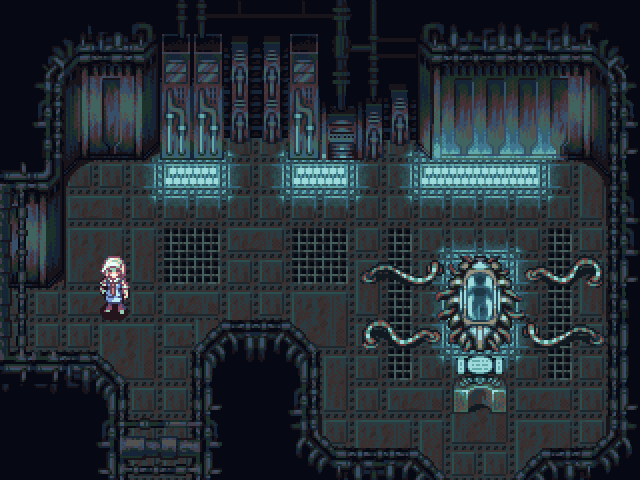
:< Whyyyy, why do you have to be so awesome? I really like the amount of animation you've put into it, with the flickering lights and the character's idling pose. At first I didn't even notice the body in the tube-- which makes for good fridge horror.
Random Art Topic

Because apparently everyone thinks I suck after the whole "Screenshot Topic" incident, I decided to draw a character design to prove that I'm not a complete loser.
Just wait until this pops up in the "Make me a Sandwich" topic. (Although personally, I don't think this is over-sexualized.) The only thing "sexy" in this picture is the whip and the horns, but that's not an issue because she uses a scythe in-game and ram horns are a cultural decoration. (Justified trope? LOL)
A couple of small mistakes here and there, I can't say that I like doing lineart too much, so naturally it's a bit messy. The horns look terrible, and I've never used so many overlays in my life before. Overall though, I'm happy. =)
 Screenshot Saturday 2
You're going to overhaul Act Three too, right? With new endings? Because I want my catharsis. Still, I'm looking forward to it. Keep up the good work!
Help Saya improve her pixel art
author=DE
Oh, and calling your traced image an original creation is bad. It's no different than plagiarism, it's rude, and don't do it again. Like, ever.
I was never trying to pass off the tracing of SD3 as my own work straight from scratch. Granted, I was a bit vague in my terminology, so I apologize for that. So, now that we've FINALLY gotten that out of the way, can you all stop treating me like a criminal and get down to business?
As for making the game in low resolution: I hate to say it, but having the wrong resolution REALLY REALLY bothers me. It's like an obsessive compulsive habit of mine to have exactly the right resolution. For this reason, I was considering using RM2k3, but I feel guilty using abandonware when I can be using the legal product.
Thanks for the tutorials Ocean! I'll be sure to check those out.
Anyhow. I've moved onto this right here:

It looks a bit flat right now, I need to implement shadows and get the cliffs to loop better horizontally in some places. Still, the palette doesn't clash so much anymore, although I'm considering recoloring the dirt tiles (and I still need to break up the grass-grid).
And this is just for fun:

Using Rudra as a reference, I drew a balcony. Do the shadows and dithering look right?
Help Saya improve her pixel art
Okay, so the general consensus is "do your own sprite work, don't copy SD3". So I tried to do that:

The reason I copied SD3 in the first place was because, well, I suck at pixel art. The first two images are my attempts to do cliffs from scratch, the last one, I took a piece of SD3 cliff that I traced and did the surrounding cliffs to resemble that. Overall, I think it looks pretty good.
Alright. I can totally make some variations and auto-tile them as well. Is it just me, or does the grass look like it needs to make deeper shadows on the dirt?
Unfortunately, I'm very, very bad at picking my own color schemes for pixel art. I tend to use pre-defined palettes that RTP uses, so hopefully, my final chipset won't look so disjointed.
As for smoothing out and internal anti-aliasing, I'm not quite sure what you mean. Basically, surround the lights with slightly darker colors until they get to darker ones? I know people anti-alias outlines on pixel art, but I'm a bit clueless on how to do "internal anti-aliasing". Show me an example perhaps?
Alright. Let me finish these and we'll try the screenshots again.
The reason I copied SD3 in the first place was because, well, I suck at pixel art. The first two images are my attempts to do cliffs from scratch, the last one, I took a piece of SD3 cliff that I traced and did the surrounding cliffs to resemble that. Overall, I think it looks pretty good.
author=Perihelion
First, I like the texture of the grass, but the tiling is really obvious. Try making 2-3 variations and scattering them around when you map to break up the grid.
Alright. I can totally make some variations and auto-tile them as well. Is it just me, or does the grass look like it needs to make deeper shadows on the dirt?
author=Perihelion
Second, your palette choice makes the piece look disjointed. Pick very similar shadow colors for all color ramps, and try to have highlight colors tend towards the same shade as well (for example, yellow). Third, you're going to clean this up, right? Your bush looks awesome, but it really needs smoothing out and internal anti-aliasing. Same for the cliffs.
Also, are you going to make your own sprites?
Unfortunately, I'm very, very bad at picking my own color schemes for pixel art. I tend to use pre-defined palettes that RTP uses, so hopefully, my final chipset won't look so disjointed.
As for smoothing out and internal anti-aliasing, I'm not quite sure what you mean. Basically, surround the lights with slightly darker colors until they get to darker ones? I know people anti-alias outlines on pixel art, but I'm a bit clueless on how to do "internal anti-aliasing". Show me an example perhaps?
Alright. Let me finish these and we'll try the screenshots again.
Help Saya improve her pixel art
Okay, so I posted a screenshot in the screenshot topic, and since my pixel art wasn't particularly that good, I decided to start this topic. So basically, what I'm asking for is for some constructive criticism. Please be as specific as possible, because when people say "remove that weird filter", I have no idea what they mean because I'm not using a filter.
So I've gone from this:

to this:

I did the grass and ground tiles myself this time around, no reference. Is it better? Needs more color depth? Currently working to fix those pesky cliffs and looping problems.
So I've gone from this:
to this:
I did the grass and ground tiles myself this time around, no reference. Is it better? Needs more color depth? Currently working to fix those pesky cliffs and looping problems.

