FLOWERTHIEF'S PROFILE
Switching to Python.

Search
Filter
 Testing
Thanks for the reporting that, and good to see you back.
Having received very little feedback about the customizer since I first released it, I wasn't sure if people were using it without problems or if they just weren't using it. Looks like it was mostly the latter! The bug will be fixed shortly.
@dude
Actually I have something more simple and less original in mind, but I do like the air freshener idea haha. Anyway, I'll be thinking about that. For now it's time for a new update....
 Spelunkémon
I was just on my way to play some Spelunky now, no joking. Just like I have played it every night for the last week or so. I am totally addicted to that game.
 Testing
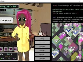
About the outline, all I did was print the text twice, once in white and once in black off by one pixel up and one pixel to the side. If it doesn't improve readability I can undo it. I don't know what a stroke fx is but it's probably not something that can be done from RGSS.
About taking delinquents out by surprise, that is actually not a bad idea and one that I've had myself. I'm going to try to think of a way to implement it. Whatever I end up doing, it will probably not be an ability you start off with.
About taking delinquents out by surprise, that is actually not a bad idea and one that I've had myself. I'm going to try to think of a way to implement it. Whatever I end up doing, it will probably not be an ability you start off with.
 Creating characters is so easy now that my cat just made one!
Lack of RTP shouldn't cause that problem. Vista shouldn't cause it either. I don't know what would cause it at this point. To troubleshoot I would have to make test versions of the app and have Idida1 test them one by one, if he's willing. (Just to make sure, you don't have some version of Ruby already installed by any chance?)
 Testing
 Testing
^ Thank you for your feedback. It's much appreciated. I don't think I can come up with 4 new mini-games to accommodate different attributes or change the protagonist's personality according to attribute scores, but I agree those ideas would make the game better if they could be accomplished!
 Testing
 Testing
Looks great ;)
Only thing I would change is to move "Reach the end of the board" closer to "to enjoy your afternoon", and "Hint: Try waiting." closer to "Some icons move on their own."
I'll try to think of something to put in the middle.
Only thing I would change is to move "Reach the end of the board" closer to "to enjoy your afternoon", and "Hint: Try waiting." closer to "Some icons move on their own."
I'll try to think of something to put in the middle.
 Testing
@dude
Hmm, I think I like the third box on the left separated like it was before. And I think it should say "Hint:" somewhere. Maybe it could be "Hint: Try waiting. Some icons move on their own"
For the second box, I still think "Reach the end of the board to enjoy your afternoon" could stand to have the font size slightly smaller. Also, it might look better to not have a dividing line between the first and second boxes? Not sure about that. Pardon my pickiness!
I'm not against putting a logo on the screen. But the thing is that LivingEffigy made the logo (the same one that appears in the background of Story Test) and I don't think he's around. So you would have to "extract" the logo from that image which might be a pain.


