SCREENSHOT SURVIVAL 20XX
Posts

Man, these ships.
Man, it talks to me, I know I want to explore the cave and the town is so Alaskan or Canadian. All that empty space between houses works here.
@Infinite, I like it. Some details bother me, tho. Like the mouth. It seems to be a pixel too wide. Maybe it's just too dark and reminds me of cigar too much.
Boxes in the left top corner look like being taken from Minecraft.
@Nerds, Is that a brain? Anyway, I'm a jelly.
@Luchino, More like Mount Awesome.
Thanks for the comps guys!
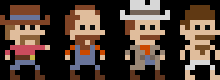
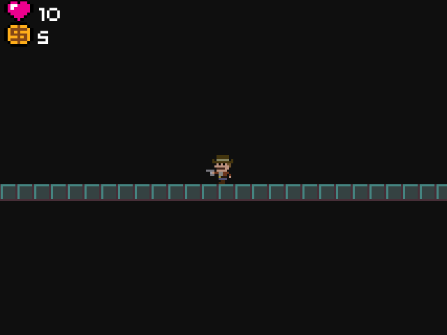
@Cap It's supposed to be a mustache... Every great hero needs a mustache!
He even fights legged mushrooms...
@Cap It's supposed to be a mustache... Every great hero needs a mustache!
He even fights legged mushrooms...


author=PizzaI'm around 3/4 of the way done with this town now. Still need to make the northern chunk as well as add loads of small details to the boats and docks and shit. unreal amount of work.
This is three maps stitched together, so it's a rather big image.

The ultimate Newfie RPG town. Nice work.

That's about as good as it gets, Pizza! Stunning.


After a few days of work I finally got the last major gameplay system in Aelsea put together, the party/character swapping. I feel pretty good about how smoothly it works since this is the most complex thing I've evented in the last 5 years, hahaha.


Infinite
@Pizza really cool as usual. I wish the waterfalls had splash or mist or something...
As do I. They aren't finished yet, since mist is pretty hard (for me) to animate. Thanks for reminding me though, I need to set up the waterfall tiles for time-changing so I should really get on that.
I'm liking the look of what you've got going there, by the way. Some pretty good colours, and a nice cutesy aesthetic too. That block exploding effect is A+.

author=Infinite
@Cap It's supposed to be a mustache... Every great hero needs a mustache!
I thought it was the guy's mouth too. Even after reading it's a mustache, I still see the mouth.
Ramshackinauthor=InfiniteI thought it was the guy's mouth too. Even after reading it's a mustache, I still see the mouth.
@Cap It's supposed to be a mustache... Every great hero needs a mustache!
Now that I notice this comment, yeah, I assumed it was a mouth too.

Perhaps something like this?


You guys want to explore a really moist, warm cave?
Still a WIP. This looks like it was just ripped from FF2, but it's heavily edited to get working decently. It is also gross.
@Pizza: Lovely! I evented a similar system in Evoker for some multi-party events. It was a pain in the buns, for sure.
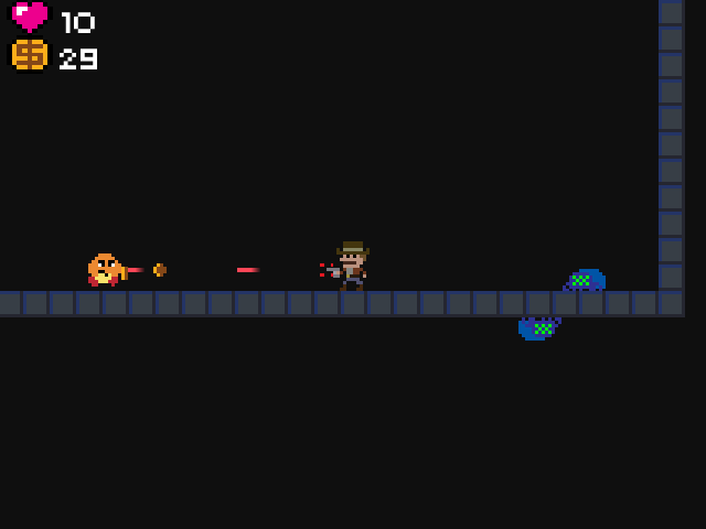
@Infinite: Do what Pizza says. That is extra moustachey. I look forward to some solid platforming!
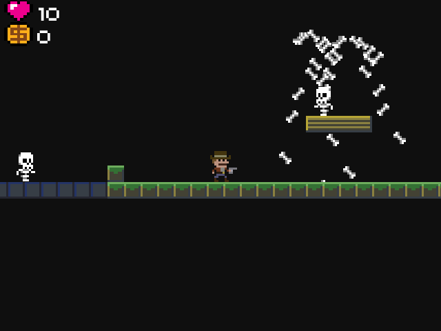
@MOG: Looks great, although I'm starting to feel bad for those grunts we keep seeing getting killed.

I feel like it's a bit too bright. The chips are nice, but would be better if they weren't so eye-blindingly saturated. Turn it down a bit and it should be better. Currently it kinda hurts to look at it too long. >.<;
author=Liberty
I feel like it's a bit too bright.
Fair enough, I'll see what I can do! The saturation is too high in general for the charsets in my game, so I was planning on doing something about it already. This is just sort of a test run to see if the tiles would work in the editor.

author=Kaempferauthor=LibertyFair enough, I'll see what I can do! The saturation is too high in general for the charsets in my game, so I was planning on doing something about it already. This is just sort of a test run to see if the tiles would work in the editor.
I feel like it's a bit too bright.
If you like what you've done and want to add some dynamics, maybe create an event that pulses the saturation of the area.
At its max you'd be back to the brightness you have showing, and at its lowest maybe do 50% of current saturation. Done well, this might even have the feels of an ember in a fire while also reducing the amount your current picture's brightness is burning into my eyes oh God the burning.