


WE DID IT FIRST SCREENSHOT THREAD
Posts


I'm sorry but the options you give make the scientist more like a Biologist than a Chemist! xD
Lol. He is actually just a farmer trying to get his plants to grow better. I shouldn't say JUST a farmer as obviously he has something of a scientific etiquette. I don't know why I stuck chemist in there, just a mistake I guess.
Eschalt, that is ridiculously small text. My eyes have exploded trying to read it.
Though I am sort of afraid to, I really need to switch to XP. It's easier to read in full screen but I can imagine on certain monitors it would be nearly impossible.
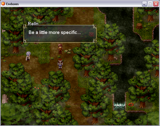
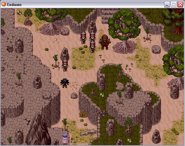
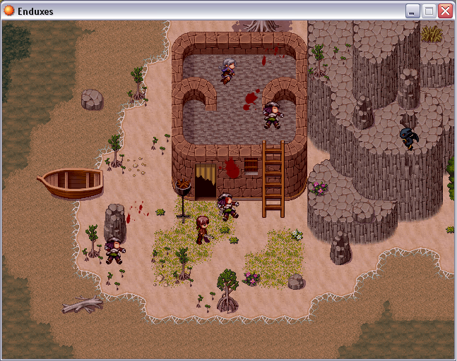
I really like those screens Arion, especially the second one. That demon guy seems out of place though. And the last screen the fort is too close to the mountain imo and also on the roof the tile sort of cuts off.
Yeah it's all sidescrolling, WIP. There is horizontal and vertical movement. You know climbing ladders, vines, swimming, etc.


Arion... I am jealous. Those look great, except the faux waterfall in the first scene. I only suggest one thing: Less bloody cutscenes, more game please. =D

author=Chartley link=topic=5.msg1065#msg1065 date=1182744623
I remember your demo UPRC, hot damn it was good.
Hopefully I can repeat that with the next demo, eh? :)
author=Craze link=topic=5.msg1055#msg1055 date=1182731317The entire game is actually a cinematic. I've released episode one as a quick, unscripted test. (that wasnt even the bloody part either XD )
Arion... I am jealous. Those look great, except the faux waterfall in the first scene. I only suggest one thing: Less bloody cutscenes, more game please. =D
And i thought the creek looked decent. Surely you can remember back in the day, palying at the waterhole. Small little drop offs in the creek made tiny waterfalls.


First post here.
I'm still deciding what to do with the character portraits. The battle system is pretty sussed, there's just a few atmospheric effects left to implement.
One complaint I have with it, is the text on the info displays. "Health", "Power", and "Exp". They seem too thin or something, and the bar going through them is a bit jarring.
However, it looks pretty cool despite that. I'm not sure what kind of faceset to use, though. It could be anything, really.
However, it looks pretty cool despite that. I'm not sure what kind of faceset to use, though. It could be anything, really.

I kinda like the black fade on the bottom.
Give the text a shadow. Easiest way would be to first draw in bold and all black one/two pixels up and down, left and right.
Give the text a shadow. Easiest way would be to first draw in bold and all black one/two pixels up and down, left and right.

Or use the Font Addons script by Yeyinde, and simply set self.contents.font.shadow = true in the Window_BattleStatus class.
You can find the Font Addons script at rmxp.org, it's both standalone and part of the Methods and Class Library.
You can find the Font Addons script at rmxp.org, it's both standalone and part of the Methods and Class Library.

Is experience relevant in the middle of a battle?
I'm not saying it can't be, but in most games you'd do better to leave that bar out.
I'm not saying it can't be, but in most games you'd do better to leave that bar out.

I'm new to the site, although not too new to RPGMaker XP, and was refered here by a friend (Prexus). I've been looking for a way to jump start my interest in finishing a project that's already got a good start.
I'd just like to include a couple screenshots, I'll work on getting the project posted probably tomorrow:


I'd just like to include a couple screenshots, I'll work on getting the project posted probably tomorrow:
Wow, lookin' damn sexy! The more RMXP games I see, the more hours of the day I spend crying wishing my PC could run it.
I really like those percent bars! Something doesn't feel right about black color font in the second picture, though.

