


SCREENSHOT SESAME STREET (40TH ANNIVERSARY EDITION)
Posts


damn it geodude that broke my internet

get better internet it's not that big

work-in-progress of the upper elevated train line, for express and freight traffic. nearly the highest level of the city, barring the skyscrapers
i get the feeling the sleepers need to be made from metal, not wood but i can't decide. also it might throw off the perspective slightly.
work-in-progress of the upper elevated train line, for express and freight traffic. nearly the highest level of the city, barring the skyscrapers
i get the feeling the sleepers need to be made from metal, not wood but i can't decide. also it might throw off the perspective slightly.
oooh nice, i feel surprisingly excited by this sudden yet fantabulous screenshot
@wolfcoder, these look ace, reminds me of the old(like...OLD) psx rpgs. 3D homegames are always fun to see.
@wolfcoder, these look ace, reminds me of the old(like...OLD) psx rpgs. 3D homegames are always fun to see.


Menu is too spaced out and hard to read, make it compact and give it a background/window/something.
The map's pretty nice. A bit plain, but I like its cleanliness.
The map's pretty nice. A bit plain, but I like its cleanliness.

Remodeling thanks to a new method of ripping.
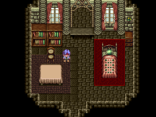
OLD:
NEW:
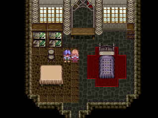
Which do ya'll think is better? (The bed is only like that temporairly, I'm still fixing the things there.)
OLD:
NEW:
Which do ya'll think is better? (The bed is only like that temporairly, I'm still fixing the things there.)

@j-men: I much prefer the old walls/floor, but the new tables/chair look better (due to contrast)
@rockmen: the repeating tile on the leftern train is pretty obvious; it doesn't look bad but a little bit of variation'd be nice, yeah? Are there people on those lighter grey walkways below? Workmen perhaps? That'd be a really nice touch! Also, the sleepers could have wood paneling but it'd be hard to match the style to the dark, dark metal of the rest of the train. What's that? Consider it... a challenge... heh heh
@rockmen: the repeating tile on the leftern train is pretty obvious; it doesn't look bad but a little bit of variation'd be nice, yeah? Are there people on those lighter grey walkways below? Workmen perhaps? That'd be a really nice touch! Also, the sleepers could have wood paneling but it'd be hard to match the style to the dark, dark metal of the rest of the train. What's that? Consider it... a challenge... heh heh
I swear we need a tardis code (That looks great with tardis code = That looks fucking awesome. I LOVE YOU).
Anyways -
@Shadyman >> Your character sprite is reminiscent of Rei's Cyrus one. I would also follow KingArthur's advice, because at the moment, that text is WAY too hard to read (especially against the white of the snow!). You should also compact it in a little so the player can read all of the information in one go instead of having to look to and fro across the screen. Also, you should add some variation to the snow tile (perhaps have mounds of snow rising from the ground, or around the bottoms of the houses? Just an idea).
@J-Man >> I'm actually quite fond of the old castle floor tiles and furniture as well. Though, I don't agree with the new windows. They appear to be cut-off at the top, whereas the old ones didn't (and had nice curtains :D).


