THE SCREENSHOT TOPIC RETURNS
Posts
LockeZ

I'd really like to get rid of LockeZ. His play style is way too unpredictable. He's always like this too. If he ran a country, he'd just kill and imprison people at random until crime stopped.
5958
Your uniquetitude and originalificationedness must be indisputationable

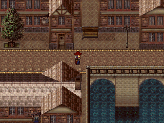
I started working on the graphical style for my upcoming project. I'm planning to entirely do the graphics myself which will be tedious but very good for the game quality. I've done some tests tonight and I'm starting to feel satisfied by the outcome. I wanted the opinion of others. Please note that the brick wall is not definitive and is more of placeholder, the rest will probably stay the same (minus some tweaks).
So, what do you guys think of it ?
Really nice lezales. I don't know but it reminds me of dungeon master 2...thats good by the way. One little tip, don't be afraid to use contrast, mainly on metals.
@Lezales, really great the lighting, rarely seen such an good one!
@Dethmetal : beautiful street, I really like the walls and the roofs of the houses and the very fine detail of both and the light. Two things though, I have a problem with the lining of the street, looks like it's higher than the base of the houses (or is is it ?), and with the water, where does it go?
@Dethmetal : beautiful street, I really like the walls and the roofs of the houses and the very fine detail of both and the light. Two things though, I have a problem with the lining of the street, looks like it's higher than the base of the houses (or is is it ?), and with the water, where does it go?
author=chana
@Dethmetal : beautiful street, I really like the walls and the roofs of the houses and the very fine detail of both and the light. Two things though, I have a problem with the lining of the street, looks like it's higher than the base of the houses (or is is it ?), and with the water, where does it go?
It's not higher, the base your referring to is actually part of the wall. :) As I said, it's a port town, so some of the town is actually built on the water and there's a lot of bridges and stuff. It makes more sense when you see the whole map and you're walking around in game.
author=Creation
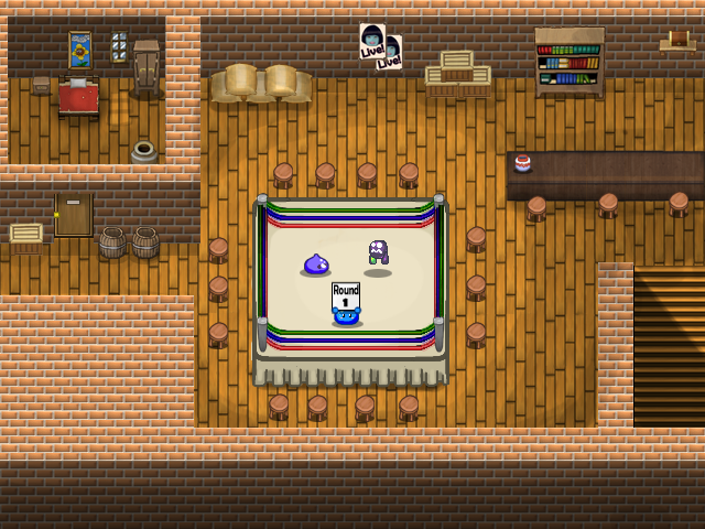
Could you kindly comment this screen please? I'm looking for ways to improve it
the rope on the far side of the ring looks odd. It looks like it should go straight across instead of bow in a u shape or be placed beyond the edge of the ring instead of where it is ie. moving the horizontal lines 1 square "north" so that you see wood floor between the ropes, not ring.
edit: ps otherwise nice custom tiles.
Dizzy... aren't the flour bags and the boxes (the bar?) slightly falling forwards? Also the door of the room looks like its going into the wall at the top. That ring definitely isn't too great (color, lining, and how do those curves get there with the strings?)
Dizzy... aren't the flour bags and the boxes (the bar?) slightly falling forwards (actually the 2 barrels on the right of the door are the only elements that seem to be standing straight up)? Also the door of the room looks like its going into the wall at the top. That ring definitely isn't too great (color, lining and how did those curves get there with the strings ?).
Edit : for the "falling forward, maybe it's the floor tiles, would be better horizontal ?
Re-edit : That's a pretty thick wall on the right, but, why not?
Edit : for the "falling forward, maybe it's the floor tiles, would be better horizontal ?
Re-edit : That's a pretty thick wall on the right, but, why not?
I think the door is supposed to be slightly recessed but yeah it would look better with the frame at top visible.
author=Archeia_Nessiah
Needs more screenshots
FULLMETAL ALCHEMIST FANGAME?!!?!?!?! GIMME GIMME GIMME
(I am aware that there is a 90% chance this is for testing purposes but <3 anyway? XD)
The design is very slick. Though I feel there's a lot of empty space between the Potion and the amount- maybe have an item description appear under the item in question when selected? I dunno ^^''
author=Creation
Could you kindly comment this screen please? I'm looking for ways to improve it:
Everything is custom made except for the sprites fighting.
Thank you!
A lot of the tiles look fuzzy (in a bad way) especially the brick. Some of the object like the bookshelf are fuzzy and pixelated on the top. The door on the left room looks clean and stands out way too much.
I like the look overall, but the tiles are just too different in quality and presentation. Layout is very good though, and the tile choice too, just that the quality doesn't match up.
Creation, that entire chipset is custom made by you? Really? That's pretty excellent, considering :o
Someone's little brick house does seem like an odd place for a boxing ring, but otherwise I have nothing negative to say about that screenie.
Except that maybe the posters are a little out of perspective, like they're flat while the wall is sloped Zelda-style.
Someone's little brick house does seem like an odd place for a boxing ring, but otherwise I have nothing negative to say about that screenie.
Except that maybe the posters are a little out of perspective, like they're flat while the wall is sloped Zelda-style.


