THE SCREENSHOT TOPIC RETURNS
Posts
author=VanitI can't help but being annoyed by the Magic-use animation on Cloud.
*video*
Battle system is basically finished. Will have a proof of concept demo out in a day or so. :)
Less getting the sword on the back and more holding out hands I think.
Otherwise, looking very nice.
author=ZephyrI'm not sure what you mean by this. The animation is pretty much frame for frame as the original, and timed similarly as well - what exactly do you think needs changing? Do you think he should hold his hands out a little longer?author=VanitI can't help but being annoyed by the Magic-use animation on Cloud.
*video*
Battle system is basically finished. Will have a proof of concept demo out in a day or so. :)
Less getting the sword on the back and more holding out hands I think.
Otherwise, looking very nice.
I think he meant that whenever cloud grabs that sword off his back, there's no "gravity" or "weight" feeling to it.
To be honest the fact that this is 2d, it would be nice if you could add more life in your animations than just copying it directly from the game. For example, even if the animation is exactly the same as the one in the 3d version, at least FF7 added more eye candy to avoid making them look like some dead dolls on the field (like changing the camera angle etc.)
To be honest the fact that this is 2d, it would be nice if you could add more life in your animations than just copying it directly from the game. For example, even if the animation is exactly the same as the one in the 3d version, at least FF7 added more eye candy to avoid making them look like some dead dolls on the field (like changing the camera angle etc.)
I suppose holding out his hands a little longer during the strike would make it look better even though it is frame-by-frame right now. Right now it looks like a really quick flick which doesn't give much intensity in how the character executes it. I also compared a video of the original and there's a longer pause between the charge-up sound and the actual magic-strike. All of this is my opinion though.
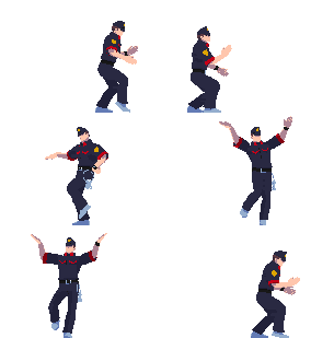
@Nessiah: If Cloud acted like his sword weighed anything he'd be dragging it along the floor. :P Seriously though, I see where you're coming from and if this project was anything else I may agree with you, but its not what this games about for a few reasons. 1) This game is kind of meant to be "what FF7 would've looked like if it was on the snes", and that means the animation really isn't supposed to have that many moving parts. 2) the animations were lifeless and stiff in the original, and similarly while you're going "make the animation fluid with more moving parts!", others would go "his hair didn't move in the original!", etc. My remake is designed to be as nostalgic as possible, and part of that is having 1:1 animations that are the same as the original, for better or worse.
@Zephyr: Ah I see what you mean now. I'll have to tweak things a bit when I get the chance, thanks for pointing that out!
@Zephyr: Ah I see what you mean now. I'll have to tweak things a bit when I get the chance, thanks for pointing that out!
oooh... I was never a fan of FF7, but this project looks pretty badass. It's like you're taking all the great things of it while eliminating the crappy 3d.
Maybe when I play your completed game, I'll actually recruit Vincent this time.
As much as I would love to put in that level of detail, I have over 250 images, each with between 6 and 12 frames. If I did attempt it, I wouldn't have a release date until sometime in 2015.
Since favor for the 2nd screenshot was pretty unanimous, I'll go with it. On the bright side, the finer details won't be noticeable due to the speed of the animation.
Maybe when I play your completed game, I'll actually recruit Vincent this time.
author=alterego
Ugh, no. The sprites in the second screen just have an awful blur effect to them, by all means keep the ones from the first screen. And if you feel like trying edit them a bit on your own, it's not that hard; Believe me, whatever you do will look better than what you have going on in that second screen... Look at the example I did, and I didn't even paid much attention to shapes or other details. I also adjusted the contrast of the grass in Photoshop.
As much as I would love to put in that level of detail, I have over 250 images, each with between 6 and 12 frames. If I did attempt it, I wouldn't have a release date until sometime in 2015.
Since favor for the 2nd screenshot was pretty unanimous, I'll go with it. On the bright side, the finer details won't be noticeable due to the speed of the animation.
Doing 100 hits in an RPG Maker game!? Impossible!!! O_O;;;
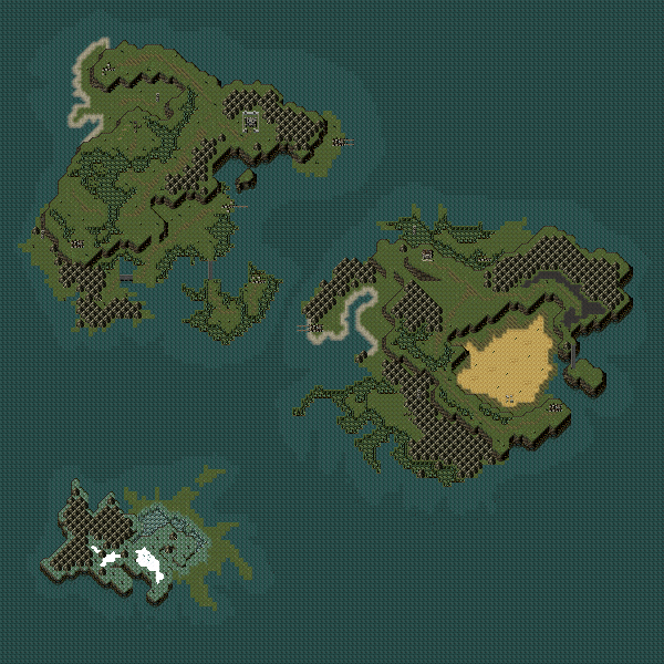
Dethmetal@ A most fun lookin' world map, continue with the making of the world map, needs a few more little islands surrounding some of the larger continents, but that's just me being nitpicky.
LockeZ

I'd really like to get rid of LockeZ. His play style is way too unpredictable. He's always like this too. If he ran a country, he'd just kill and imprison people at random until crime stopped.
5958
Multiple heights on an RPG overworld is pretty unusual, but it ends up actually looking mostly okay. I guess it's not unheard of - the Wild ARMs series used it occasionally, as did Chrono Trigger (in 65mbc). I just don't usually expect to see a sheer cliff that's five thousand miles long...
You can easily push that southern continent a little further north and get rid of a bunch of the empty space. I realize a vast ocean is realistic, but assuming the player has to travel via boat or airship, it can be really monotonous, not to mention extremely hard to keep your bearings. Adding more little tiny islands would help the monotony of ocean travel also. If your game doesn't include a sea or air vehicle, then disregard this paragraph!
You can easily push that southern continent a little further north and get rid of a bunch of the empty space. I realize a vast ocean is realistic, but assuming the player has to travel via boat or airship, it can be really monotonous, not to mention extremely hard to keep your bearings. Adding more little tiny islands would help the monotony of ocean travel also. If your game doesn't include a sea or air vehicle, then disregard this paragraph!
Thanks for the input. I agree that multiple heights on a world map is a little unusual but it ends up looking good when viewed up close, and if you think about it world maps aren't exactly 'to scale' anyway. Just a representation.
I definitely want to push up that southern continent; the only reason I have it so low is because it doesn't exactly make sense to have an icy continent so close in latitude to a desert. I do plan on having usable vehicles but I also plan on having a map that shows your location on the corner of the screen, so hopefully if I do that and add some islands between the continents to make the boat/air ride less monotonous it won't be a dreadfully boring or confusing ride.
I definitely want to push up that southern continent; the only reason I have it so low is because it doesn't exactly make sense to have an icy continent so close in latitude to a desert. I do plan on having usable vehicles but I also plan on having a map that shows your location on the corner of the screen, so hopefully if I do that and add some islands between the continents to make the boat/air ride less monotonous it won't be a dreadfully boring or confusing ride.
Nice map dethmetal, kinda remembers me from breath of fire 2 with those different heights
Here are the first 3 screenshots of a new project I'm working in.
So far I have all the characters sprited, and their special skills ready. Now I just need to start drawing and making tilesets.
Note. the background and the enemies are more of a practice, Don't know if there will be such an area in the game yet:


By the image size, I'd say VX(I can't think of any other program that uses such aa random size). It really looks 2k3, doesn't it? That might be what he's going for, though.
EDIT: oh okay then, nevermind then
EDIT: oh okay then, nevermind then
@dethmetal: That's really good looking, love the multiple levels of elevation.
Chipset looks really good too, what's it from, or is it custom? It's hard to tell at that zoom level.
Chipset looks really good too, what's it from, or is it custom? It's hard to tell at that zoom level.
author=Pneumatic
@dethmetal: That's really good looking, love the multiple levels of elevation.
Chipset looks really good too, what's it from, or is it custom? It's hard to tell at that zoom level.
It's a Theodore chipset. I'll upload it for you if you like. It's very underused imo.
@dudesoft - some of those charsets are a little mismatched. Some are a lot taller than others and it just looks sloppy. Adding to the sloppy look, it appears that you may have made them with the charset generator. Honestly I'd recommend using different ones..
LockeZ

I'd really like to get rid of LockeZ. His play style is way too unpredictable. He's always like this too. If he ran a country, he'd just kill and imprison people at random until crime stopped.
5958
Well, the two that are different sized are presumably on purpose. I mean, one of those two is a centaur... Not sure why the guy in the cape is taller but I'm guessing it's on purpose because he's almost twice as tall as anyone else. It would be hard not to notice that.
That said, some of the others admittedly don't match in other ways. Some have dark black outlines around them, while others have soft outlines (using a darkened version of whatever color their hair/clothes are). It wouldn't matter so much if they were each in different scenes, or even if it were a more active scene, but it is sort of visually disconcerting when they're all lined up like that. The teacher meanwhile has a strong black outline around his clothes and body, and only a very soft outline around his hair, making him look strange all on his own. I assume you pasted one character's head on another character's body to get that sprite?
The floors and walls of the tileset are brilliant in their simplicity. However, beware of furniture that has the same issue I described about the charsets. Your filing cabinet and wastebin don't match the door, desks and chairs.


