


THE SCREENSHOT TOPIC RETURNS
Posts

Funny thing, chipsets. Although they're called 'tiles' it supposedly looks bad when they obviously look 'tiled'. :0

The decision is up to you (obviously) but to me I think it looks better without the small white rock :> I do love everything else about the map though. xD
And now for something completely different :

FIGHTER MAGE THIEF game :0

Aztec-inspired civilization :\

Yes I will name everybody after an Agatha Christie character
The decision is up to you (obviously) but to me I think it looks better without the small white rock :> I do love everything else about the map though. xD
And now for something completely different :
FIGHTER MAGE THIEF game :0
Aztec-inspired civilization :\
Yes I will name everybody after an Agatha Christie character

I think, ideally, you'd go with Miracle's edit and use the bright stone tile to break up the tile a little bit. That'd be best! But yeah, it looks way more clear without the autotile on the top wall.
What do you think my title? Good? Bad? Ugly? A little too bright? Then step right up, folks, we got tickets on sale!!! lol. jk.

I like playing rpg maker in mini mode, so it's a small windowed screen using F5.
The title theme music I'm using sounds like a song from Lost. :)
Sorry if too many projects are at hand here, wanted to think up a better story and game, like those classic rpgs on the playstation.
Supposely it's going to be try at a three game saga.
Our hero saying his first words in the game:

Another hero steps forward for a combo insult. Though, I only guess he kind of disliked the hero at first.

Ms Serina, another character on the defence!!! I actually should give her one more step, because you don't really see her character from the text box. :p

Count Gudin, one evil dude.....

Will post more soon as I don't go overboard, detailing too much of the beginning.
Post Office: Where you'll recieve your rewards after you complete a Job Hunt. The peopleare ghosts at the moment. lol. Naw, it's just WIP.

Have a "Weapon Upgrader" um....to errr....."upgrade" your weapon to one attack point. You must at least
have the right amount of money to do so. 500 is enough, but if you don't, boo hoo. :p

Don't worry, this pub will be filled with "life" soon.....don't worry my pretties.

I like playing rpg maker in mini mode, so it's a small windowed screen using F5.
The title theme music I'm using sounds like a song from Lost. :)
Sorry if too many projects are at hand here, wanted to think up a better story and game, like those classic rpgs on the playstation.
Supposely it's going to be try at a three game saga.
Our hero saying his first words in the game:
Another hero steps forward for a combo insult. Though, I only guess he kind of disliked the hero at first.
Ms Serina, another character on the defence!!! I actually should give her one more step, because you don't really see her character from the text box. :p
Count Gudin, one evil dude.....
Will post more soon as I don't go overboard, detailing too much of the beginning.
Post Office: Where you'll recieve your rewards after you complete a Job Hunt. The peopleare ghosts at the moment. lol. Naw, it's just WIP.
Have a "Weapon Upgrader" um....to errr....."upgrade" your weapon to one attack point. You must at least
have the right amount of money to do so. 500 is enough, but if you don't, boo hoo. :p
Don't worry, this pub will be filled with "life" soon.....don't worry my pretties.

I lol'd at "give her back, you prick!"
i guess when i read "our hero saying his first words" i just didn't quite expect that
i guess when i read "our hero saying his first words" i just didn't quite expect that
Damn straight....Main character doesn't take no shit. He's a mercenary, he needs the money, whatever
the case. His personality forwards towards nothing but caring for the money. Though, he properly cares
deep inside, like most tough guy characters.
I had moved the heroes up more, so they won't be covered in message boxes. But I would
work with the message box options.
BTW, I hope no one thinks it's Licara, because of font lettering seems to think it's not.


@psy_wombats : I really, really like that! don't know how you're going to use it in the contest but i imagine it could do very well!
@benos
The title screen would be a lot easier to read if the text wasn't blurred and distorted.
@psy_wombats
I really like those water/ice tiles. Their contrast seems to be a lot higher than everything else, though. But given the contest theme, that might've been intentional?
@Archeia_Nessiah
That's adorable! The interface uses red nicely too. ^-^
LockeZ

I'd really like to get rid of LockeZ. His play style is way too unpredictable. He's always like this too. If he ran a country, he'd just kill and imprison people at random until crime stopped.
5958
Benos, all your maps have a lot of large empty floor spaces. On the roof it's okay, but in the indoor maps I would probably condense them to about half the size they are now. Delete only empty tiles, leave all the furniture.
Also, the line "As much as I disagree with this guy so much, I agree." makes zero sense.
Also, the line "As much as I disagree with this guy so much, I agree." makes zero sense.
Well, in past tense. Since the scene is actually 3 months prior to the events before they all meet(it was supposely 3 years but that's too far for my standards of the game).
Well, to change a better dialouge, maybe to this:
As much as I disagree with this so much, I finally agree with him on this".
I also have three title screens for this, so two of them are properly not blurred or distorted. :p The third one doesn't seem bright or distored, seems normal though, but I know you properly wouldn't like it.
The first one, the background is too bright, the title would seem too bright if you brighten up your monitor.
I think it depends on full screen play or window play that it might not be too bright. Title screens don't have to stay too long for someone to admire it or think it's garbage(that's well and good, I can make new one and see how it goes). Seeing as it's a title with white mostly on it, guess, why I choose black for Elendor.
That sentence is still... awkward. Maybe try:
"Although I don't usually do so, I agree with him this time"
or
"We may not agree on much... But I agree with him on this."
idk it's after midnight and I'm exhausted so those might be terrible too
"Although I don't usually do so, I agree with him this time"
or
"We may not agree on much... But I agree with him on this."
idk it's after midnight and I'm exhausted so those might be terrible too
"As much as I disagree with him, I competely agree with him this time".
Alot of different ways to go about it, so I take yours for granted. lol at least you got excuse for mind numbing dialogue in your "midnight" sentences. :p
Alot of different ways to go about it, so I take yours for granted. lol at least you got excuse for mind numbing dialogue in your "midnight" sentences. :p

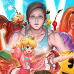
Nessy; oh my god - is this what you've been up to while I've been away?
;v;
;v;
author=ChaosProductions
Nessy; oh my god - is this what you've been up to while I've been away?
;v;
yes ;v;
@benos how about, "I don't want to be on the same level as this guy--but for once I agree with him." ...lol fail!dialogue
@Melkino daww thanks ;v; I'm glad the colors work nicely

Welp, I wish I posted here before Nessiah, now I feel a distinct lack of self-confidence.
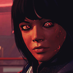
On the other hand, I would appreciate pointers on how to get rid of the nasty white outlines of the speaker's picture. (Will making the background black work? ... that might give nasty black lines.)
P.S. I suck at mapping.
Your character seems say the right thing, lol. Though the white outline of the character portairt has that white lineages. But it's not bad, just transparented. But still great art.

I would suggest making a white border around the head graphic to hide the sparse white edge it has now and to make it stylistic like the message window.
I like it though
I like it though

