


THE SCREENSHOT TOPIC RETURNS
Posts

@arcan: Post just the tiles then and ask for feedback on those instead (in the other thread), as it is now it's impossible to give any feedback except on maybe the trees.
Edit:
Edit:


See? I do have other font systems. (The one that keeps popping up is just the default)
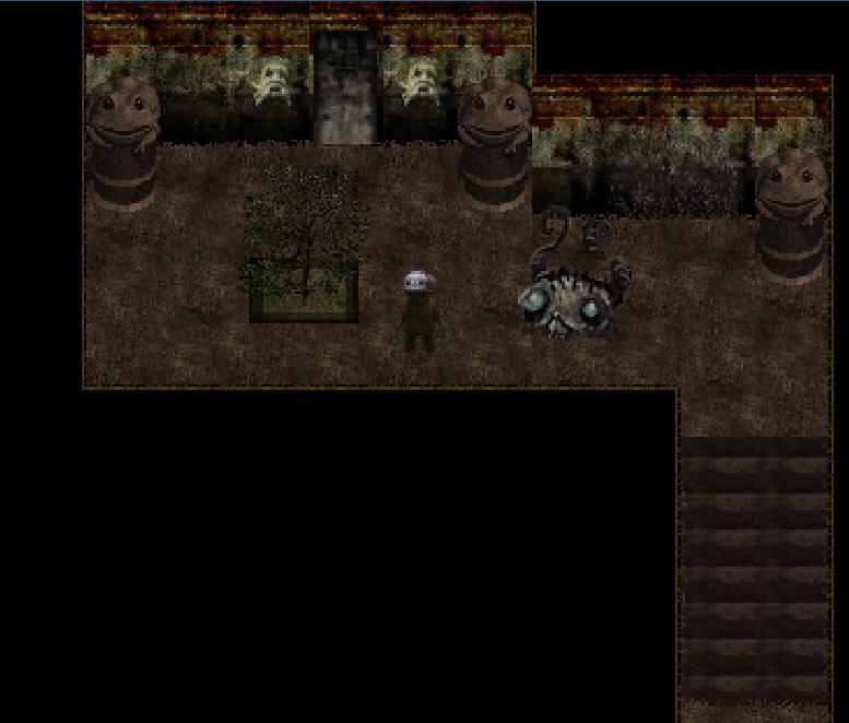
Dern, 2k3 doesn't really have the function of being able to shift the actual location on the screen (without animated_monsters which has characters that roam offscreen), so I can't really permanently scoot the Tonberry closer.
It's got basic six frame animation, but not move/attack animation (I don't care enough about that to have it).
Anyway, it works. After a few turns of moving closer, the Tonberry switches from Observe Battle/Move to knife/death attacks.
LockeZ

I'd really like to get rid of LockeZ. His play style is way too unpredictable. He's always like this too. If he ran a country, he'd just kill and imprison people at random until crime stopped.
5958
You could change the monster graphic each time it moves closer. Changing the enemy graphic to one that has the monster further to the right seems like it would work.
I'm not sure how necessary it is, and if you're using animated enemies there might be a conflict. A skill called "Move Closer" is probably fine.
That background image is ridiculous though. Like for one thing the grains of sand in it are as big as the characters' hands. And for another thing it's not at the same perspective as most battlebacks, which show the horizon. Did you really need a "wet sand that someone drew in with their finger" battleback so badly that you were willing to use this one?
@arcan: Beside the tile sets you could post the character graphic
for you NPC from each direction? The coloring looks a little off
to me.
@bulmabrbriefs: That battle system looks amazing.
The characters and everything in there looks really good.
I wish I had the skill to make stuff like that.


@SnowOwl: Very sexy map, reminds me a lot of Grave Spirit and I adored that game. I'd love to explore your world. Are those mostly Teo? Or did you make some of your own sprites for this? I don't recognize the decor from anywhere particularly.

Gargh! Can someone help me with this map? I can't figure out what to put down, and the two buildings are not looking so well. :(

I am basing it off of this one.
http://images.wikia.com/megaman/images/1/18/SeasideHospital.png
I am basing it off of this one.
http://images.wikia.com/megaman/images/1/18/SeasideHospital.png
author=LockeZ
You could change the monster graphic each time it moves closer. Changing the enemy graphic to one that has the monster further to the right seems like it would work.
I'm not sure how necessary it is, and if you're using animated enemies there might be a conflict. A skill called "Move Closer" is probably fine.
That background image is ridiculous though. Like for one thing the grains of sand in it are as big as the characters' hands. And for another thing it's not at the same perspective as most battlebacks, which show the horizon. Did you really need a "wet sand that someone drew in with their finger" battleback so badly that you were willing to use this one?
Oh, it's a leftover from another boss battle. I was just testing battle system, and happened to have it on that.
It's a line in the sand.
The original battle is with some guy who heavily emphasizes boundaries (i.e. "drawing a line in the sand"). I, uh probably should turn it vertical instead of horizontal though.
Yea, I understand what you mean. And yes, I have transformed one animated to another, there isn't an issue. It would end up being absurd tho' with 5 or six sets of animated monsters swapping out each other. Trying to figure out whether it's worth the extra work...
author=Lotus_Games
@SnowOwl: Very sexy map, reminds me a lot of Grave Spirit and I adored that game. I'd love to explore your world. Are those mostly Teo? Or did you make some of your own sprites for this? I don't recognize the decor from anywhere particularly.
Teo? I'm not aware what that means. I did make most of it myself, but not 100%.

author=Mr_Detective
Gargh! Can someone help me with this map? I can't figure out what to put down, and the two buildings are not looking so well. :(
I am basing it off of this one.
http://images.wikia.com/megaman/images/1/18/SeasideHospital.png
Honestly, its a bit flat, if you look at your example, the area around the entrance sticks out beyond the normal part of the hospital, if you could capture that, and perhaps add a bit more life, or variety to the walk path, it would look a lot better.
@Tombombadil: That's some pretty good mapping skills.
A lot of different levels. The pathway fits well in
the forest theme there. No wasted space in the picture.
@MrDetective: The color scheme here just isn't working.
Theres' too much white so everything just blends together.
You need to have some contrasting colors here.
@SnowOwl: I'm pretty sure Teo was the name of the guy who made modern day chipsets and character sets for rm2k3, the ground, tree, and stairs really remind me of his style. That's awesome that you are making your own stuff though, kudos =)
Hmm could be Theo, maybe that sounds more familiar.
Hmm could be Theo, maybe that sounds more familiar.
LockeZ
I'd really like to get rid of LockeZ. His play style is way too unpredictable. He's always like this too. If he ran a country, he'd just kill and imprison people at random until crime stopped.
5958
Hospital yard needs more grass and flowers. They don't want it to feel lifeless.
Also needs a road instead of just a 150 foot wide sidewalk. Road should go right up to the door, for ambulances.
Police station being part of the same building is weird. In the US and I'm pretty sure also in Japan, police stations are owned by the city, but hospitals are owned privately, so you'd never find them connected. But maybe this setup is based on some anime, like other maps you made.
Ambulances don't usually drive up to the front entrance, they go in the back where the beds and doctors are. A road to the front door would be used by old people.
Everything else he said is a good start, but you are probably limited in what you can put down based on the chipset so it's hard to make too many suggestions since many things won't exist, so... If there was some kind of roadlike tile connecting the walkway at the bottom to both doors, maybe a road that runs parallel to the building close to the doors, and some kind of greenspace on the left/right sides on the map - it would appear full.
Everything else he said is a good start, but you are probably limited in what you can put down based on the chipset so it's hard to make too many suggestions since many things won't exist, so... If there was some kind of roadlike tile connecting the walkway at the bottom to both doors, maybe a road that runs parallel to the building close to the doors, and some kind of greenspace on the left/right sides on the map - it would appear full.
LockeZ
I'd really like to get rid of LockeZ. His play style is way too unpredictable. He's always like this too. If he ran a country, he'd just kill and imprison people at random until crime stopped.
5958
This could be the back entrance, I have no way to tell
Put a road in either way though, you might as well
People gotta get close in emergencies
Not everyone uses ambulances due to the fees
Put a road in either way though, you might as well
People gotta get close in emergencies
Not everyone uses ambulances due to the fees
author=Tom_Bombadil_I just want your oppinion on my most recently completed map for my game...
A pet-peeve of mine: If you are going to mix RMXP's RTP with VX or Ace, you NEED to change the saturation of the XP, or VX graphics. RMXP's RTP is noticeably more pale and lighter colored compared to VX, which has very bright, high saturated colors.
The layout of the map is okay, though. One thing to consider, however, is that tall grass never grows around trees, because trees are nutrient hogs. Simply place the grass around the base of the tree instead of directly underneath it.
author=Link_2112
Everything else he said is a good start, but you are probably limited in what you can put down based on the chipset so it's hard to make too many suggestions since many things won't exist, so...
Pretty much this. :( I am going to try to find some more building tiles. I think there are some futuristic building tilesets out there that I overlooked.
So I cut down the size drastically, and I am planning on putting them into 2 different maps. How's this? :P

@ Mr_Detective - It is still rather flat and lifeless, there is no angle or design to the building, it is just one giant wall, on top of that using just the brick tiles leaves no path for people to follow.
If it is for some odd reason a walk up hospital, as you perhaps don't have cars or some such, you may still want to include a walking path. I'd put the stairs just in front of the doors if you are going to separate them, it looks rather odd off to the side like that.
One last thing, your life saving, grace giving hospital is devoid of life, there is no plants, no trees, no birds, no butterflies, no people....some of that would really help.
Bottom line: It's just really barren and bland.

author=arcanRemember how I made a post long ago about working on a zelda style game? Well here is the work in progress. I have some of the features already coded, but this is most of what I have graphics wise.
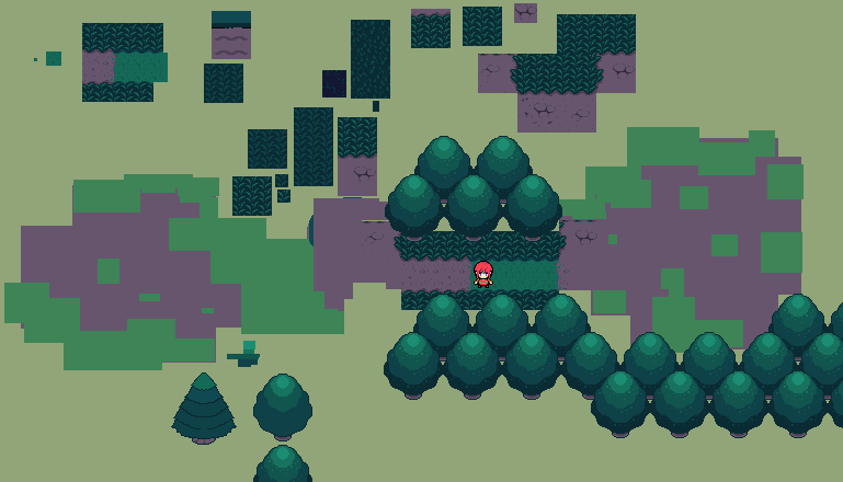
I really like the darker tones you're giving the graphics. I think you should maybe make the highlights a bit brighter, though. It might be me but I think it's a bit too dark, or at least, too dark too soon. That said, the actual tiles are really nicely done - I'm loving the dirt blocks and colours. They kinda remind me a little of pokemon. ^.^
It's supposed to be night time so that's why it's dark. Maybe I will add some shadows and darken the character sprite to make it look the part. The bottom part of the tree does look too dark actually. Thanks for the tips.
The trees were based on the trees from pokemon so I can see why you would think that.
The trees were based on the trees from pokemon so I can see why you would think that.

