


THE SCREENSHOT TOPIC RETURNS
Posts

The TV doesn't seem to have any depth to it. Like it's built into the wall. I mean, flatscreen TV's are a thing, but this seems a little much.
Maybe it's just me?
Maybe it's just me?

So ummm, my newest game was rejected due to font. Hmmm, that's completely shocking, considering I had white BG and that horrible white to black. And of course because I've never had problems with font.

(Original color to the right, new to left)
Now, obviously, the gold is better. But I want to know what color contrasts best with white. Green? Red? Blue? Black gives the highest contrast, but thanks to screwy shadowing, tends to blob a bit.

(Original color to the right, new to left)
Now, obviously, the gold is better. But I want to know what color contrasts best with white. Green? Red? Blue? Black gives the highest contrast, but thanks to screwy shadowing, tends to blob a bit.
author=bulmabriefs144
Now, obviously, the gold is better. But I want to know what color contrasts best with white. Green? Red? Blue? Black gives the highest contrast, but thanks to screwy shadowing, tends to blob a bit.
I can just barely read the white text. Cool colors would probably work best with your windowskin. (Specifically Blue and Purple IMO)
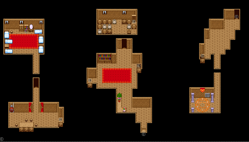
author=GamingMitchell03232013Why are some of the rooms so oddly-shaped? Doesn't really make sense.
Just finished this interior. Its really bare-bones as of right now, but it'll have to do.
Otherwise it looks good, except there should be a tad more clutter.
author=bulmabriefs144Good grief, I can just barely read anything in that text box. Change the font to something more darker or a color that doesn't mix in with the window's color.
Now, obviously, the gold is better. But I want to know what color contrasts best with white. Green? Red? Blue? Black gives the highest contrast, but thanks to screwy shadowing, tends to blob a bit.
author=Nightowlauthor=GamingMitchell03232013Why are some of the rooms so oddly-shaped? Doesn't really make sense.
Just finished this interior. Its really bare-bones as of right now, but it'll have to do.
Otherwise it looks good, except there should be a tad more clutter
Can you give me some examples of an oddly shaped room? The best example I can think of is the room on the top right.

author=bulmabriefs144
The yellow is pretty hard to read, but the white's almost impossible to read on that background. Light coloured text should go on a dark coloured background.

@bulmabriefs
Look at what color your background is. Then pick the opposite color (ex. black>white). It's that easy to make readable text.
Stop it with gradient text if you have no sense of color or if you're color blind or whatever is wrong with you.
Edit:

Pick a color for background then pick the one on the opposite side for text color,
or pick a color on the edge of the circle and white text, or pick a color in the middle and black text.
Look at what color your background is. Then pick the opposite color (ex. black>white). It's that easy to make readable text.
Stop it with gradient text if you have no sense of color or if you're color blind or whatever is wrong with you.
Edit:
Pick a color for background then pick the one on the opposite side for text color,
or pick a color on the edge of the circle and white text, or pick a color in the middle and black text.
So, basically, there is no opposite on the spectrum besides black. Because it's equidistant from everything. Guess I'm doing black.
SnowOwl, do I go your game and go "God you've gotta stop making massive pathways high in the sky"? No? It's because your game is awesome, and the aesthetic works for you. If I tried to copy your style, it'd probably look like a knockoff.
Answer the question asked (you did, I'm gonna try it), and if the opinions are given and the person still won't change (I won't), they probably don't want it. It's the doorstop salesman principle. Even though everyone obviously needs The Book of Mormon, not everyone will take one. Accept it and move on.

Does it show up in extremes of white...

and black? Because that's what I'm testing for.
Also, how the hell did like four ppl get in ahead of Snowy? I commented like just two hours ago. Mkay, so I tested the black on transparent (since I've got a cutscene that uses it). Black on white BG seems to work across the board, with white to black to shades of grey. But I got screwed over when the text went across dark brown on transparent, where it didn't for the yellow.
I think yellow or blue would be my top choice, and since someone mentioned blue, I'll try that. ...Blue works for white/black/green/grey/brown. I suppose that's the choice, but I'll double check on my menu and other conditions. Yep, from what I see, except for extreme blue rooms (which never happens, unless you're playing Earthbound), blue works for everything.
I like these colors the most. They blend together very well. Though just curious, what are the other text colors in your System?
LockeZ

I'd really like to get rid of LockeZ. His play style is way too unpredictable. He's always like this too. If he ran a country, he'd just kill and imprison people at random until crime stopped.
5958
If your window background is transparent, you should probably also check whether it shows up readable on a checkerboard map. A multi-colored background is much harder to read than a solid one, just like multi-colored text is much harder to read than solid text.
Also, quit trying to start fights about the role of advice every time someone gives you advice. It doesn't make things go any smoother, and people are going to keep trying to provide ways to improve the game, because that's what we do around here; we work on games.
Also, quit trying to start fights about the role of advice every time someone gives you advice. It doesn't make things go any smoother, and people are going to keep trying to provide ways to improve the game, because that's what we do around here; we work on games.

author=...........
Why is it that every time I see your font, I would get irritated? :( Pick the last one. :P
author=Marrend
The TV doesn't seem to have any depth to it. Like it's built into the wall. I mean, flatscreen TV's are a thing, but this seems a little much.
Maybe it's just me?
So maybe I should move it down a little bit more? On the same line as other shelves? :-?
author=Mr_Detective
Is it okay for the TV to be bigger than everything else? :O Is there anything else wrong? :P

That's a really cool store. It reminds me of the Department Stores in Pokemon. But yeah, moving your TV down a tile would certainly help.

@bulmabrief
Did you read my post? There are plenty of opposites, but every color technically only has one opposite.
Two opposite colors, one for background and one for text color, would be the easiest to read.
The opposite for yellow would be purple, for example.
But very light colors and black is a good match, is what I was trying to say.
Same with white and very dark colors.
Look at the picture I posted. The opposite color for any color in it would be the
color on the opposite side in the same position.
You really should stop asking for help if you don't want it.
It's just annoying for both us and you when you're hostile whenever someone doesn't agree with your methods.
LockeZ
I'd really like to get rid of LockeZ. His play style is way too unpredictable. He's always like this too. If he ran a country, he'd just kill and imprison people at random until crime stopped.
5958
The stand the TV is on is 2-dimensional. There's no top to it, just a front.
Also, everything else is pixel art with only 5 or 6 colors per object, but the image on the screen is in true color. That's a little awkward. I don't know if it needs to be changed though.
If you can't fix the stand it might look good mounted on the wall instead. You could get rid of the stand and the base, and move the screen up one tile on the wall.
@Snowowl: yellow on purple (especially if they're the same darkness) ain't gonna be readable. Light purple on dark purple will look fine, though. Color wheel's odd like that. Chromatic contrast doesn't create readability for text nearly as well as darkness contrast, and even when it's readable it sometimes looks bad because it clashes. Look at the JUNES sign in Mr_Detective's screenshot. Dark red on light yellowish-tan. Totally readable, even though red and tan aren't opposites at all. The black shadow around the text helps even more.
It looks a little awkward to me because the screen is bigger than the shelves. Being that you're taking a realistic approach to your mapping, it should be the other way around. (Shelves being bigger than the screen)

@LockeZ
See picture.
Ofcourse, if you want it to be even easier to read, making one color lighter and one color darker is even better, yes.
author=LockeZ
If your window background is transparent, you should probably also check whether it shows up readable on a checkerboard map. A multi-colored background is much harder to read than a solid one, just like multi-colored text is much harder to read than solid text.
Also, quit trying to start fights about the role of advice every time someone gives you advice. It doesn't make things go any smoother, and people are going to keep trying to provide ways to improve the game, because that's what we do around here; we work on games.
I'm fine with any criticism that doesn't contain the word "you should." Such criticism is reserved only for my parents, maybe a boss, or a girlfriend.
I checked the blue on checkerboard and... well, it doesn't help that the checkerboard is blue and white. I think I'll change the chipset.
Still kinda week on checkerboard after black/white change. But the blue works for most BG, whereas black fails on dark brown.

Pan-through of town, I apologize for the largely empty screen here. I chose blue about this time.

Blue or yellow as primary? Both seem to work on a wide color range.
author=SnowOwl@LockeZ
See picture.
Ofcourse, if you want it to be even easier to read, making one color lighter and one color darker is even better, yes.
I'm pretty sure LockeZ meant like this:
It might be readable, but it's not pretty to look at.
It's about as ugly as Sarah Jessica Parker right?

