


THE SCREENSHOT TOPIC RETURNS
Posts


@Itaju: I'm not sure I like the darkest shade of brown on the branches of the tree. It looks so much lighter than the dark shade of green you're using there.

I think it looks better now. At least a bit. But I still have no idea what to do with the floor.
I think it looks better now. At least a bit. But I still have no idea what to do with the floor.


Working on some graphics. Still trying to step up my game a little bit. The character set isn't finished yet, this is only a couple hours of work here.

I think you should drop the black edges, or make them non-black at least (dark green for trees dark pink/purple for ground). Pure blacks are almost never a good idea in pixel art.
Also this may just be me, but the colors on the stars and the sky are a bit weird, I'd make the stars more yellow or maybe white with light-blue edges.
As for the sky is it a very dark gray?
The saturation kinda sticks out compared to the rest.
I would make it a very dark shade of blue with the same saturation as the rest of the stuff in the picture.
If that green thing is supposed to be a bush I'd make it stick up from the ground more, right now it almost looks like one of the trees got hammered down into the ground.
These points are pretty much minor things I guess, but it doesn't hurt to say, right?
Otherwise it's pretty good, simplistic but effective.
author=SnowOwl
I think you should drop the black edges, or make them non-black at least (dark green for trees dark pink/purple for ground).
This again. No. The style is designed around black edges, it would look ugly without them.
The sky colour might be changed a little, idk. I'm using a limited colour range for this project, and I use blue/green and pink because they're complimentary colours. The yellow is there simply because it stands out for small details.
I could fix the bush I suppose, but I'm really not worried about perfection with this project. It's meant to be a simple job.
If you don't want to remove the edges that's fine. I'm guessing you're going for earthbound style graphics. Take a look at the edges in that, I believe none of the edges are pure black in that but the edges still stand out. You could do what I said and make the edges a dark colour of whatever color the object is.
It's just that pure black stands out alot. Or you could just ignore my advice if you're not aiming for perfection, up to you I guess.
Edit: Just checked Earthbound and the edges on alot of sprites are dark brown. You could also do something like that.
It's just that pure black stands out alot. Or you could just ignore my advice if you're not aiming for perfection, up to you I guess.
Edit: Just checked Earthbound and the edges on alot of sprites are dark brown. You could also do something like that.
It's just that pure black stands out alot. Or you could just ignore my advice if you're not aiming for perfection, up to you I guess.
Your advice is far from perfection. There's no mysterious rule in spriting that black outlines are a bad idea, if the style of the art is supported by them then they're perfectly fine. The whole point of the black outline is to make the edges stand out in a style not reliant on lots of shading or colours.
If you must know, it's not "Earthbound Style". I draw my main inspiration for spriting from Mother 3. (http://www.spriters-resource.com/fullview/6207/) is the image I use for reference when I'm stuck on how to make something look.
Yeah, the outlines in that game are usually dark grey. Or a darker colour, and not black. Who cares. I use black outlines, and I always have. People have tried to use all this shit on me tons of times over the years, but this is how I do stuff, and it's not really gonna change unless the project dictates it.
Sorry for ranting and shitting up the thread, but I don't like this kind of discussion. It bothered me back then and it still does now, apparently. The style of outlining you're talking about does have merit, and it can look good, as evidenced by Mother 3. It's just not what I do.
Well, if people keep bothering you about it, maybe they keep doing it for a reason?
Black outlines looks harsh and inappropriate. Well whatever, it's your choice.
Black outlines looks harsh and inappropriate. Well whatever, it's your choice.

author=Pizza
Your advice is far from perfection. There's no mysterious rule in spriting that black outlines are a bad idea...
Actually, it's pretty much a 'rule' in all forms of art to never use black for anything. I've studied painting and graphic design and the advice is never to use pure-black. It overpowers all colors around it... You could say Pure-black doesn't exist in nature, so when we see it, it throw us off. What we think is pure-black is always a softer color altered by the light around it. Put something black next to a green object and it will take a greenish shade of black. Put it next to something pink and it will take a pinkish shade of black. It's unperceptive to the eye, but the difference is there. That's why when designing a palette is a sensible consideration never to use Pure-black.
I mean, sure, go ahead and use it. No one is going to hold it against you. It can be your own "signature" if you want... Just to let you know that this advice doesn't come out from some magician's hat. Is not something that people repeats just because. It's something that many artists throughout history have come to a conclusion to. I think that's the closest to 'perfection' you can get.
Edit: @SnowOwl: Inorite? Don't worry, next time you post a screen I'll find something to complain about it. Promise. xD
LockeZ

I'd really like to get rid of LockeZ. His play style is way too unpredictable. He's always like this too. If he ran a country, he'd just kill and imprison people at random until crime stopped.
5958
The black border doesn't matter to me on its own, but the sky pressing against it does. I would actually just make them the same color maybe? Preliminary cuntpasting into MS paint and looking at what happens if I bucket-fill the sky to be jet black suggests that it looks pretty great.
I don't know about this "black never appears in nature" bullshit because last time I checked outer space and ink were both real actual things. I mean if you think it looks ugly, then okay, feel free to explain why, but that's not a good reason. Neither is "don't use black in art" because, uh, here. (Personally I just think it would look better with a one pixel thick white or colored border between the black part and the map)
I don't know about this "black never appears in nature" bullshit because last time I checked outer space and ink were both real actual things. I mean if you think it looks ugly, then okay, feel free to explain why, but that's not a good reason. Neither is "don't use black in art" because, uh, here. (Personally I just think it would look better with a one pixel thick white or colored border between the black part and the map)

I have seen pure black in a great many games, so I don't know what you're talking about when you say you're not allowed to use it as a colour. Maybe you are right if talking in the general sense of pixel art where a lot of dithering is used, but the style that Pizza uses eliminates dithering altogether, instead using pure flood fills and two tones for shadows.
It actually looks pretty cute.
It actually looks pretty cute.
author=thatbennyguy
I have seen pure black in a great many games, so I don't know what you're talking about when you say you're not allowed to use it as a colour. Maybe you are right if talking in the general sense of pixel art where a lot of dithering is used, but the style that Pizza uses eliminates dithering altogether, instead using pure flood fills and two tones for shadows.
Hey guys, this is what happens when you actually act like a human being and try to understand where I'm coming from, instead of a bowl of sewage frothing with the "rules of art".
Actually, it's pretty much a 'rule' in all forms of art to never use black for anything.
Check out this guy. Last time I check purple mountains and pink grass also didn't exist in nature. Holy fuck, it's a game, what do you know? God fucking forbid I have a style that I KNOW doesn't look bad, as I've receive bucket loads of compliments about it over the years and spend quite some time on each tileset making sure it's okay.
Could it be finessed? Hell yes it could, and I took SnowOwls critiques on the sky and the bushes because that's what they were. Me changing the entire way I do something isn't helping anybody.
Maybe I should just steal somebody else's hard work. I'd probably fit in a lot better around here, and hey, maybe I'd even get the most subscribed game?
The black border doesn't matter to me on its own, but the sky pressing against it does. I would actually just make them the same color maybe? Preliminary cuntpasting into MS paint and looking at what happens if I bucket-fill the sky to be jet black suggests that it looks pretty great.
You're right, a black sky does look pretty nice. I need to fuck around with a couple more colours but that's definitely an option. Thanks.
@LockeZ: Heh; Space? Well, I guess the complete absence of light would do the trick; but I mean, c'mon! ...Black ink is not Pure-black. Link Grab any of those drawings on that page you linked to, and try to find any with Pure-black on them. Sure, there's bound to be some (most likely digital art), but that is something that any traditional artists will try to avoid by diluting/mixing the base ink/paint. - Also, I may add that it is one thing to have a B&W-only piece of art and another is to throw color into the mix.
Let's be clear, the deal here is "Pure-black", or RGB: 0,0,0. (Technically not Pure-black either because monitors emit light, but asdfg...)
@Pizza: Whoa! Chill? xD Didn't I just said no one was going to hold it against you if you used it? Just that it wasn't some hack advice or w/e.
Edit: All is fine. ;P
I apologize. I'm just so sick of hearing people tell me this. This is the first time it's happened in years but I swear it came up every time I posted a screenshot back when I was on this site before. It gets tiring and grating after a while.

author=Pizza
I apologize. I'm just so sick of hearing people tell me this. This is the first time it's happened in years but I swear it came up every time I posted a screenshot back when I was on this site before. It gets tiring and grating after a while.
And this is why I not only blocked SnowOwl, but ultimately decided to back off from the forum for a bit.
Your art looks fine. Things naturally have shadows. Except for Thomas Kinkade.
Linked because it's copyright.
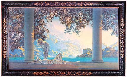
And Maxfield Parrish.
Same deal.
Does that look any more realistic? No?
And why does Pizza have to be the one to chill? Wouldn't it be more reasonable to believe that he has the ability to be defensive about his own work? Why not ask the critics to get a grip? Yea, I know people are there to criticize. But it's how you do it that matters, apparently. You can be out of line as a critic just as easily as you can as a poster.

I would say the no pure black is a tip for professionals who want to do godlike paintings like feng zhu but uh, yeah lots of cartoons used black outlines so I don't know why art majors are nitpicking about it. I don't apply everything I learn in school to RPG maker so...
Pizza you should just say there's no argument here and leave it at that. I don't know why you bother with the screenshot topic because it's going to just be nitpicking about the bush placement in a single shot or something. Unless you are unsure about the overall artstyle of your game I would just move on to making more content for the game and not get hung up on it.
Pizza you should just say there's no argument here and leave it at that. I don't know why you bother with the screenshot topic because it's going to just be nitpicking about the bush placement in a single shot or something. Unless you are unsure about the overall artstyle of your game I would just move on to making more content for the game and not get hung up on it.

