THE SCREENSHOT TOPIC RETURNS
Posts
author=LockeZ
It would be nice if you had four or five different-shaped cracks instead of all of them being the same, but otherwise it's pretty good.
Is the blue and white thing centered above the chalkboard part of the location bar, or is it a window or something else?
Having different cracks sound good. I think there's a few more crack tiles in the RTP graphics.
That blue thing is a monitor. You are in some sort of TV show and the whole thing is being broadcasted live back at the station. :D
author=Dookie
Maybe that wasnt the best comparison, Begriff. In fact, I'd go as far as to say that anyones "behind" would look far preferable to that tile choice.
Now thats just my opinion, and if you take that "personally" you might want to consider a different hobby and grow some thicker skin.
P.S. If you don't think that tile looks like stairs then we can just agree to disagree. (Seriously change it tho asap)
Now on to some more suggestions for ya.
I cant tell what that's supposed to be, next to the lockers, oh...OH....its a potted plant. I had to stand up and look from a top angle on my monitor to even make out the shape and it was still hard to decipher. Looked like some bags or something piled up. I dunno if its the lighting effect or what, but that's really hard to make out. (and dont say its supposed to be like that)
Then back to the scaling issues. Either shrink the sprites height, or everythings gotta be taller, man. Character is bigger than the doorframe. Taller than the lockers. Way bigger than that ridiculous table and chairs. The characters legs would poke out over the edge of the bed.
Unless your game is about a Giant who lives in a hospital I would make that priority one.
Thats a glaring cohesiveness problem that you need to address. It seriously takes 2 seconds to extend table legs in an image edit program, come on now.
: ) criticism is a good thing, and I would definitely say I'm being constructive. We're all here to help.
The plant just looks that weird because it's completely dark in this Screenshot. Otherwise it looks okay.
It's just how you word things. I am not one to get butthurt easily. But there are a lot of people that will take these things personally. I don't want that these people drop what they are doing because of it. That's all.
Yeah, I definitely need to work on the scaling stuff. Still don't know how to fix everything, but it will surely look better once I edited a few tiles. It might not be perfect, but better. :)
I've been working on this as my side project for a while now,
its all about the layers, ship, to space, to worldmap, to map
my question is do you think the landing splash screen animation is too long to have to sit through everytime you land?
p.s. the npcs on the maps are just placeholder for now, ill flesh them out once the environments are done
(note to self: stop saying ps so much)
LockeZ

I'd really like to get rid of LockeZ. His play style is way too unpredictable. He's always like this too. If he ran a country, he'd just kill and imprison people at random until crime stopped.
5958
This is a weird complaint but the captain's shadow is lighter than the ground sometimes. I noticed it in the spaceship.
It seems like it should be either black or the darkest color you typically use in place of black (since I know a lot of pixel artists prefer not to use pure black)
As far as the landing scene, I would probably leave it in but speed up the outdoor part, before it enters the hangar, to double the current speed. There's no particular reason for the ship to be going that slow, it's totally believable that the speed limit would be higher than that thanks to automated piloting assistance and so forth. You could probably also get away with increasing the speed that it descends in the hangar by 50%, if you're still worried.
basically everything you're doing is completely amazing, don't remove any of it, just make it faster if it feels like it takes a long time
You're totally right about the shadow.
Thinking about maybe just using the splash screen landings for before you get control ofthe ship. when youre like, the passenger. Later when you're the captain maybe you just see the regular landing. idk yet.
but i wanna use the splashes somewhere cause i made these (they look better in motion):


Thinking about maybe just using the splash screen landings for before you get control ofthe ship. when youre like, the passenger. Later when you're the captain maybe you just see the regular landing. idk yet.
but i wanna use the splashes somewhere cause i made these (they look better in motion):


From this:

To this:

Began to fix Hisao's hospital room. There is still a lot missing, but do you guys think it looks at least a bit better now?
Things I changed:
- made the tinted contrast a bit lighter
- reduced the room by one tile of width
- began changing the bed (still not quite finished)
- made the table a bit higher
- made the lockers bigger
- made the floor tile lighter
- made the roof tile darker

To this:

Began to fix Hisao's hospital room. There is still a lot missing, but do you guys think it looks at least a bit better now?
Things I changed:
- made the tinted contrast a bit lighter
- reduced the room by one tile of width
- began changing the bed (still not quite finished)
- made the table a bit higher
- made the lockers bigger
- made the floor tile lighter
- made the roof tile darker
@Dookie: Those splash screens are gorgeous! ...But make the landing sequence skipable after the first time you arrive to a new place. Sometimes players like to indulge on pretty graphics (summon animations, etc.), but sometimes they just want to get back to the action.
@Schwer-von-Begriff: Alright, the floor tile and the lighting have improved a bit. But really, is that supposed to be one of those weird Japanese tables or what? Because I think it is still too small for a normal person to sit at. Also, I noticed you not only made the roof tile darker, but the walls as well. They no longer look like Hospital walls... Besides that, the shape of the room is a bit too irregular, isn't it? Remember to think in terms of the entire floor or even the entire building in order to design believable interiors.
@Schwer-von-Begriff: Alright, the floor tile and the lighting have improved a bit. But really, is that supposed to be one of those weird Japanese tables or what? Because I think it is still too small for a normal person to sit at. Also, I noticed you not only made the roof tile darker, but the walls as well. They no longer look like Hospital walls... Besides that, the shape of the room is a bit too irregular, isn't it? Remember to think in terms of the entire floor or even the entire building in order to design believable interiors.
@alterego: Someone told me I should try to make the walls darker - and I did just that, to see if it works. Might still use the lighter wall tiles. This was just a test. =)
Now that you mention it, the room does look a bit odd. I will try to change that. Yeah, the table is still really small. The story plays in Japan, so I could try to use that to my advantage - but I guess I will just make the table even higher.
Now that you mention it, the room does look a bit odd. I will try to change that. Yeah, the table is still really small. The story plays in Japan, so I could try to use that to my advantage - but I guess I will just make the table even higher.
LockeZ

I'd really like to get rid of LockeZ. His play style is way too unpredictable. He's always like this too. If he ran a country, he'd just kill and imprison people at random until crime stopped.
5958
Room shape is probably fine, on the assumption that that door leads to a restroom or closet, and you go right past the light switch to leave into the hallway. Like, I'm imagining that the restroom combined with the visible room make his living area form a perfect L shape. If that door is the exit out of the room though then yeah it's quite weirdly shaped. Lots of alcoves and such.
I think the map is pretty decent, actually, it's just weirdly dark. The old and new versions both were. The shadows are solid black, and then I think you're using "glare" style lights on top of a darkened map which just makes it hard to see.
There are two main ways to create lighting in RPG Maker. One is to add a semi-transparent black overlay that slightly darkens everything on the map that isn't lit, making the lit areas easier to see. This way is suitable for most dark areas. The other is to make a non-darkened map with a semi-transparent white or light yellow overlay over the lit sections, which will create a glare effect and make the lit areas harder to see than the rest of the map. This way is sometimes suitable for beams of sunlight shining through windows into lit indoor rooms, or the area right around lamps/fires/torches in an already very well-lit area.
The problem I think is that you're doing both. This makes it extremely hard to see, since both the lit and unlit areas are being tinted. Unless Hisao is a vampire, his hospital room is probably pretty well lit to begin with, so personally I'd get rid of the darkened tint covering most of the room.
If it's his only table, I'd probably go ahead and make it about as high as his legs. You expect a table to be about waist high. (The legs of the bed and chairs could probably come up to his knees while you're at it.)
@LockeZ: Yes, the room behind the door is a small bathroom. I might place the TV somewhere else, though.
That could very well be the problem! I read a lighting tutorial once, but it didn't specify what would work best for dark rooms. I am definitely going to change the light effects. Do you know a good tutorial by any chance...? :)
Thanks for the critic.
That could very well be the problem! I read a lighting tutorial once, but it didn't specify what would work best for dark rooms. I am definitely going to change the light effects. Do you know a good tutorial by any chance...? :)
Thanks for the critic.


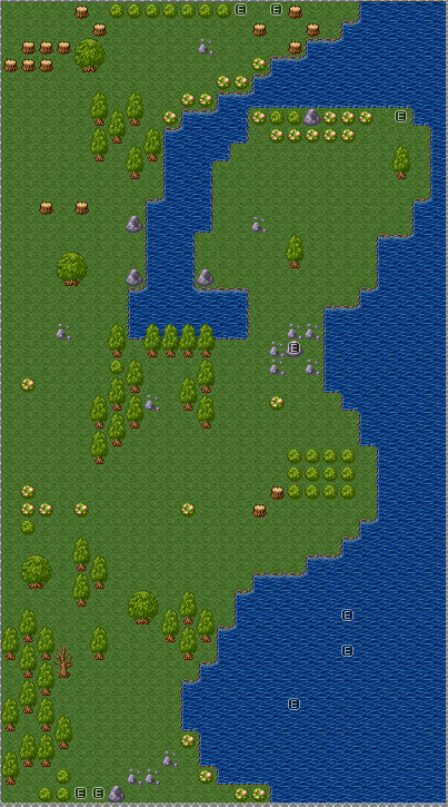
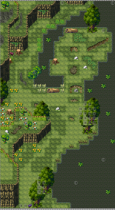
I figured it was time to start reworking some of my beta1 dungeons, so I started with my very first dungeon of the game. First one is the screenshot of the original map (first part of the left path, so 2nd map that I did), while the second screenshot is the revamped version. None of these maps are going to have their dimensions even remotely touched, just reskinned really. My, how much has changed over 5 years...
@Xenomic: Haha, a change indeed. The bottom screens looks way better, even though RTP can look nice (But not the 2k3 one >3<). Even though you said you wouldn't change the dimensions, the big part of water on the bottom of the map looks rather empty. Also, that plant on the water is not supposed to be placed.. on water, I think. But yeah, looks cool. huge improvement. :0

2k3 Standard Battle System (+ DynRPG of course) - Please ignore the background and testgraphics. 0:

2k3 Standard Battle System (+ DynRPG of course) - Please ignore the background and testgraphics. 0:
Yeah, probably not but I didn't have any lilipads or anything to really add onto the water soo...it's supposed to be a giant lake is what the area is supposed to be and the player is walking along the shores of it. ^^


