BLIND'S PROFILE
Blind


2262

Search
Filter
 Commercial Revamp
author=KoopaKush
Whew man, all of this is just looking so gorgeous! I know you've been bidding your time with decisions and careful planning, and it's all really showing off!
Just keep it going and never let that passion falter, you have the vision and ambition, let's get it! Consider me an always loyal supporter :)
Thank you buddy! Yeah, I definitely spent quite a lot of time putting my team together, I’m glad it’s finally paying off. Your support means a lot. :)
author=Giznads
Wow, dude. Looks fantastic!
author=Kaempfer
Exciting stuff! I'm looking forward to the Kickstarter!
author=sixfootblue
Really looking forward to playing this when it's out. :)
Thanks all!
I’ll keep everyone updated on the campaign!
 Screenshot Survival 20XX
 Screenshot Survival 20XX
 Alright then, it's demo time
Congrats!
Agreed with Kaempfer. From the beta I played, the climax will definitely leave the player clamoring for more. Just the right amount of content for a demo.
Agreed with Kaempfer. From the beta I played, the climax will definitely leave the player clamoring for more. Just the right amount of content for a demo.
 Screenshot Survival 20XX
author=Roden
Yes. I can't tell where the light is coming from- just looks like you're intending for the character to be high on shrooms or something and getting a general glow.
EDIT: Also, the shadows that are present dont seem to match with the lighting or suggest much- and there are shadows missing, such as near the torches at the top. Can't just do some shadows and not others ;D
EDIT2: In addition to that, the stairs aren't deforming the shadows, which is flattening the room out.
Thanks Roden!
Yeah, it’s meant to be the “entrance” corridor, so the light is coming from the outdoors. I figured making it a bit overdone was the only way to convey that (compared to the more dim lighting of the torches), but I could be wrong about that.
How would you have the stairs “conform” to the light and shadows? *scratches head*
 Screenshot Survival 20XX
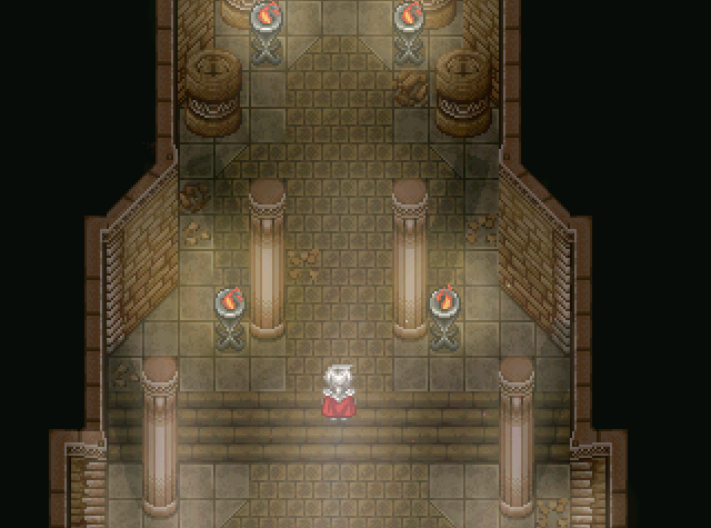
Finally putting to use the tiles I commissioned for an actual dungeon. Is the lighting too overwrought?
 Screenshot Survival 20XX
author=Garbamesh
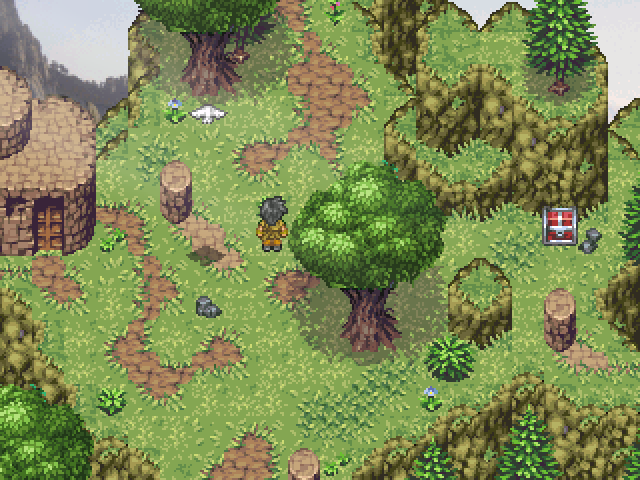
Fair enough point about the contrast...I still can;t help feel like that color temperature is totally wrong though! I think there is a happy medium here..
is this any better? I really like this screenshot but the cool aqua trees are throwing me off.
https://rpgmaker.net/media/content/users/76181/locker/ithink2.png
Thanks Garbamesh!
I actually really like your edits, although obviously they're just rough examples.
Lockez was correct that I went with the deeper green/aqua hues primarily as an attempt to contrast with the rest of the map. But you may be right - a more natural shade of green probably feels more coherent with the other tiles? XD
 Screenshot Survival 20XX
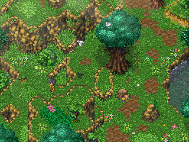
@IF: Hm, I did add a tiny bit of noise to protect from theft (and an overlay). Maybe that's the blur you're seeing? Or did you mean the palette itself?
And point taken about the bottom cutoff! That tree originally had a different trunk, so maybe I didn't mesh it together smoothly enough.
And point taken about the bottom cutoff! That tree originally had a different trunk, so maybe I didn't mesh it together smoothly enough.
 Screenshot Survival 20XX
Painstakingly replacing every ripped tile with an original counterpart (..with some Refmap for good measure). XD
Anything seem out of place?

Anything seem out of place?
