SNOWOWL'S PROFILE
Search
Filter
 The Screenshot Topic Returns
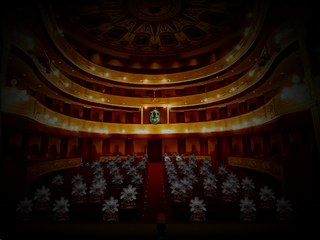
Change the tileset to something less fancy looking then, at least. I doubt this elementalist would want to cast spells in a expensive as hell house. Those carpets, especially.
 The Screenshot Topic Returns
What are those dark spots supposed to be? It looks like burn marks.
I dunno if you're trying to make it look aged or worn down, but everything being in tip-top shape except for the occasional crack isnt helping.
I dunno if you're trying to make it look aged or worn down, but everything being in tip-top shape except for the occasional crack isnt helping.
 Fishing.png
Ah, the writer himself. I'll be sure to put your effort to good use.
It really is quite the wonderful script.
It really is quite the wonderful script.
 The Screenshot Topic Returns
@Dreaded
The dirt and the darker grass cut off into squares, instead of smoothly transitioning in the upper left and upper right.
The left cliff somehow has a shadow while the right one doesn't, also. Apart from that it's pretty neat. I like the character sprite.
The dirt and the darker grass cut off into squares, instead of smoothly transitioning in the upper left and upper right.
The left cliff somehow has a shadow while the right one doesn't, also. Apart from that it's pretty neat. I like the character sprite.
 The Screenshot Topic Returns
 The Screenshot Topic Returns
My god bulmabrief, do you have some kind of brain damage where you can only understand half of the words in any given sentence?
Here, this might help: Use use dark dark background background with with light light text text. Skip skip the the gradient gradient text text and and picture picture background background in in favor favor of of something something simpler simpler.
Here, this might help: Use use dark dark background background with with light light text text. Skip skip the the gradient gradient text text and and picture picture background background in in favor favor of of something something simpler simpler.
 The Screenshot Topic Returns
You are most welcome. In the future make sure that the background for text is either
A: Dark on light/light on dark
or
B: Opposite color
If you really have to keep using that gradient text which honestly I find veeery 90ies (not in a particularly good way), do not make the 2 colors used in the gradient opposing colors or light to dark (white to black would be a offender of both these) because it makes it harder to read.
Too many colors and too much contrast in a picture background is also not prefered. The simpler the better.
That forest picture with yellow text is not very good.
Yellow and green is not a good match, since yellow is pretty close to green (making it hard to read). Look at that color wheel, pretty fuggin close.
The picture also goes from dark to light in a number of spots under the text.
That Elias text is barely readable, for example.
If you really have to have that background picture (which you don't, just google something prettier, it's pretty ugly actually) make it darker, and preferably change the text color.
You have to take into consideration alot of people have shitty monitors/ bad resolutions/ shitty color settings/other stuff making display quality shit.
It might be no problem reading all of the text for you, but it won't be the same for everyone.
 The Screenshot Topic Returns
Sure you can have transparent background for a couple of messages, like introductions, but I assumed he was going for transparent background during the whole game.
 The Screenshot Topic Returns
YOU SHOULD not have transparent background for text in your game. That's even worse than before. There WILL come a time where you will want to have the same background as the text color you choose. I don't care if I'm not your mum. Stop trying to avoid sound advice just because someone doesn't tiptoe around your sensitive little ego.
Do as I said in my earlier posts.
Do as I said in my earlier posts.


