SNOWOWL'S PROFILE
Search
Filter
 The Screenshot Topic Returns
author=bulmabriefs144
I'm not looking for a yes-man.
You're not exactly very receptive to advice, either.
author=bulmabriefs144
I'm looking for a way to improve the scenes which have parallax without:
blahblahblahblah
Not gonna happen. Remove the picture already. I would rather have a black backgroudn than that. There, I improved it.
author=bulmabriefs144You can neither draw nor sprite so neither of those won't happen.
The idea of either somehow making the chipsets detailed enough that it's halfway blending with both the BG and the sprites is okay. Or even having the sprites look wonky and doing outright picture chipsets for those particular scenes that need it.
author=bulmabriefs144
I'm (somewhat) open to ideas. But if they aren't decent ones, Corfaisis, I reject them out of hand.
You're as open to ideas and criticism as a newly raped 15 year old is to another round. I'm beginning to tire of seeing this thread dominated by people giving you sound advice and you responding with 20 lines of nonsense.
 The Screenshot Topic Returns
I have no idea what you are trying to say with your bastardized "rule of thirds" but here is how it really works.
Rule of thirds:
An image is divided into 9 squares. Anything you want the player to look at should be put where the lines of the squares intersect or along these lines.
Simple example:

In the image you posted with the lawnmower, my eyes are draw to the lawnmower, which is at the lower right, and not at any of these lines.
The line of cut grass could be said to run along one line, but to me it looks more like its almost in the middle. What exactly were you trying to say with that picture?
Rule of thirds:
An image is divided into 9 squares. Anything you want the player to look at should be put where the lines of the squares intersect or along these lines.
Simple example:

In the image you posted with the lawnmower, my eyes are draw to the lawnmower, which is at the lower right, and not at any of these lines.
The line of cut grass could be said to run along one line, but to me it looks more like its almost in the middle. What exactly were you trying to say with that picture?
 Need playtesters
 The Screenshot Topic Returns
My god bulmabrief, stop trying to do this all the frigging time. It has been told to you over and over why it doesn't work with your 2D/3D mix.
It creates a very jarring contrast. It does not look good. You may think it's fine, but I can promise you that 99% percent of the viewers will say that it looks like shit. You example with the Looney tunes or whatever they are called is slightly better only because they have taken every possible measure to try to fit shadows and colors to the IRL picture. Even then I personally find it visually not very pleasing. If you have a team of dedicated animators and whatevers willing to do the same for you, go for it. Otherwise, don't. Just please. Don't.
It creates a very jarring contrast. It does not look good. You may think it's fine, but I can promise you that 99% percent of the viewers will say that it looks like shit. You example with the Looney tunes or whatever they are called is slightly better only because they have taken every possible measure to try to fit shadows and colors to the IRL picture. Even then I personally find it visually not very pleasing. If you have a team of dedicated animators and whatevers willing to do the same for you, go for it. Otherwise, don't. Just please. Don't.
 The Screenshot Topic Returns
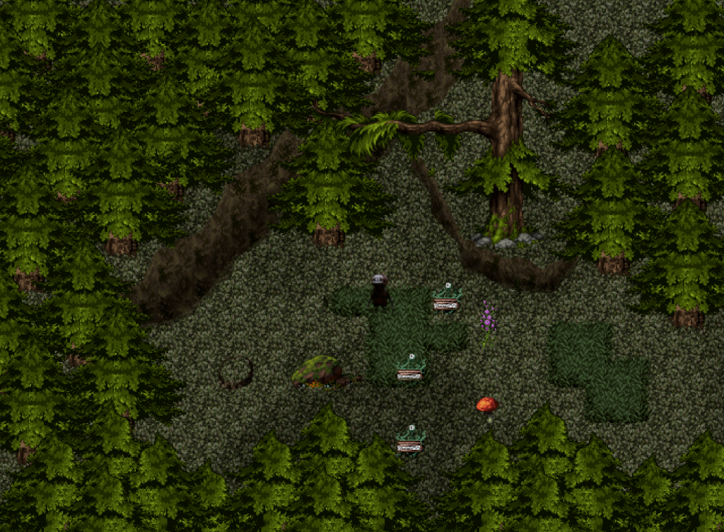
From what I can see it's just flat ground with nothing sticking up and no eyecatching stuff.
The walls are nice and you've at least tried to add some elevation with the stuff at the bottom but more needs to be done to give it some oomph.
The walls are nice and you've at least tried to add some elevation with the stuff at the bottom but more needs to be done to give it some oomph.
 Gameplay of Skinwalker Parts 1-3
 The Screenshot Topic Returns
Why do you keep using those real-life pictures. They dont fit at all with the sprites. It also makes the everything on the screen look like it has been shrinked 10x.


