


SOOZ'S PROFILE
Sooz

They told me I was mad when I said I was going to create a spidertable. Who’s laughing now!!!
5354
Hi I do art mostly but also do games.
Please read my comic, Patchwork and Lace. It's about a Lovecraftian Disney Princess dark mage and her superpowered undead partner hunting monsters and being bad at communication.
Please read my comic, Patchwork and Lace. It's about a Lovecraftian Disney Princess dark mage and her superpowered undead partner hunting monsters and being bad at communication.


Search
Filter
 The Screenshot Topic Returns
 RMN Christmas Pixel Quilt 2013
Your Game and Music
Dude, there are a lot of Touhous. You can probably stand to either drop some of them or at least not repeat them.
Man, I'd been worrying about my (possibly) 30ish tracks... o_O
Man, I'd been worrying about my (possibly) 30ish tracks... o_O
The Screenshot Topic Returns
author=yuna21
Ah, I'll lighten it up a bit, then. ( even though I like my dark interiors >:) ). I'll just drop the opacity of the lighting overlay ( since I don't use a lighting script ).
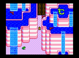
If you're really keen on having a dim interior, you could fix things by positioning the light sources on important areas. Part of the problem is that your current screen highlights the floor, some boxes, and some bottles, none of which (I assume) are important. If you switched the left window and the middle display rack, there'd be less of a problem, since the important NPC would then be highlighted.
Using light sources is all about showing the viewer what they're meant to be looking at.
Commercial game music: What to unot to use
Or take advantage of the many free music resources already available on the net, if you're hopeless at composition. Especially if you're looking for traditional vidya gaem style music, there's a jillion composers around offering their stuff for no charge other than a mention in the credits.
The Screenshot Topic Returns
author=thatbennyguy
@Sooz I love the vibe you're going for. But I do actually think Dookie's version improved on the original. It's better if you make maps that adhere to RPG conventions. To make something look like it's inside, that's generally what you do.
I'm not arguing that, I'm just explaining why that fix wasn't implemented yet. Sorry if I managed to come off like I was refusing to better something! It's just a slow process for me and I was kind of excited about the fixes I had made. I guess in the future I should hold back on that. vOv
The Screenshot Topic Returns
Those, and I redid some textures and color (to make a better palette), as well as trying to add in a shadow to better separate the ground from the wall.
I guess most of that isn't all that obvious at first glance, which is probably a good thing, given I didn't get anyone saying, "Oh man, those textures are awful!" or anything. XD
I guess most of that isn't all that obvious at first glance, which is probably a good thing, given I didn't get anyone saying, "Oh man, those textures are awful!" or anything. XD
The Screenshot Topic Returns
author=Dookie
without the black its really hard for the viewer to grasp that we're underground/inside.
also it doesn't get much easier than autotile. you can do it. look at how other games handle interiors and you'll see. I thought someone pointed this out already?
Please bear in mind that I'm making all the graphics by hand and this is my first time doing this stuff, so I can't exactly instantly fix things. I'm definitely going to fix that particular problem, however! I'm just a bit intimidated by the layout of the autotile base (and, y'know, busy with RL creative things that give me money) so I've not taken the time yet.

