


ULTIMA187'S PROFILE


Search
Filter
 Raciela
 ToD chipsets giveaway thingy.
 SHOW ME YOUR SCREENSHOTS - Fall Edition
No particular reason to see what he looks like, I just like it that way. But thanks for the suggestion, I'll see what it looks like.
SHOW ME YOUR SCREENSHOTS - Fall Edition
Yeah, I was planning on darkening the message box, but I wanted feedback on the layout before I did that.
SHOW ME YOUR SCREENSHOTS - Fall Edition
 New Screenshots
 aroundtheworld.png
corruption.png
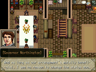
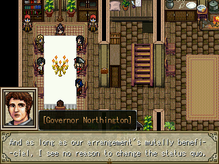
I see what you mean, but I use three different sized-boxes for names now. One for short names, one for medium names, and one for long names. Also, my setup for messages are like this: I use names on the first line, leave the second line blank, and use the last two for dialogue. So, if I put faces on the same level as names, I'll have to adjust the first line of text, and that could result in name cutoffs. The way I have it right now takes up less space than if I were using all four lines.
corruption.png
You're right, Azn, it's pretty readable ingame, and like Tardis said, the same pic is used for all dialogue, so I have no problem darkening it a little. Thx for the comments!

