SCREENSHOT SHOGUNATE
Posts
Ocean's I don't comment on your stuff often, but seriously it's shaping up really nicely. It's staying true to the whole class system of some FF titles and I think the gameplay is going to be great once your done.
Speaking of which, I should go play hero's realm in the mean-time as I never got around to play it.
Edit:
Top???
Btw, I was originally going to post these here but YOU GUYS WERE DOWN :P.


Speaking of which, I should go play hero's realm in the mean-time as I never got around to play it.
Edit:
Top???
Btw, I was originally going to post these here but YOU GUYS WERE DOWN :P.


Nice illusionist! I recognise some of that chipset but is the rest original? My only problem is the panorama in the top screen, it looks strange, its the clouds. It doesn't look good (to me).
Mack n VX....hmmm...hmmmmmmm.....hmmmmmmmmmmm.....nice. :-* (However a series of trees clash with one another, some are too light )
Alright, I guess I'll chime in on this thread, although my map design isn't quite as amazing as some of the stuff I've seen so far in here.
A house

bowing to the king

an item shop

world map

A house

bowing to the king

an item shop

world map

Yeah that's really nice Harmonic. It's nice to see VX stuff that isn't so squary. Yeah, that's right, I just made that up that word :o.
jcavonpark, the item shop is my favourite screen. It looks quite charming actually.
The second screenshot (thrown room) could be done better. It's really tight even for a thrown room maybe you should try to fix up the structure by widen it a bit. I like the tileset though. I noticed the tilesets have their own shadows which is a nice touch. The first and last screen are ok. I suggest you increase the transparency up on the world map if your going to use that overlay.
Oh Little Wing Guy, that's actually a overlay which moves across the screen. It's not really part of the panorama.
Roseskye: That windowskin + shadow makes it much easier to read the names. By a rediculous amount. Hell, the text in general looks a lot cleaner.
All these screenshots do look good.
Heres a few screenshots from our project which up til now has been so top secret that nobody's ever heard of it.
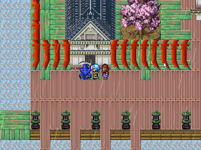
Old house on a rotting part of the floating city.
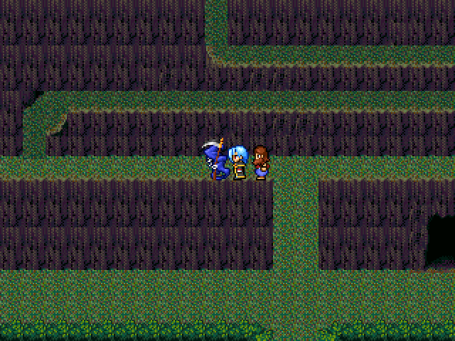
Tall mountain in the middle of nowhere.

Remade for the purpose of answering riddles! Why did I make a screenshot of this again?
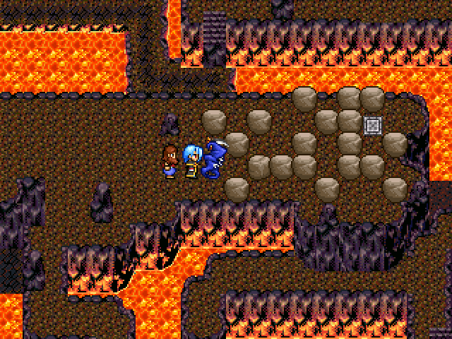
Fiery rock puzzle of doom
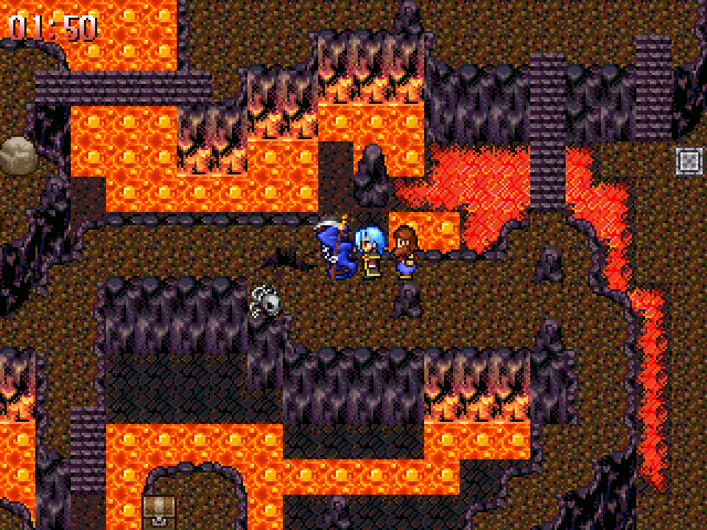
This should be plenty of time shouldn't it?
These screen shots are actually kind of old. Since then we've gone back to using the old 320x240 resolution for fullscreen mode, to keep that ancient pixilated look.
Heres a few screenshots from our project which up til now has been so top secret that nobody's ever heard of it.

Old house on a rotting part of the floating city.

Tall mountain in the middle of nowhere.

Remade for the purpose of answering riddles! Why did I make a screenshot of this again?

Fiery rock puzzle of doom

This should be plenty of time shouldn't it?
These screen shots are actually kind of old. Since then we've gone back to using the old 320x240 resolution for fullscreen mode, to keep that ancient pixilated look.
Lots of beautiful screens on this page!
A video of my renewed dungeon. Basic stuff... nothing special.
http://www.youtube.com/watch?v=ASEF60lA80I
A video of my renewed dungeon. Basic stuff... nothing special.
http://www.youtube.com/watch?v=ASEF60lA80I
My game looks like ogre shit right now, but I can post a bit of LOL right now...
BLATANT SELF-ADVERTISING FTW!

Also, someone tell me what site to use so I can get my thumbnails to the right size. (I mean the images, not keratin.)
EDIT:
I watched Dis' (Dis's?) video. But, me wonders - what program to you use to make a video in the first place?
EDIT:
A'ight, thx Dis.
BLATANT SELF-ADVERTISING FTW!

Also, someone tell me what site to use so I can get my thumbnails to the right size. (I mean the images, not keratin.)
EDIT:
I watched Dis' (Dis's?) video. But, me wonders - what program to you use to make a video in the first place?
EDIT:
A'ight, thx Dis.
Map Demo
Yes, I know, they're a tad bland, but it's a hospital and it wouldn't make sense for there to be a whole bunch of obstructions in the hallway. It's just to show off the opening sequence basically.
Also, I threw in a couple of battles (in a tutorial simulator, but still). Any comments on things I can improve? I know the spriting is bad - it's just a stand-in, but at least it's original, right? :P
http://www.youtube.com/watch?v=pkUwGso9H0Q
Imageshack can have larger images, if that is what you mean. You probably copied the wrong URL, or you made your imagine too small to begin with. Though I don't think I understood your post that well. If you really want to have another site to host your images on, try photobucket.com. You must register, however.
@ ChaosProductions - Yeah mapping wise it needs a bit of touching up, But it's an original idea, with some original graphics and great personality. It doesn't look half as bad as I thought it was going to be.
@ GameOverGames Productions - The only screen that really bothers me is the Mountain path. The thin curling path just doesn't look good. Everything else is fine.
@ Dis - Looks pretty darn sweet. I like the idea of lighting up the cave, I really like the way characters Lvl in this game. Plus great Rudra mapping, something I know a little bit about ;) everything just shows all your effort.
Complex three floor ice puzzle done!
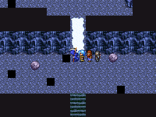

Currently, I'm merging/editing a chipset for a buried temple thats being excavated. I have a guy working on making charactersets for ruined statues, chunks of stone and such. Heres what we have so far.

Excavation Site, building of ancient unknown origion


Currently, I'm merging/editing a chipset for a buried temple thats being excavated. I have a guy working on making charactersets for ruined statues, chunks of stone and such. Heres what we have so far.

Excavation Site, building of ancient unknown origion
This is a far more polished game, although the video quality still sucks goblin dick :P. This is for Last Day, and shows of the battle system. I'm working on the system2, and making complete battle animations.
Also, the spell names are in Latin, so if you need to know what one means, ask and I'll edit this post.
http://www.youtube.com/watch?v=YXCAOahnAd0
@GOGP: Not bad. I have to ask why Death is the party leader, what is it, PERSONA 3 (in-joke!)
@LWG: Many thanks, my good sir. that's the first positive thing I've heard about Pimp so far.


