


SHOW ME YOUR SCREENSHOTS - FALL EDITION
Posts


A little visual novel I'm working on for you guys for Halloween. Text is easier to read full screen, needless to say. Yes the title screen is supposed to have fucked up text. (There's a riddle with this that's pretty easy to figure out. Just ignore the symbols and know there's no difference between upper and lower case letters.) No that's not cocaine. I think I'll be taking the majority of the rest of the pictures myself, but Google and David Lynch helped me get started.
I remember hearing about a program for RM2k3 that automatically aligns the words with the message box, so none run over. Anyone know where I could find that?


That should do it, I think.
I'll probably make other charsets' palettes as needed instead of setting up entire spectrum beforehand, but that should serve my purposes well.


@Feldschlacht:
Was it me? Because I HATE big charsets on world maps... Yours is quite okay. I would prefer it to be even smaller, but that's good too.
Your chipset is very often used. I think it is ''Rudra'' style. So if the rest of your chips is also Rudra, you have no other choice than to use this world map.
@chaos:
I don't like that style. The charset is somehow to ''edgey'' and it looks as if it moves like a roboter. But I think it depends on how the rest of your game's style is. If it's the same it has to be like this.
@Orig:
I only know this programm:
http://rpg-freakz.de/download/progz/msgbox.zip
Unfortunately it's in German, but it shows you the number of typed in letters per line. Lines with faces can show 38, lines without faces can show 50 letters. You can add your text with one single click into the message box of RM2k3.
Your pictures look interesting by the way. I wouldn't change anything, although I don't understand the text on the title screen... O.o

So over at HBgames Feld IV showed off the title screen I made him. This lead to the discussion on how I went about making it (and that it took 15 mins and that's all you need to make a passable titlescreen), but it also lead to me putzing around.
Current title:
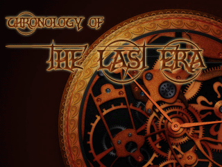
New title:
Better? Worse? Same? They're both crappy?
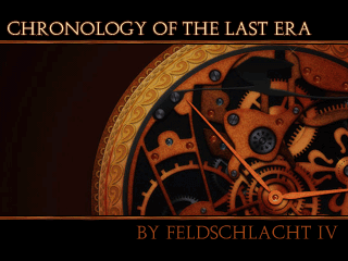
Current title:
New title:
Better? Worse? Same? They're both crappy?
Feld: I like it. Still a fan of the mini character sets, but this works too!
Deacon: Thanks, dude. 50 letter restriction noted. I think I might just see if that works in notepad. And I have no idea what's going on in your screen. There's something that bothers me about your lighting effects but I'm sure Azn will point out what it is more in depth.
kentona: Feld's name should be smaller or the title should be bigger. Maybe you could show a little more of the clock too, there's enough space above Chronology and below By Feld. Other than that, can't complain.

@Feld: Eruary is a really awkward sounding word. >_>
@kentona: I actually think that the equal font sizes looks fine, but the borders are too thick... It feels like too much of the clock is obscured. I don't like the "BY" next to the name though.
@Orig: <_> welp
@Deacon: The issue here really is that the light sources do not feel like what they should be: sources of light. For now they are really just yellow orbs. The rest of the screen needs to be darkened, or there needs to be some way to show that those torches are what's creating the light. Look at this for example: http://rpgmaker.net/games/902/images/6774/
The computer screen is the source of light in the map, putting areas that aren't lit into a darker region.
Also, for the topmost torch, the light should not shine out into the roof--cut it off at the border.
Kentona: It has more class than the first title, although that may or may not be what best represents the game. I like the borders, it looks like a book cover more than a game cover. It may just be circumstance, but game titles/logos tend to be more visually symbolic; that is, representing a game not just by its title but also the physical appearance, size, location of the title, etc. Some movies do this too. I think that's why people are saying things about the clockworks; it's really just background symbolism, but people are looking to it because it lacks a main centerpiece that they expect.
Call it a matter of personal preference, but I don't particularly care for having the game creator's name on the title screen. It's not that I don't want to see someone get credit for their game, far from it, it's just that the title screen/logo is meant to act as a windowed door into a world one creates, and I like the idea that a title screen/logo represents the world that lies within, rather than the person who made it.
That being said, it's not too big a deal to have the game creator's name on there, but I have to agree with Orig in that the size is too large.
The ideas behind the work are all good, though, from a design perspective =)
Do mockups count with crappy placeholders count?
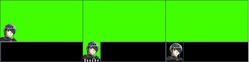
I have been trying to decide on a message box style. My primary concern is screen obstruction, RM2k3 has a low resolution so one has to keep that in mind... However, with that said there is still the problem of over complication. Having to align messages and dicking around with a custom message box might prove to be annoying in the long run. (I remember it being highly annoying back in the day, a very old game of mine used something like example 2)
I have not yet received the art I'm going to be using, so I am not sure how well the art will scale down; otherwise using the default portrait system would obviously suffice here.


Most of that could have gone in a blog post, you know. As for your screen shots, perhaps an 'action' shot of Sugar would be good (though I do like your menu - it's pretty clean) and your monopolo shot looks like most of your other monopolo shots - that is to say, pretty cool and good-looking, but I feel like I've seen it many times before.
Still, glad to hear that you're still in the scene.
Still, glad to hear that you're still in the scene.
Monopolyo
This guy is either a phenomenal idiot, or a troll. I cannot fathom why people still even pay attention to him.
Still, glad to hear that you're still in the scene.
http://www.youtube.com/watch?v=wn3F9FdOiEY
You know your first post before the edit was much more to the point, albeit slightly less insulting. Just saying.
post=99998MonopolThis guy is either a phenomenal idiot, or a troll. I cannot fathom why people still even pay attention to him.yoStill, glad to hear that you're still in the scene.
http://www.youtube.com/watch?v=wn3F9FdOiEY
Cause hes doing something different.

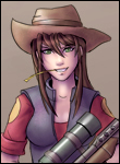
Nightblade, use the third one. Games (especially rm2k3 ones) that use the other two always tend to have an issue with jagged edges with the portraits since there is no background color to compliment them. Photoshop does a good job of blending the background color with the actual portrait. I'm not too sure how big your portraits are going to be when they're done, but you have about 65-70 pixels of space until the message box alignment becomes a problem.

